galleries
holly + ian
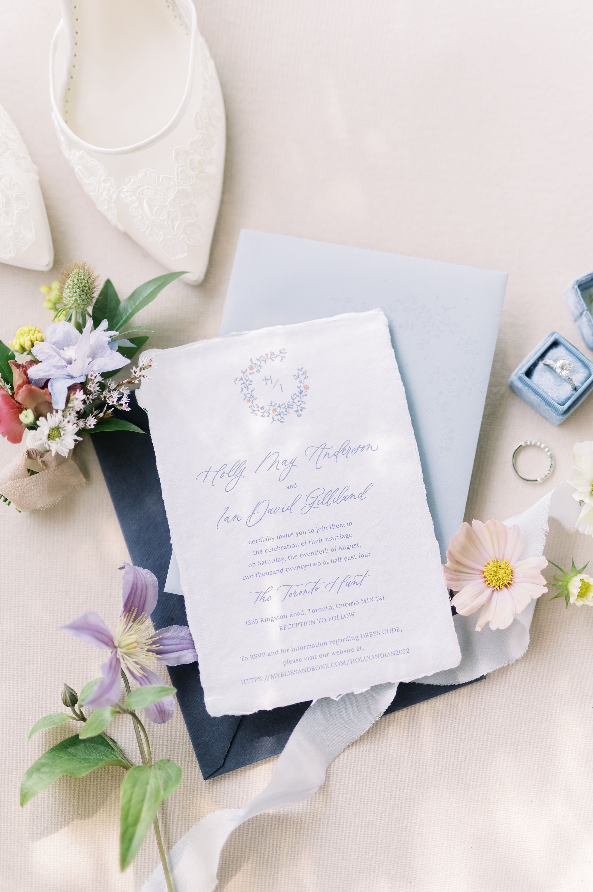
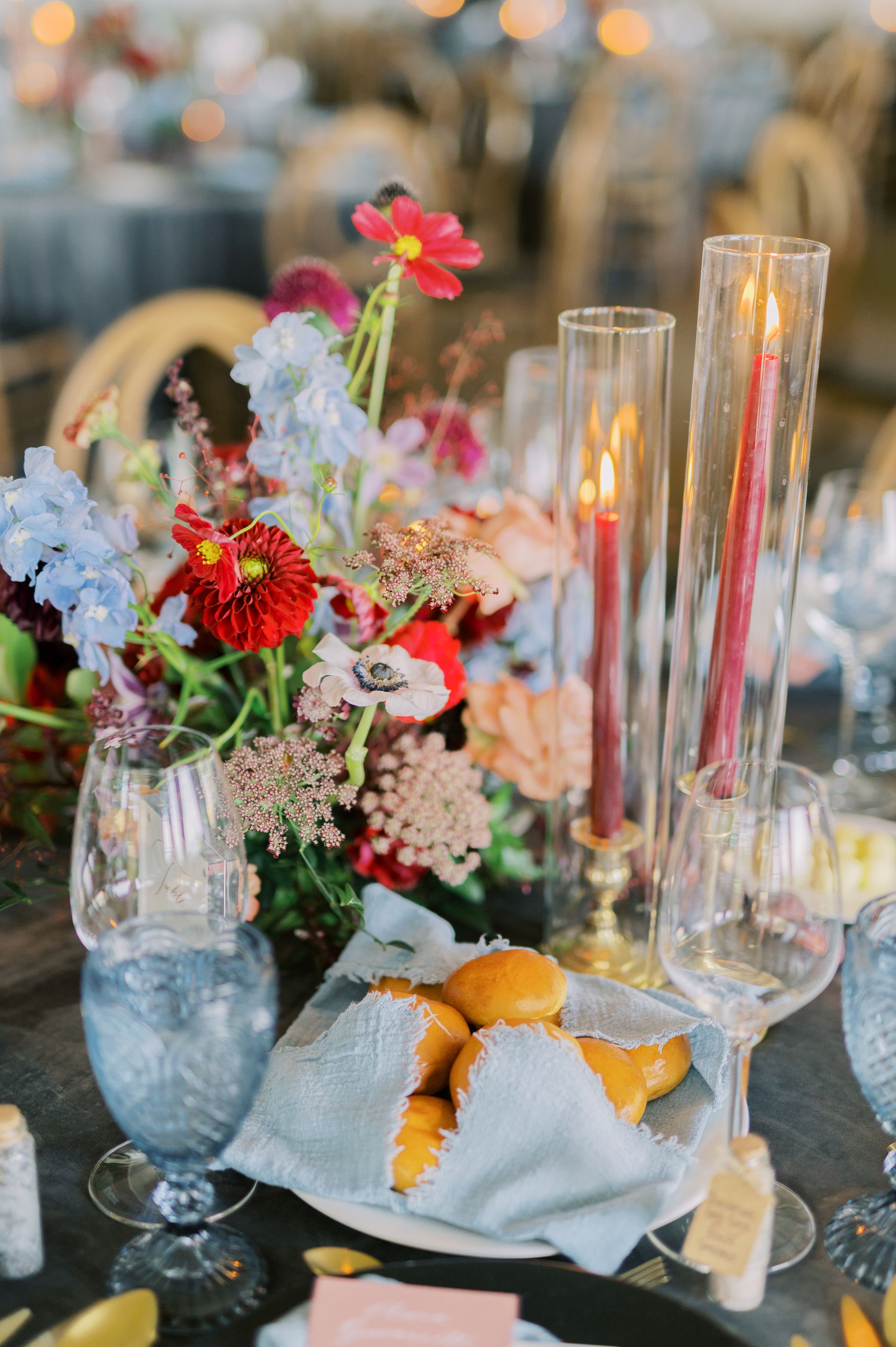
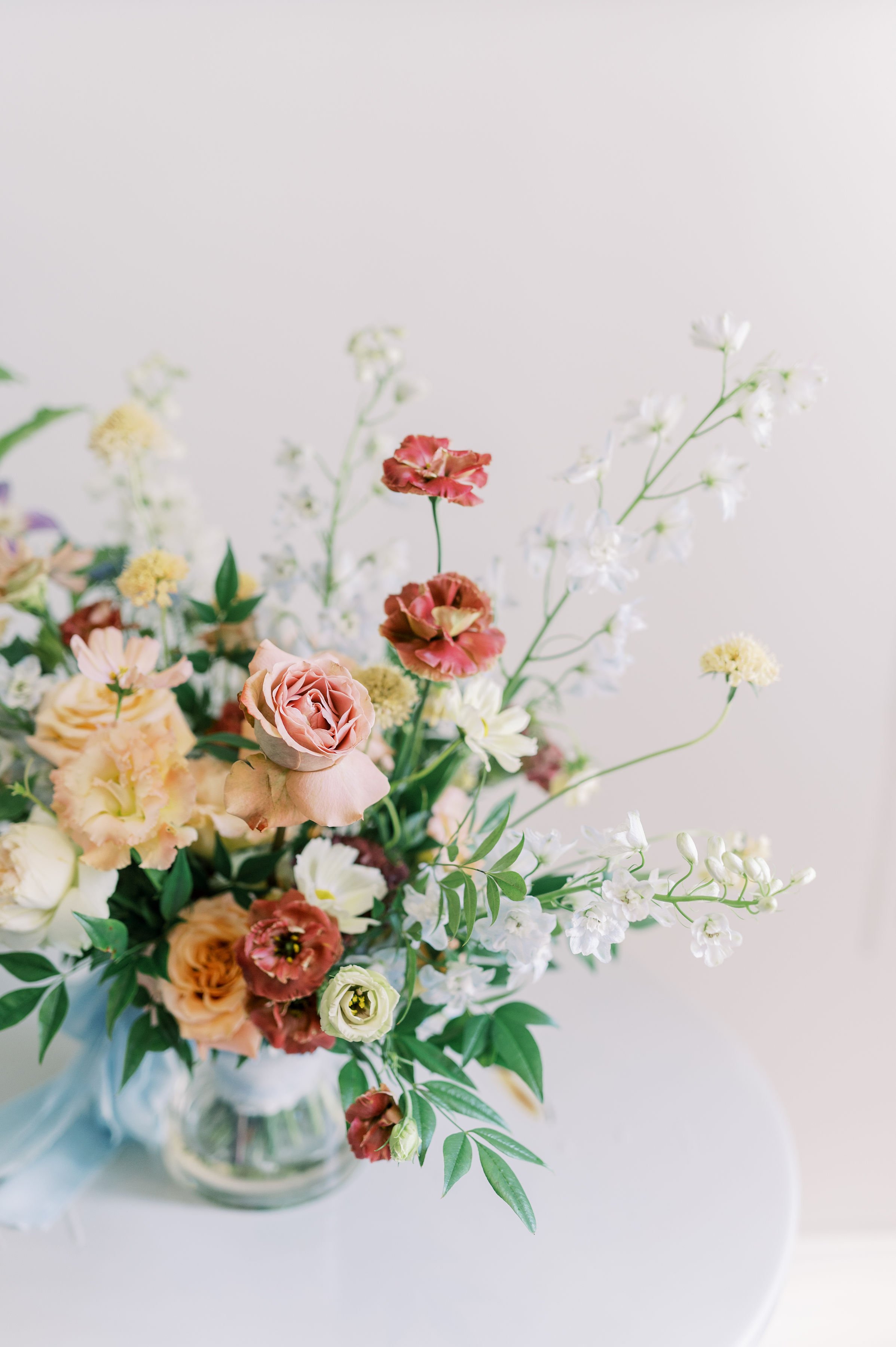
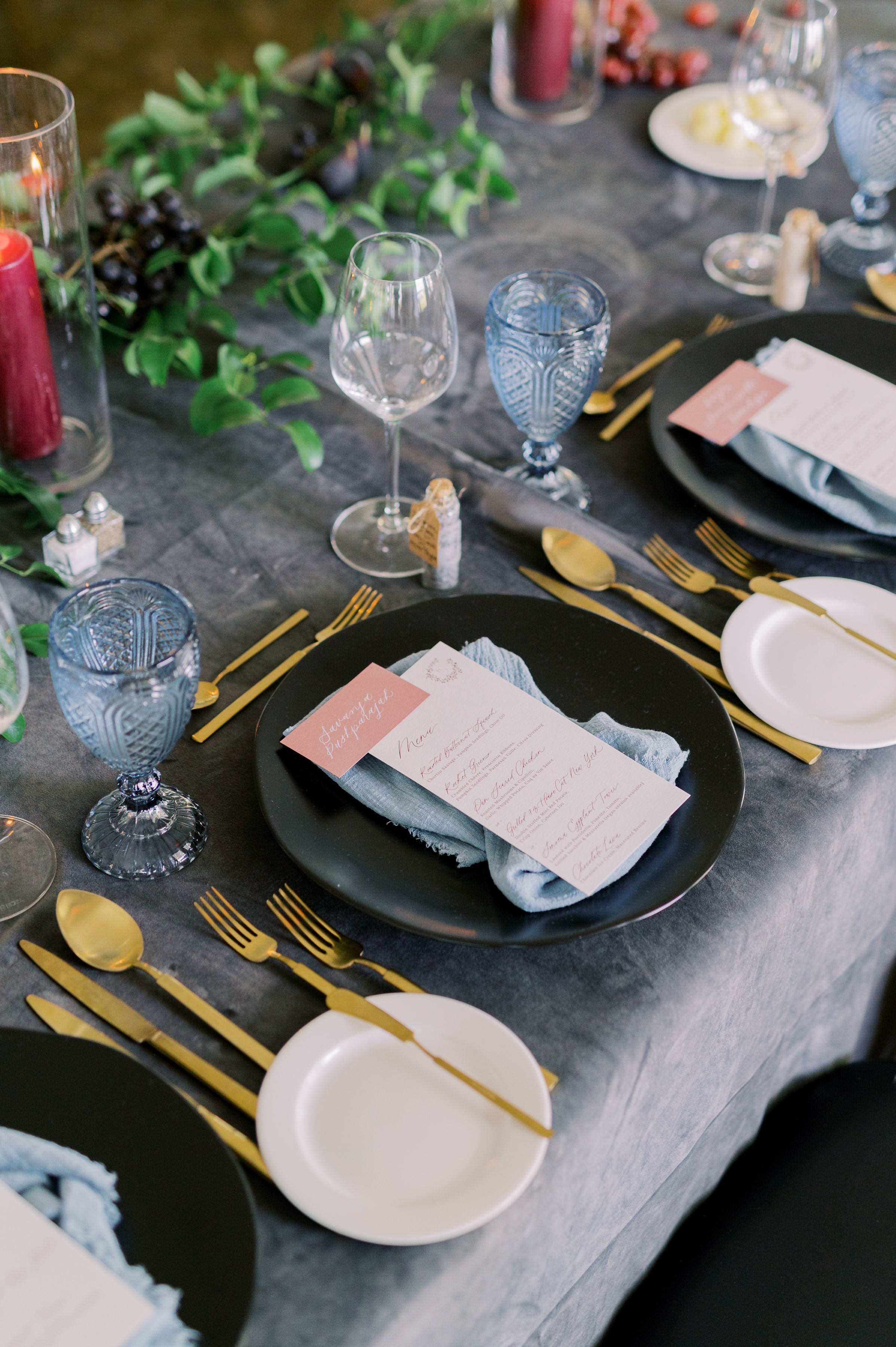
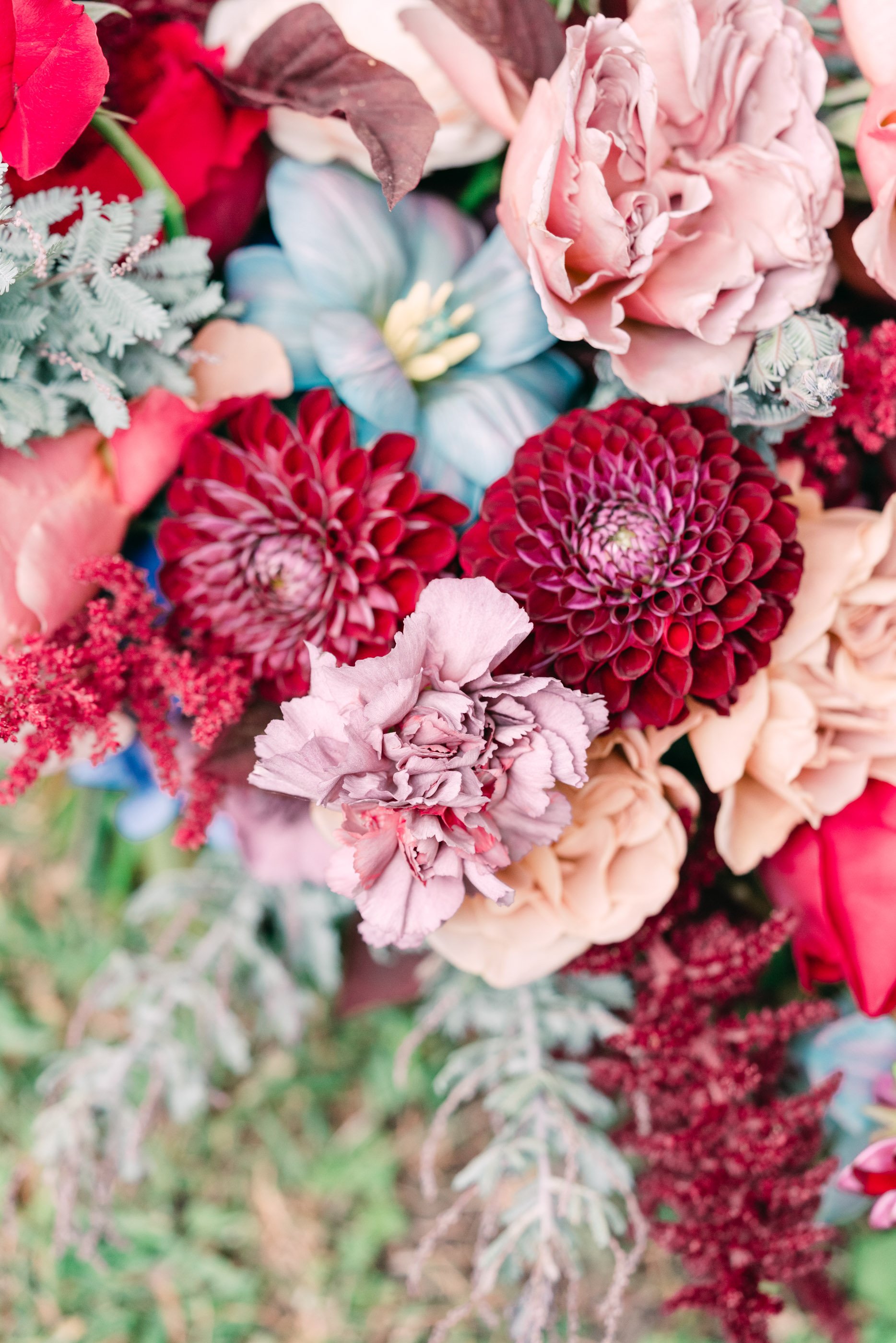
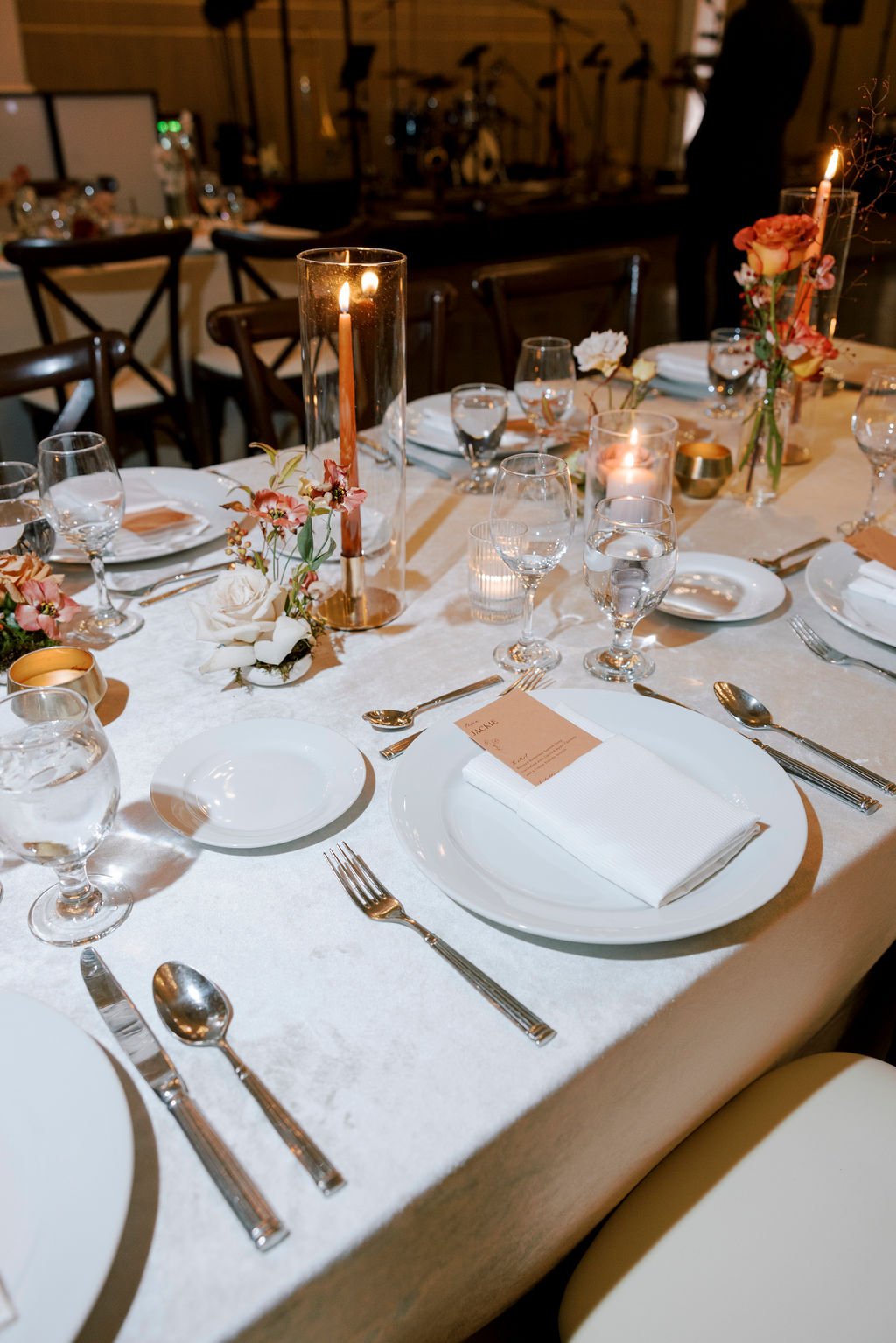
Holly and Ian’s wedding was a gorgeous display of bold colours, modern florals and textures. Their invitations were digitally printed on handmade paper and included a loose floral wreath monogram with script details. Their day-of stationery included pink place cards that helped give their table scape that extra pop of colour.
erica + alexander
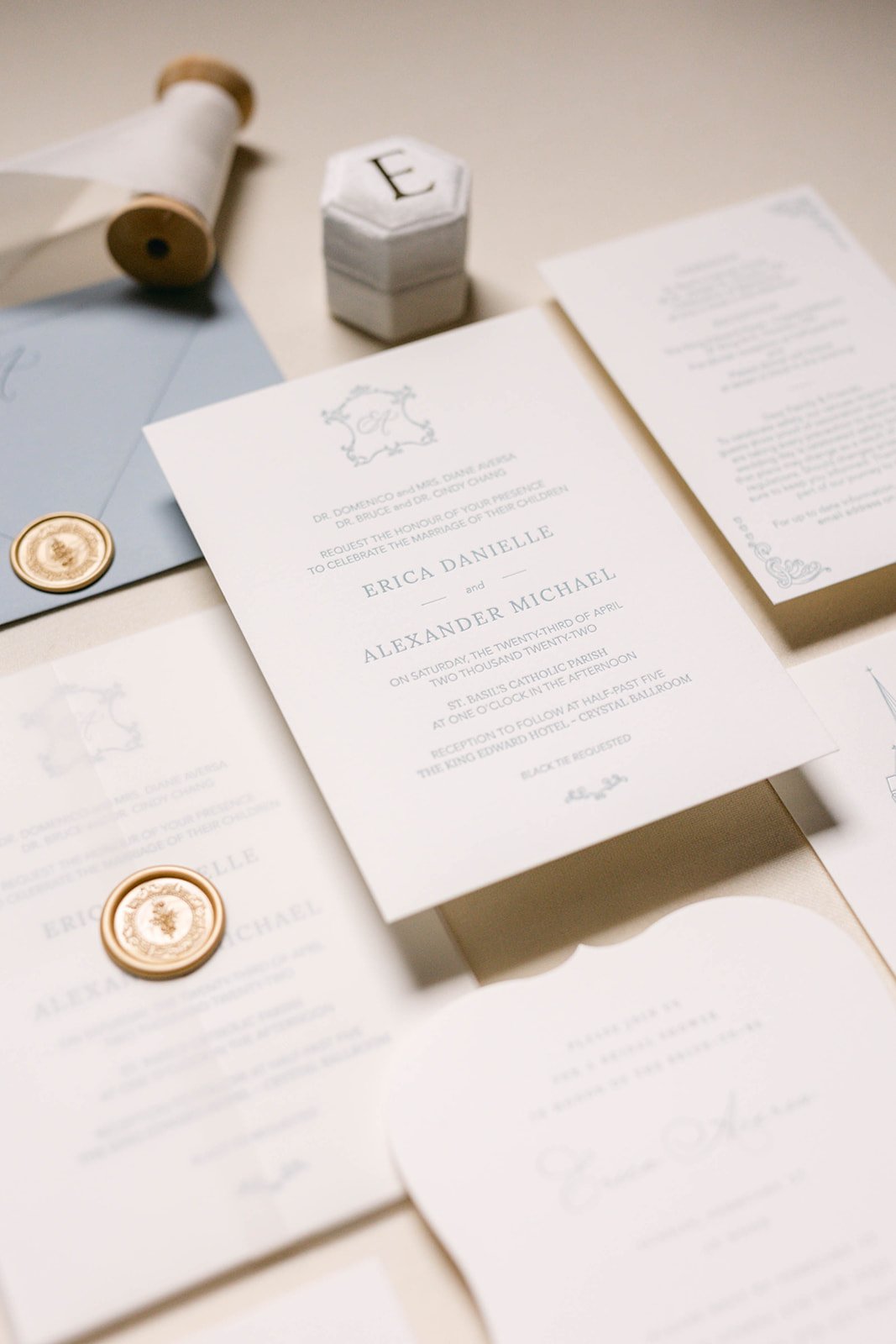
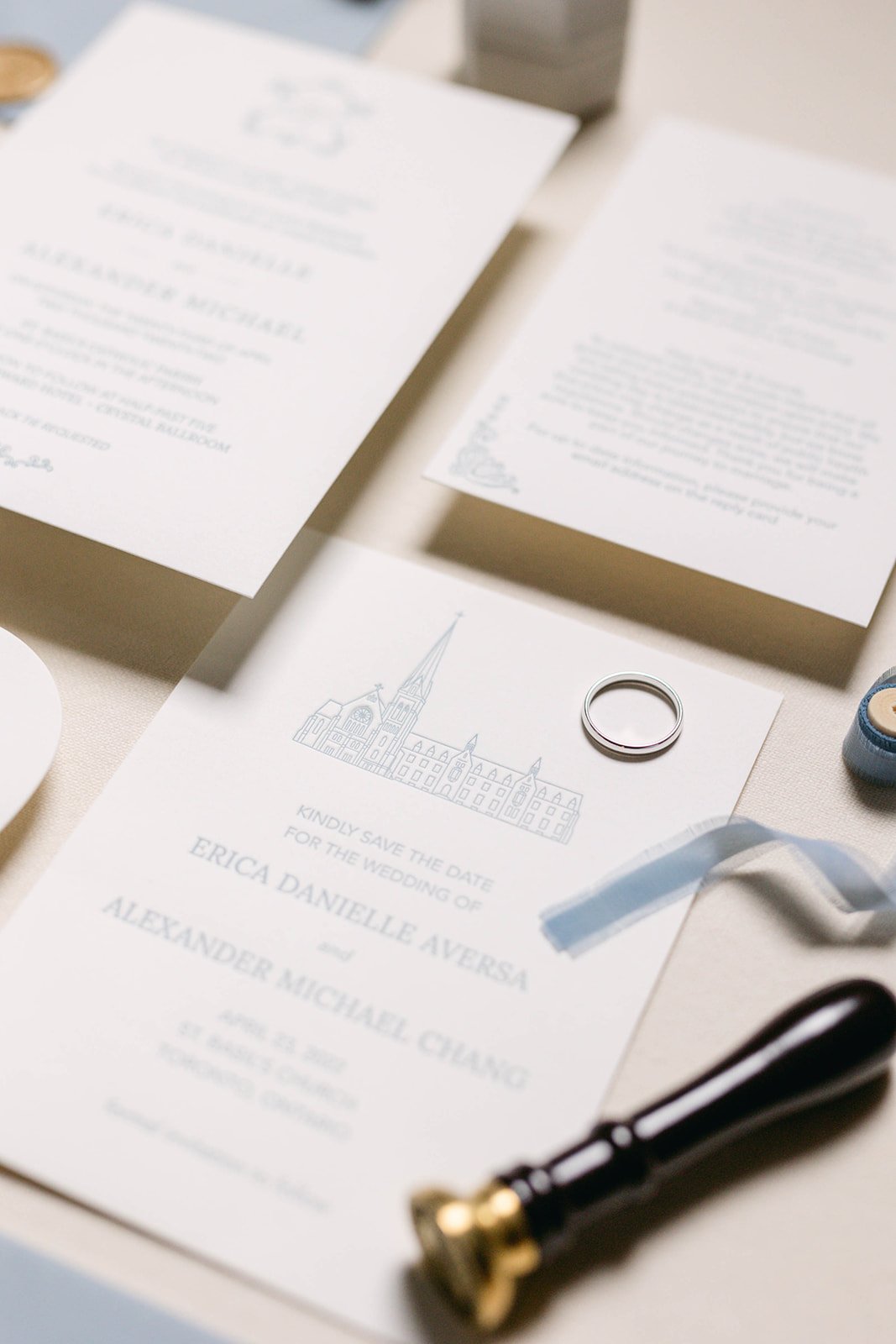
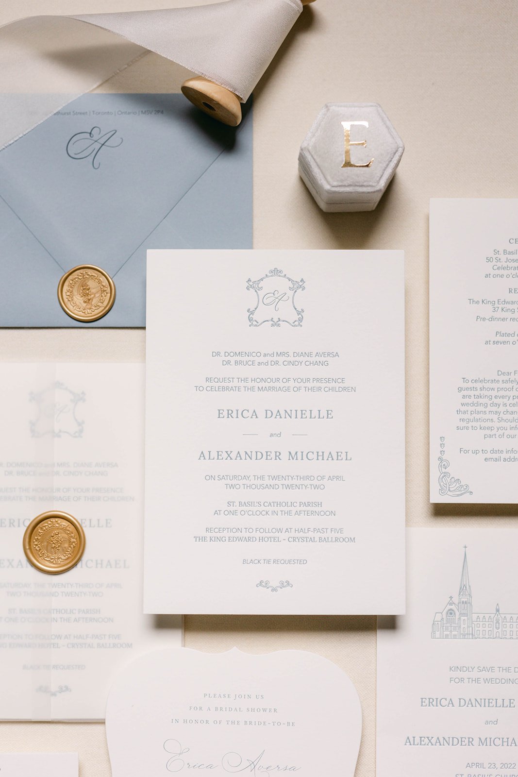
Erica and Alexander’s invitations drew heavy inspiration from their wedding venues. Their save the date included a family member's illustration of the Church their were married at. Their wedding invitation was heavily inspired by the dusty blue tones of the Crystal Ballroom and the baroque column details and the gold accents.
brittany + mitchell
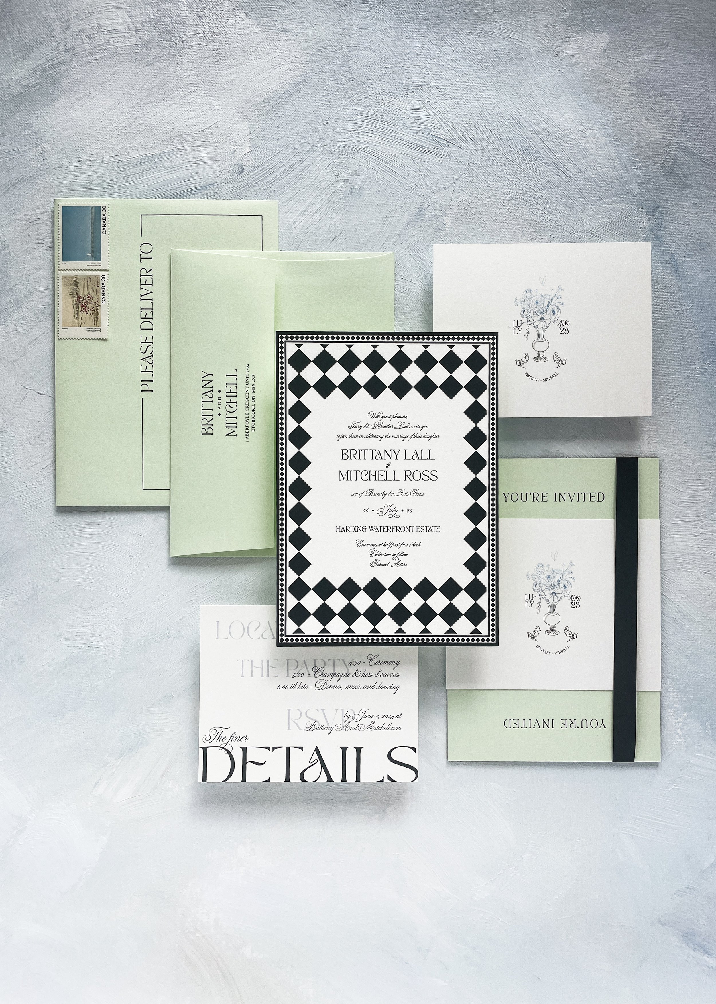
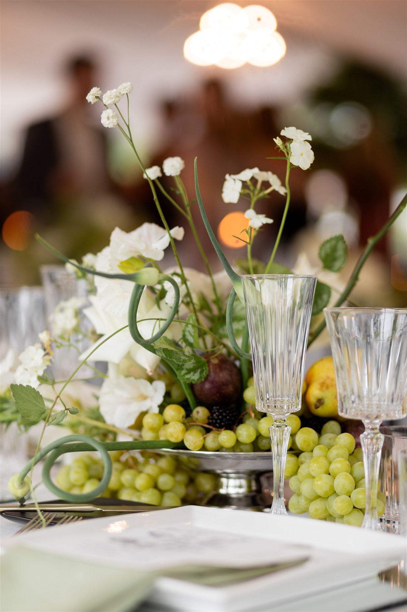
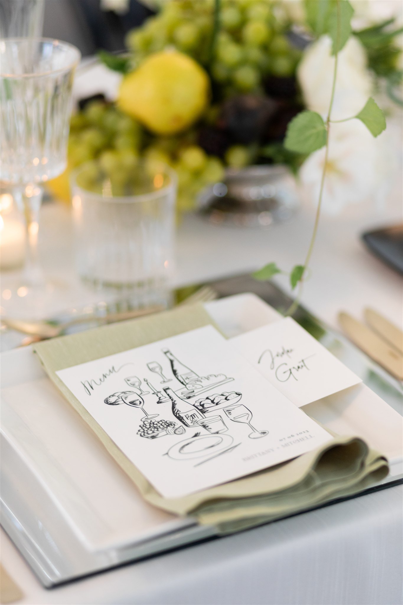
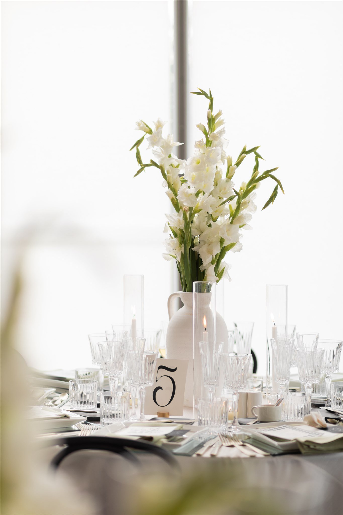
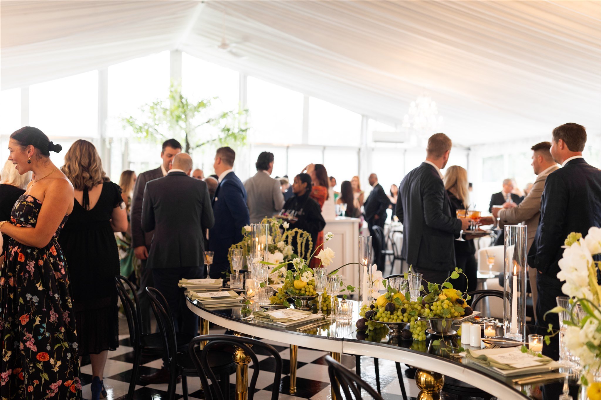
Brittany& Mitchell’s beautiful tented wedding was equally elegant, modern and fun. Their stationery included unique fonts and hand illustrations, with Brittany taking a strong creative role in their design.
natalka + david
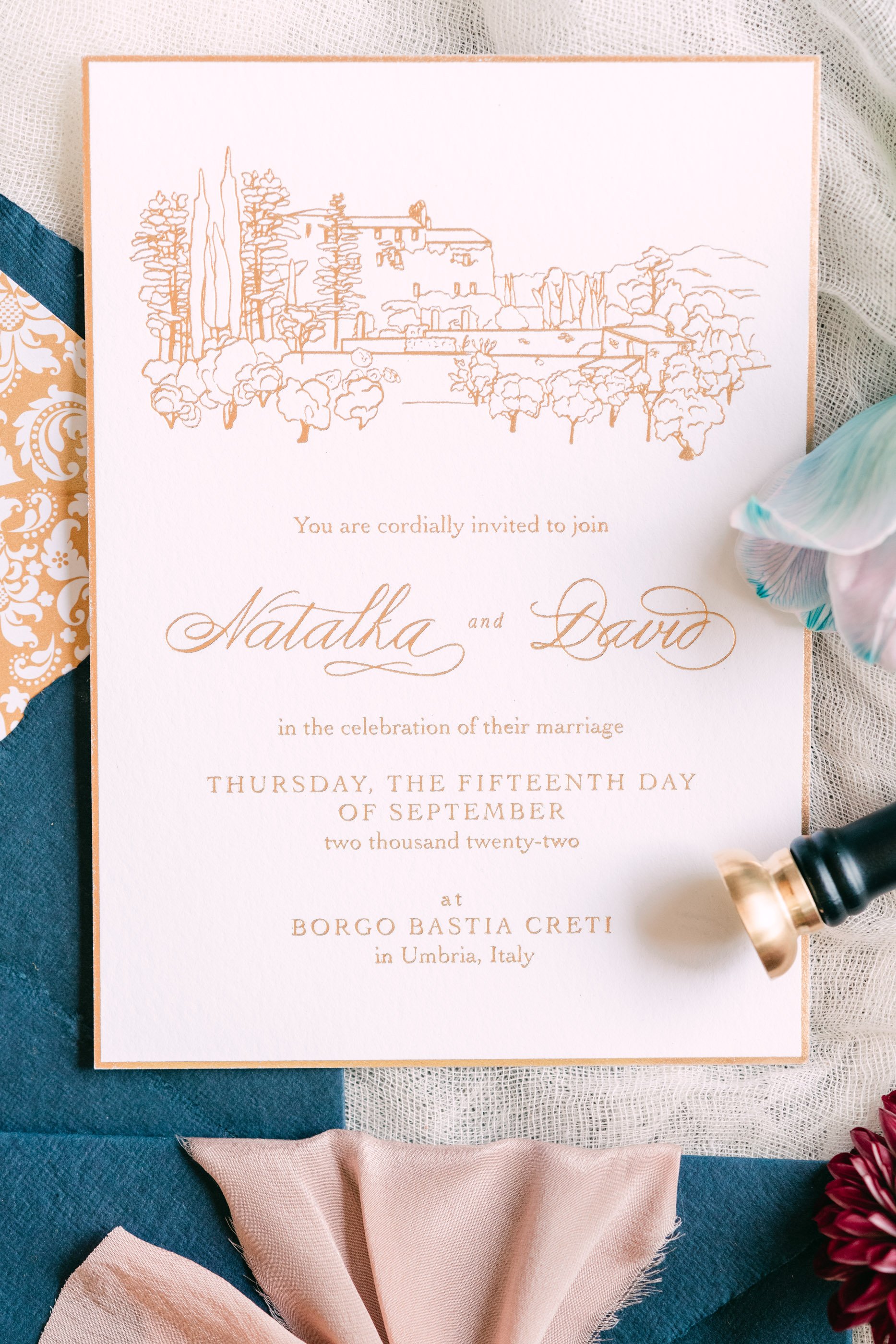
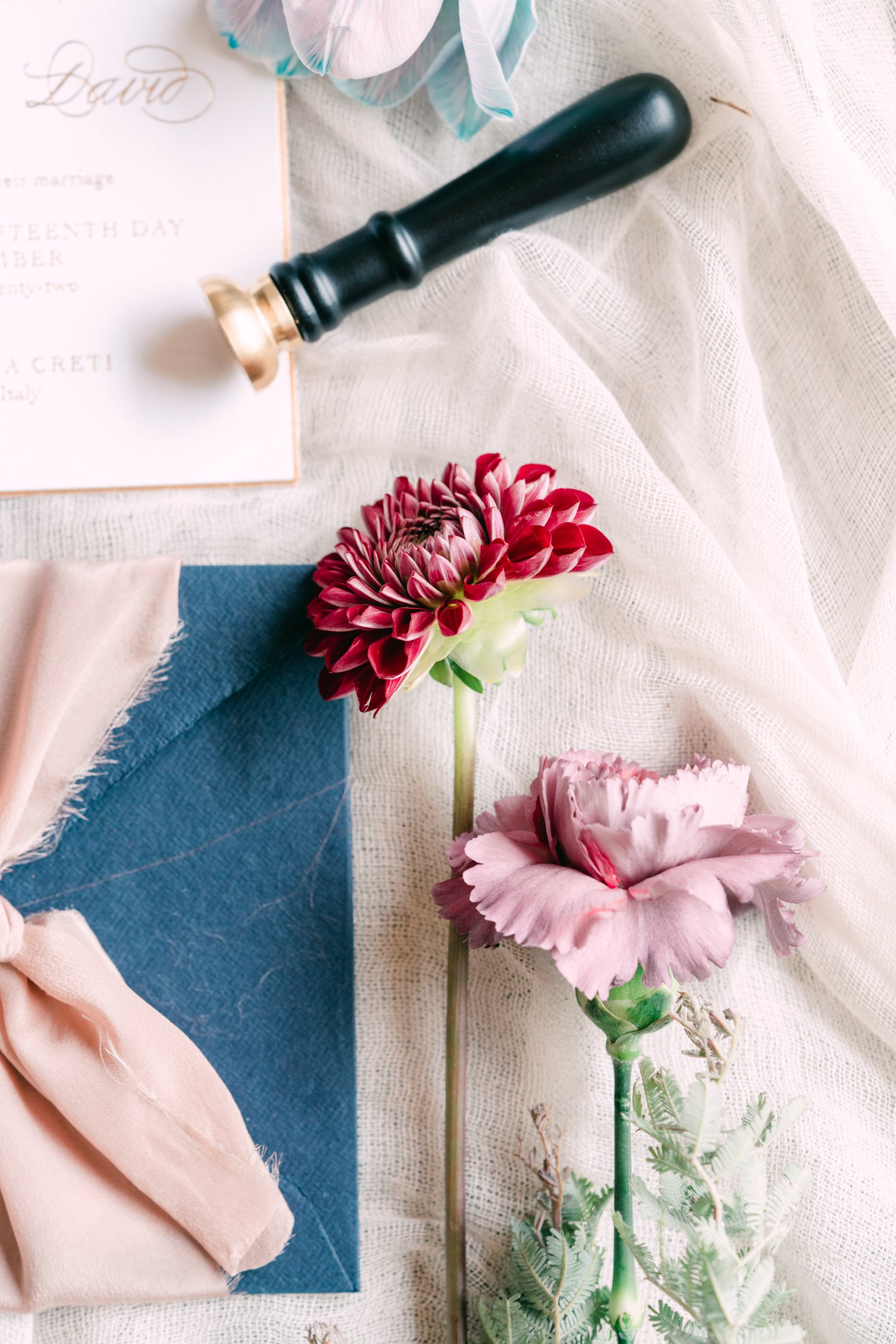
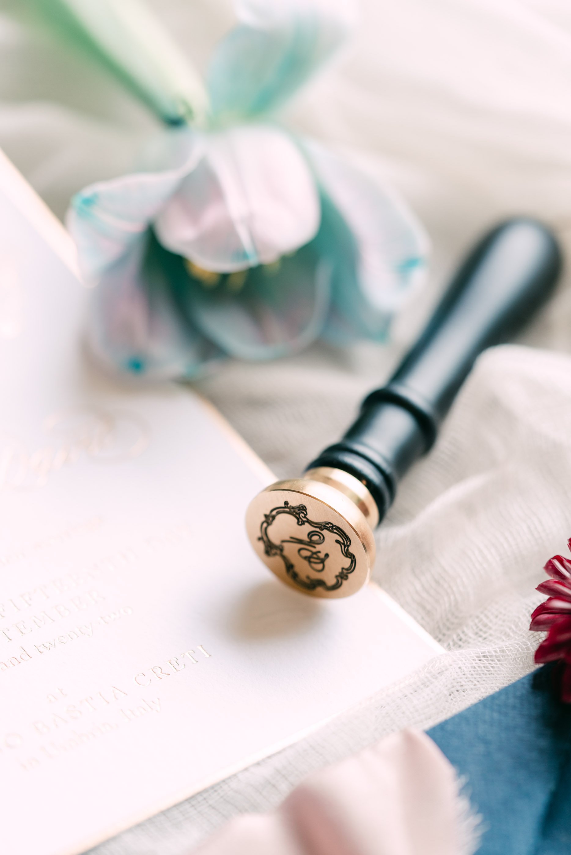
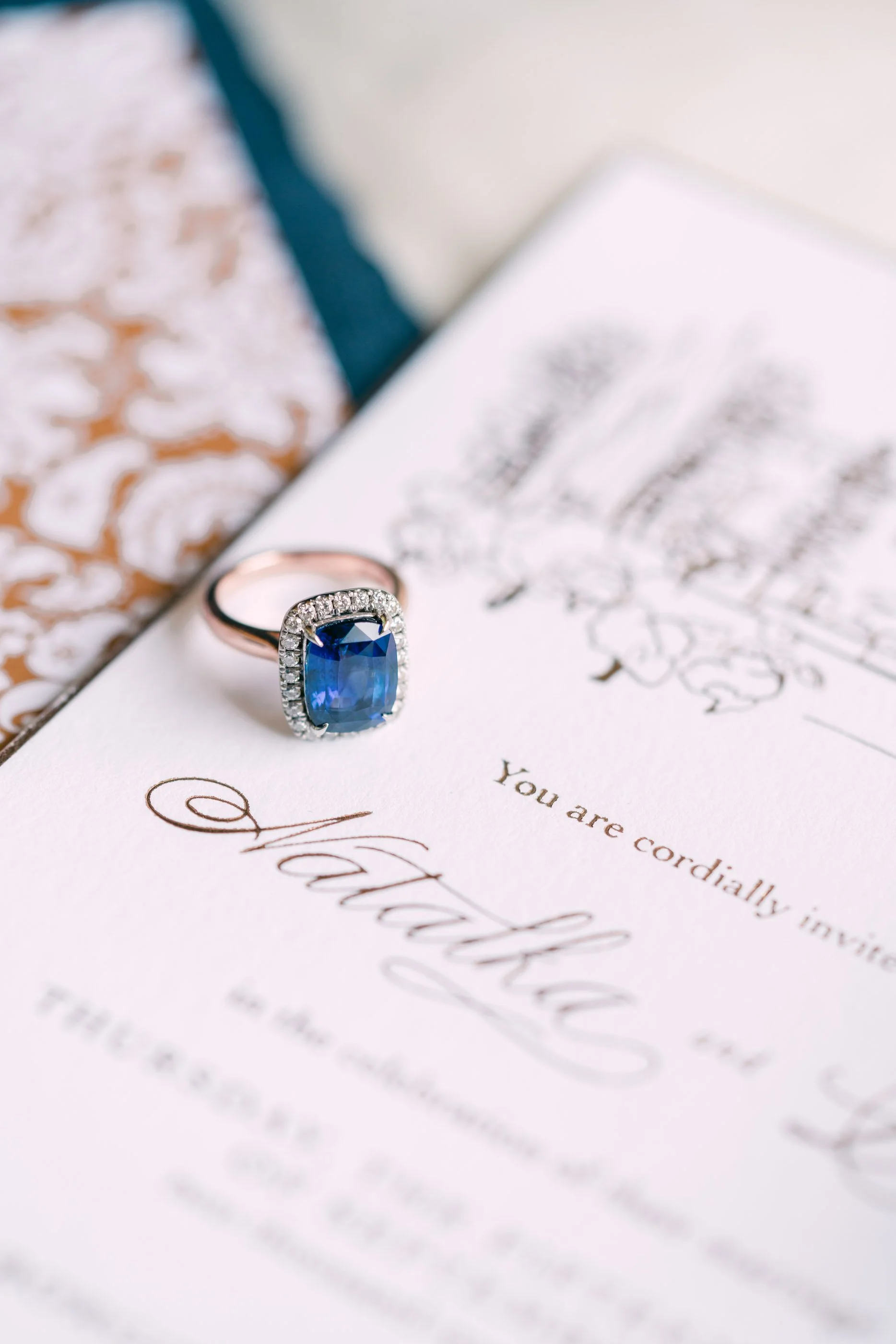
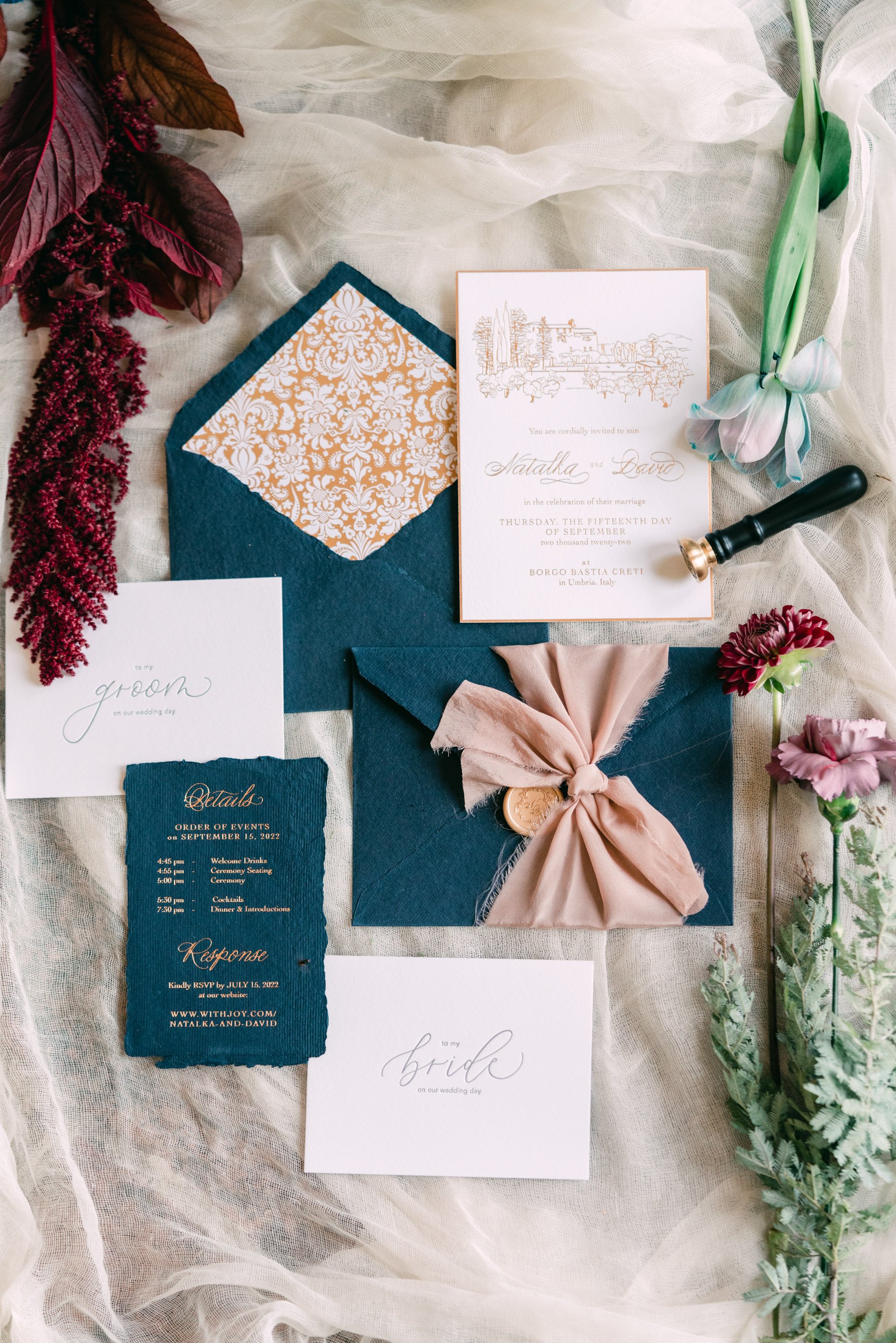
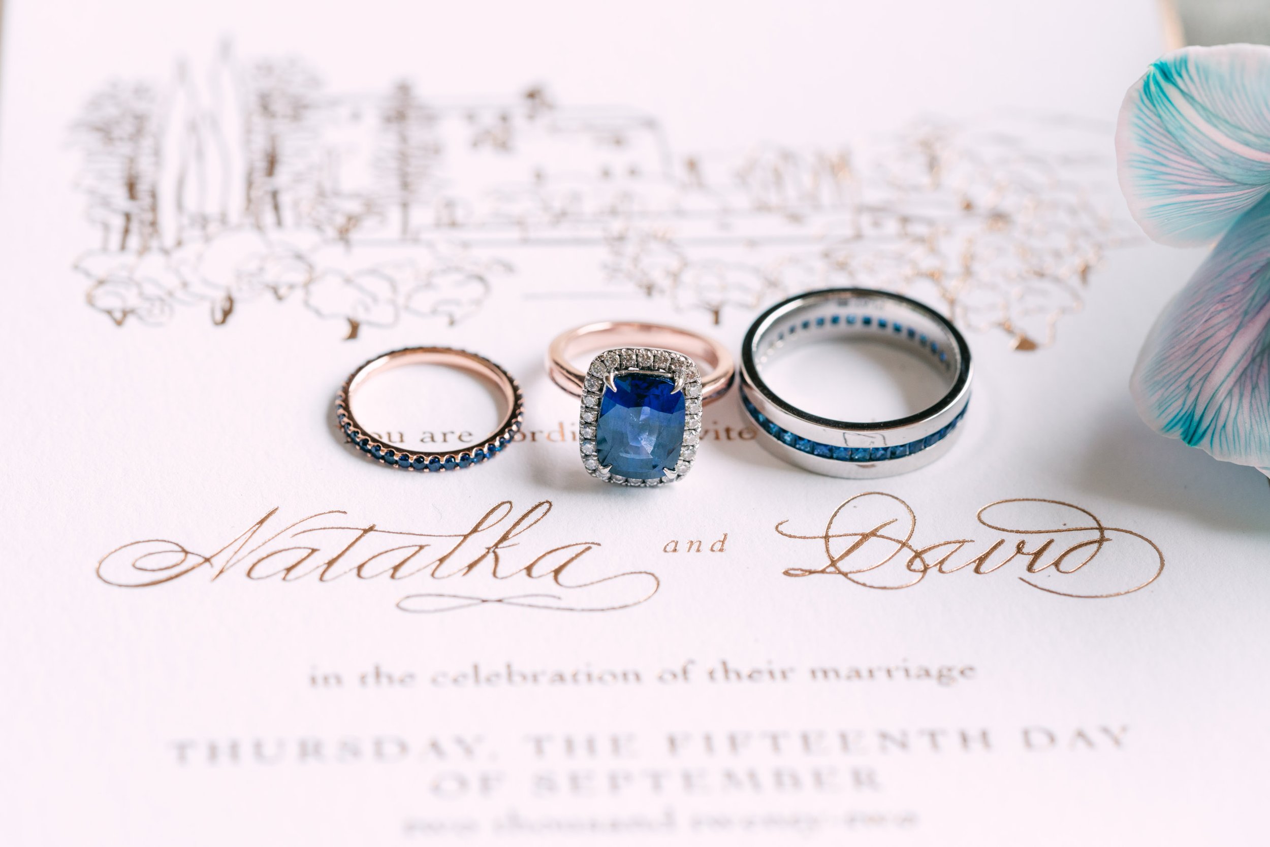
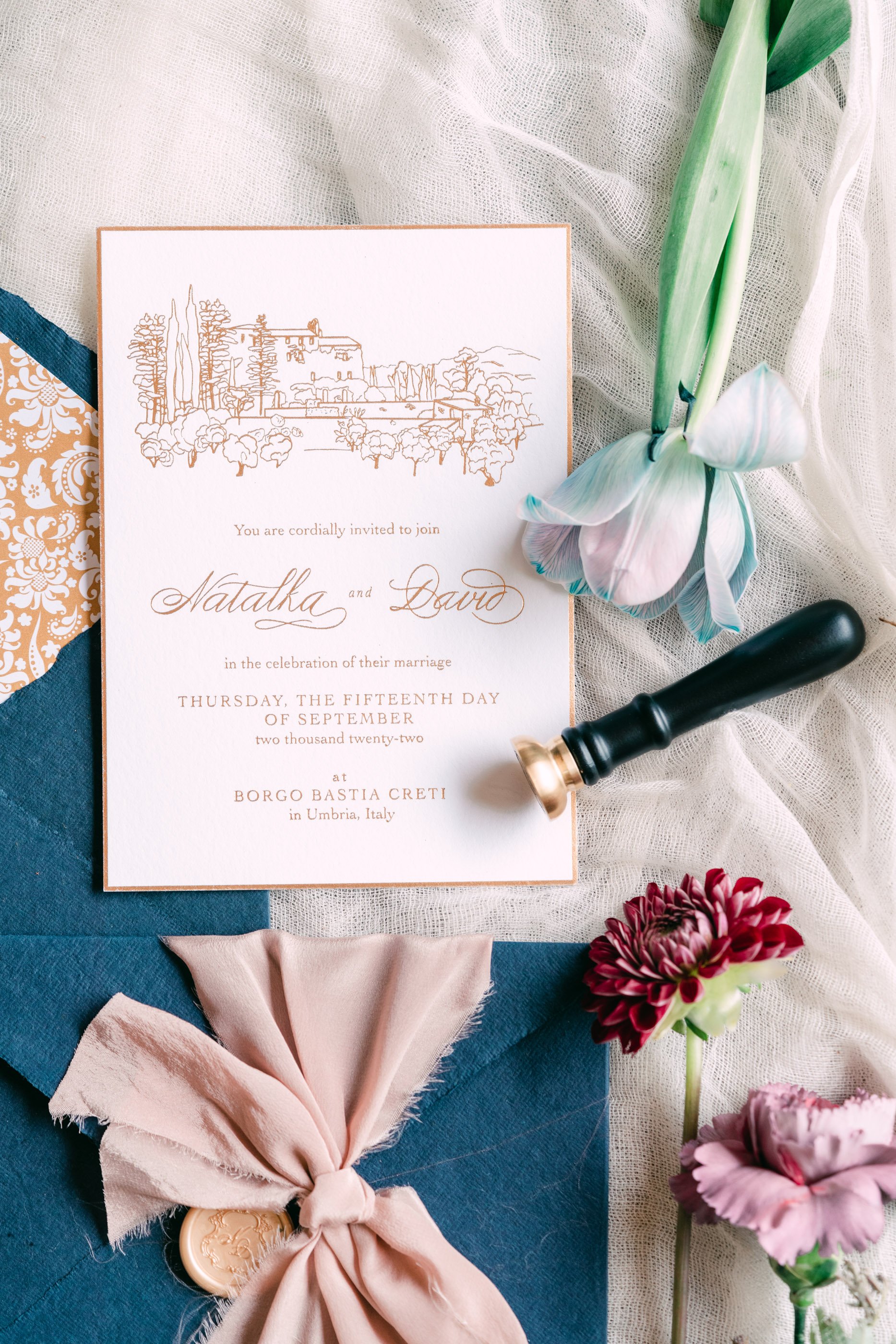
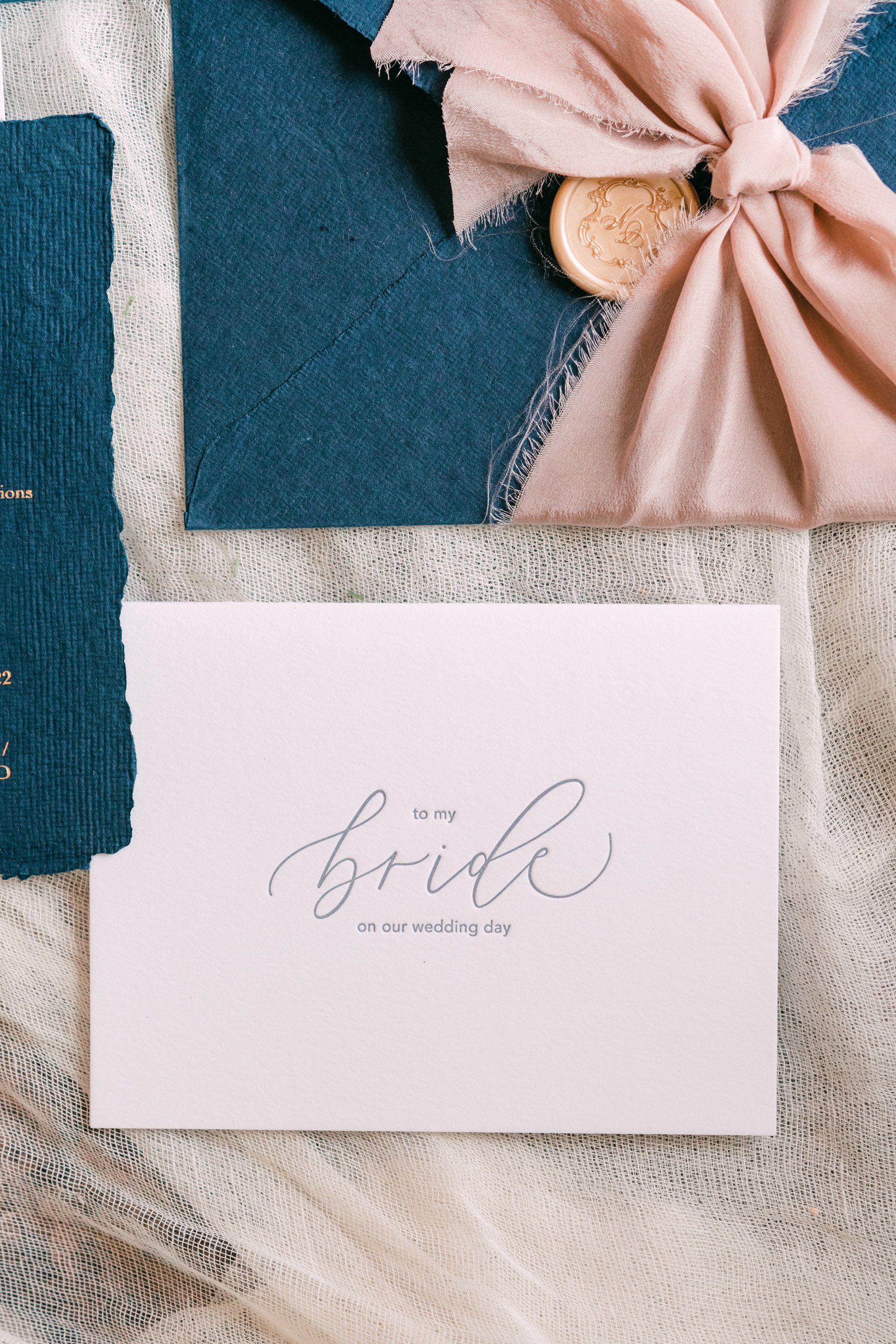
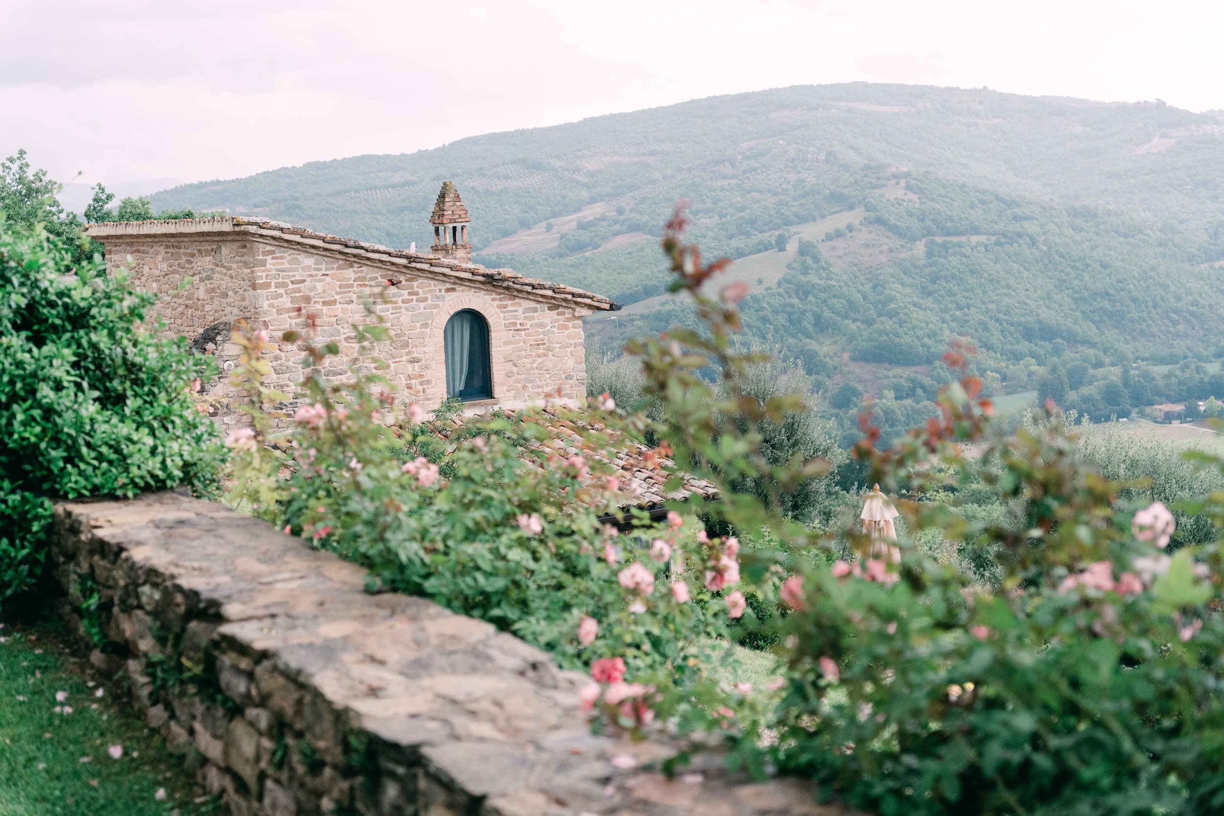
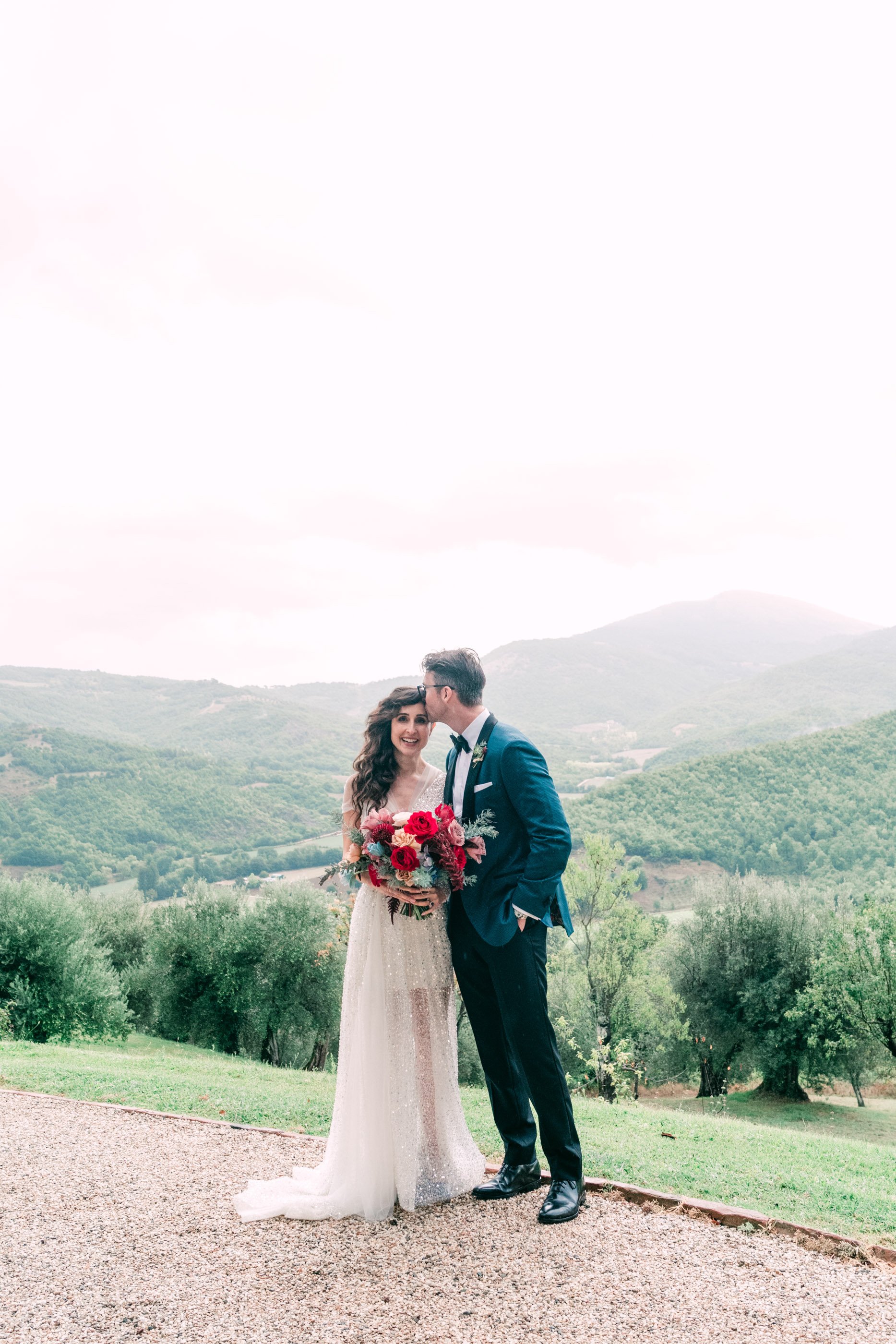
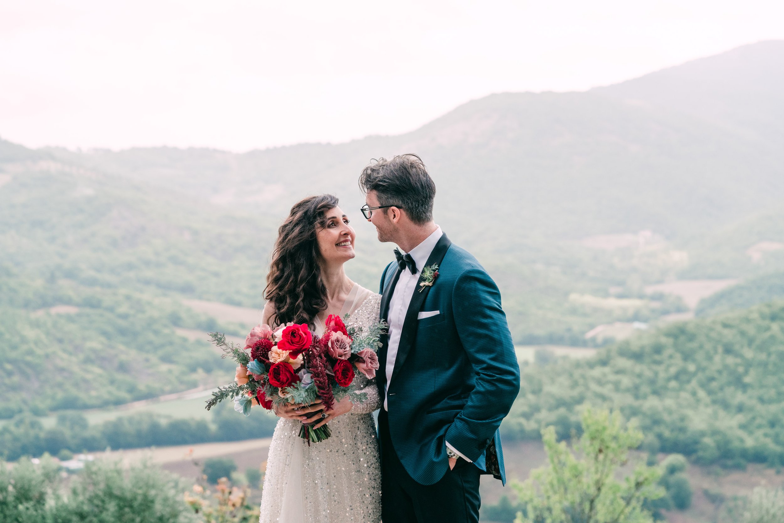
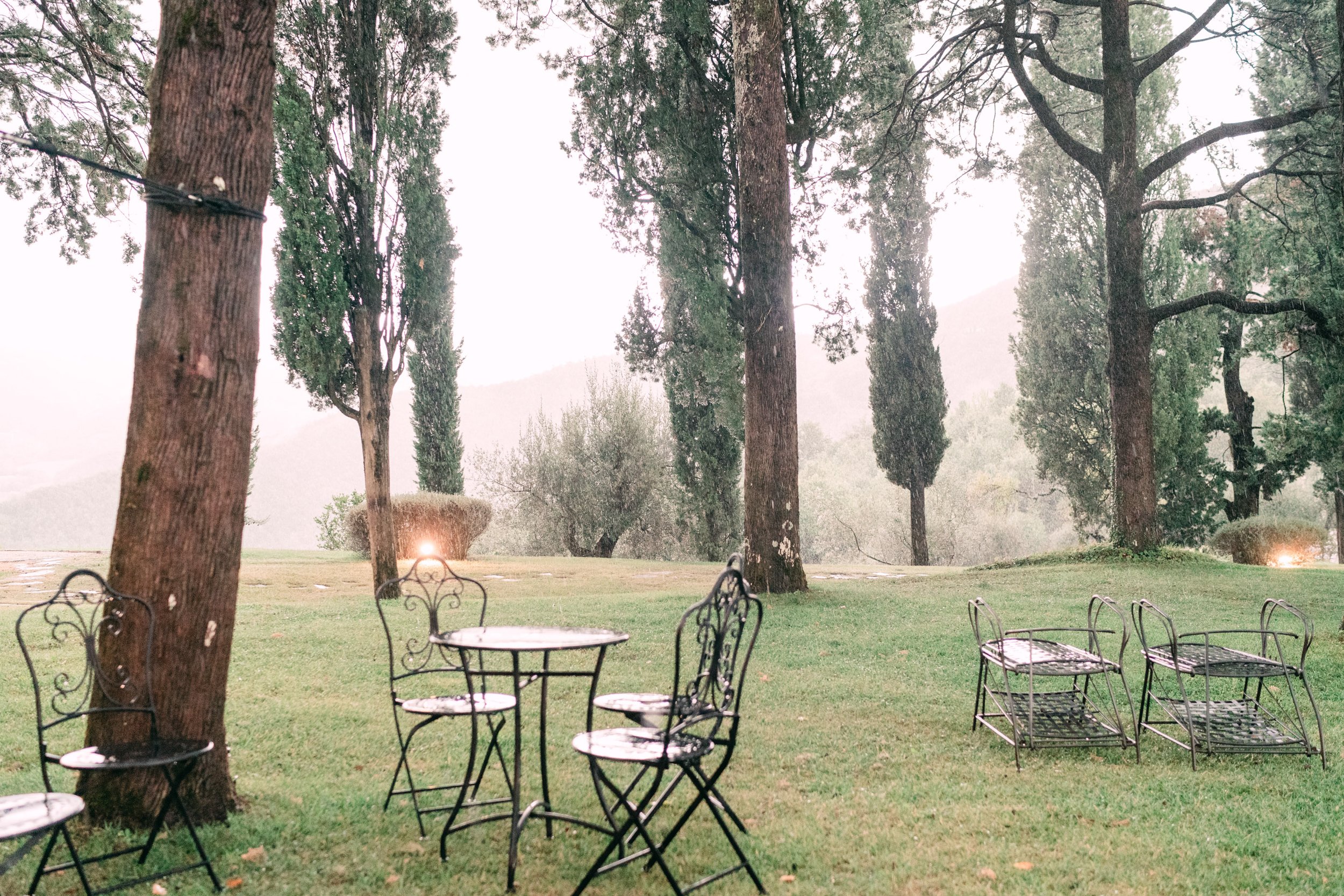
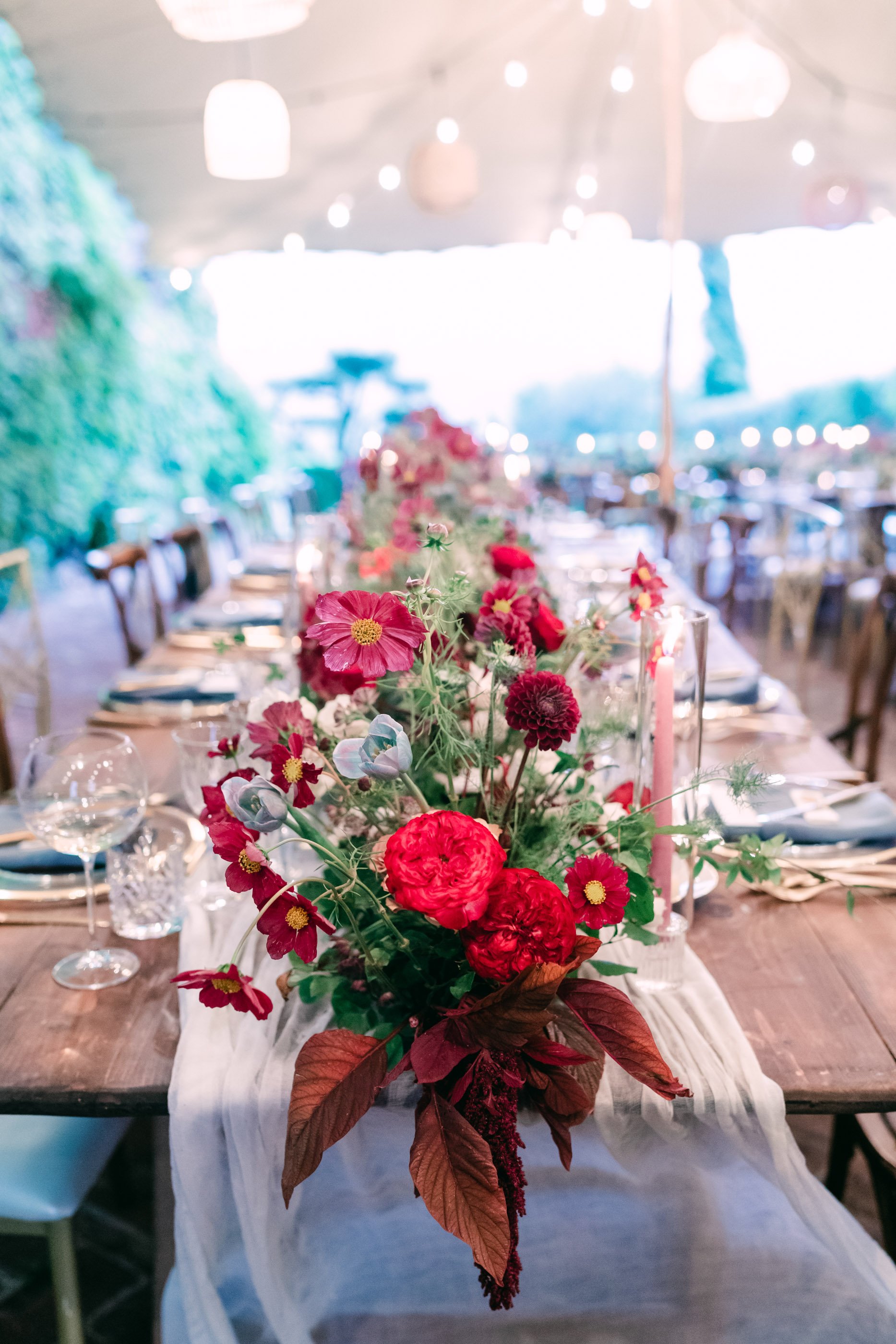
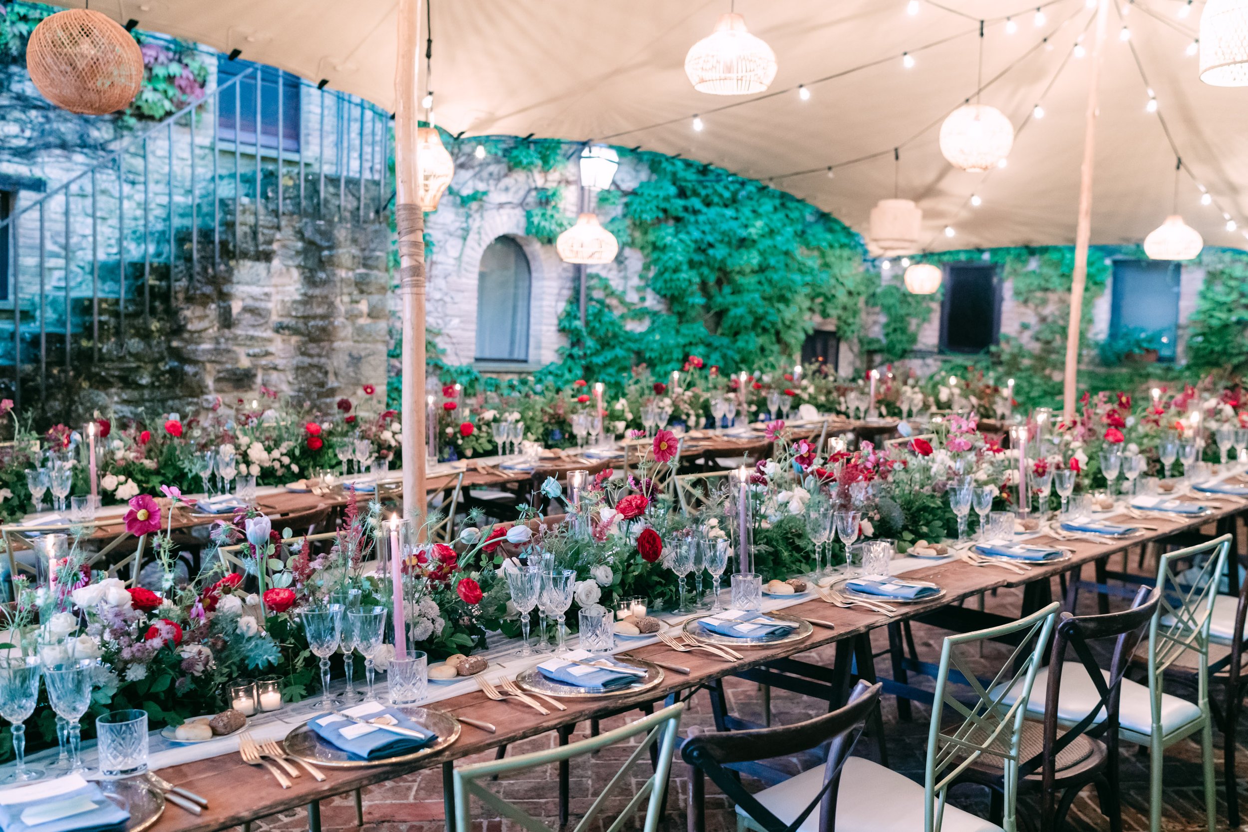
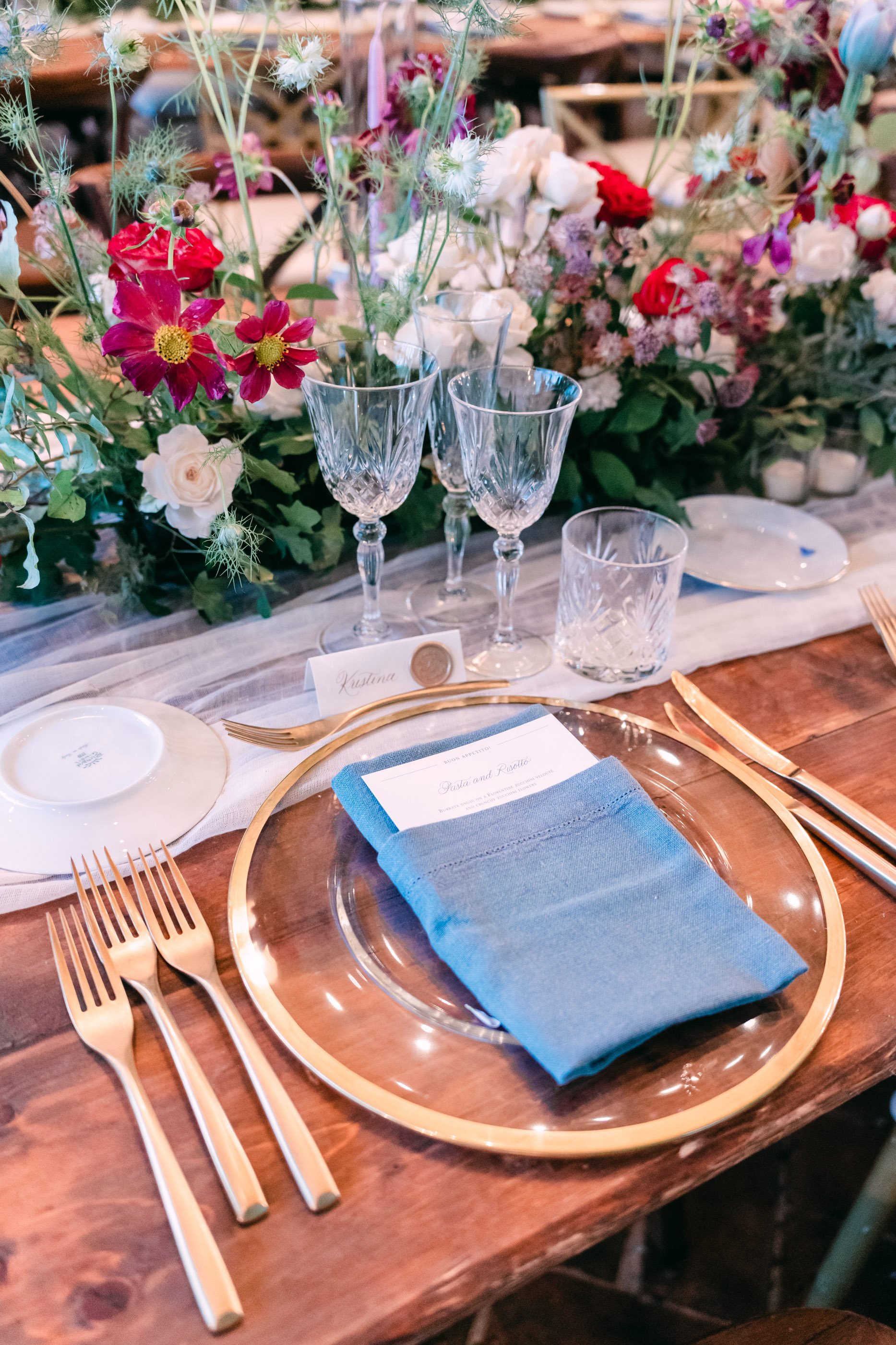
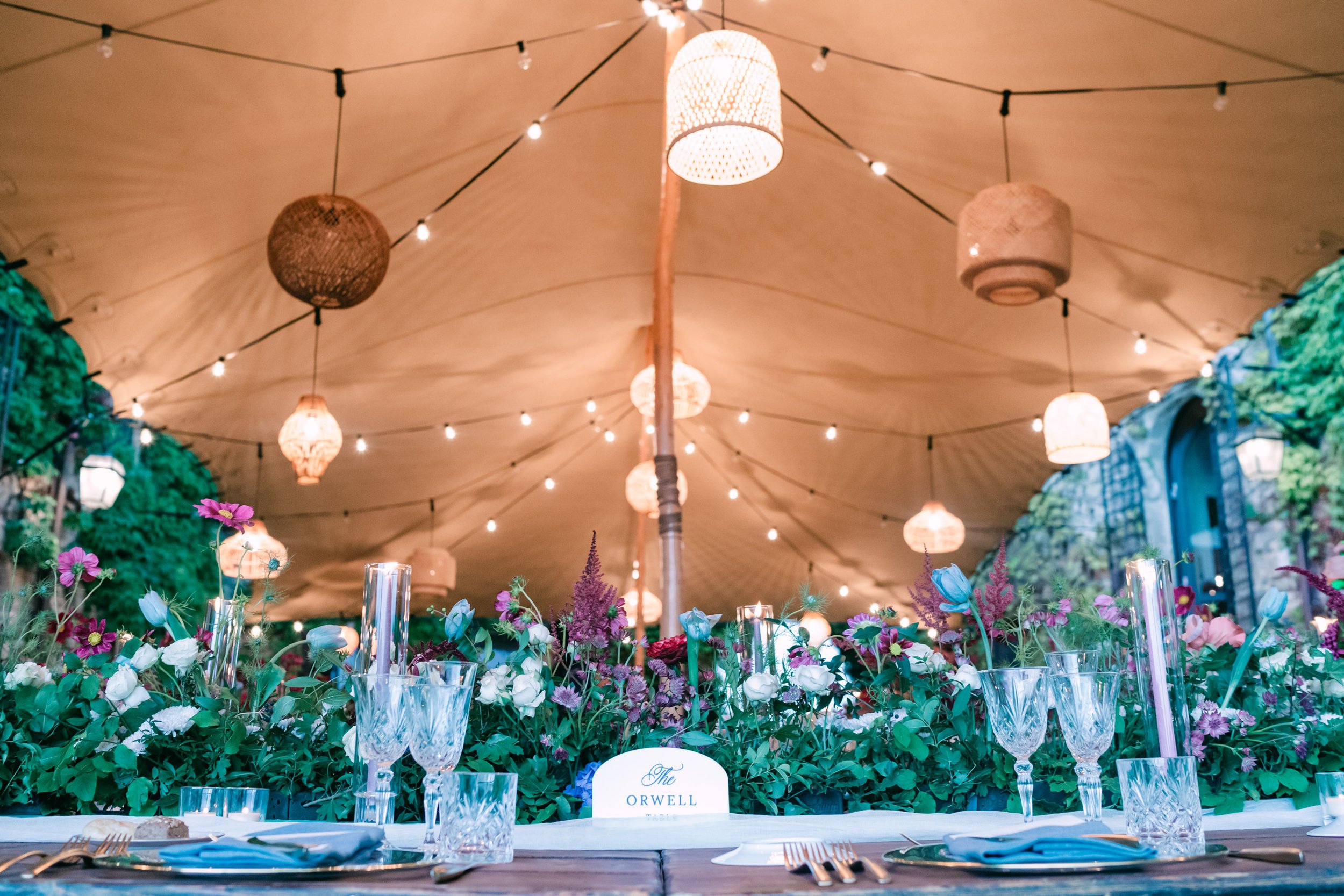
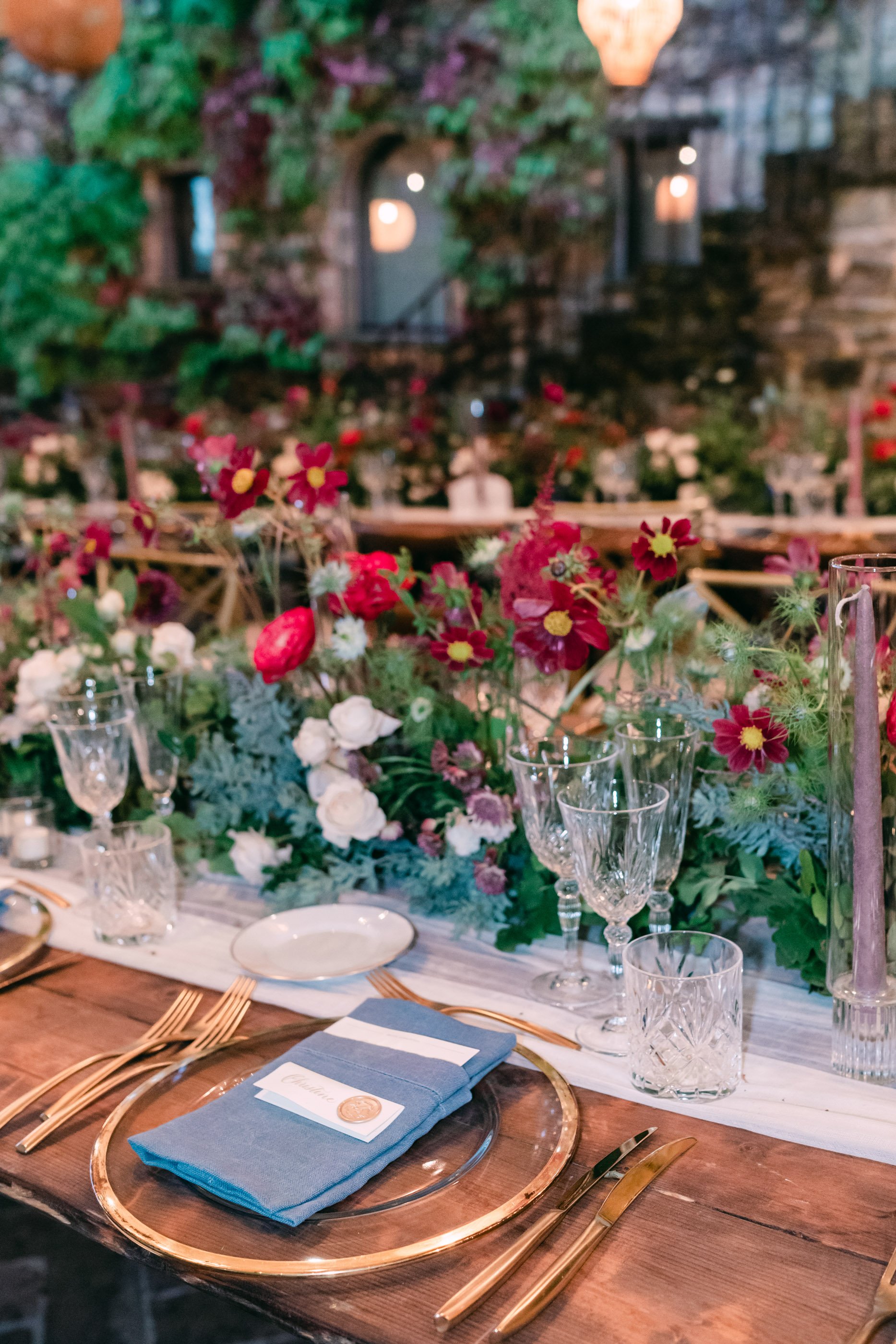
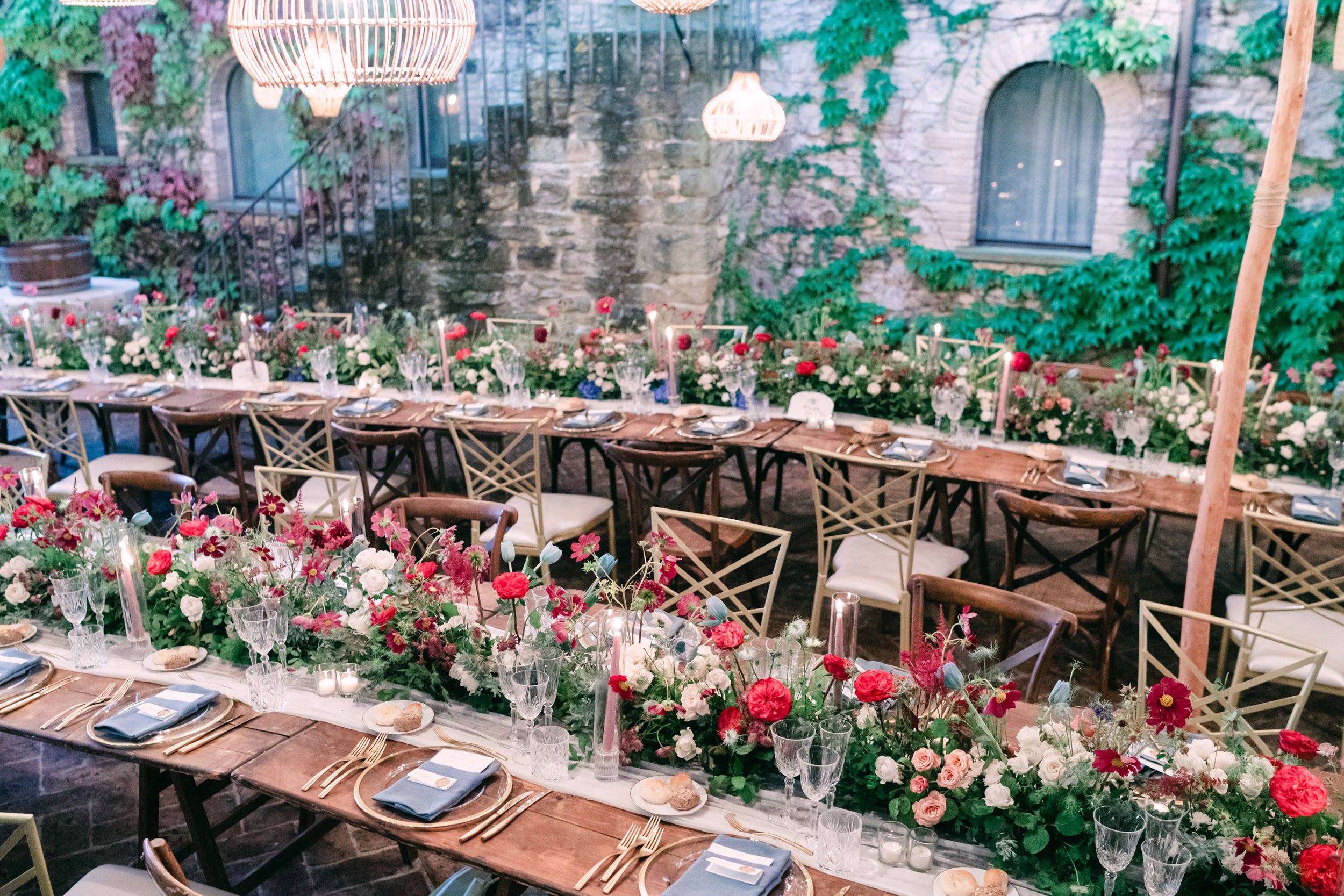
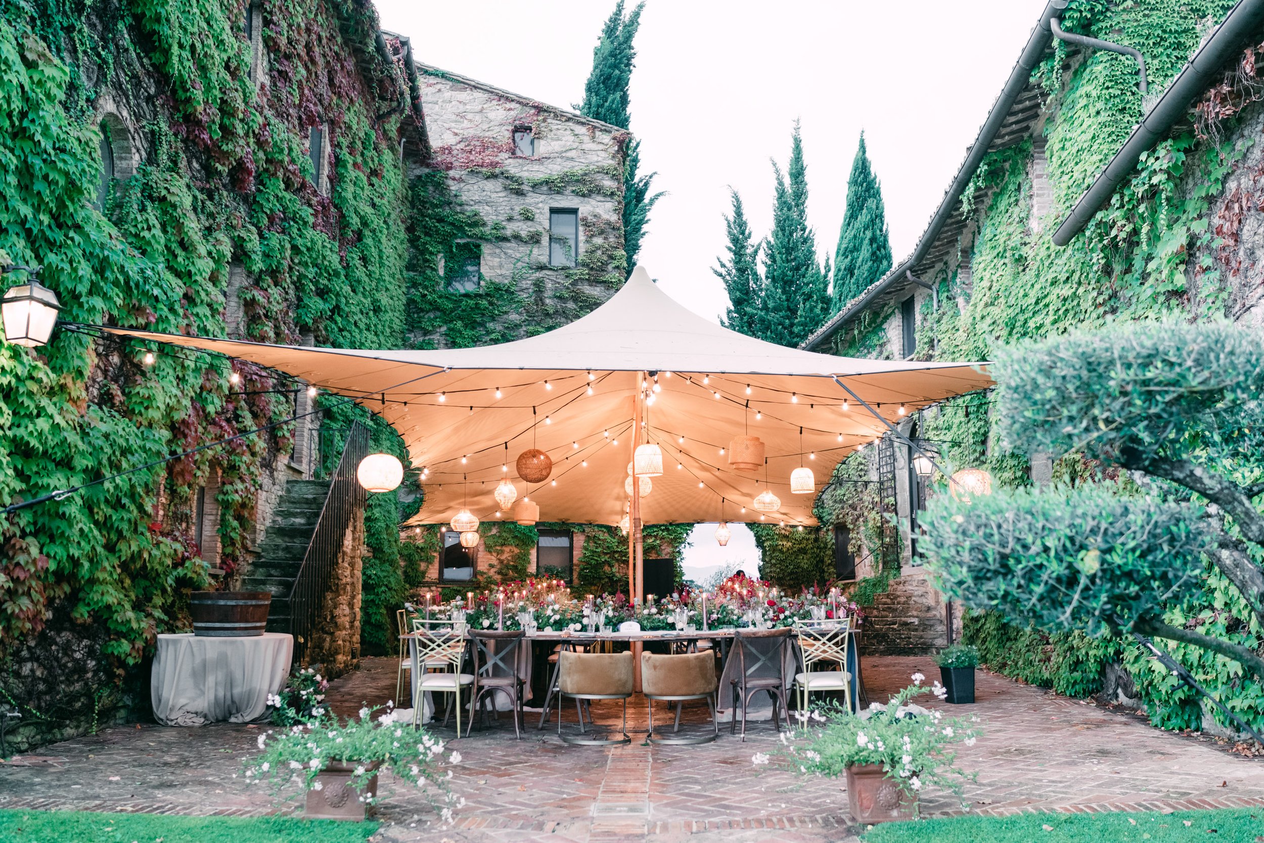
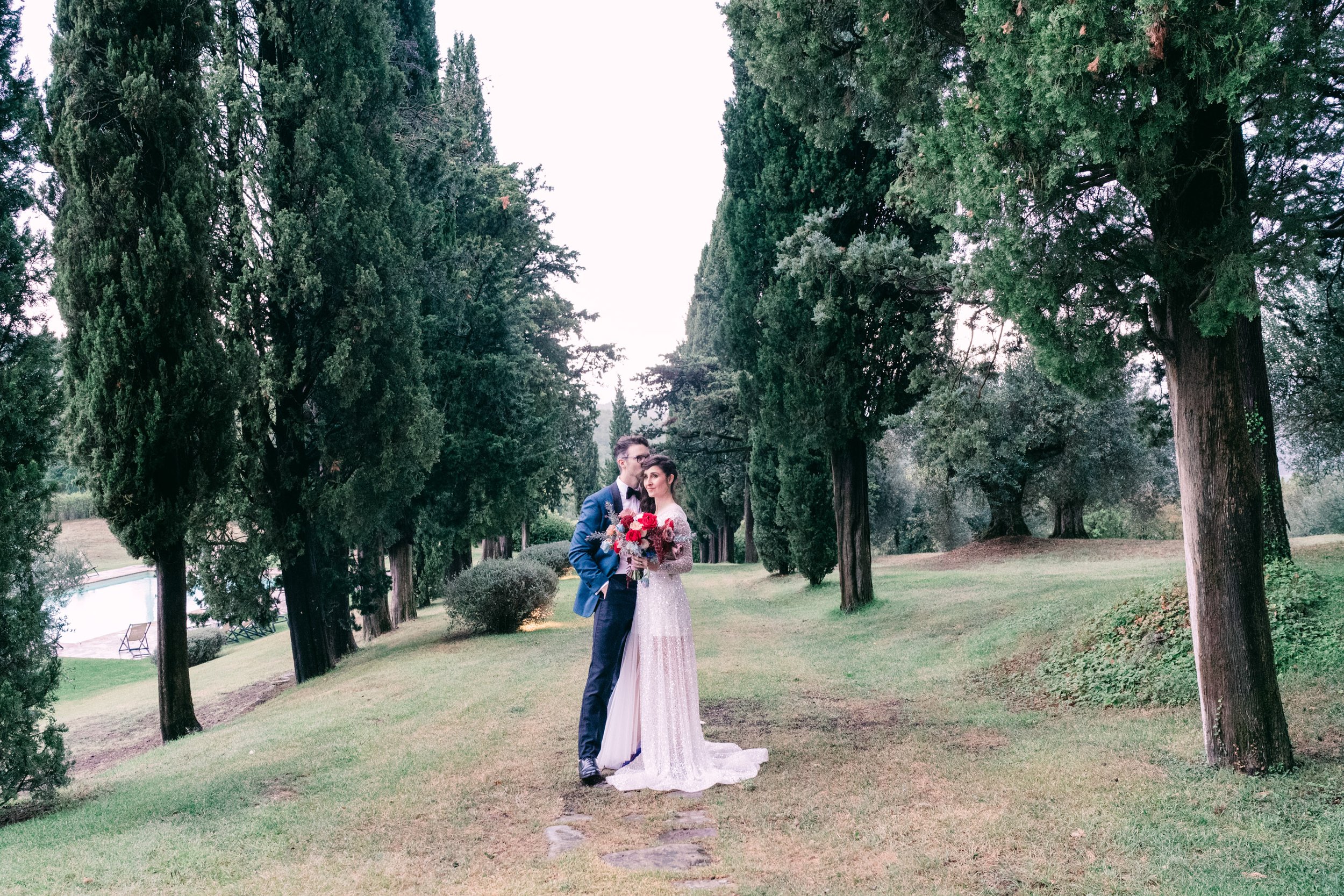
Natalka and David were married in Umbra, Italy. Their invitations were a balance of the “old world” feel of their venue, their modern taste and love of jewel tones. Their invitations featured handmade paper, gold foil press, a baroque envelope liner and a wax seal to wrap it all together.
melissa + jonathon
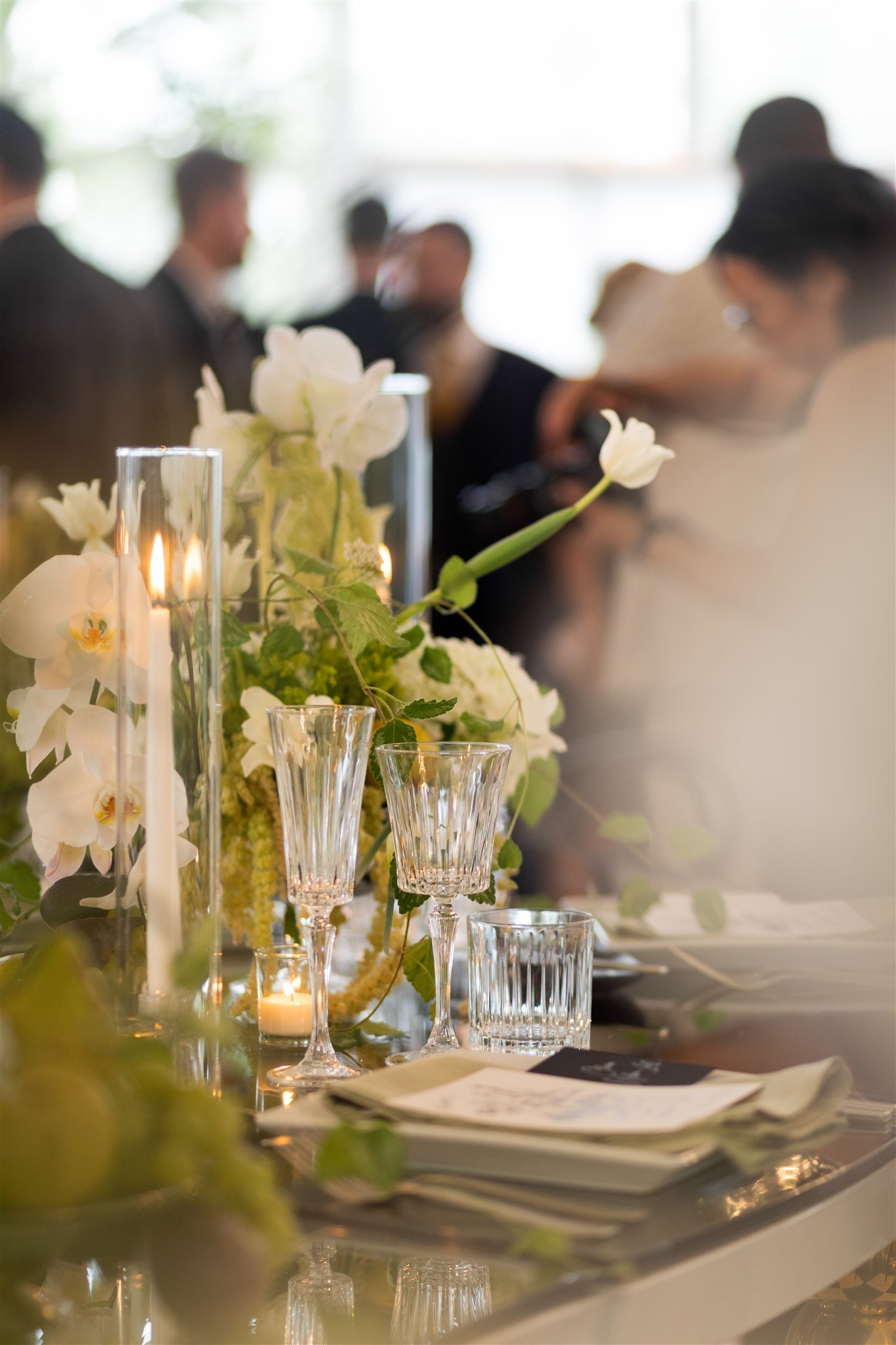
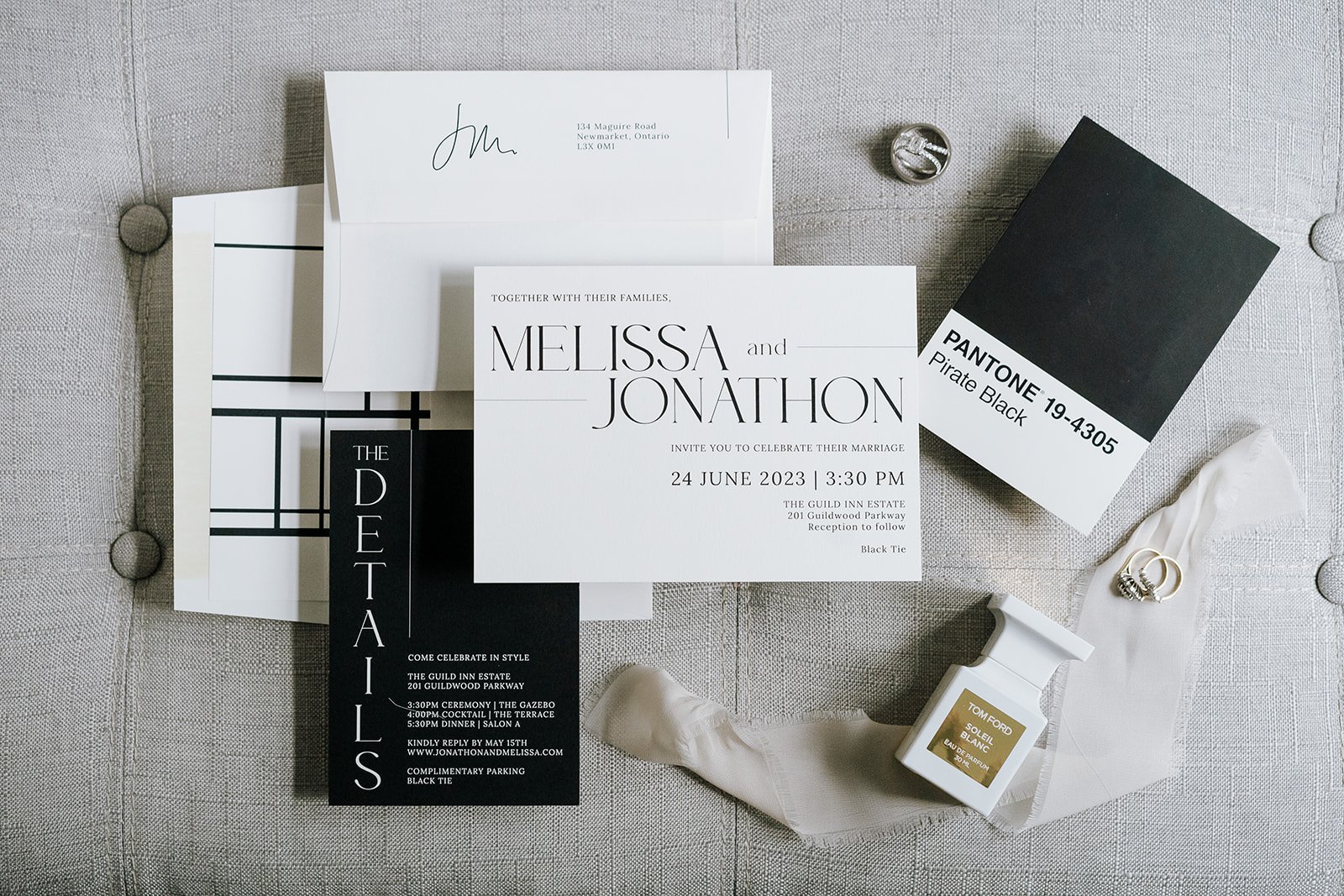
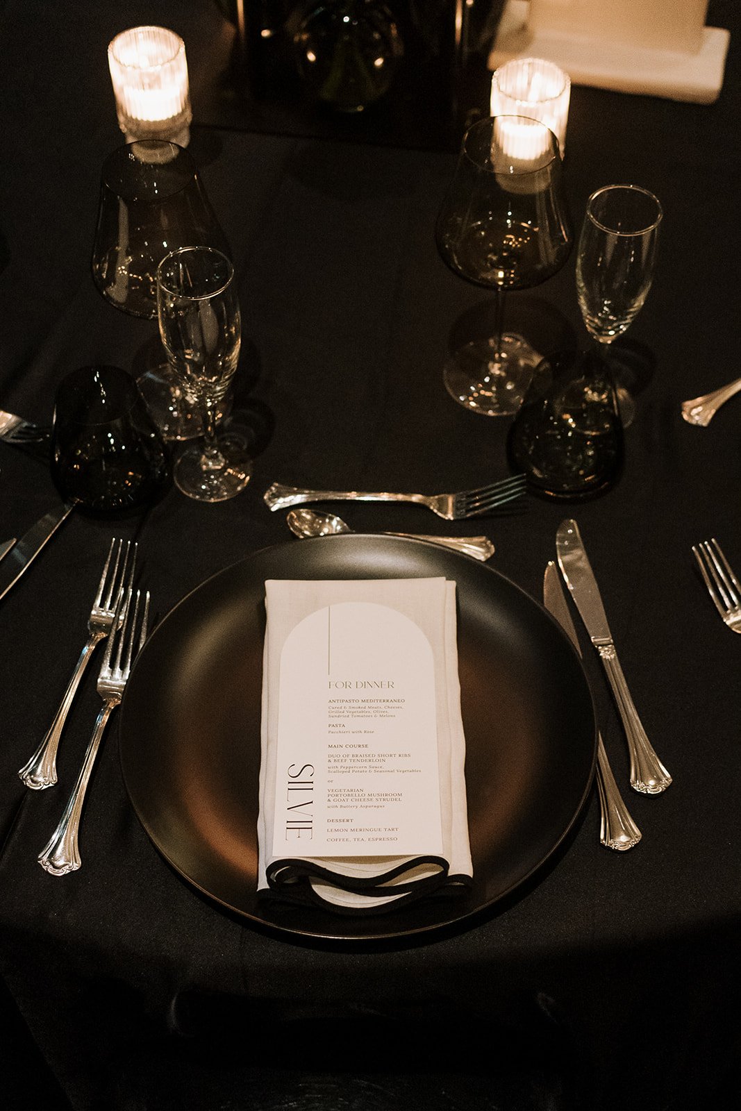
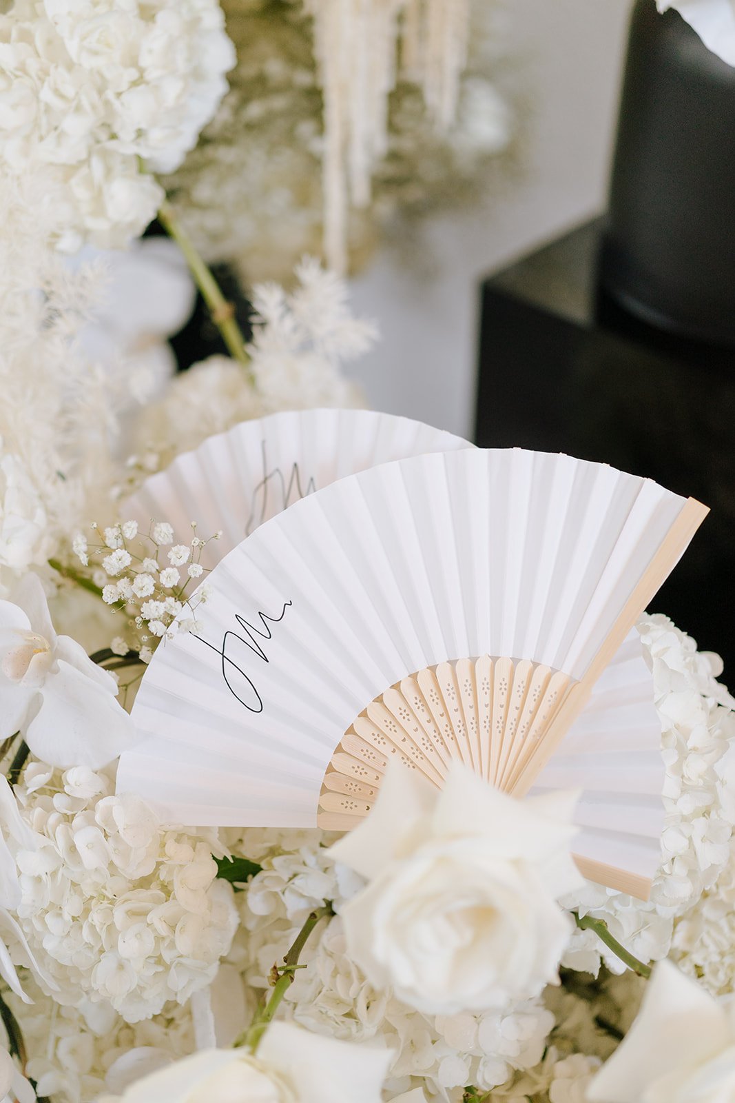
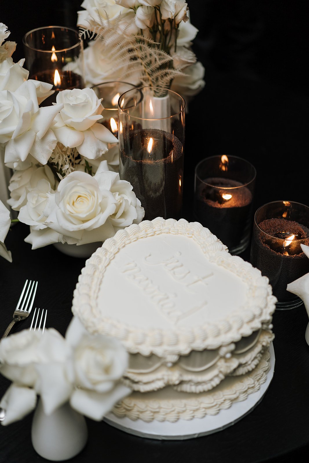
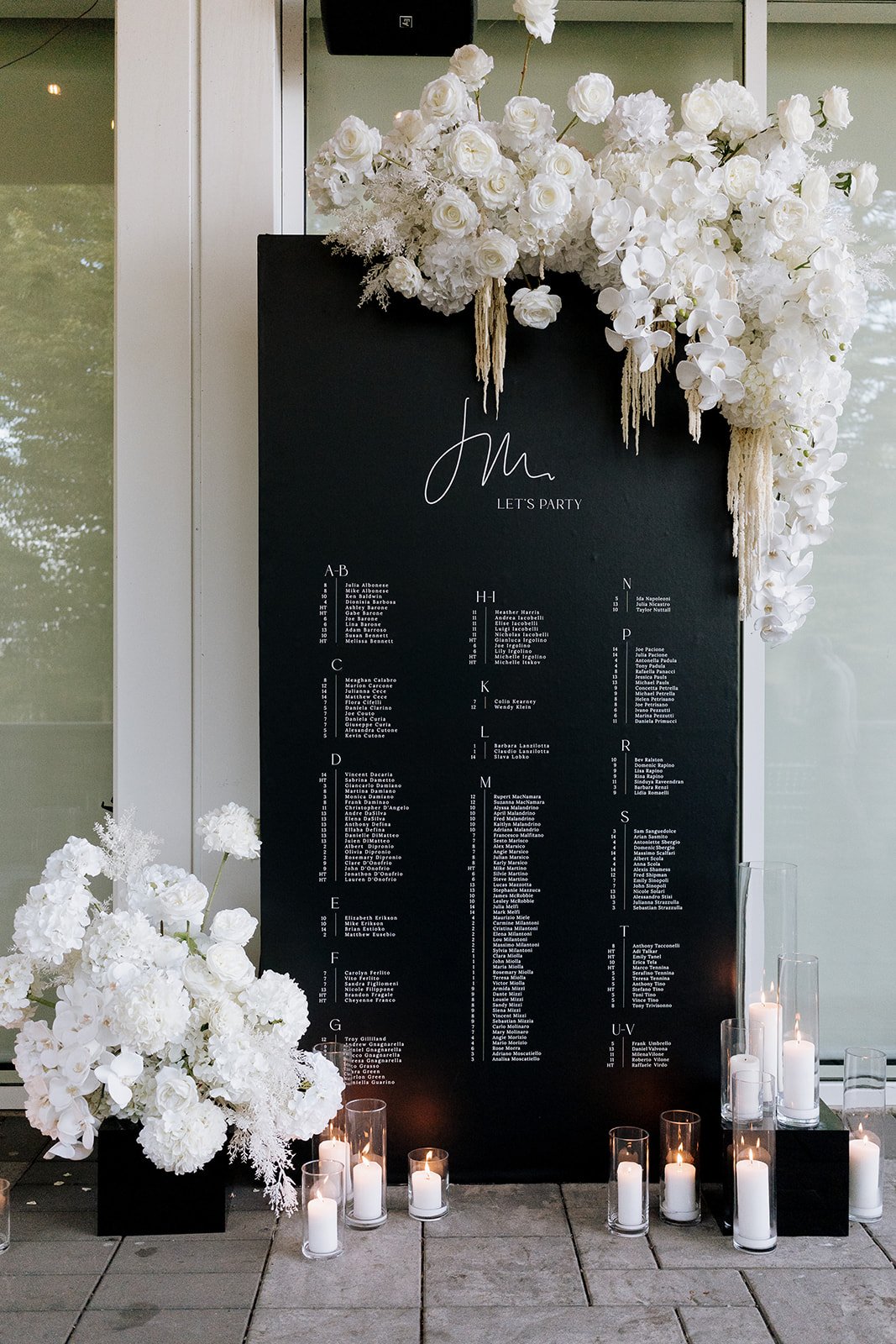
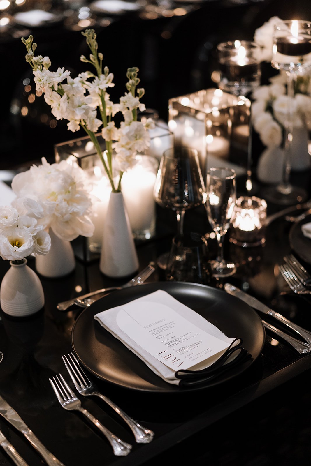
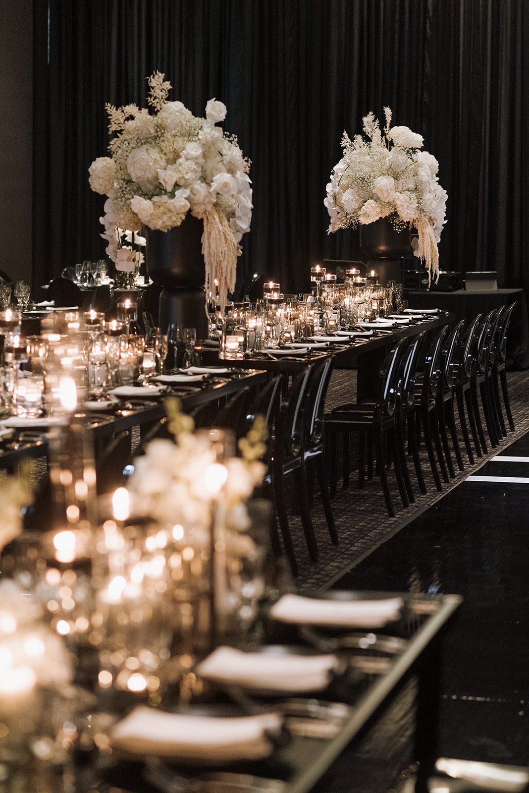
Melissa & Jonathon’s wedding at the Guild Inn Estate, can only be described as monochromatic luxury. Their black and off-white invitation included an initial scribble and a Piet Mondrain-inspired monochrome envelope liner. Tables were adorned with candles and all-white flowers were displayed around the room. Their tall seating chart included a floral installation. And the bride baked and decorated her own cake!
sarah + michael
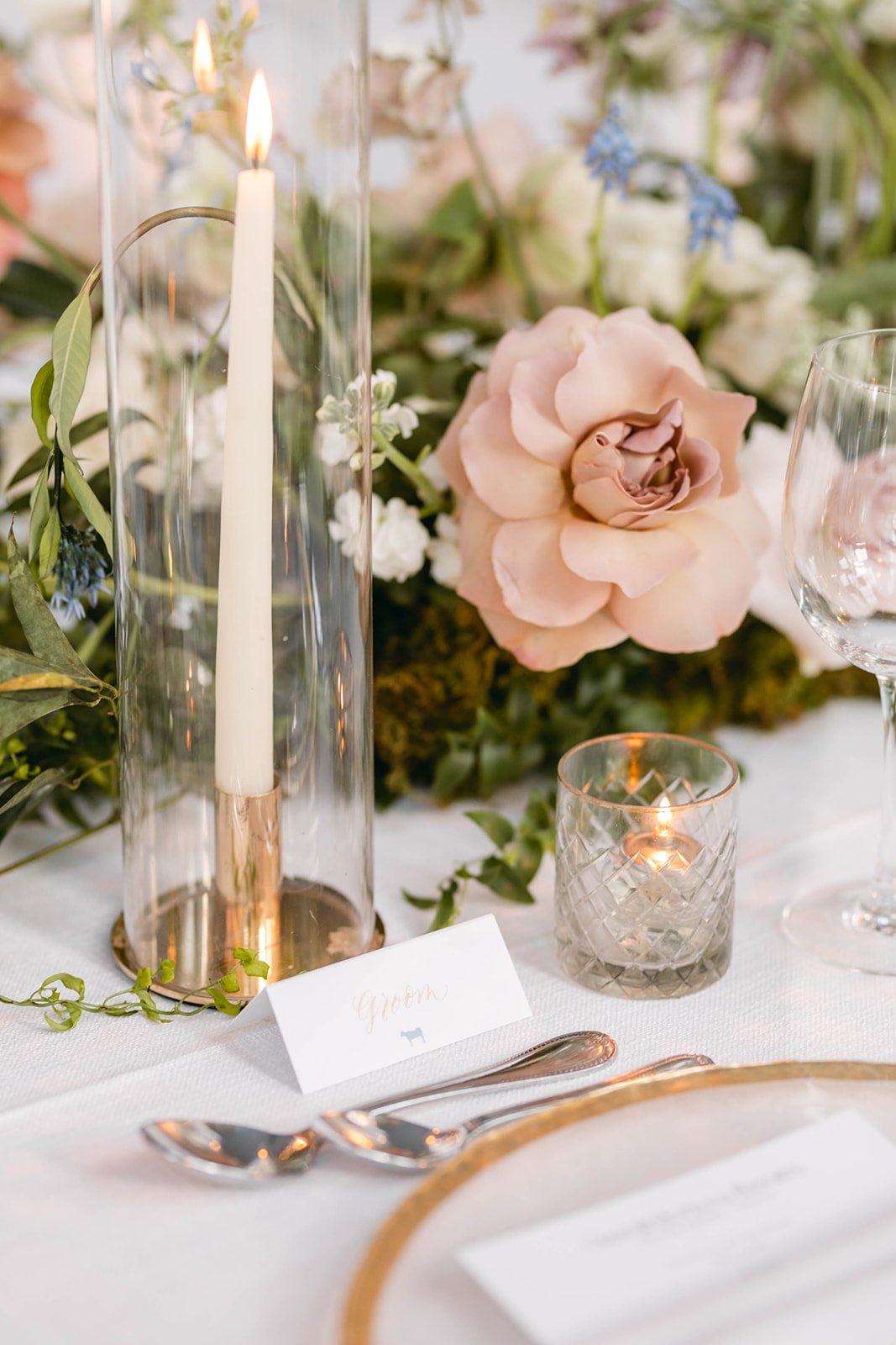
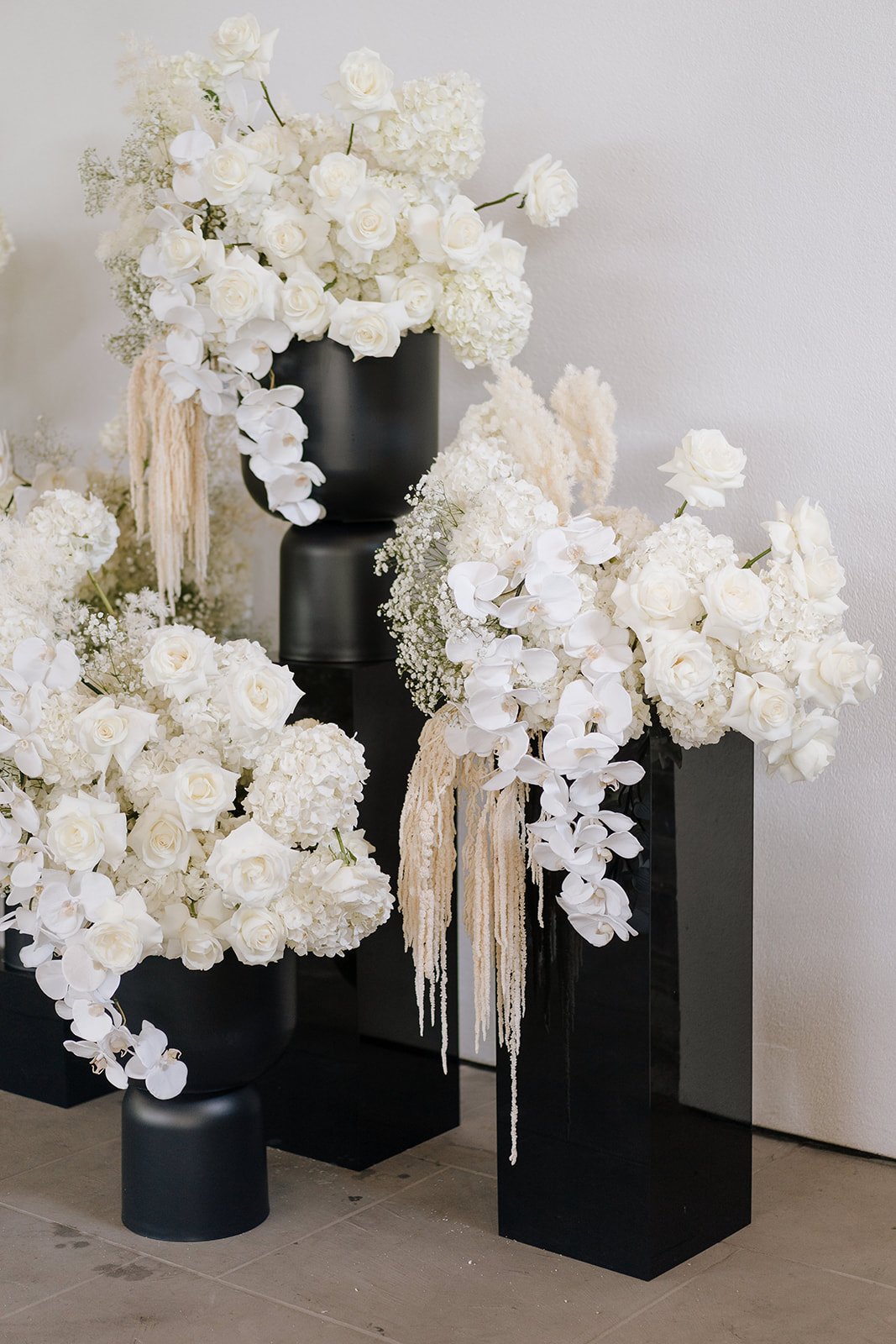
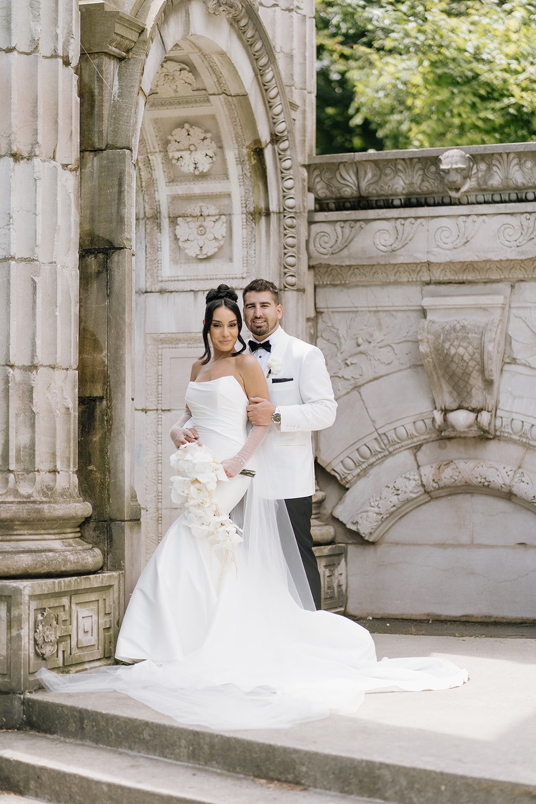
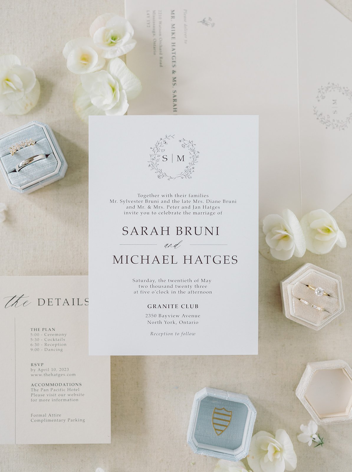
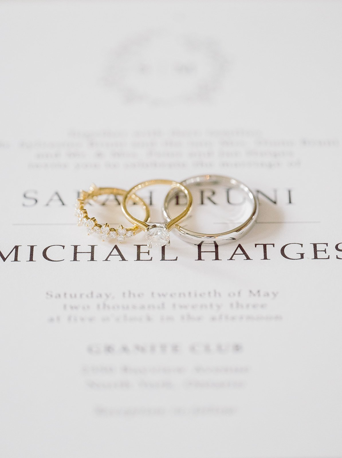
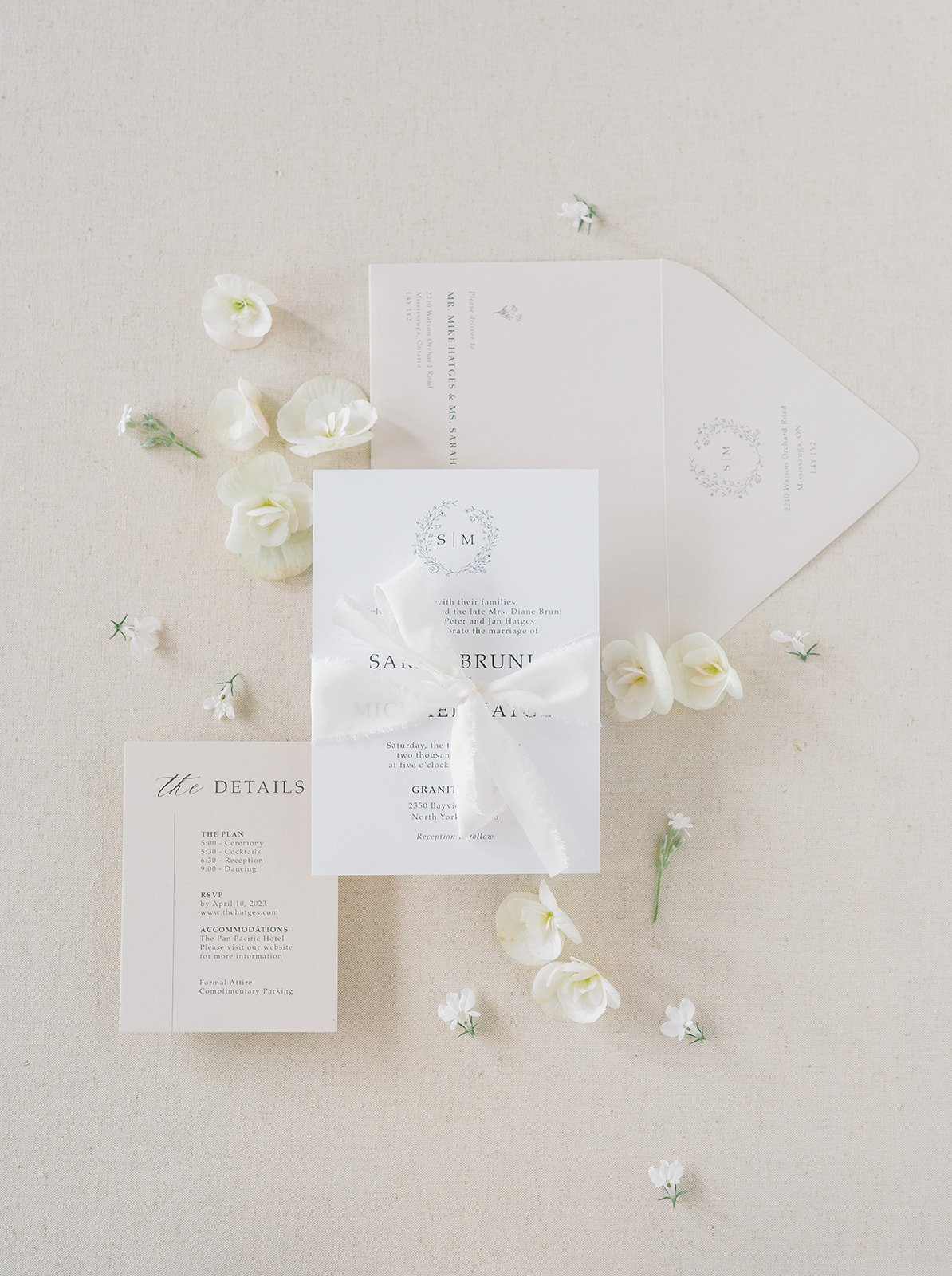
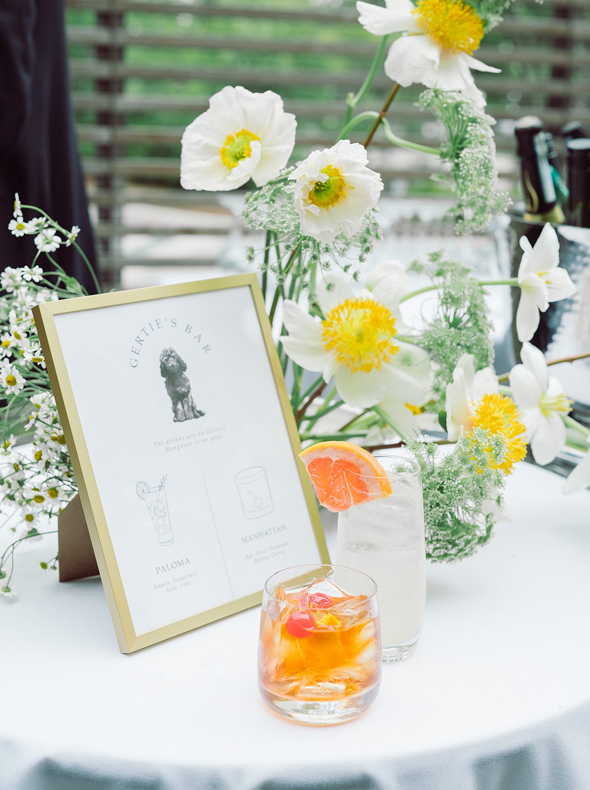
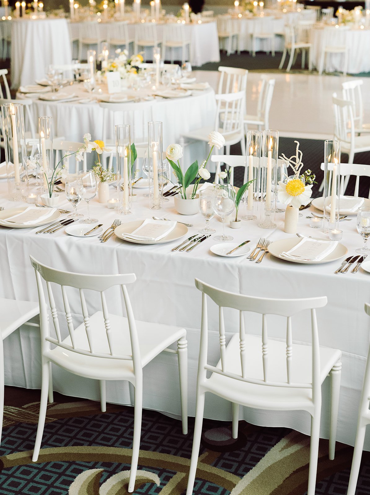
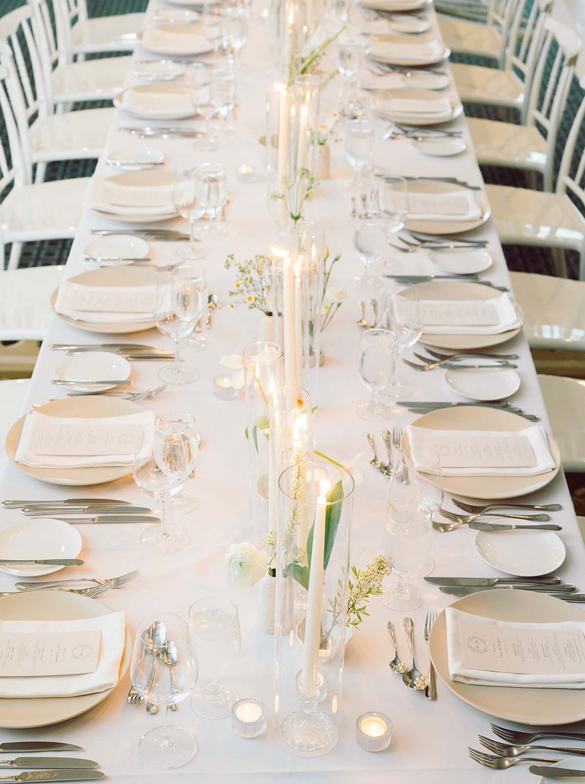
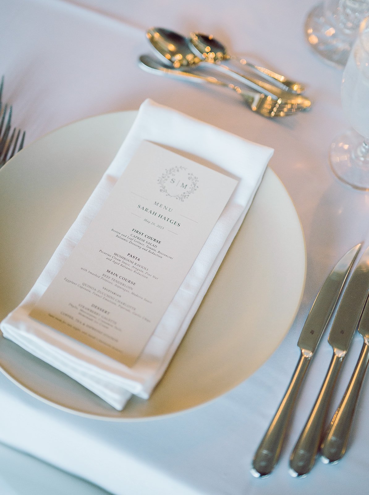
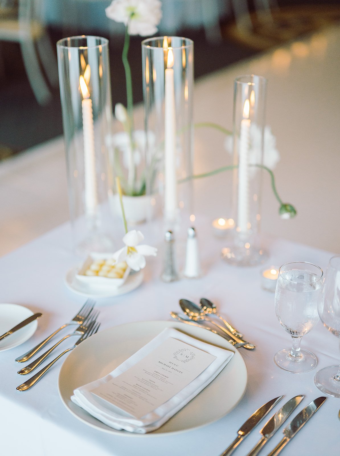
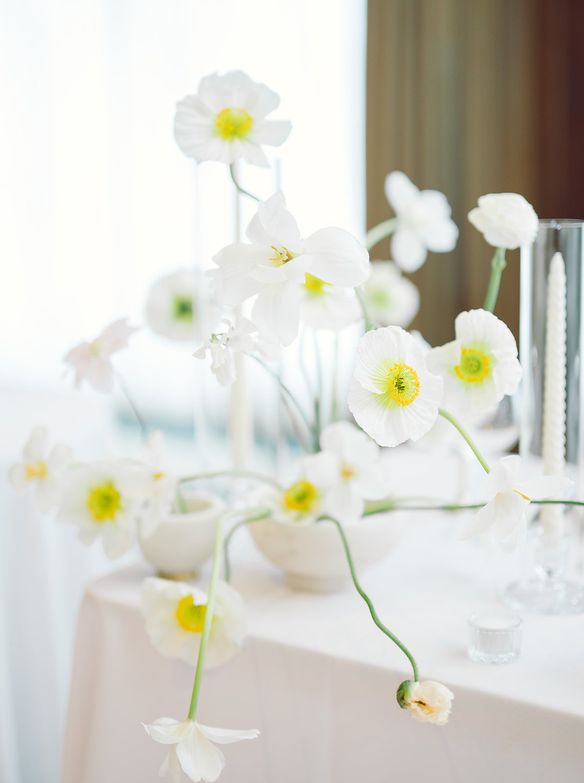
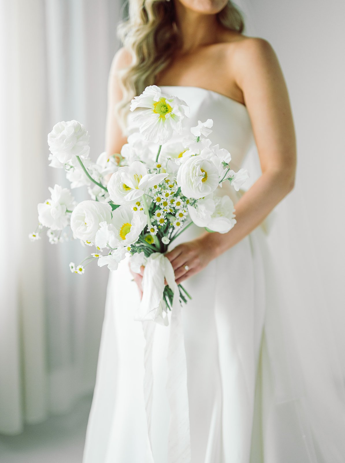
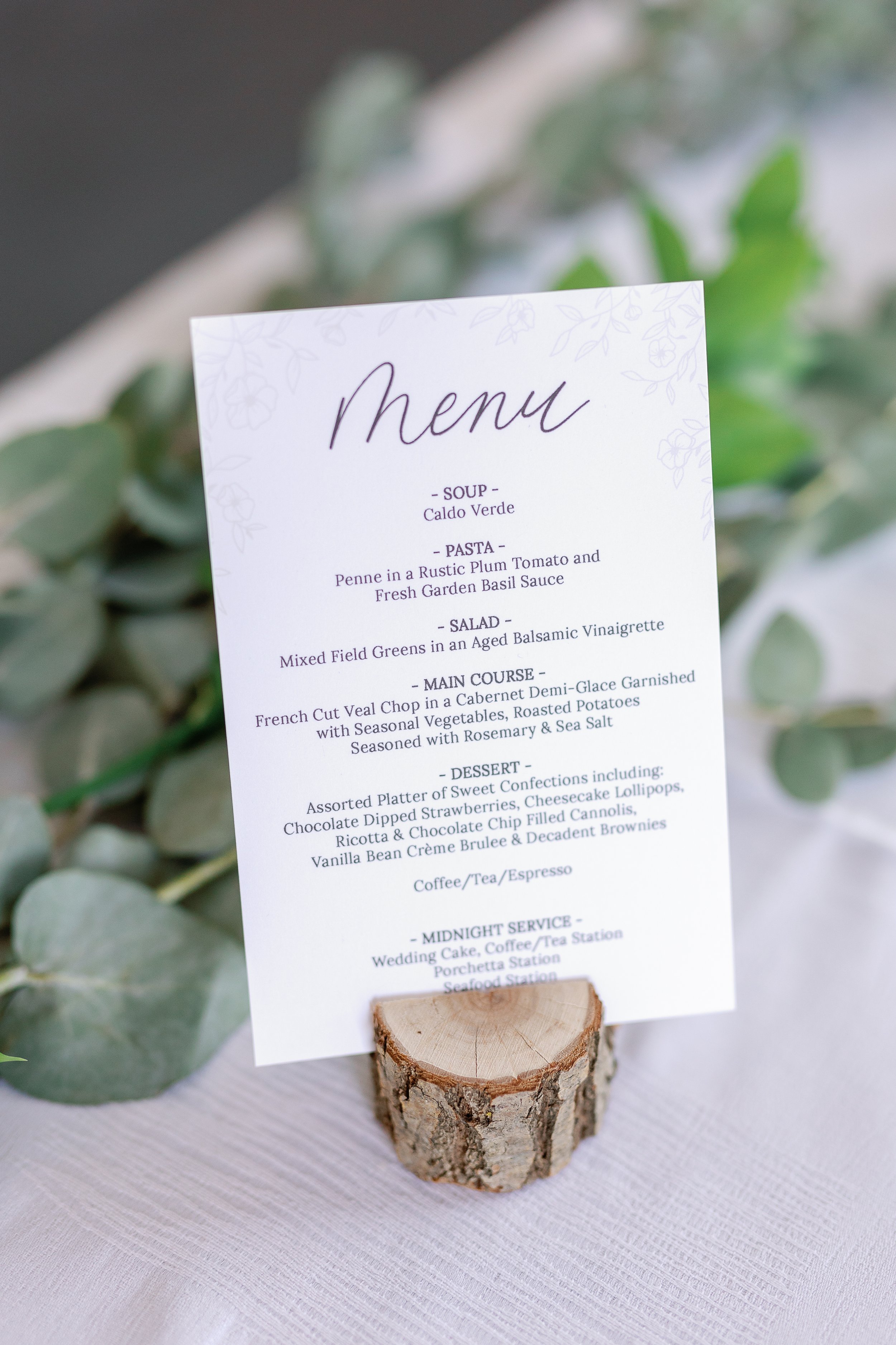
Sarah and Michaels wedding was delicate simplicity at its finest. Their invitation included a floral wreath and a neutral nude and dark grey colour palette. Their day-of stationery included a custom bar sign, in honour of their dog and nude menus to match their invitations. Beautiful white and yellow modern and delicate florals made a statement at this wedding.
danielle + nick
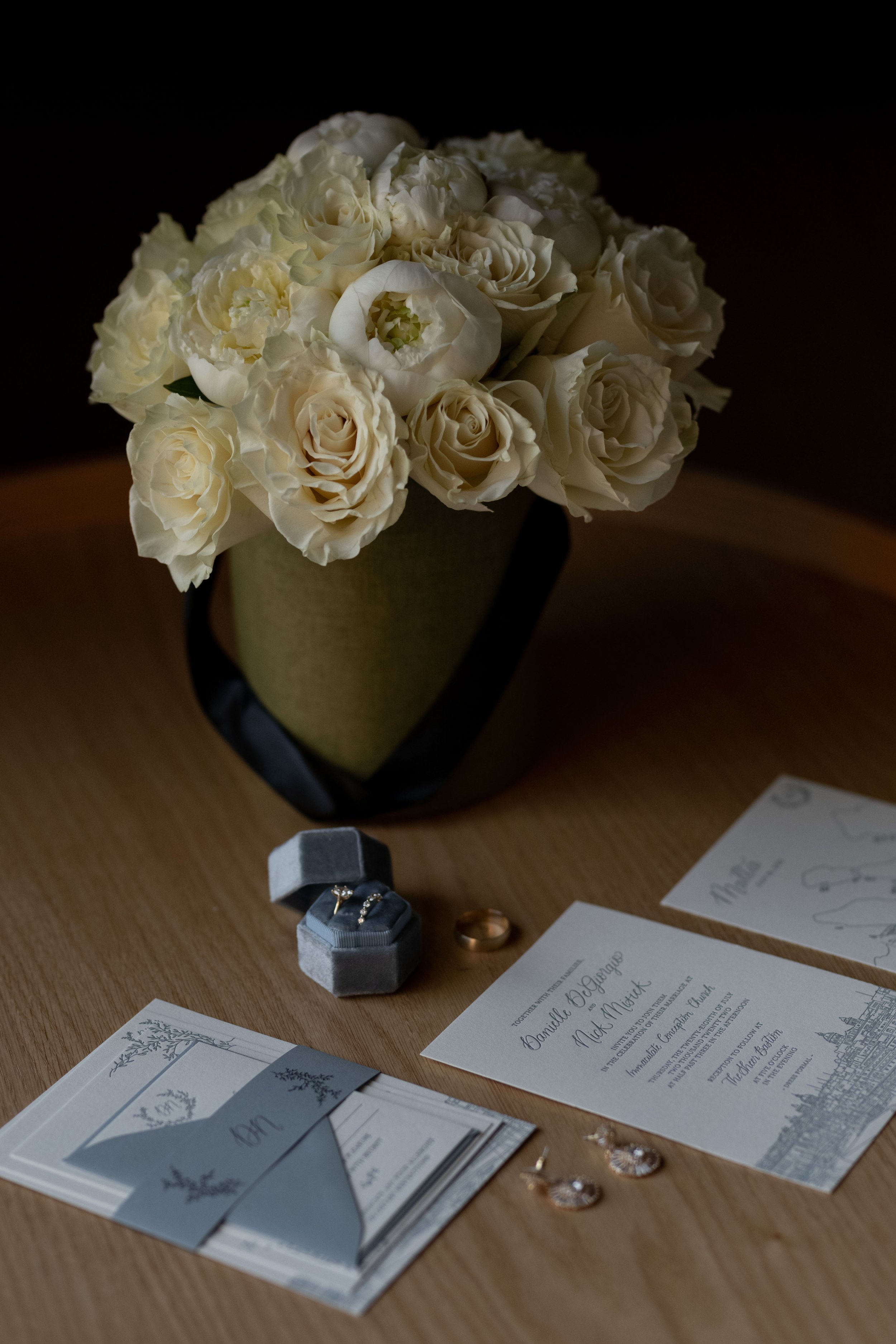
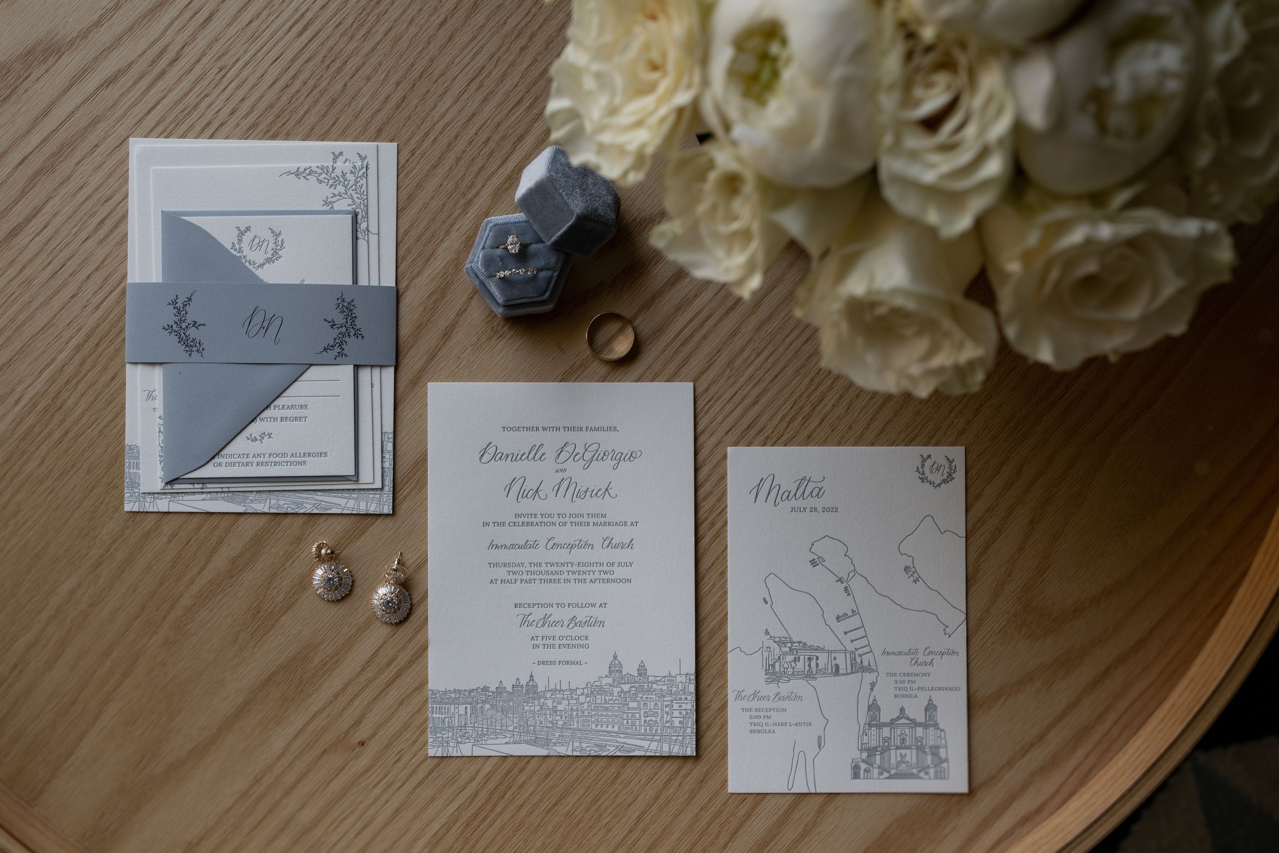
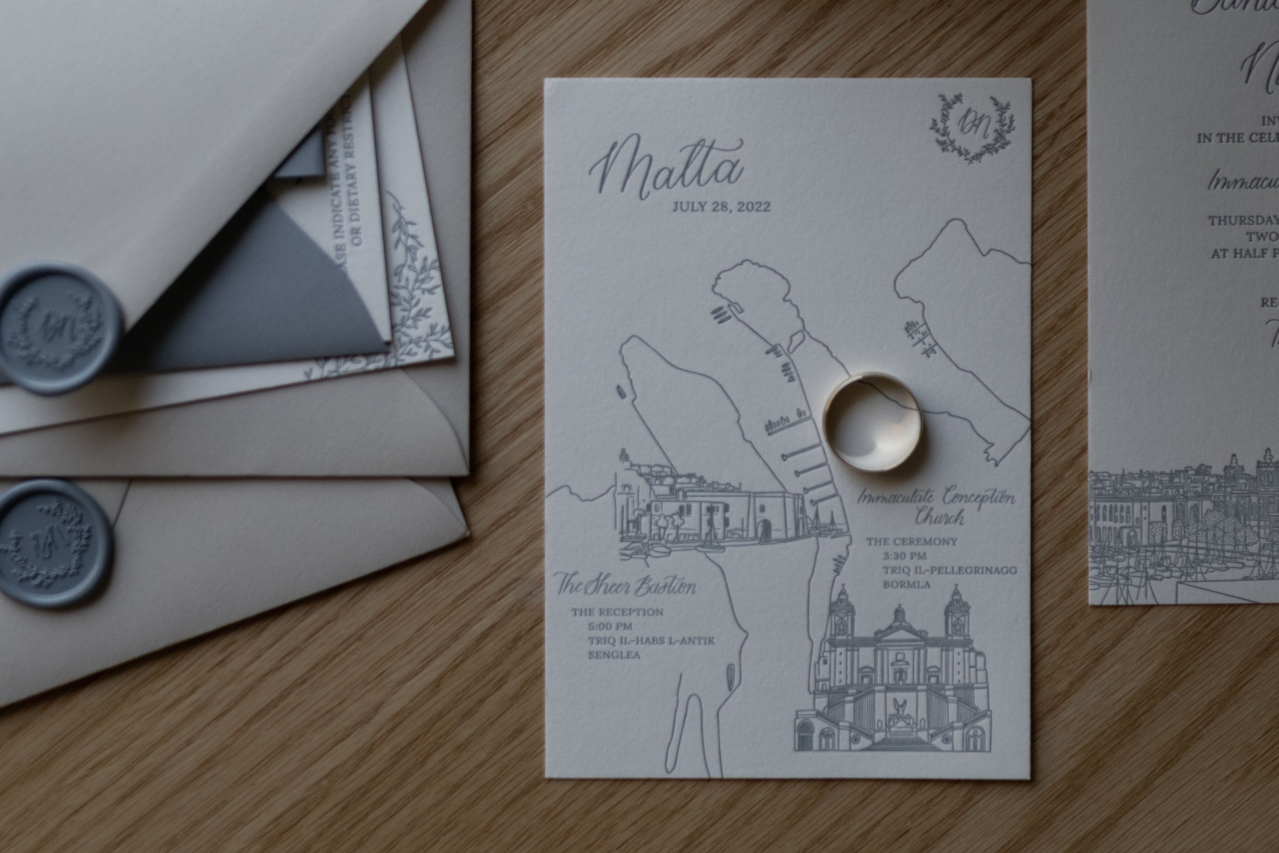
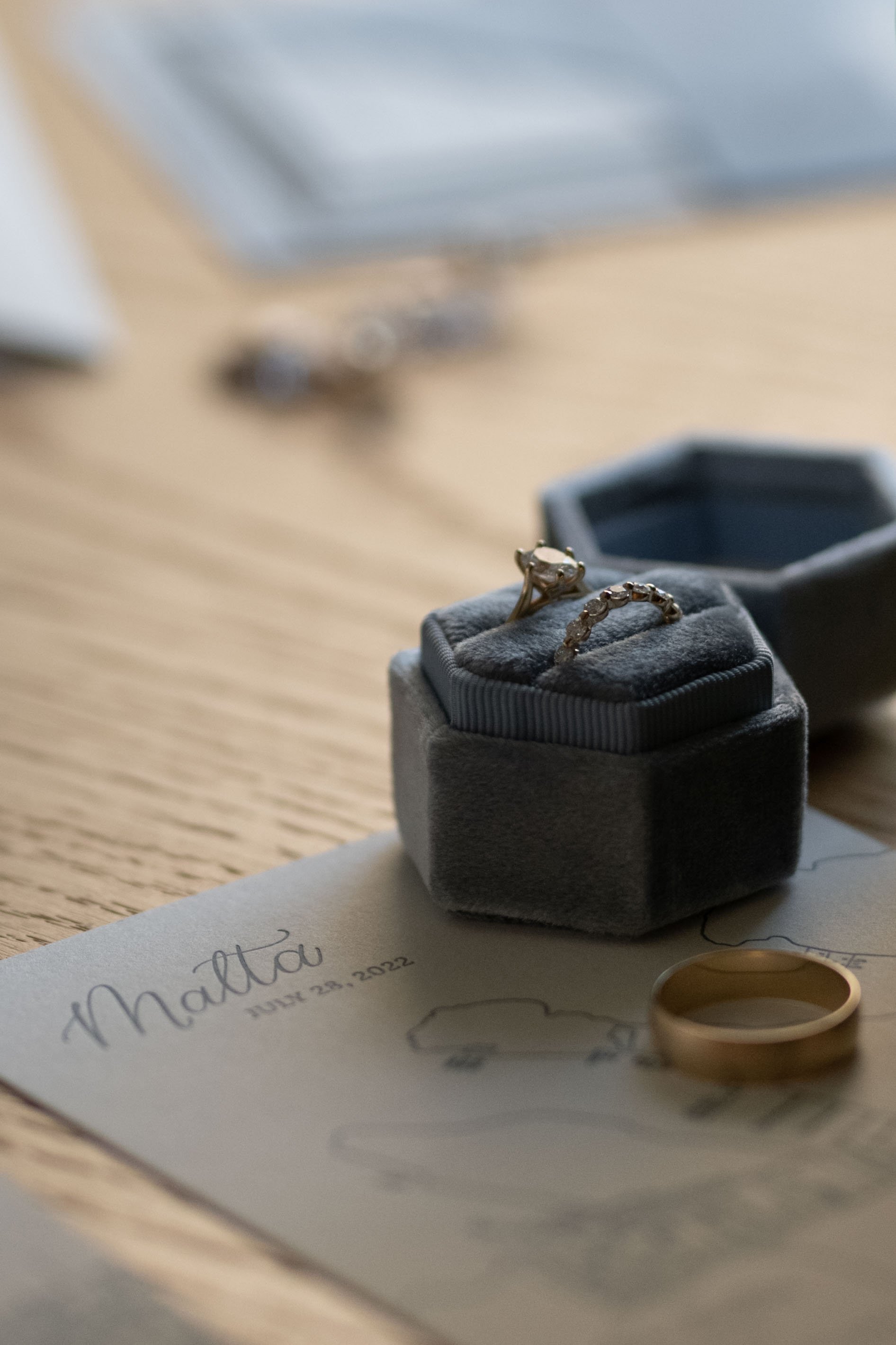
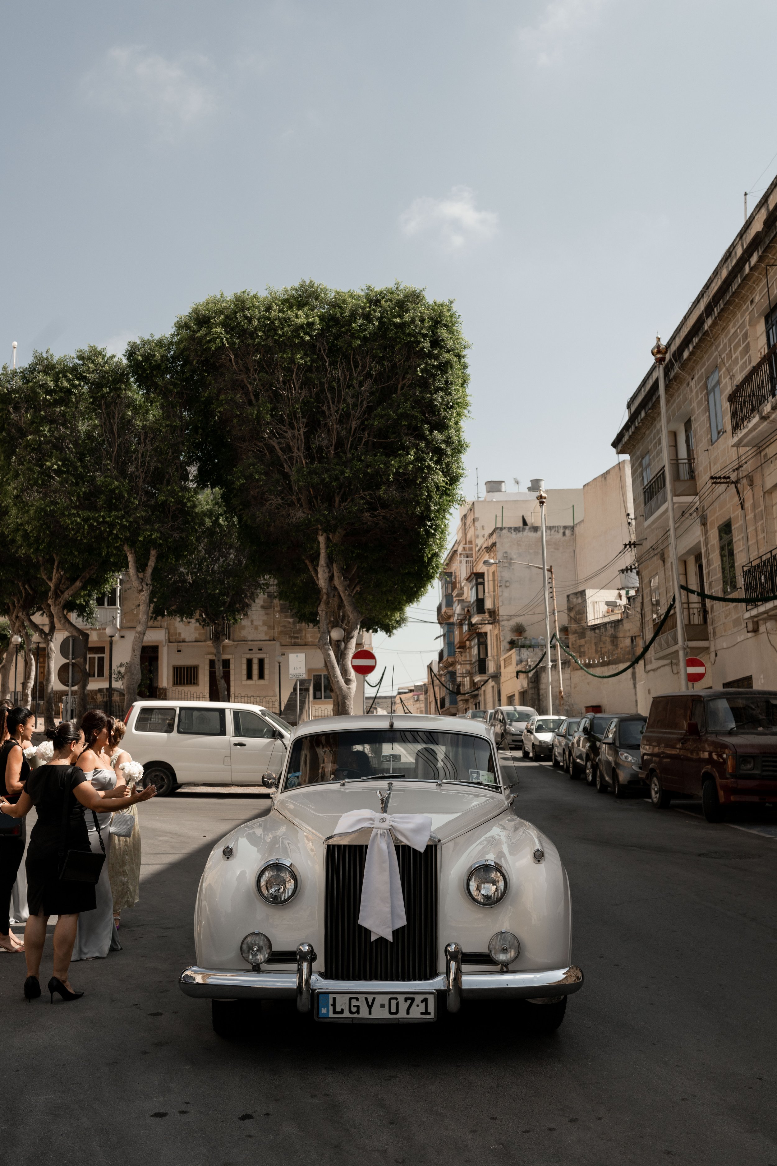
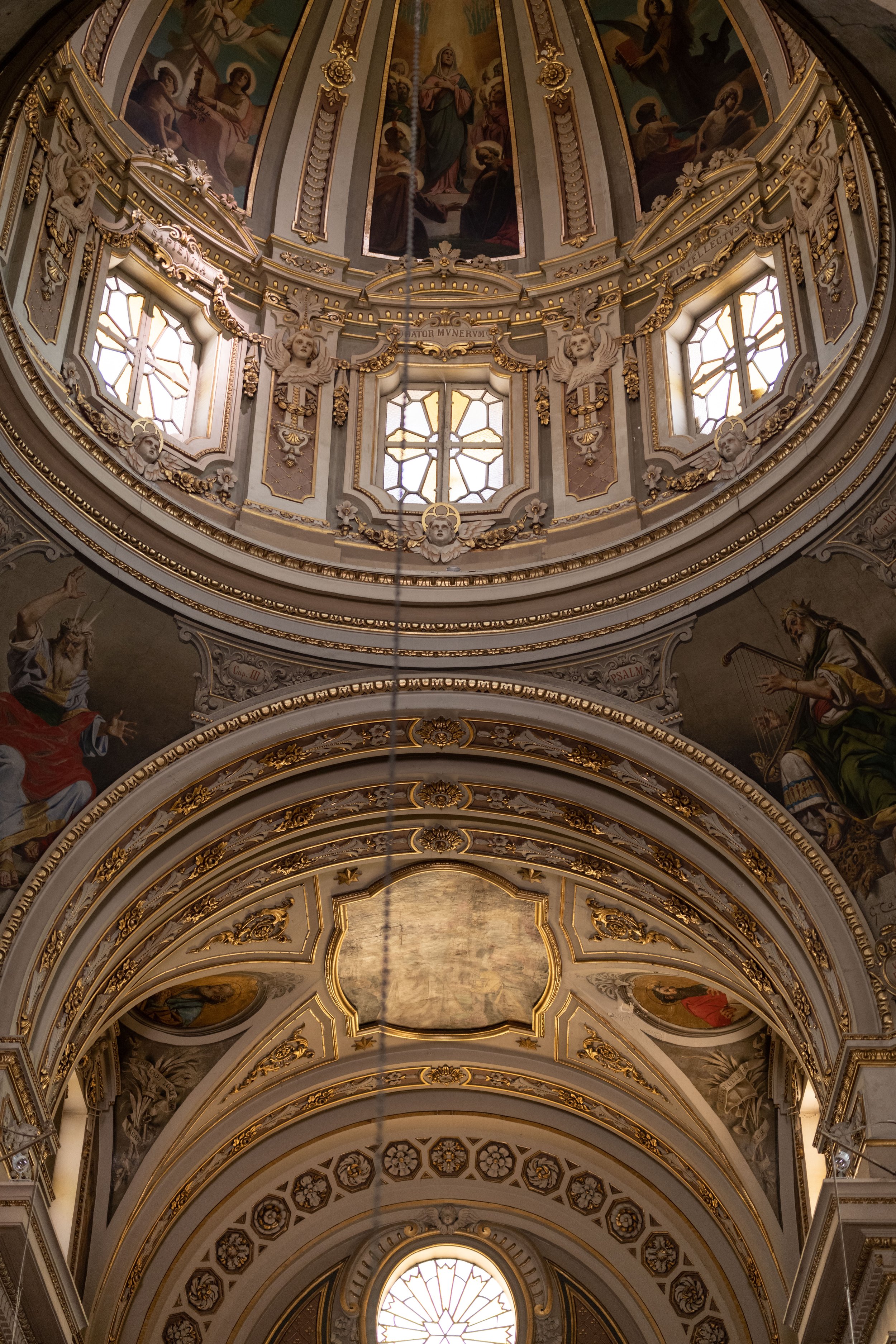
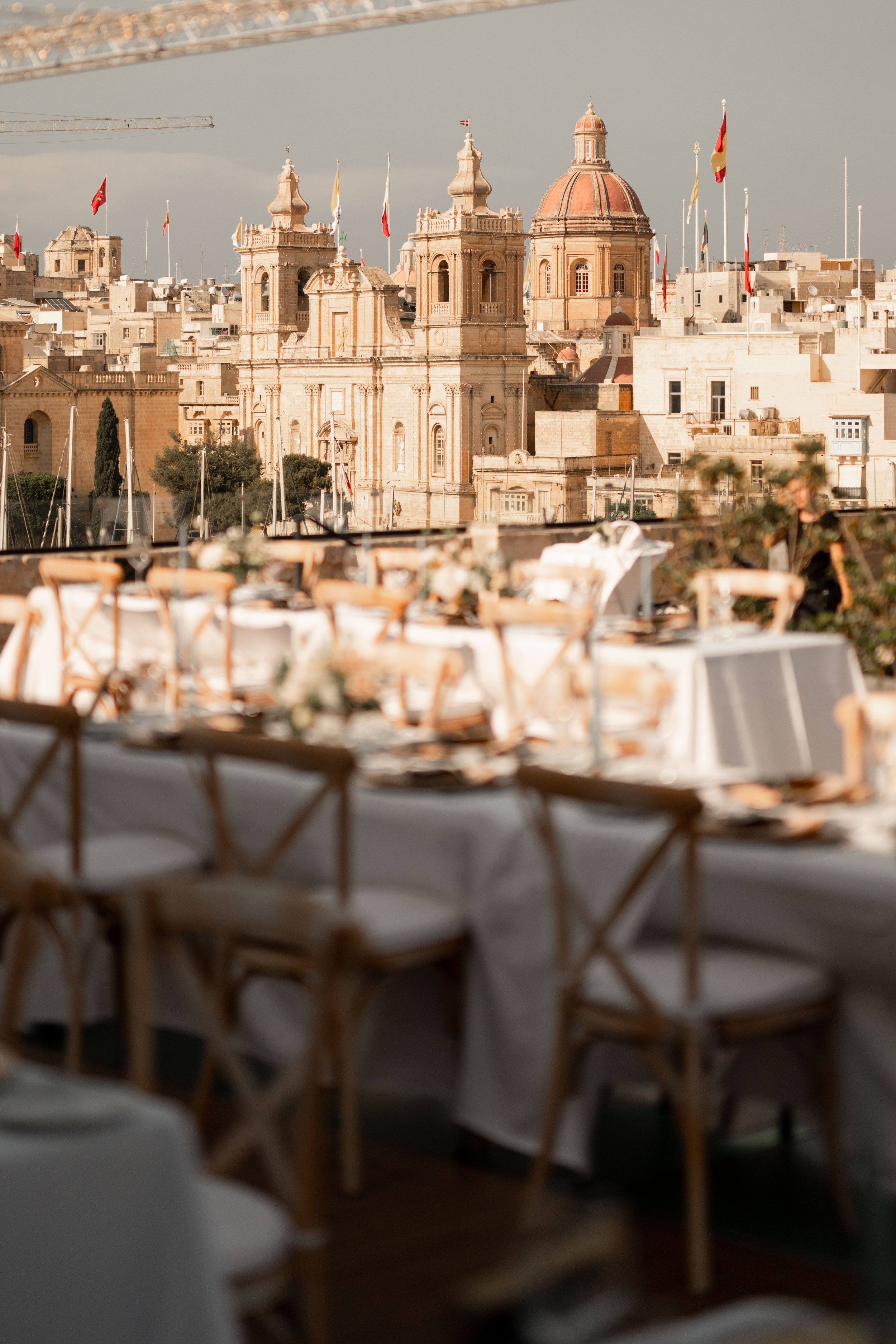
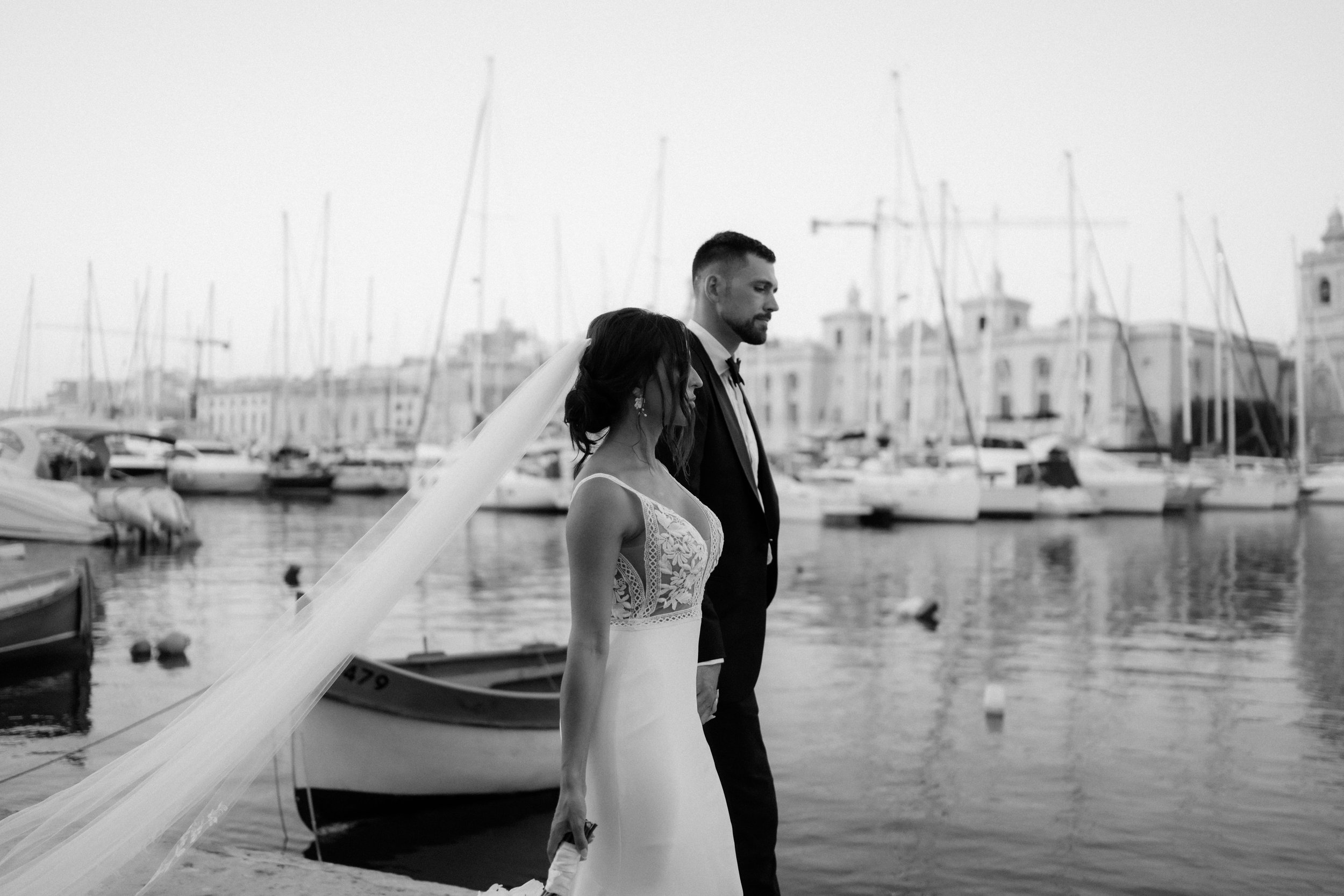
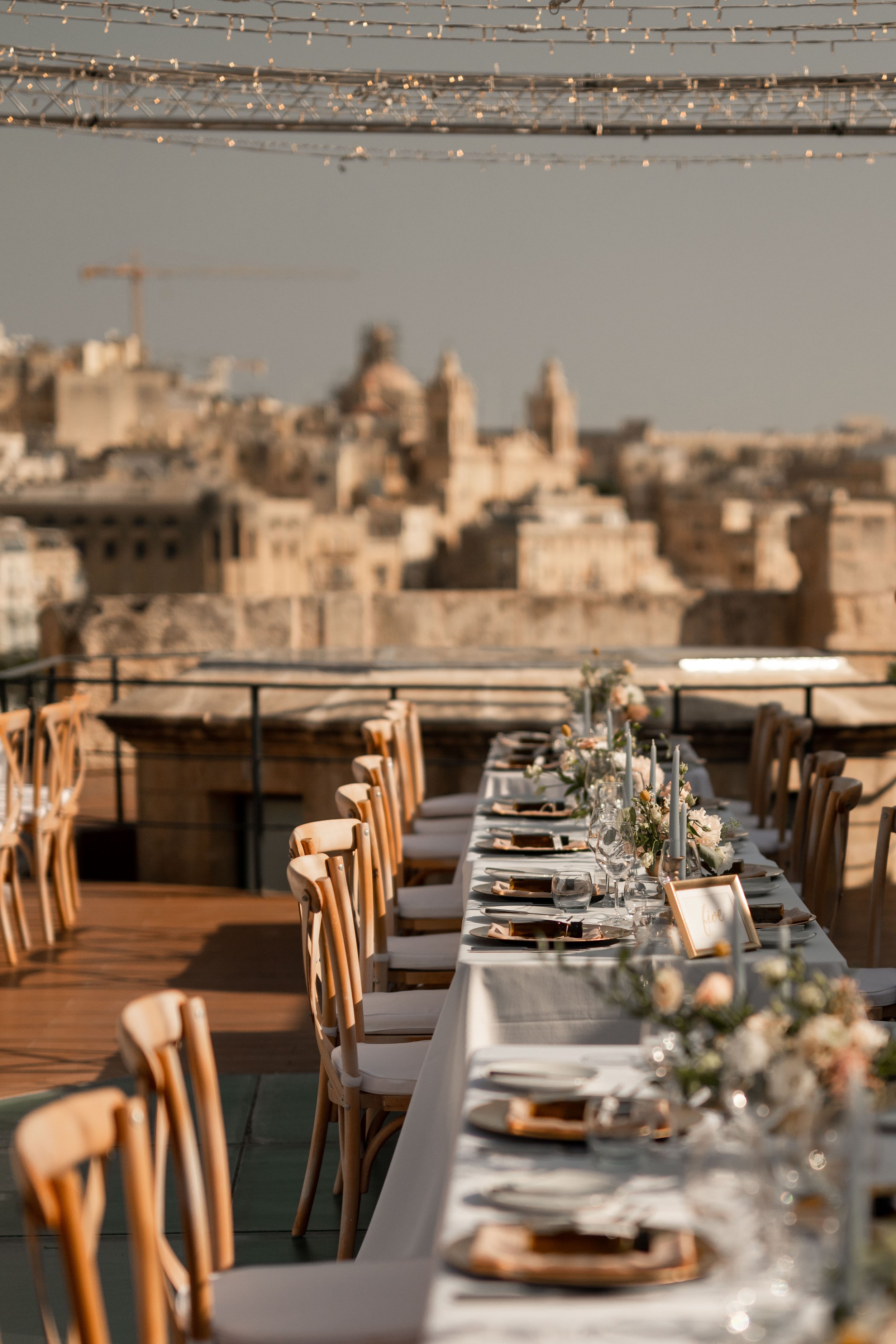
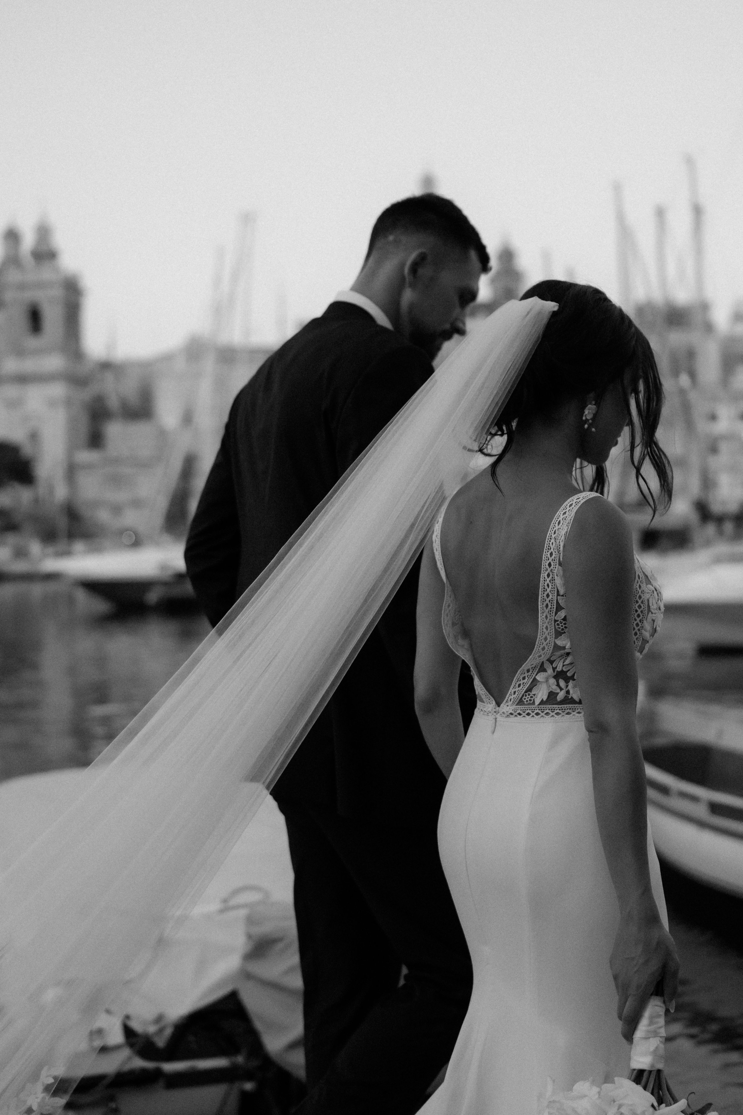
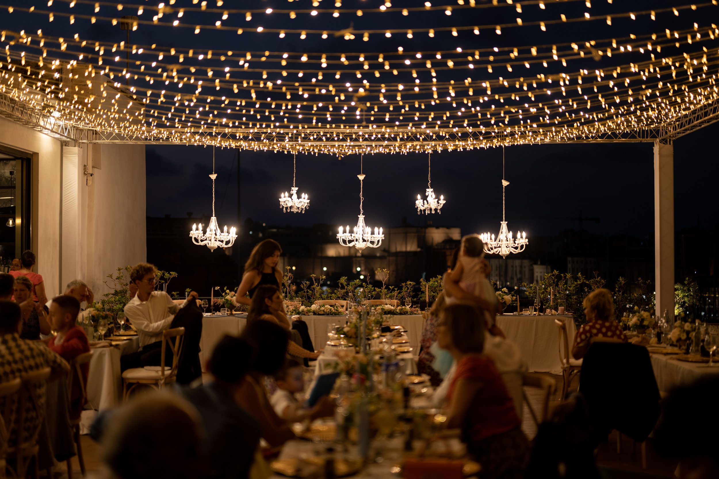
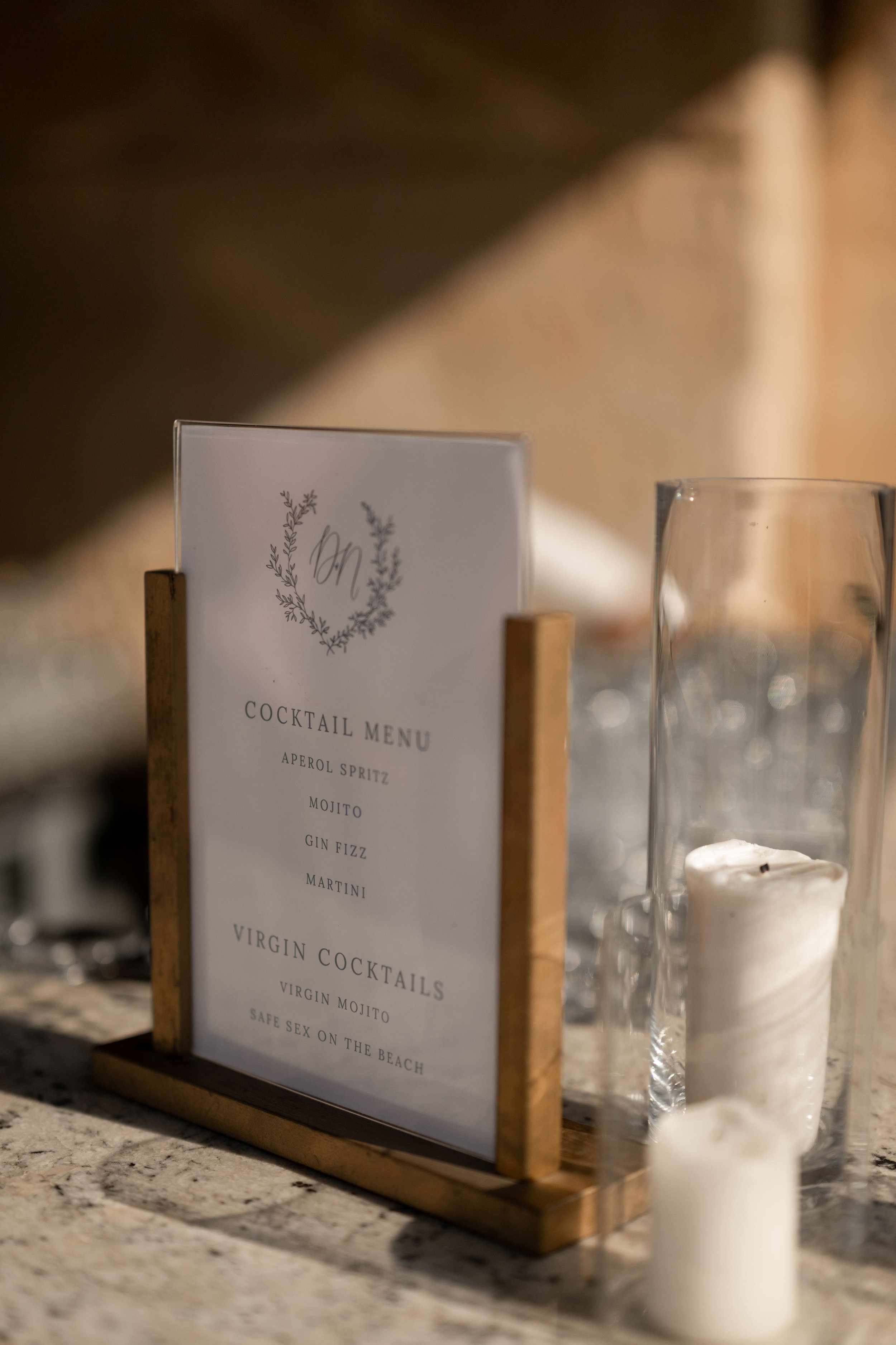
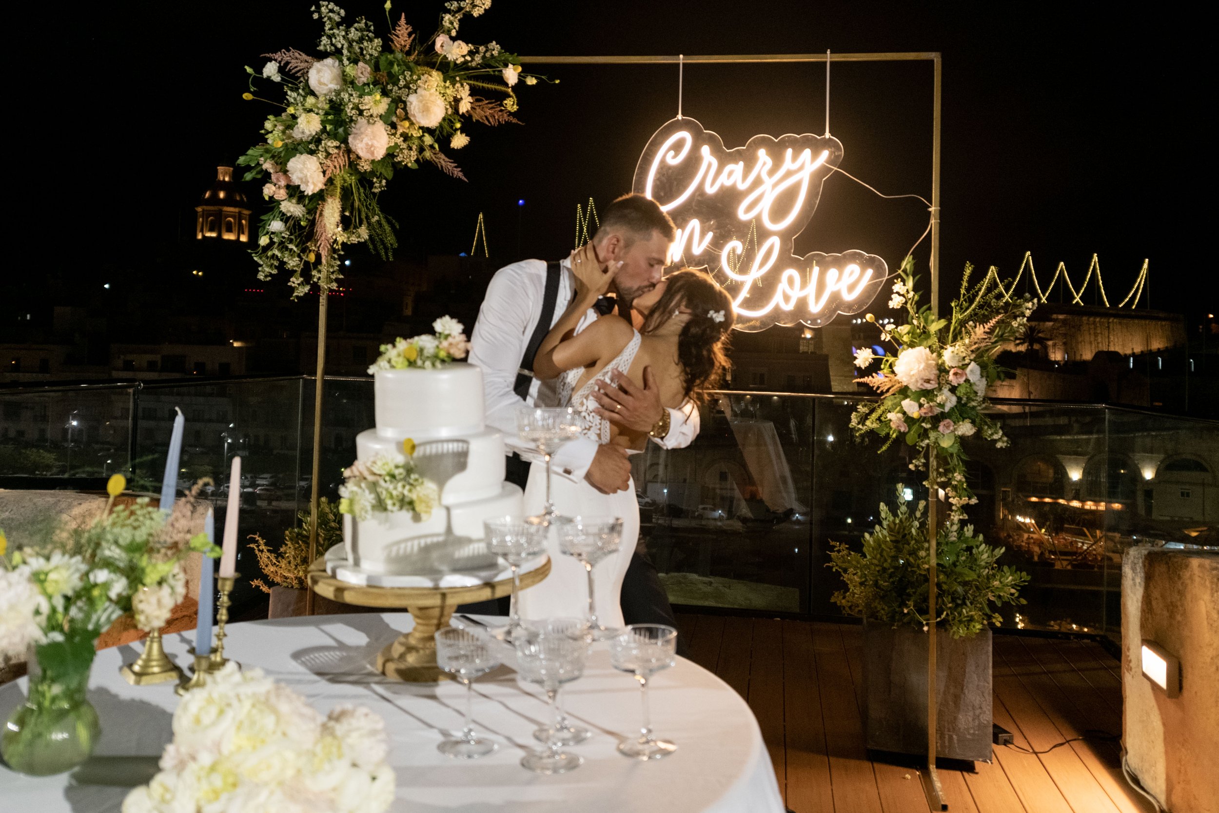
Married in Malta, Danielle and Nick’s wedding invitation colours took inspiration from the blue waters and limestone buildings. Their invitation featured an illustration of the view from their venue and their details card incorporated a map of their venues.
ella + belinda
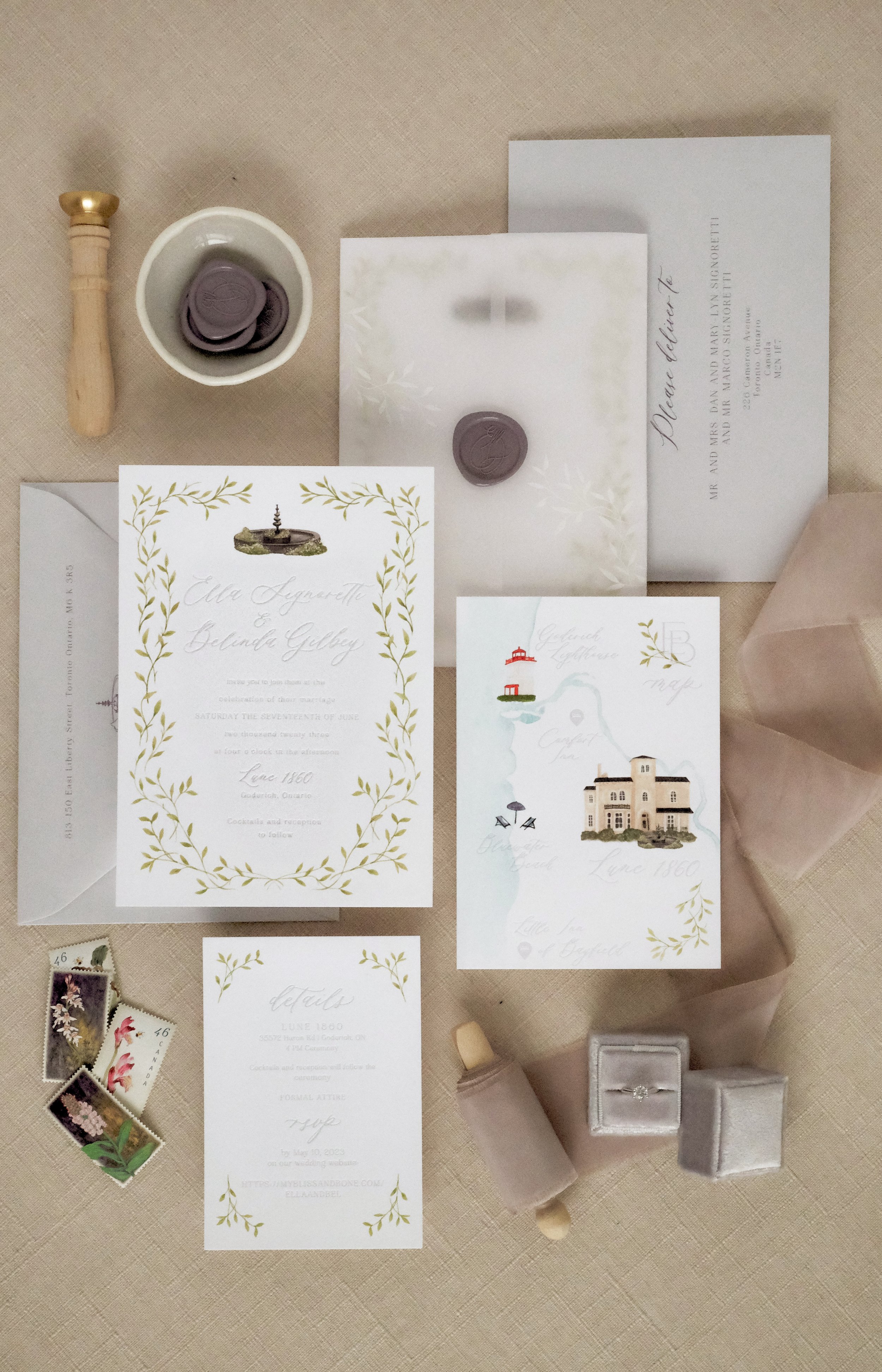
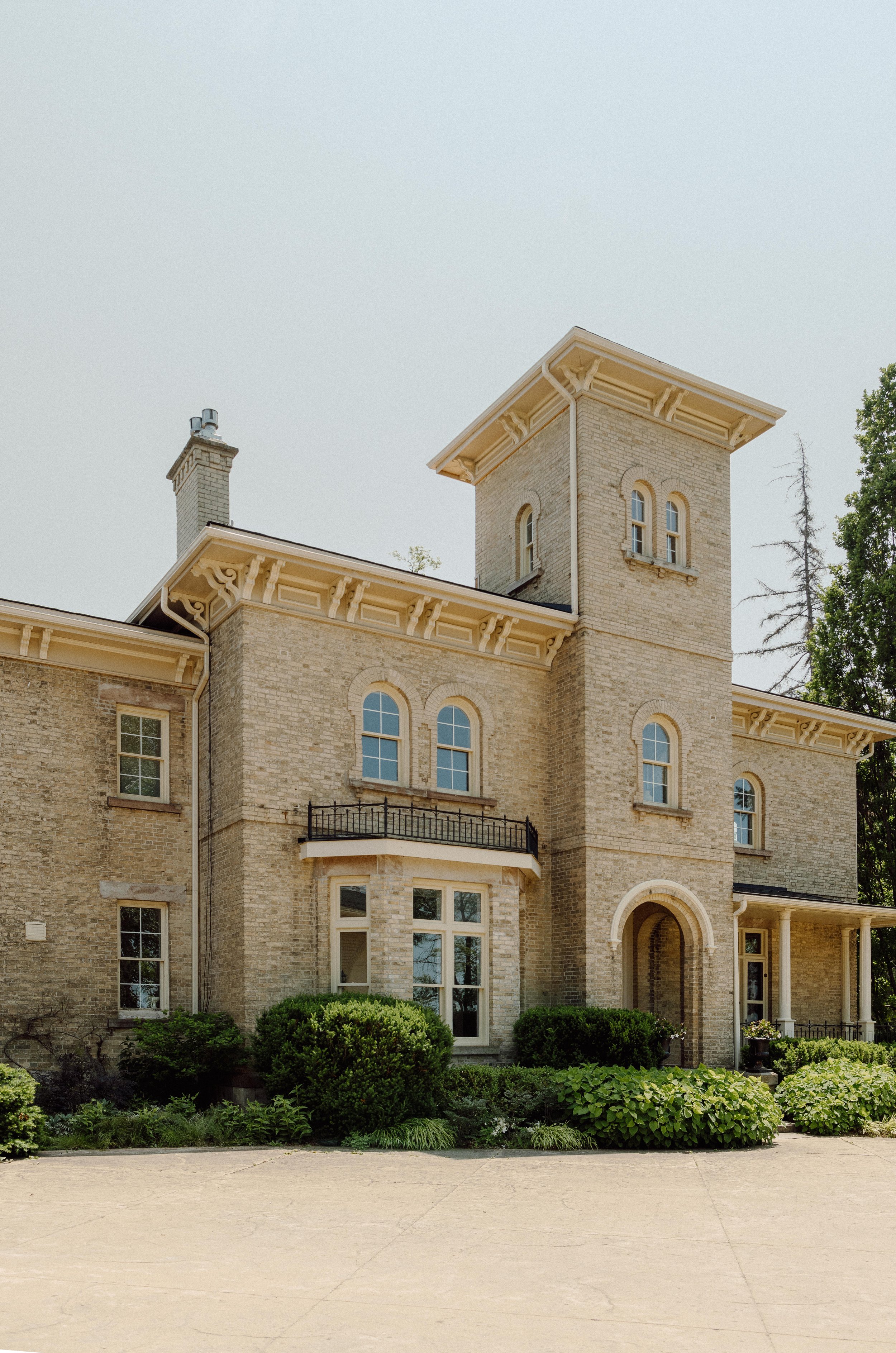
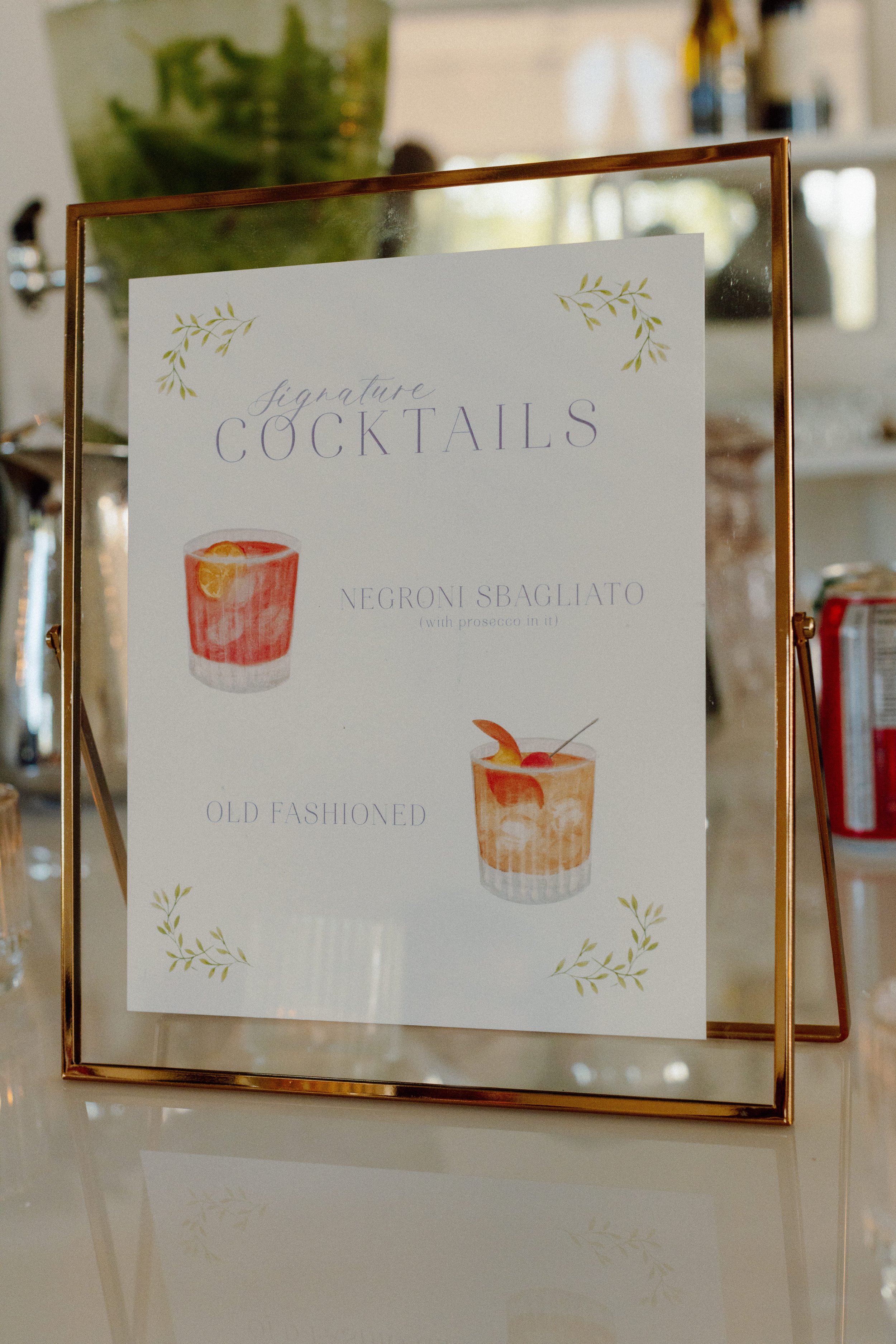
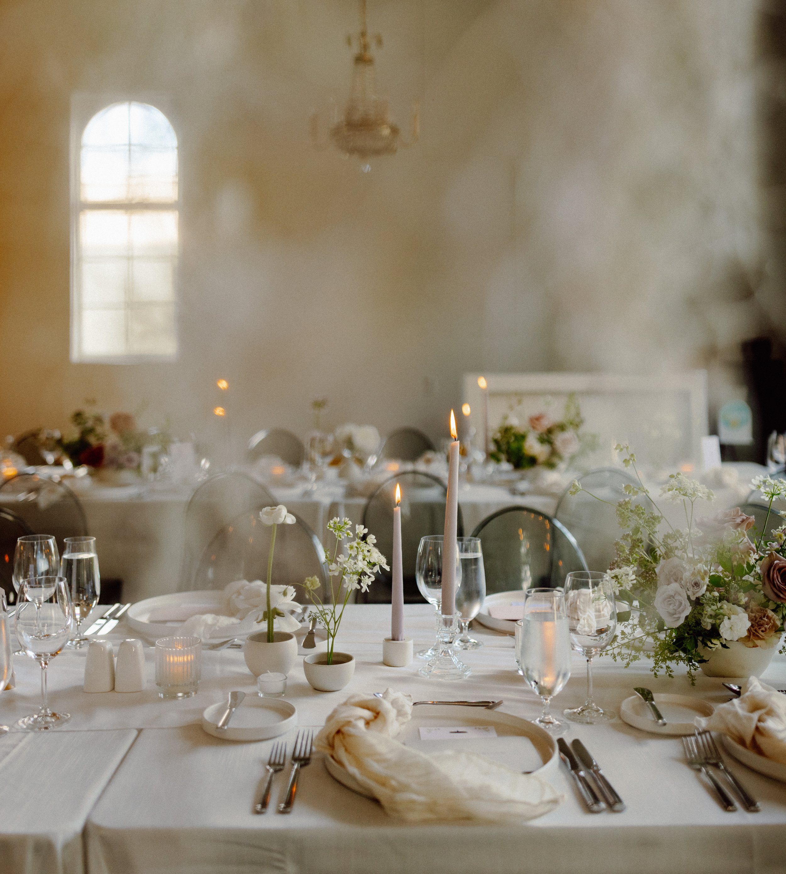
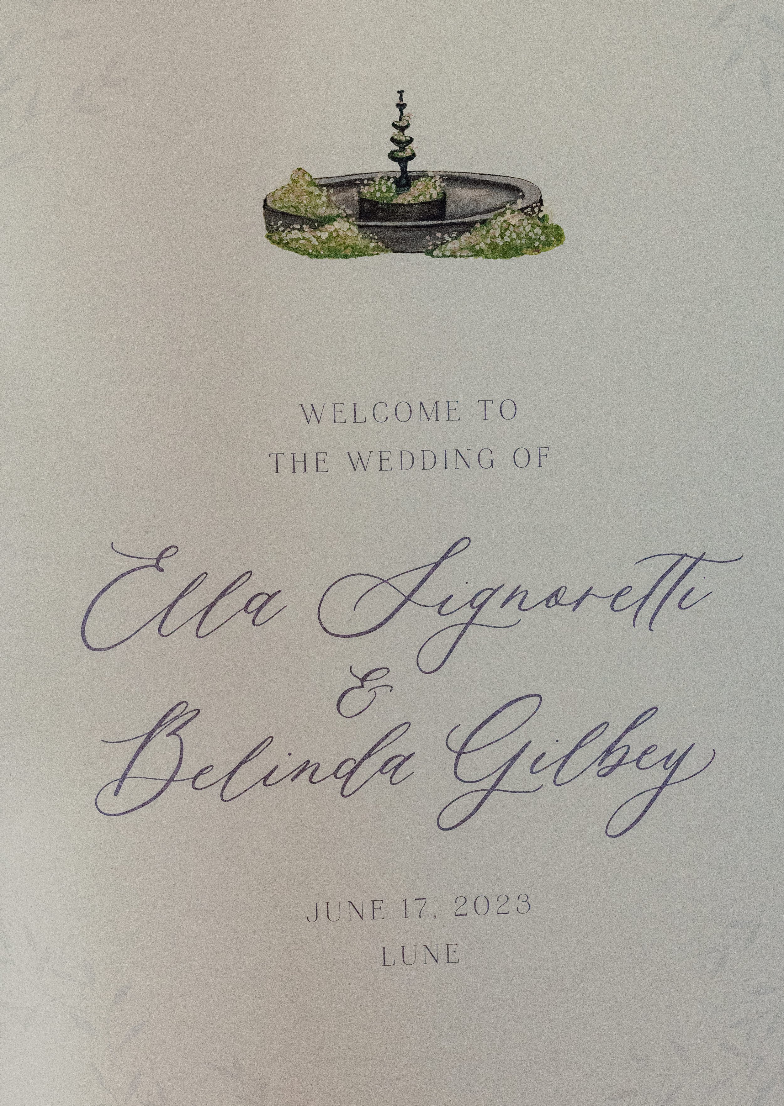
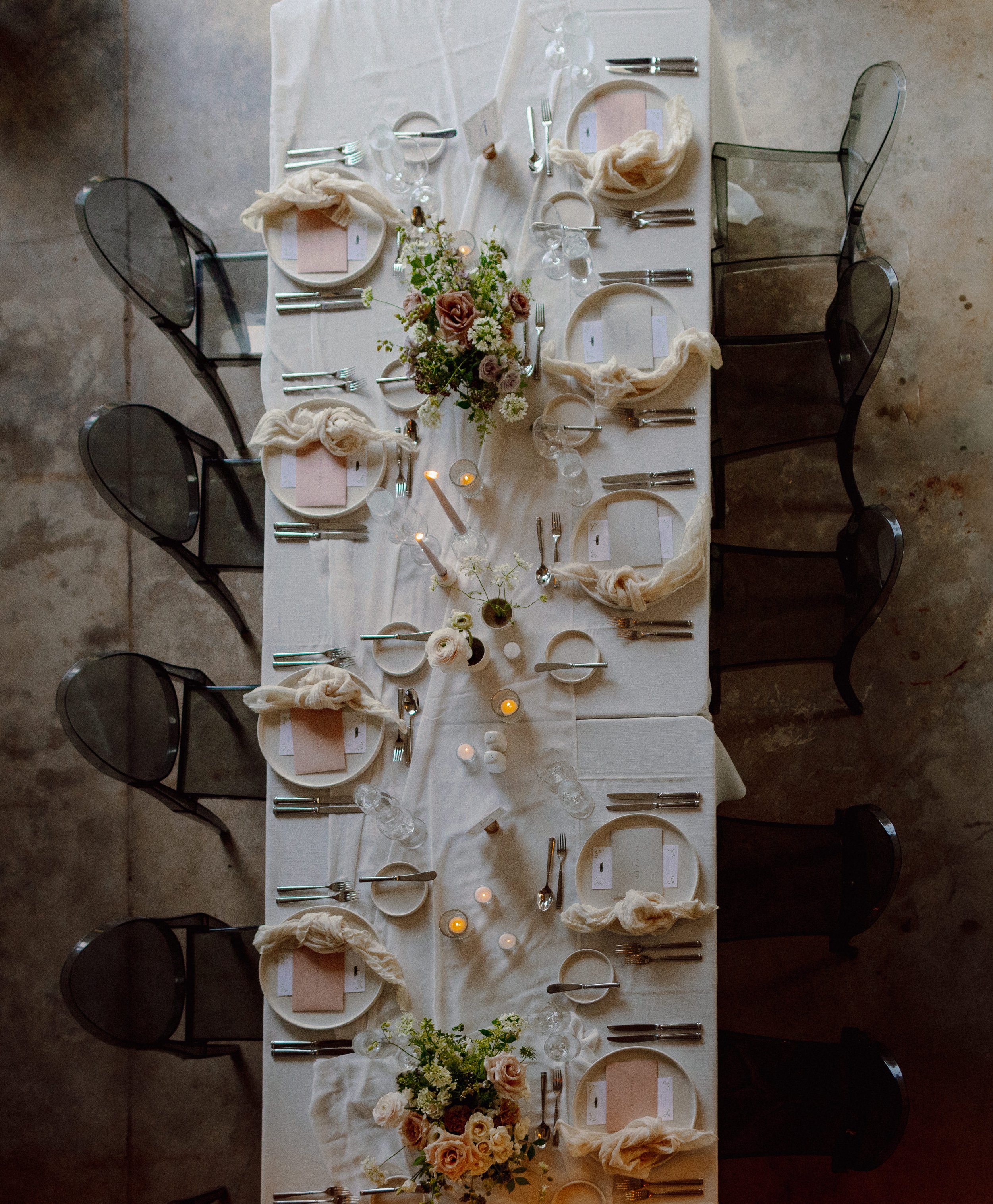
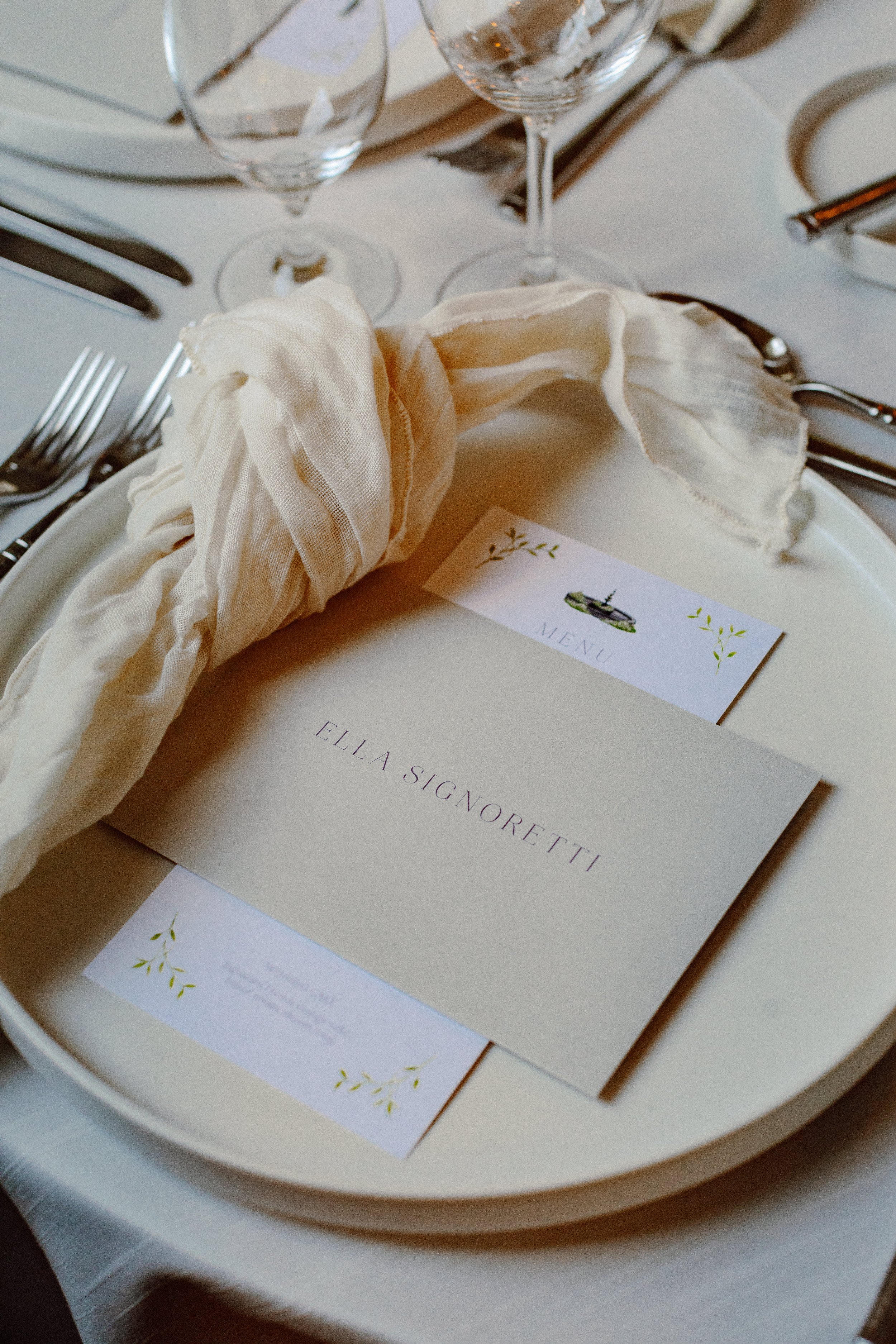
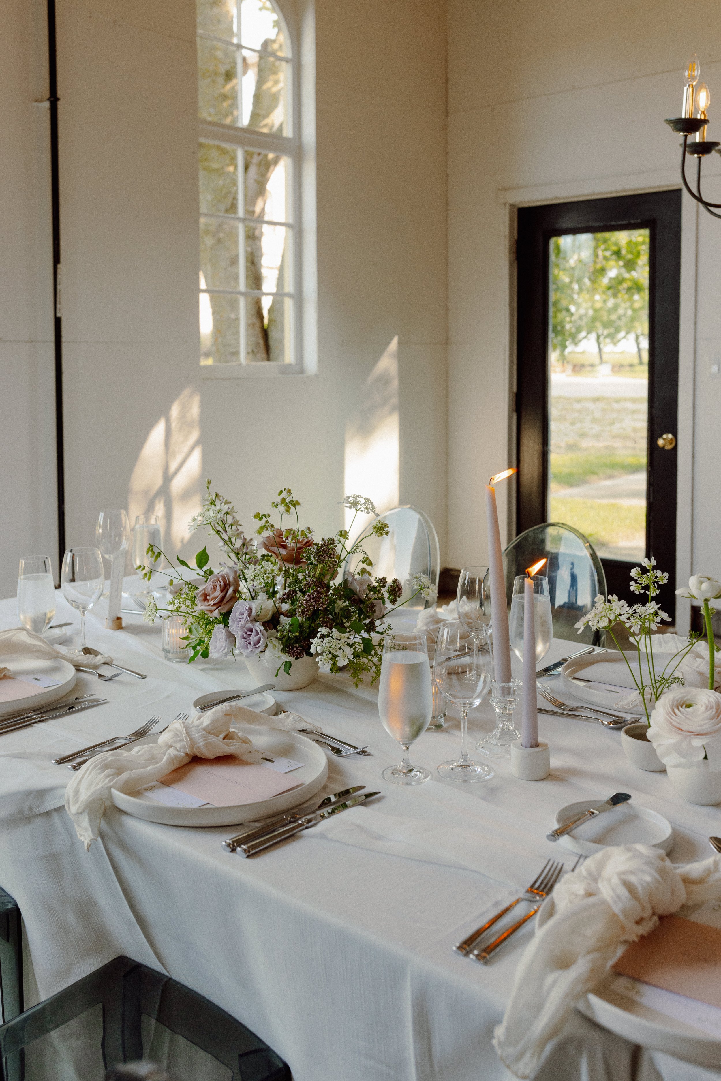
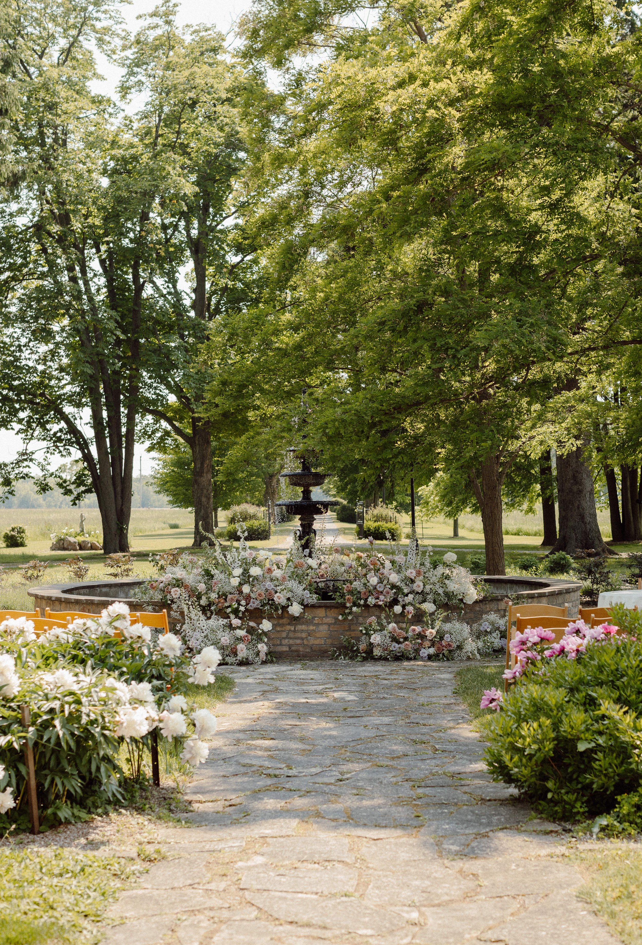
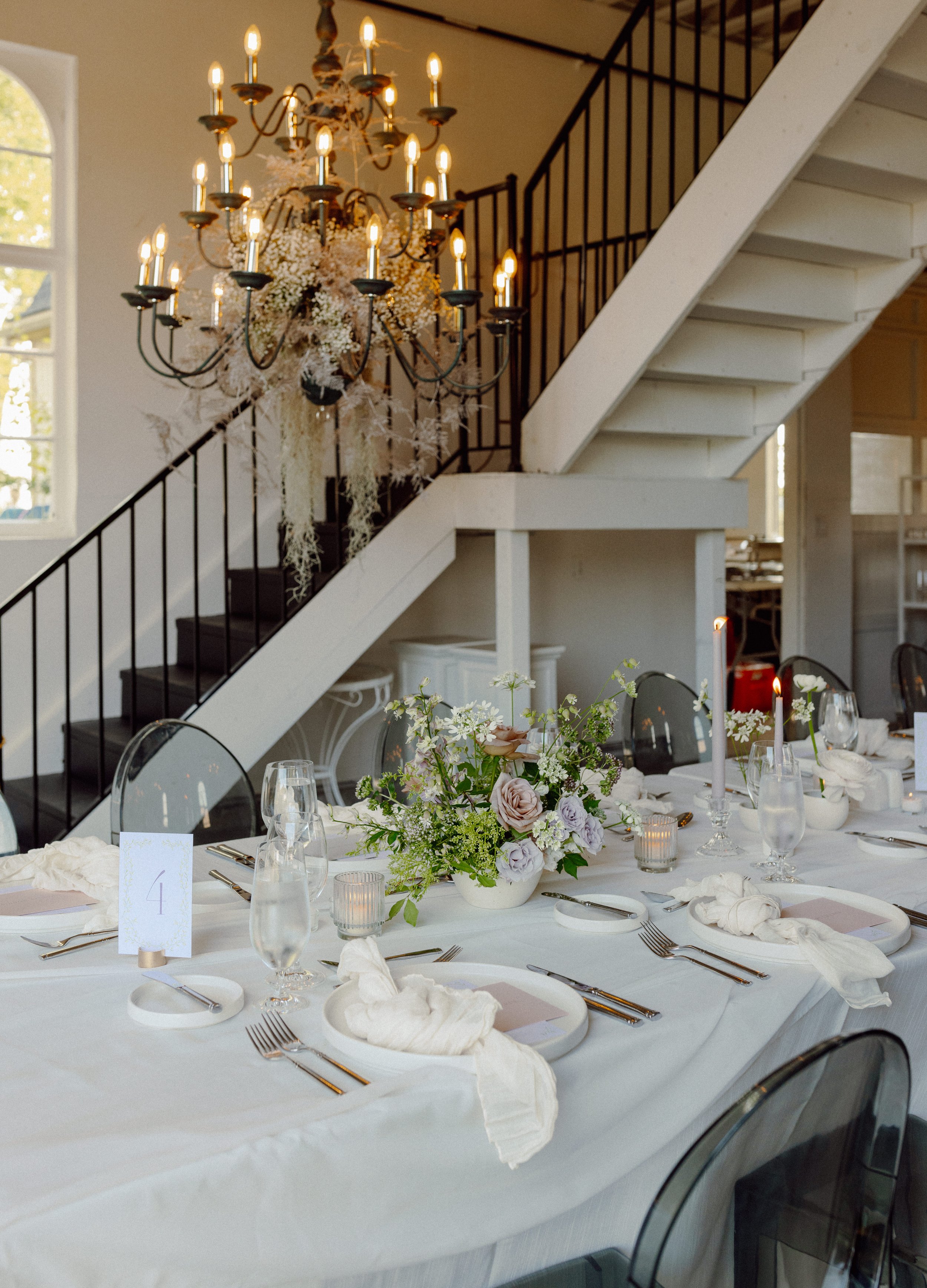
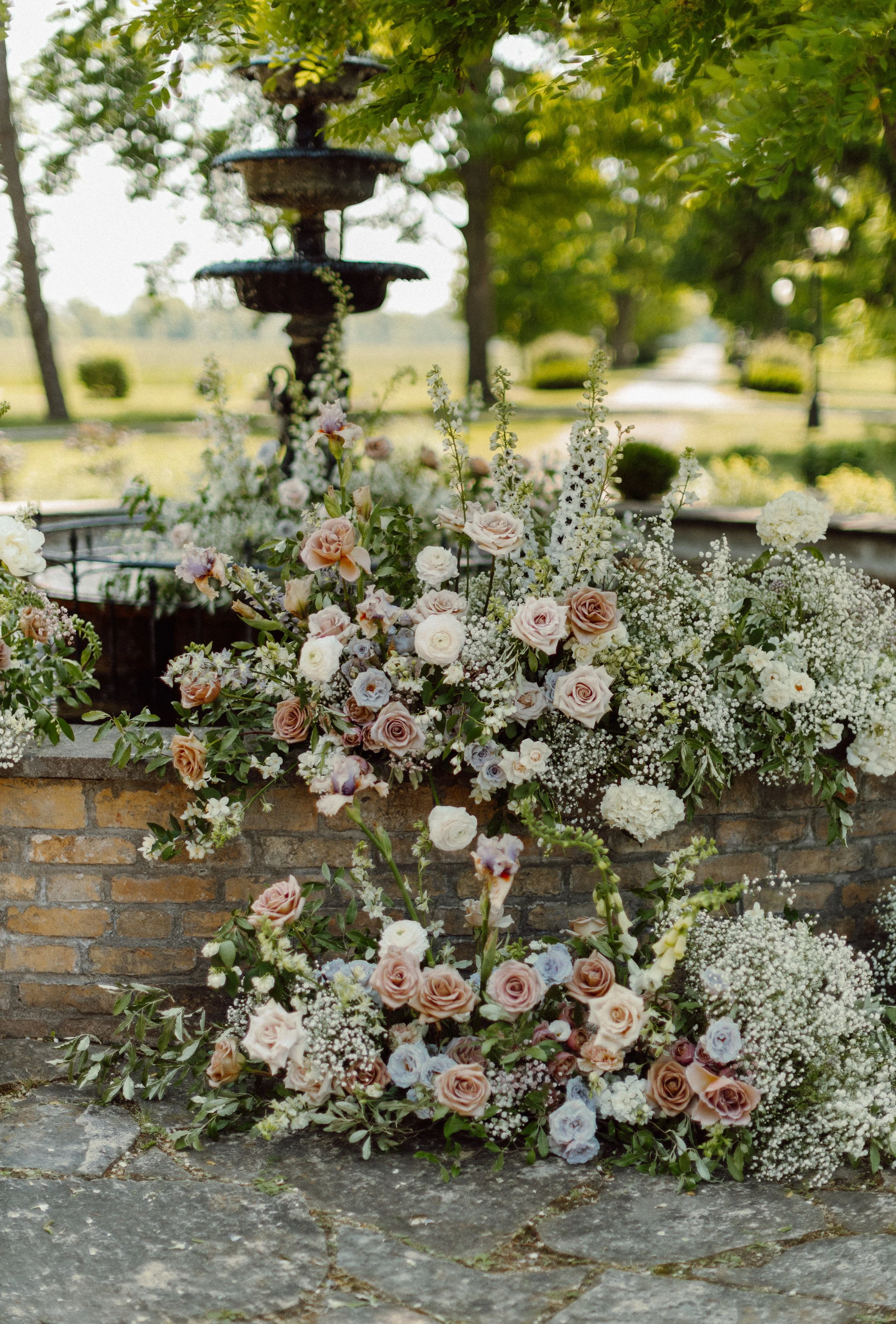
Ella and Belinda were married at the beautiful Lune 1980 in Goderich Ontario. Their wedding invitations included hand-painted foliage and a hand-painted map with lavender letterpress. The top of the invitation included the venue’s fountain surrounded by florals, which was brought to life with the floral installation on the day of their wedding. Modern table scapes featured a custom bar sign, menus to match their invitations and envelope place cards - each with a personalized note for their guests.
liza & deena
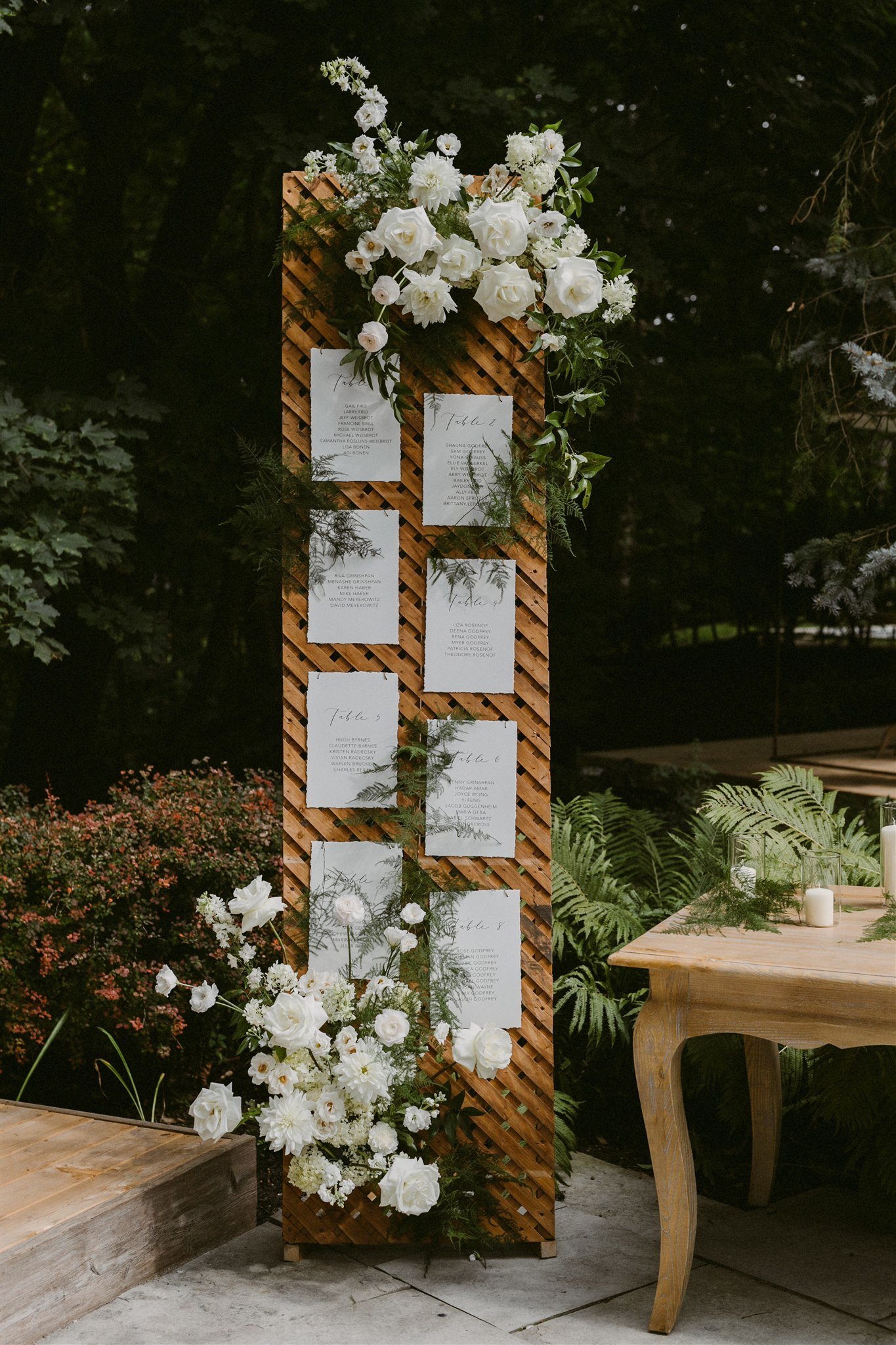
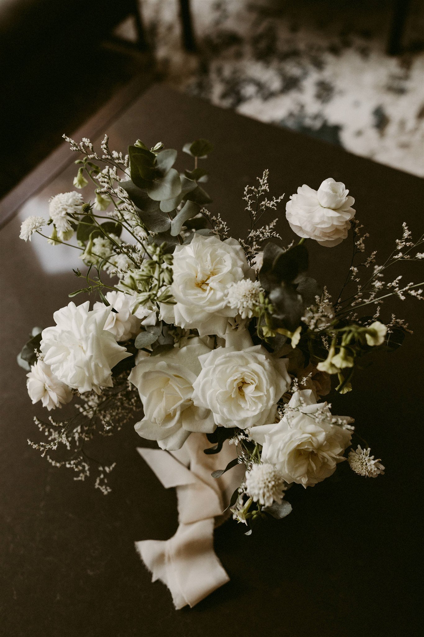
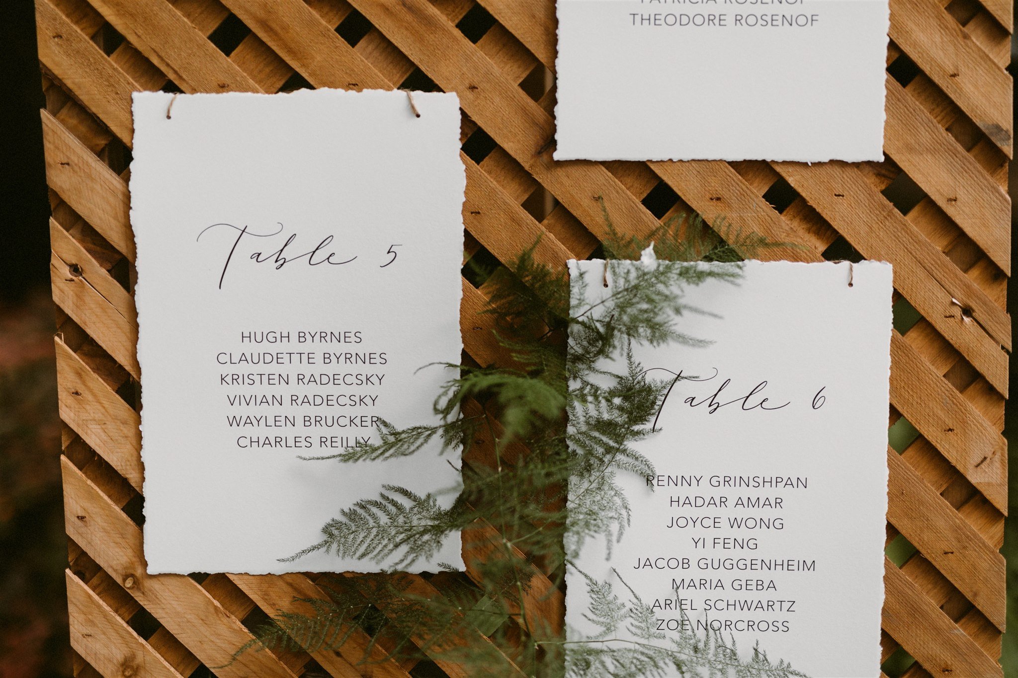
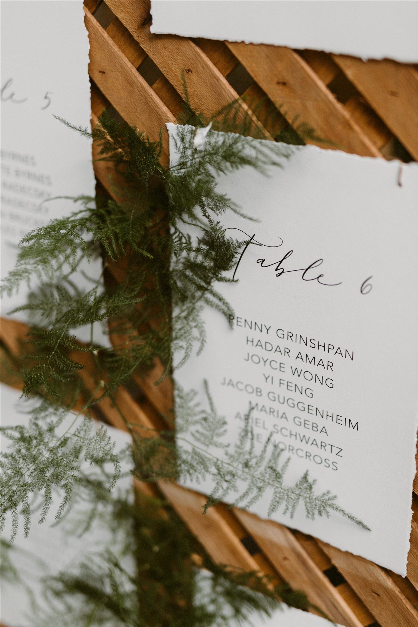
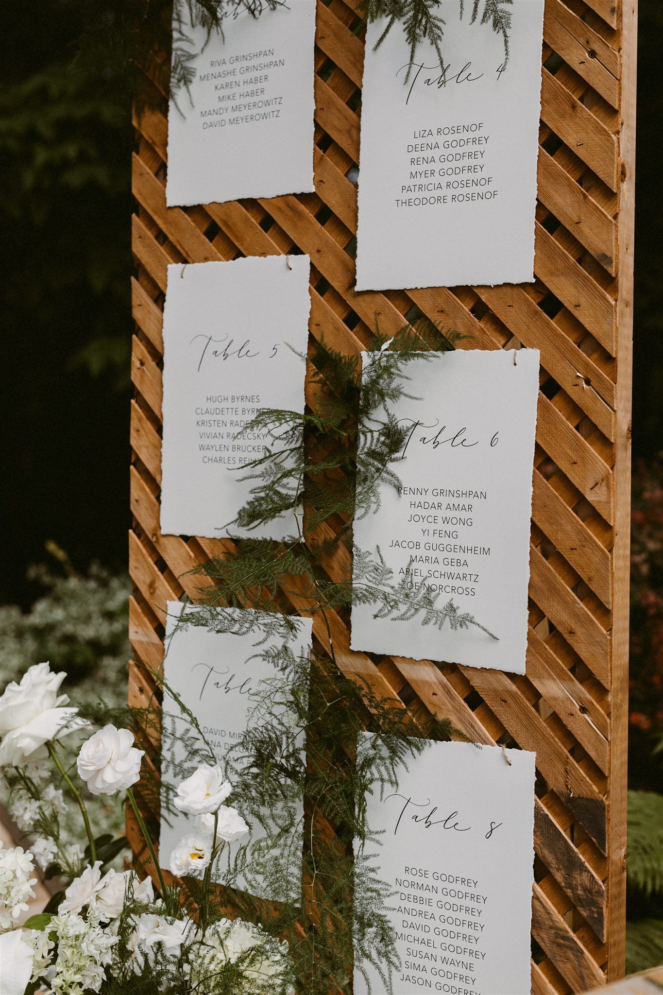
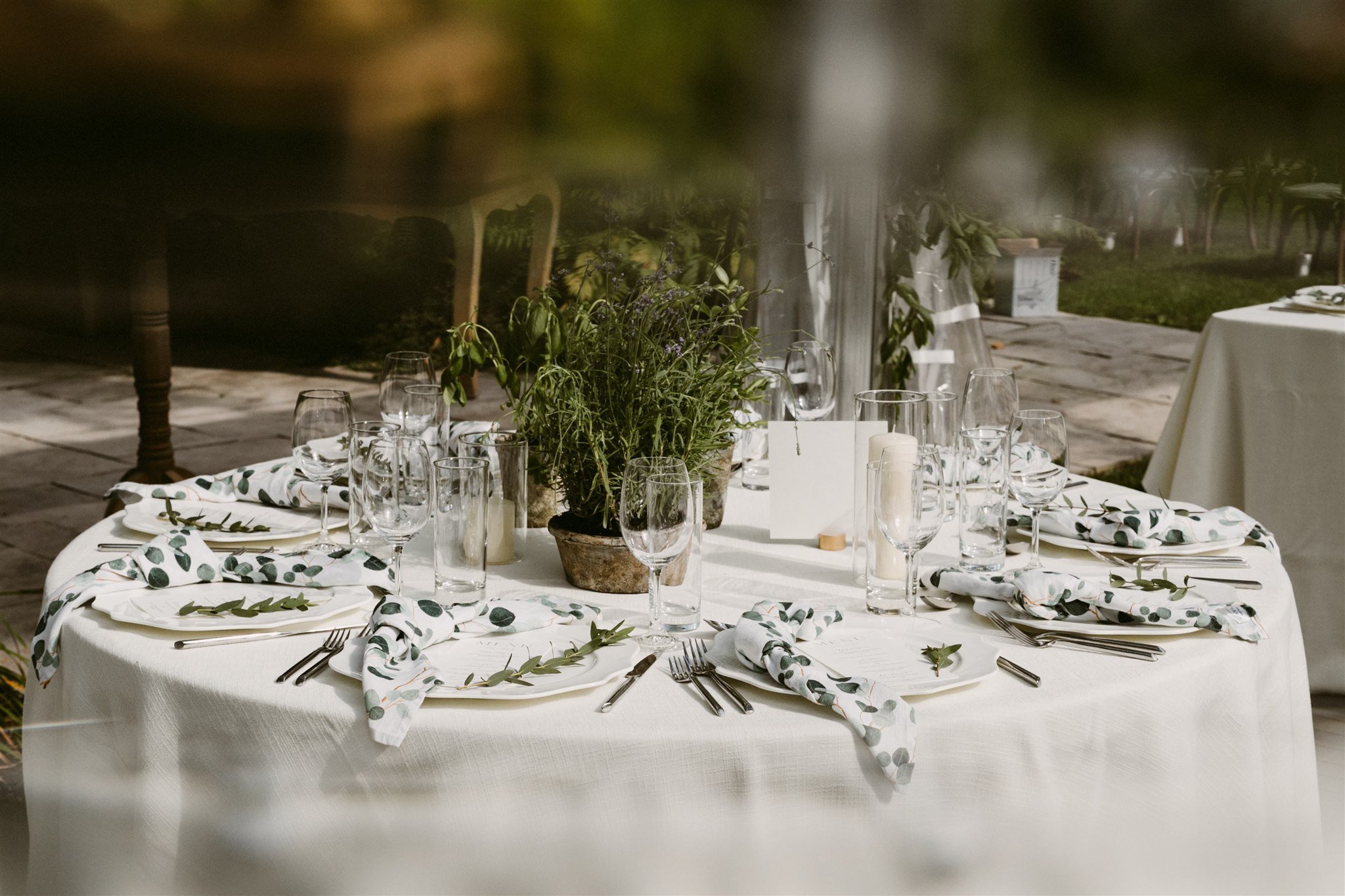
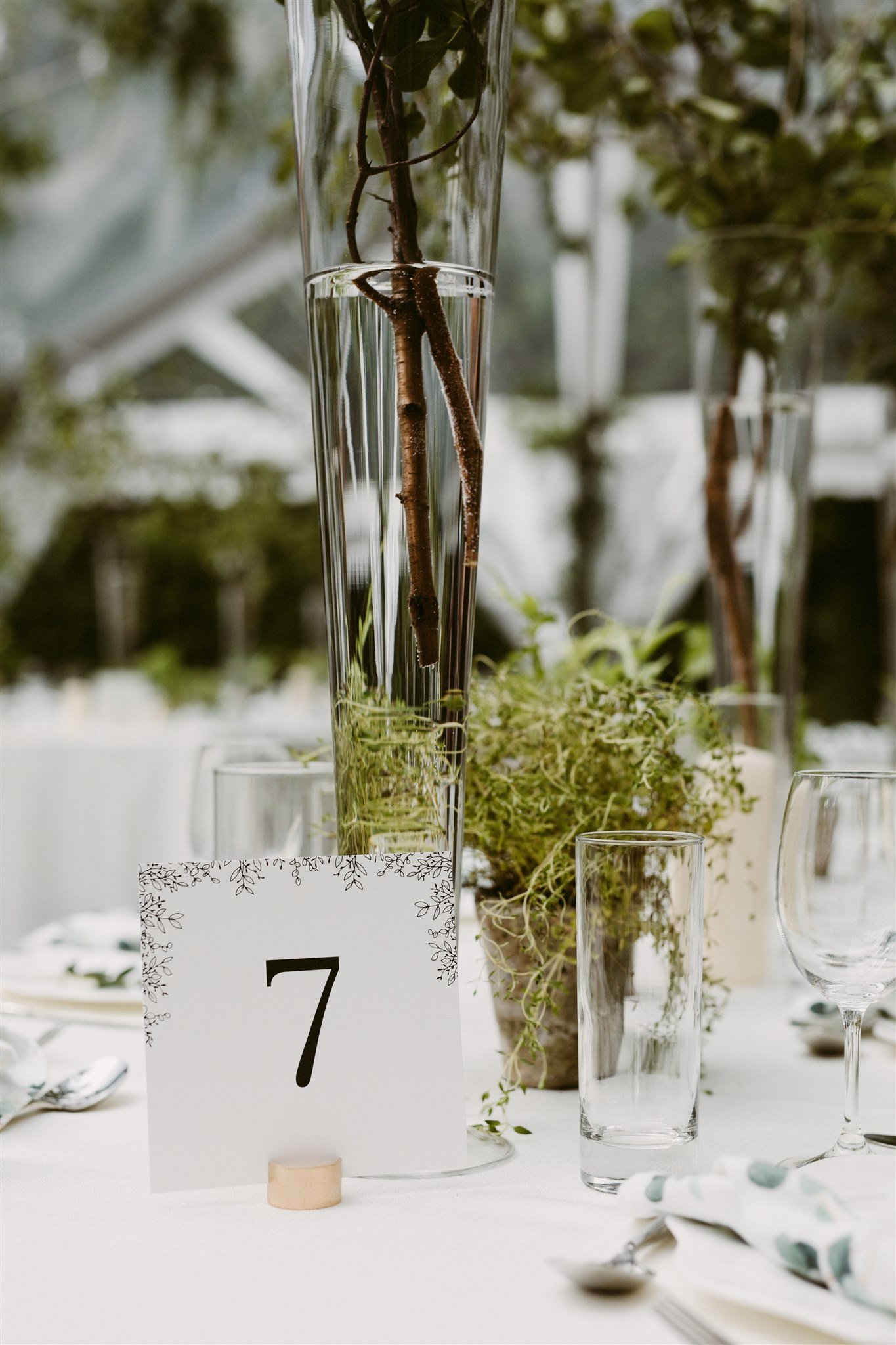
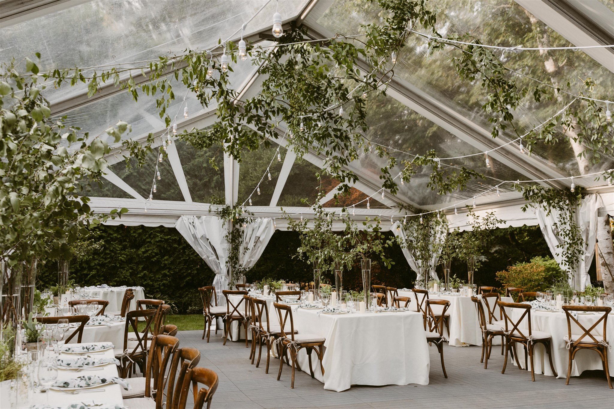
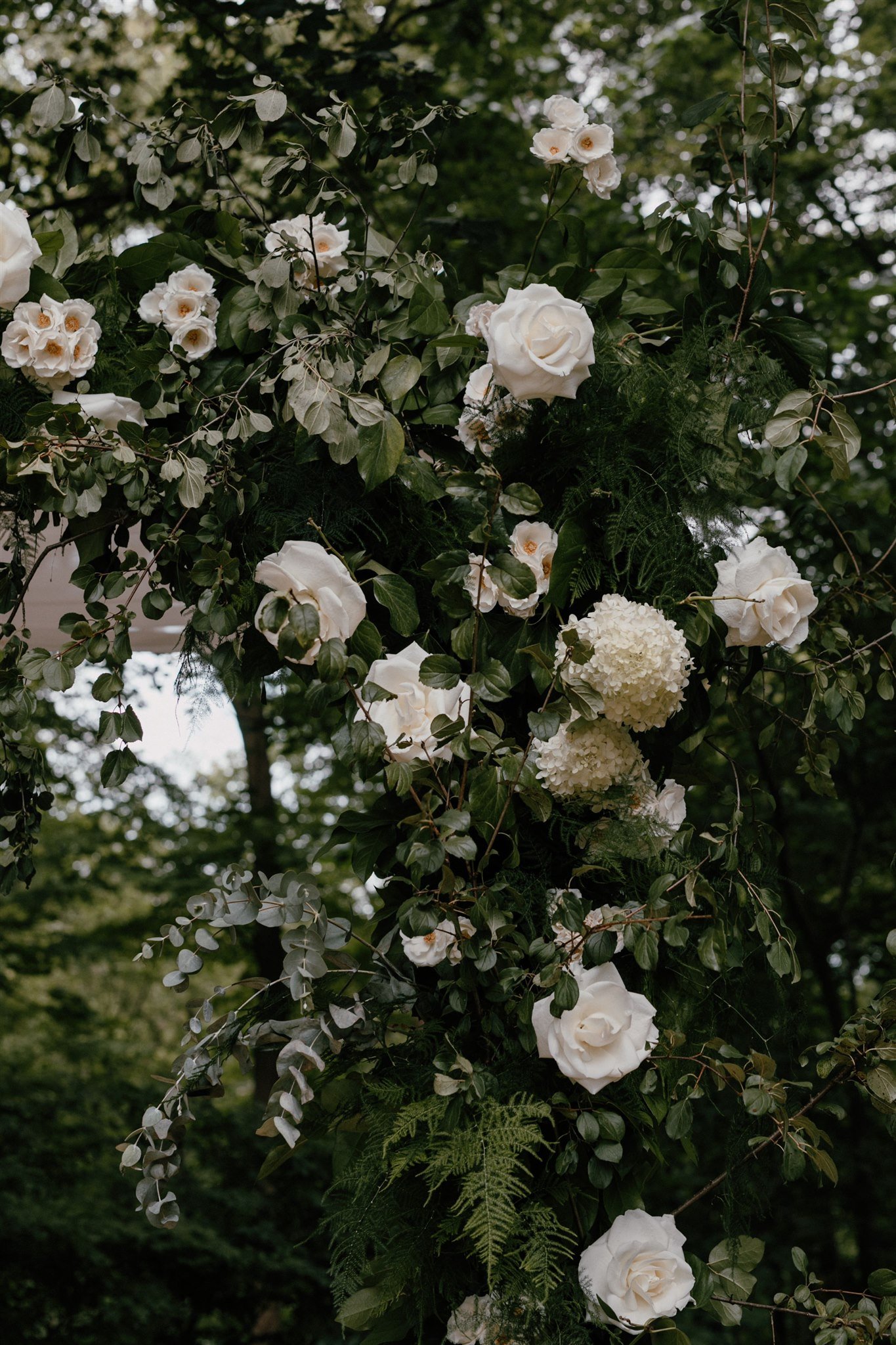
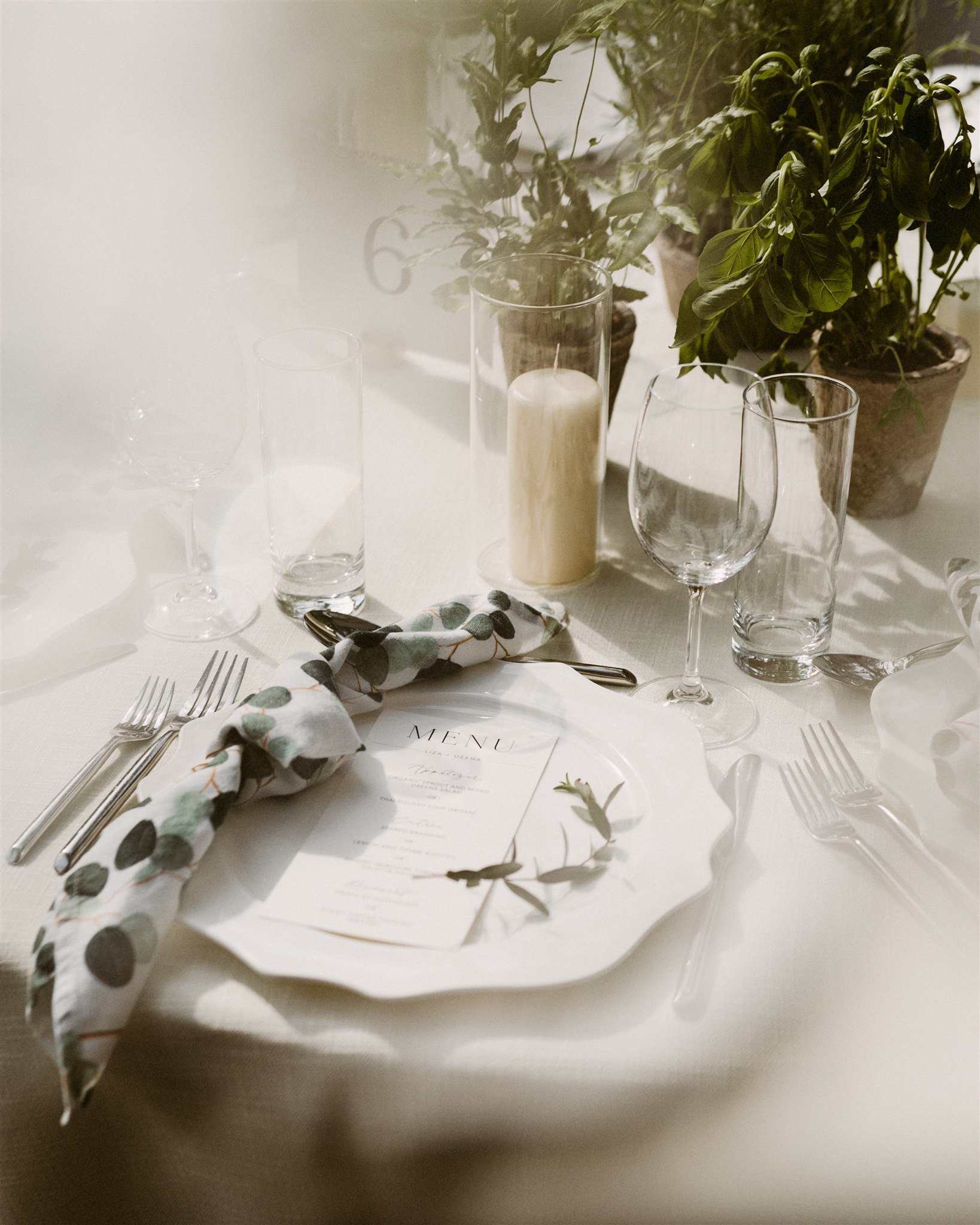
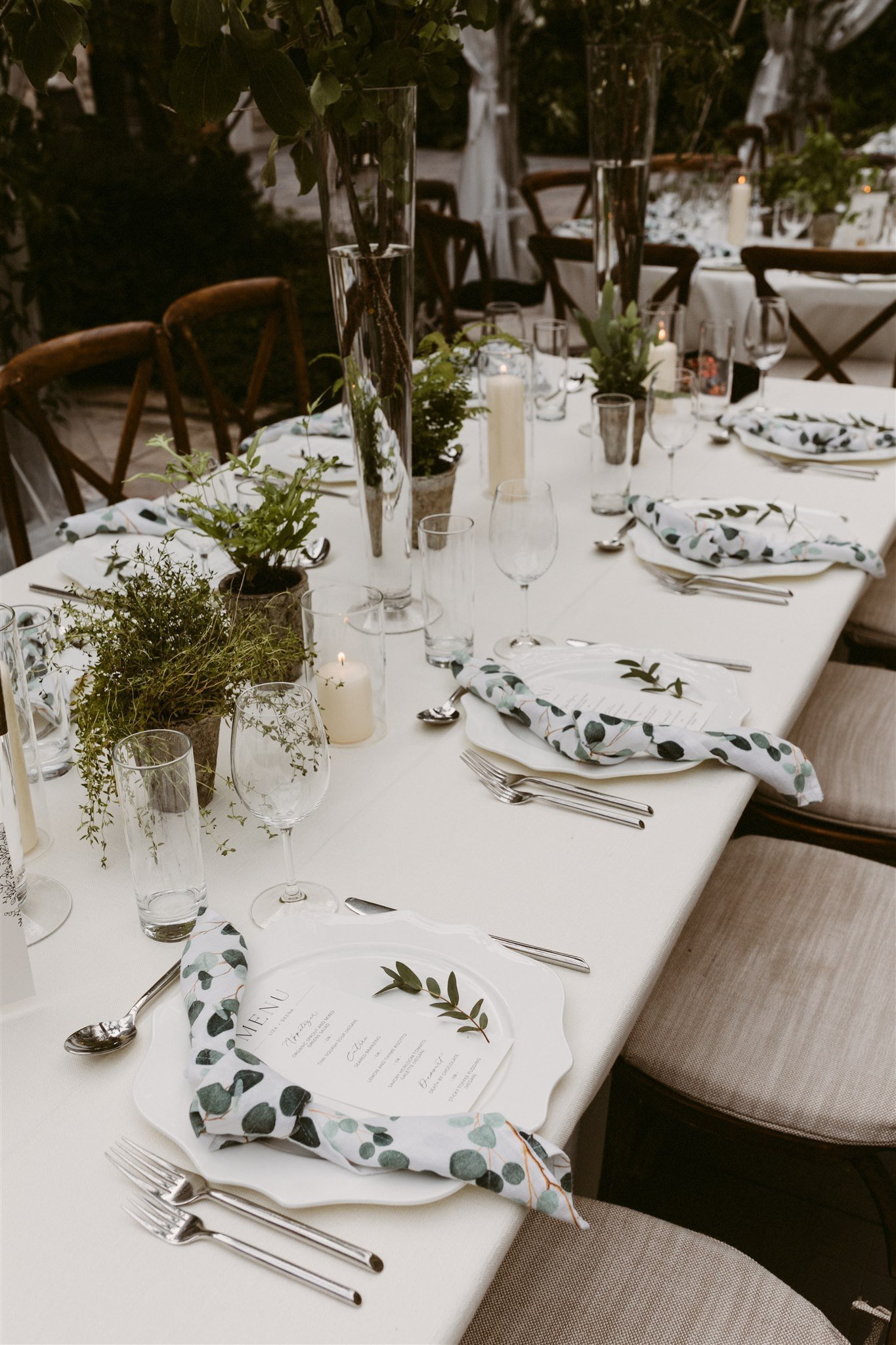
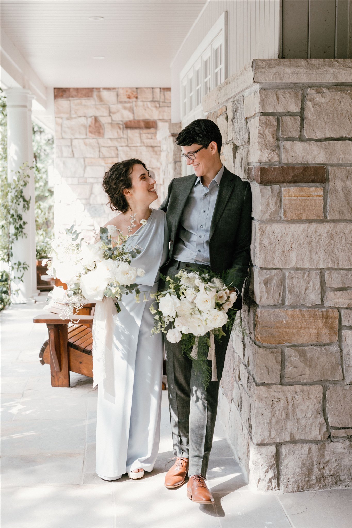
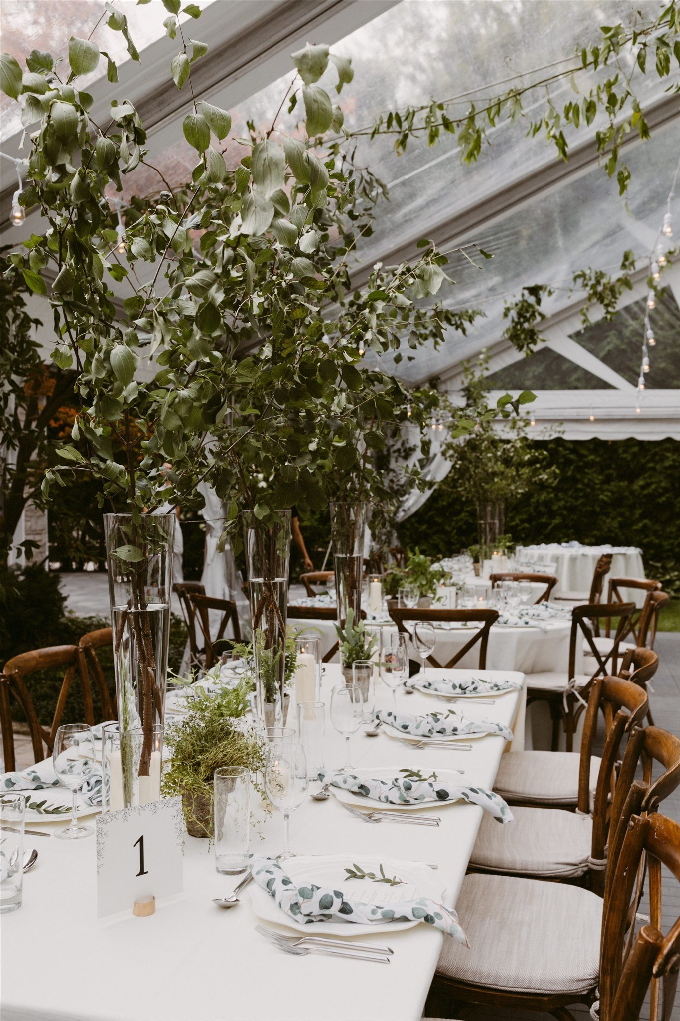
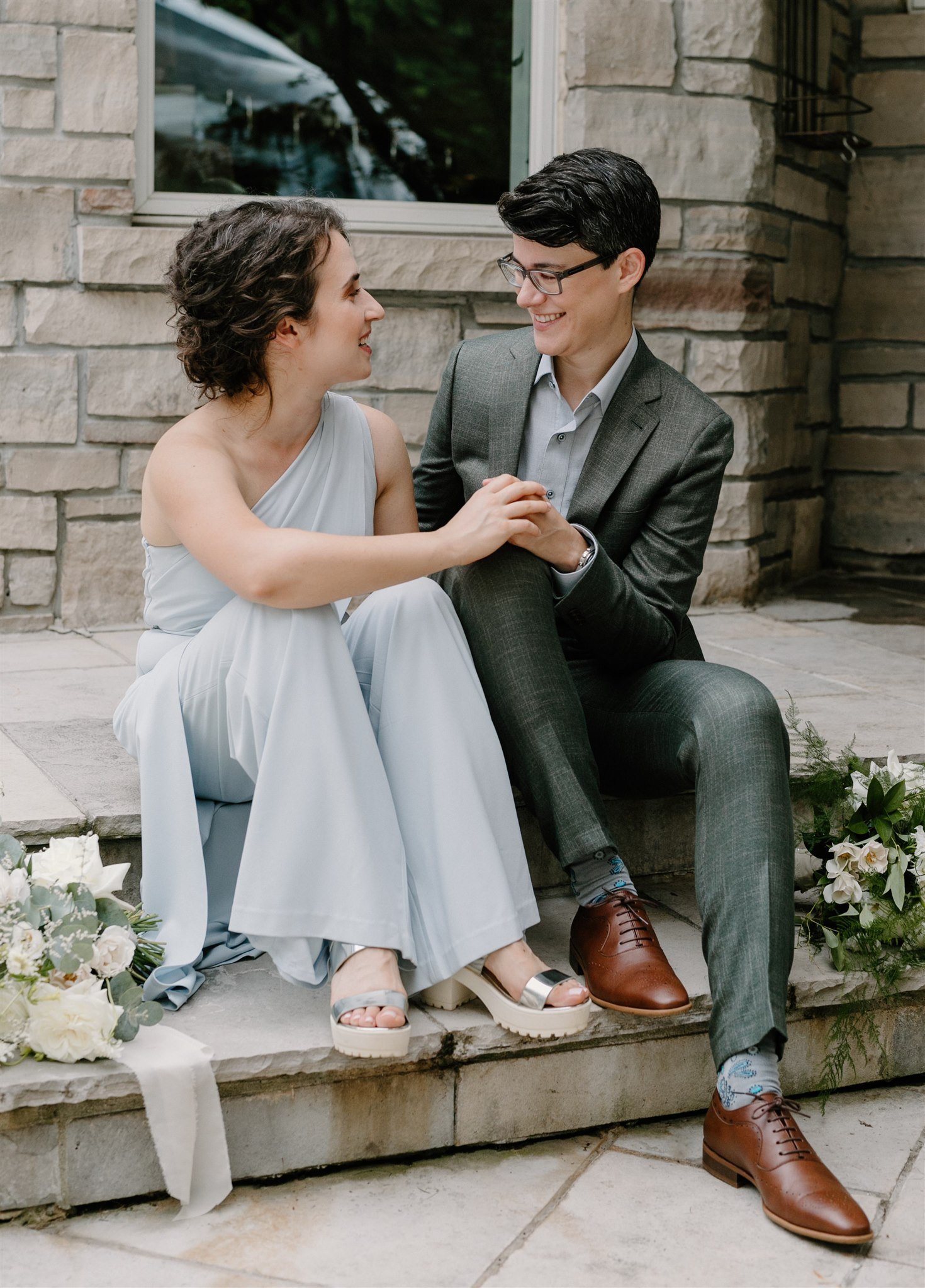
This beautiful backyard wedding was greenhouse-inspired with florals and foliage around every corner.
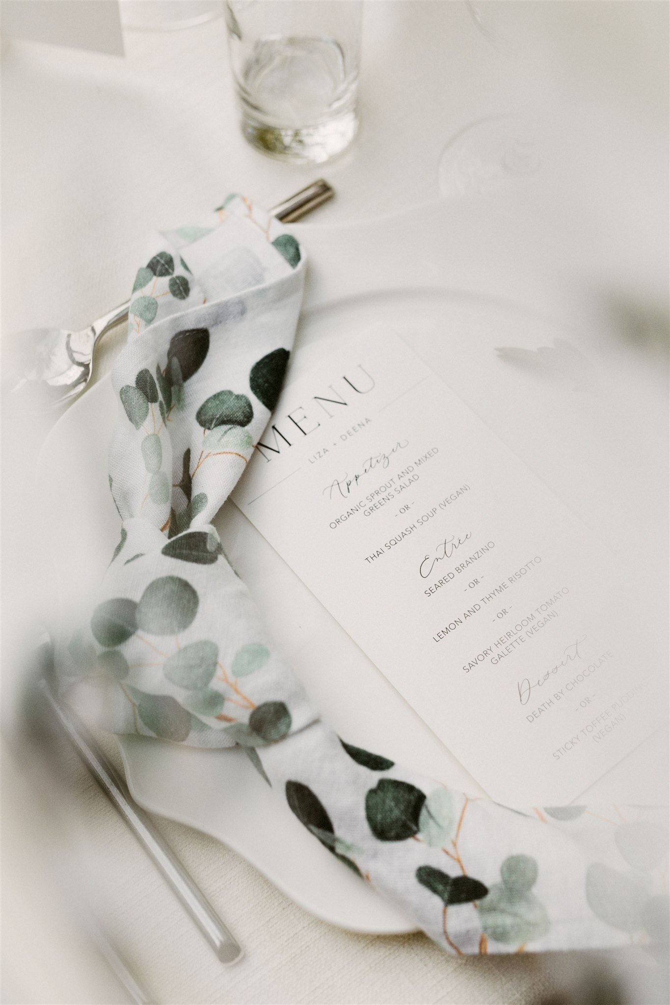
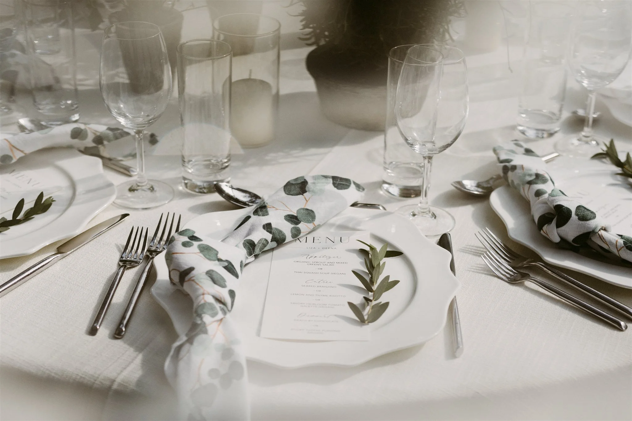
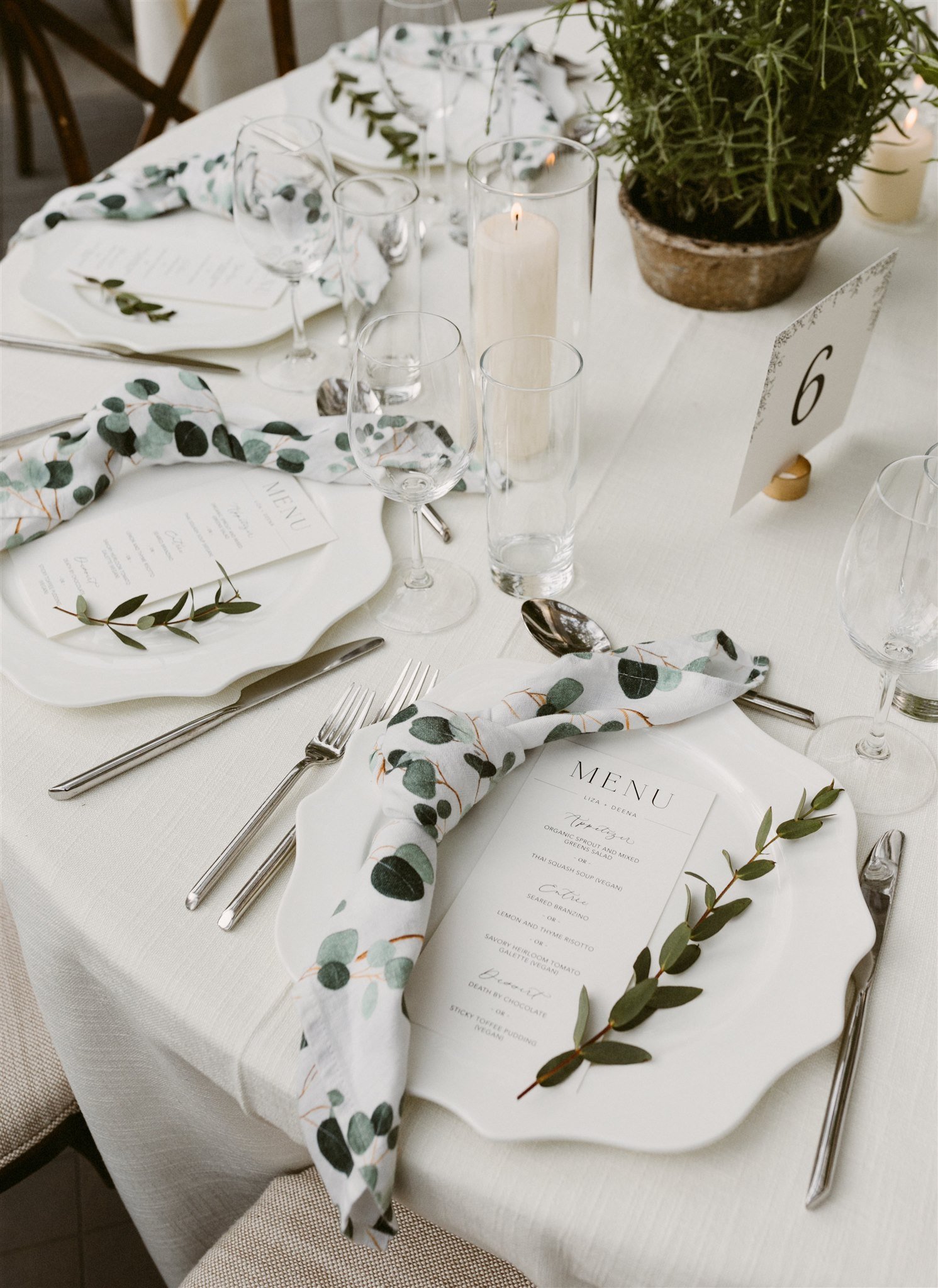
The seating chart included loose calligraphy and hand-torn edges fastened to wooden fencing and the table stationery was kept simple, with menus printed in black ink on white paper.
lexy + adam
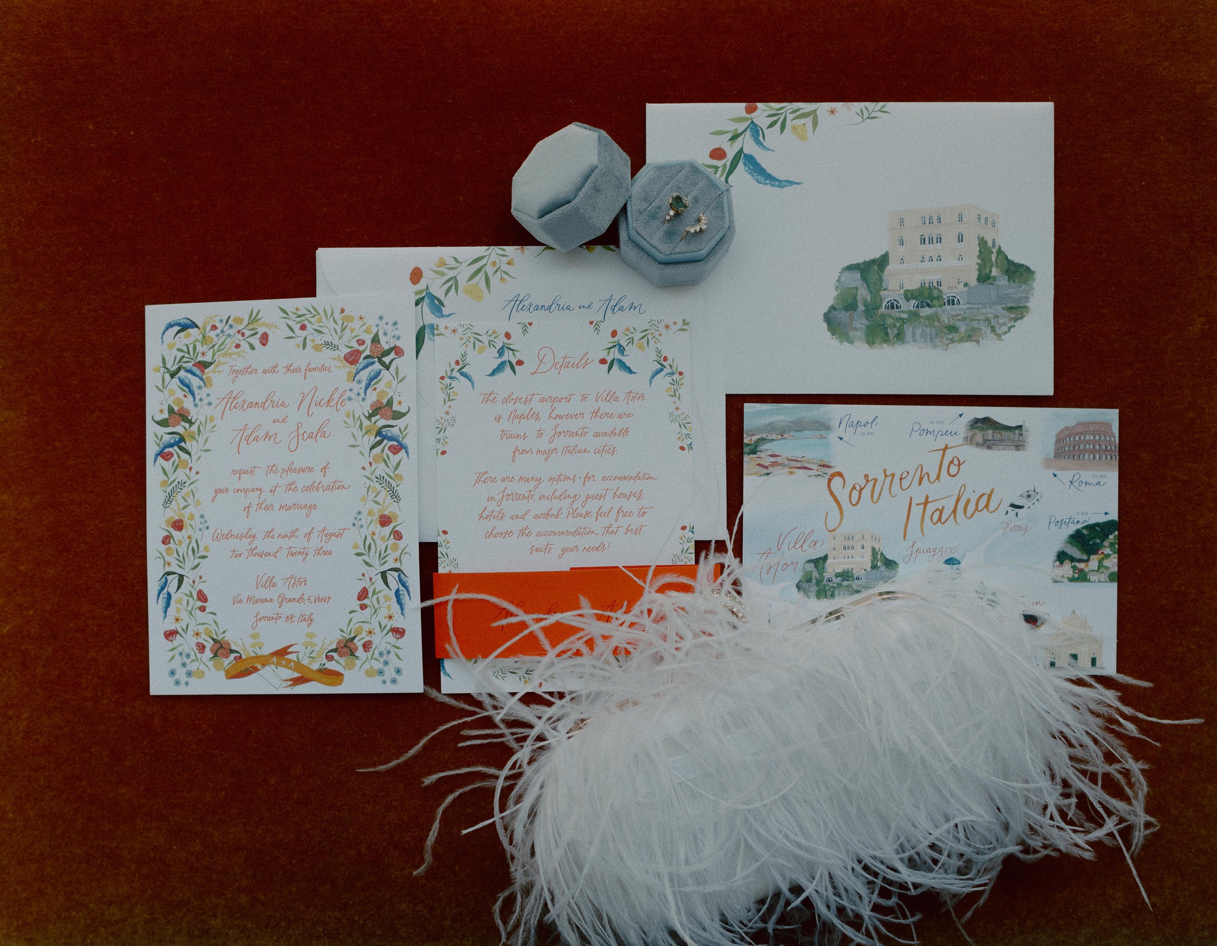
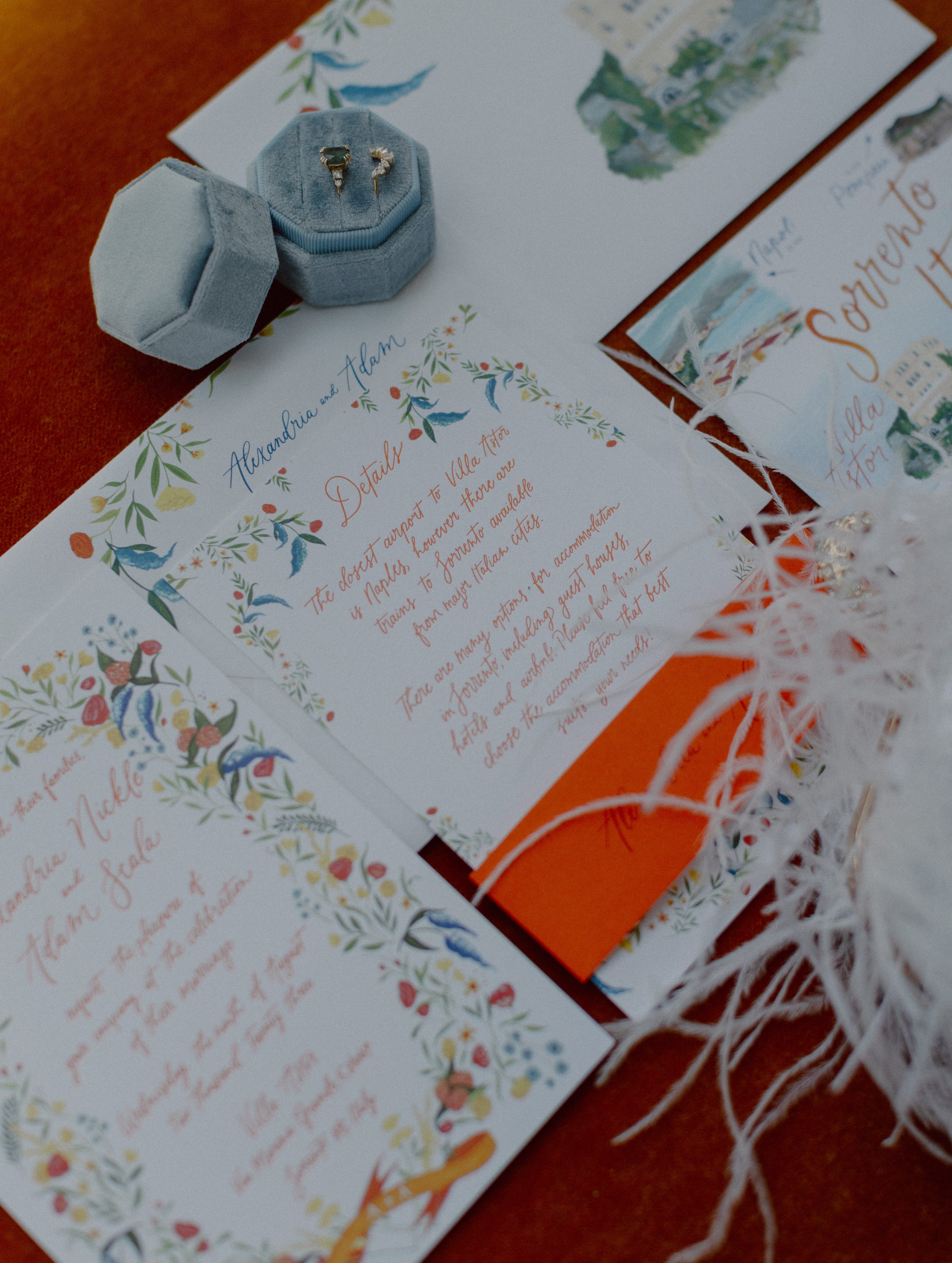
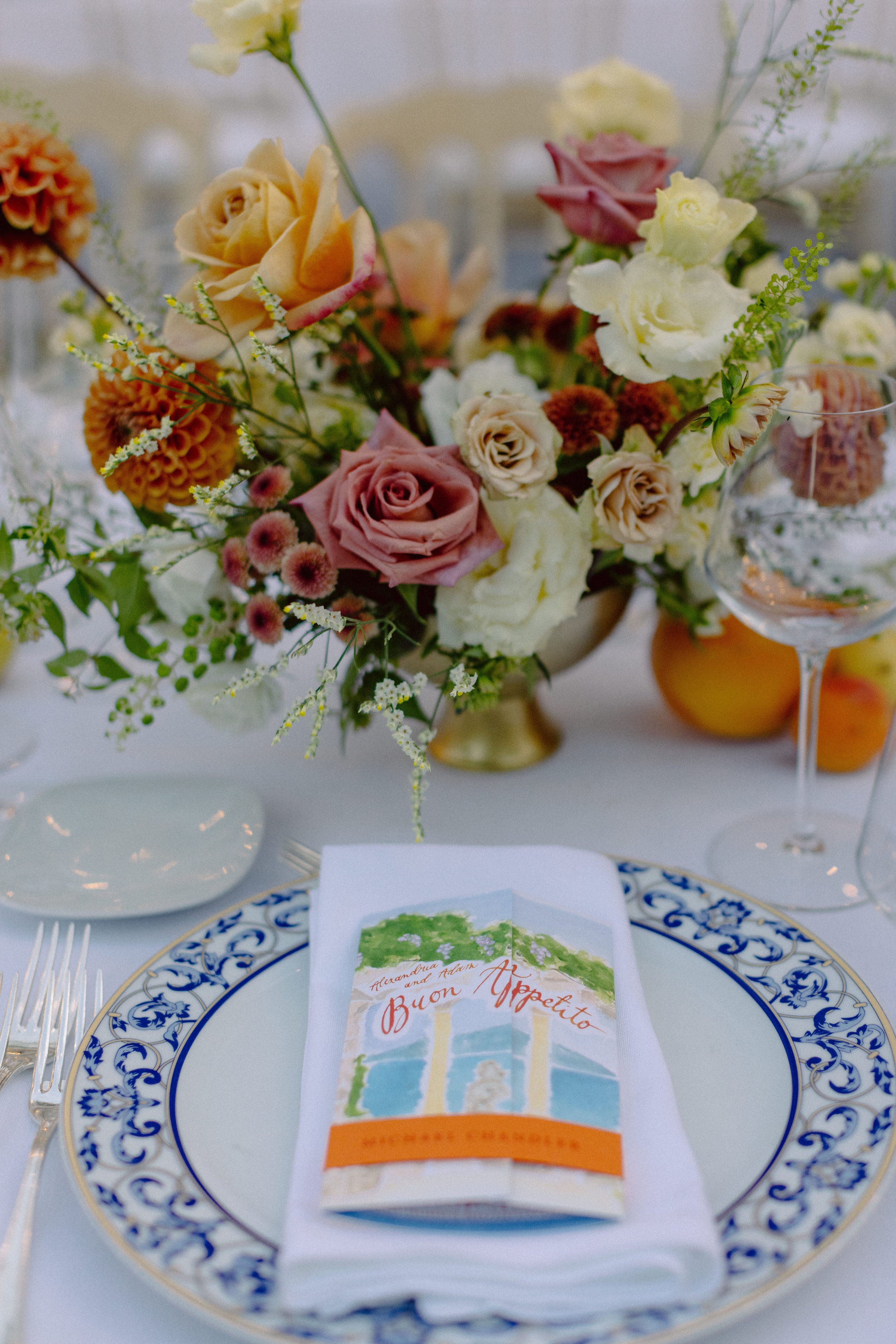
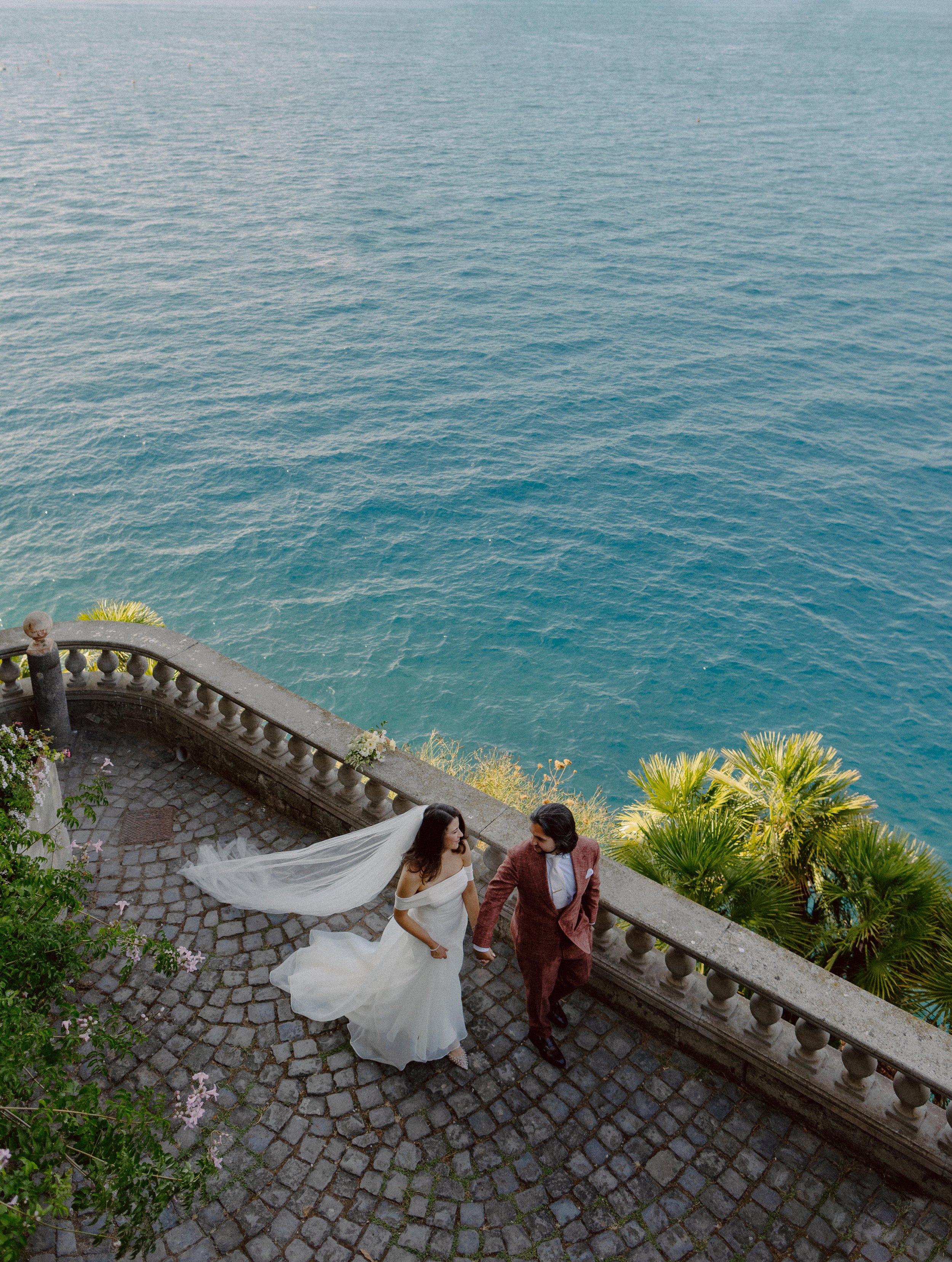
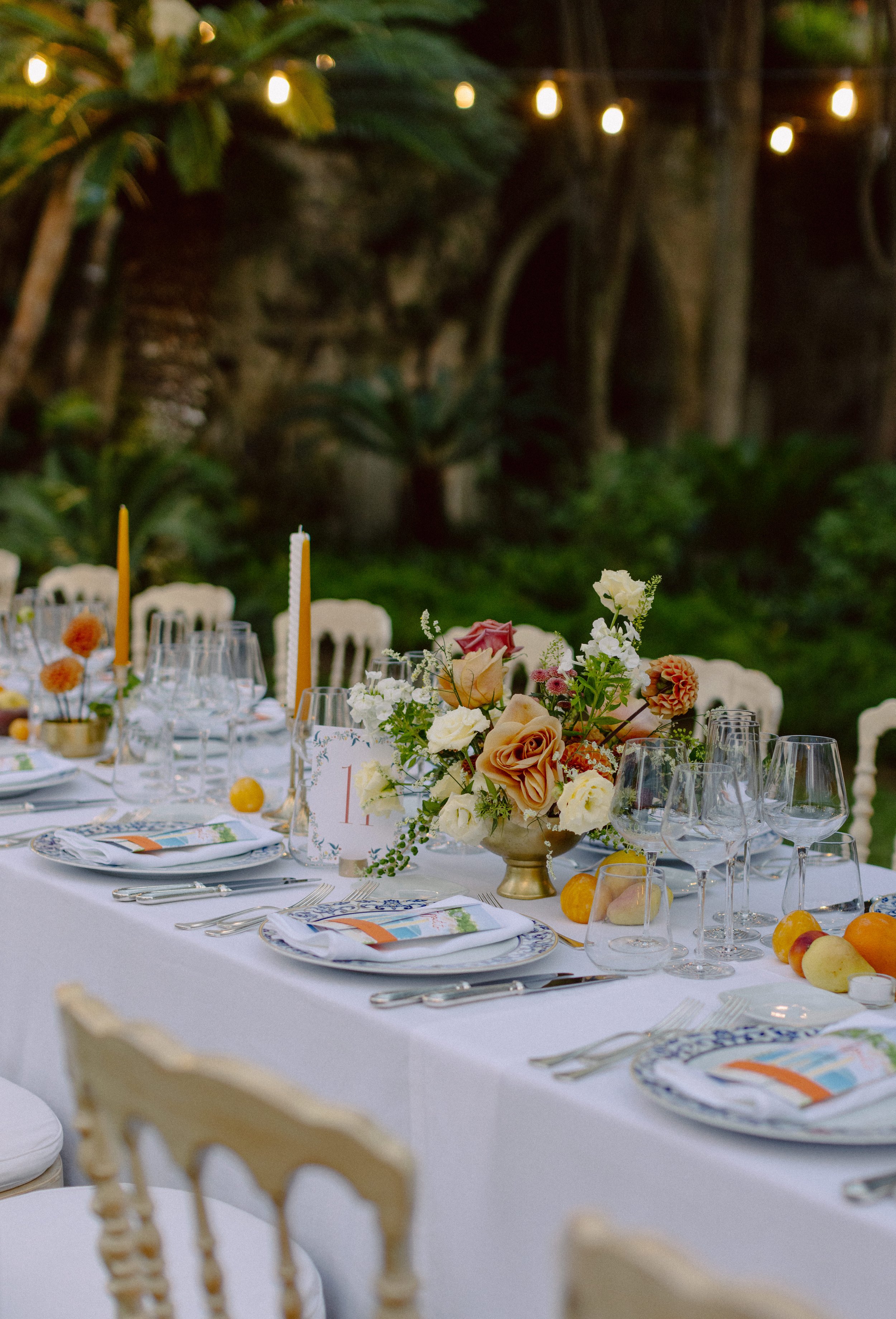
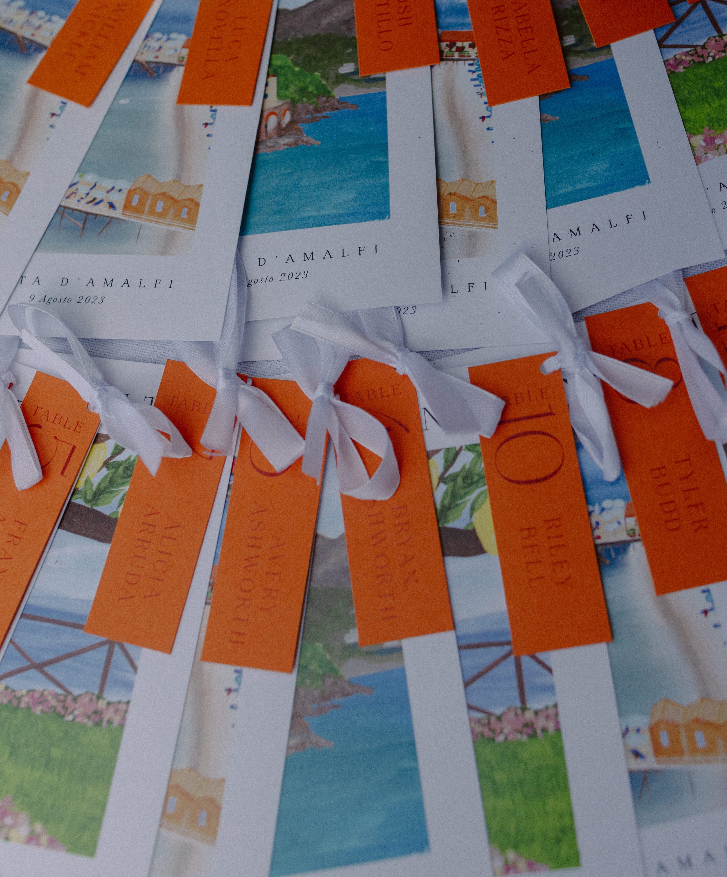
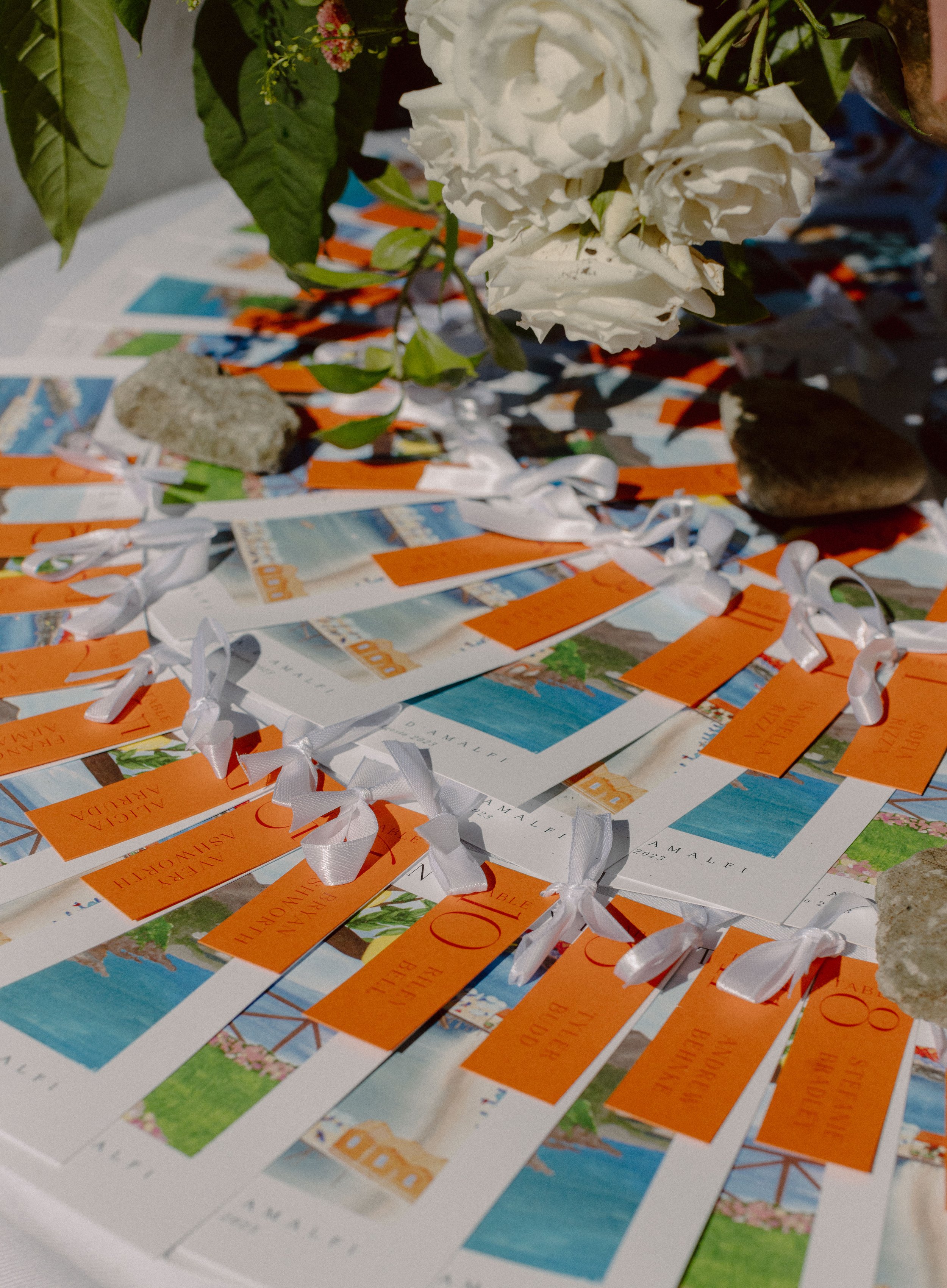
Lexy and Adam’s White Lotus-inspired invitations included a hand painted border, venue illustration and a map detailing areas around their wedding venue in Sorrento, Italy. Custom-painted postcards were fastened with guest names and table numbers to guide them to their seats, where each guest was greeted by a hand-painted bi-fold menu, with a painting of the view from the venue.
selina + frank
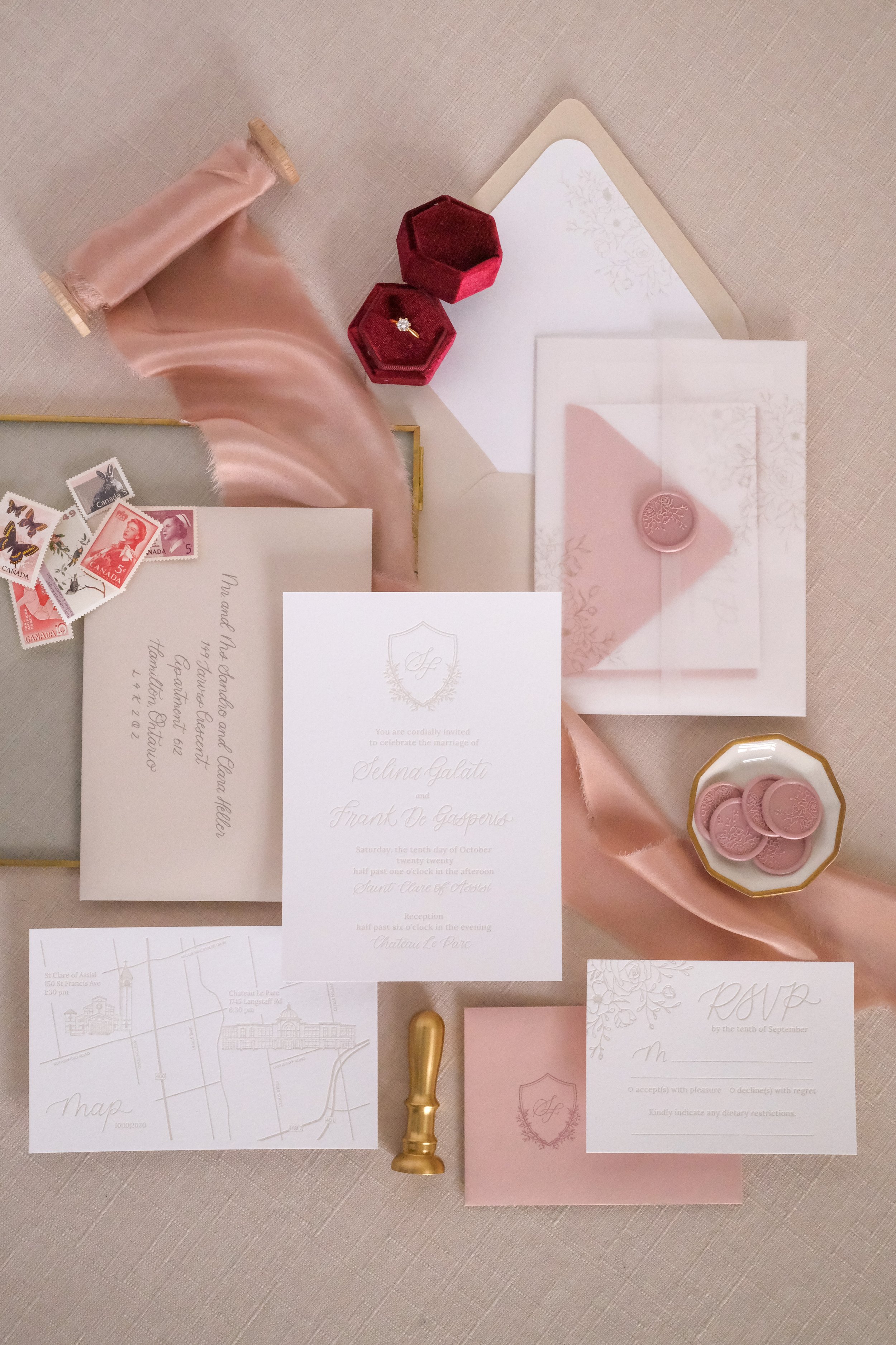
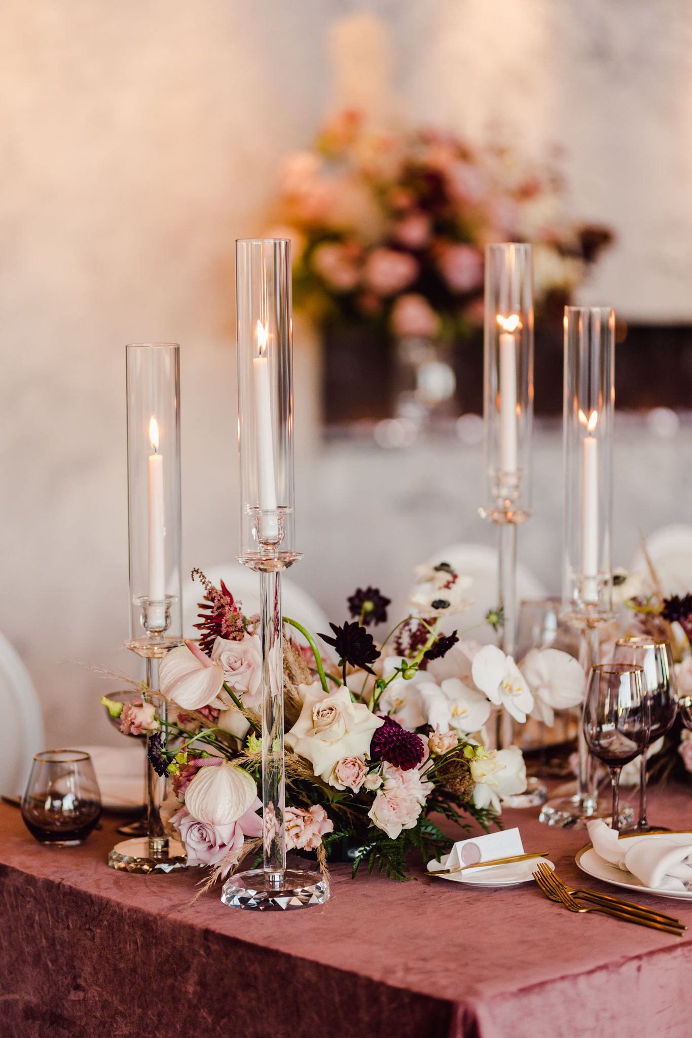
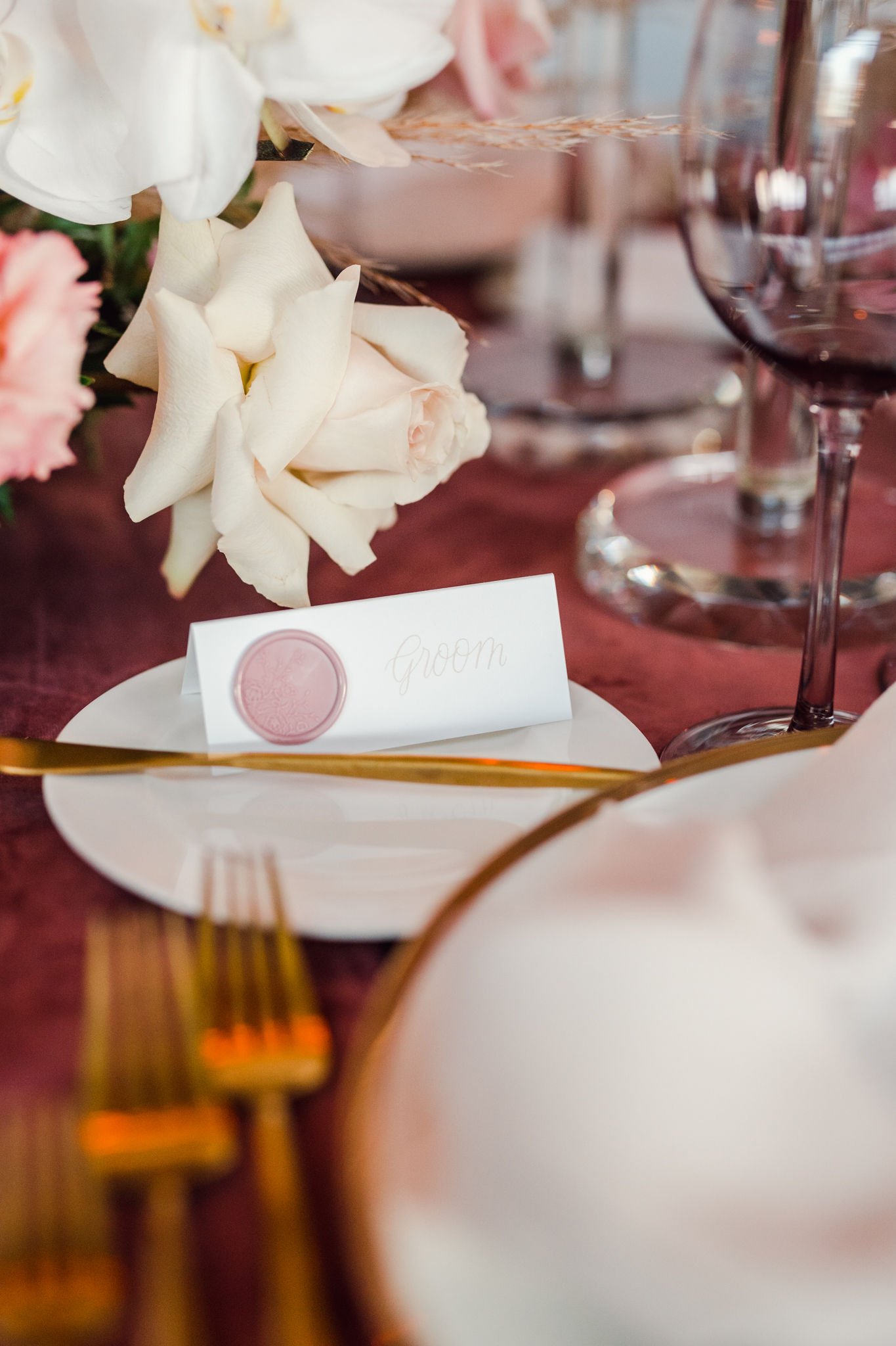
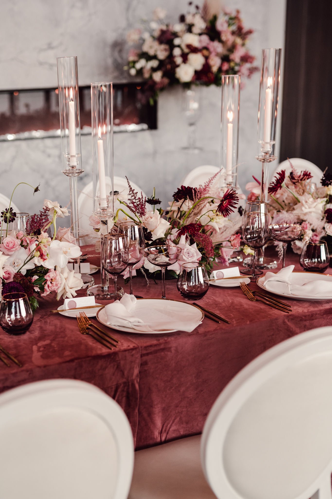
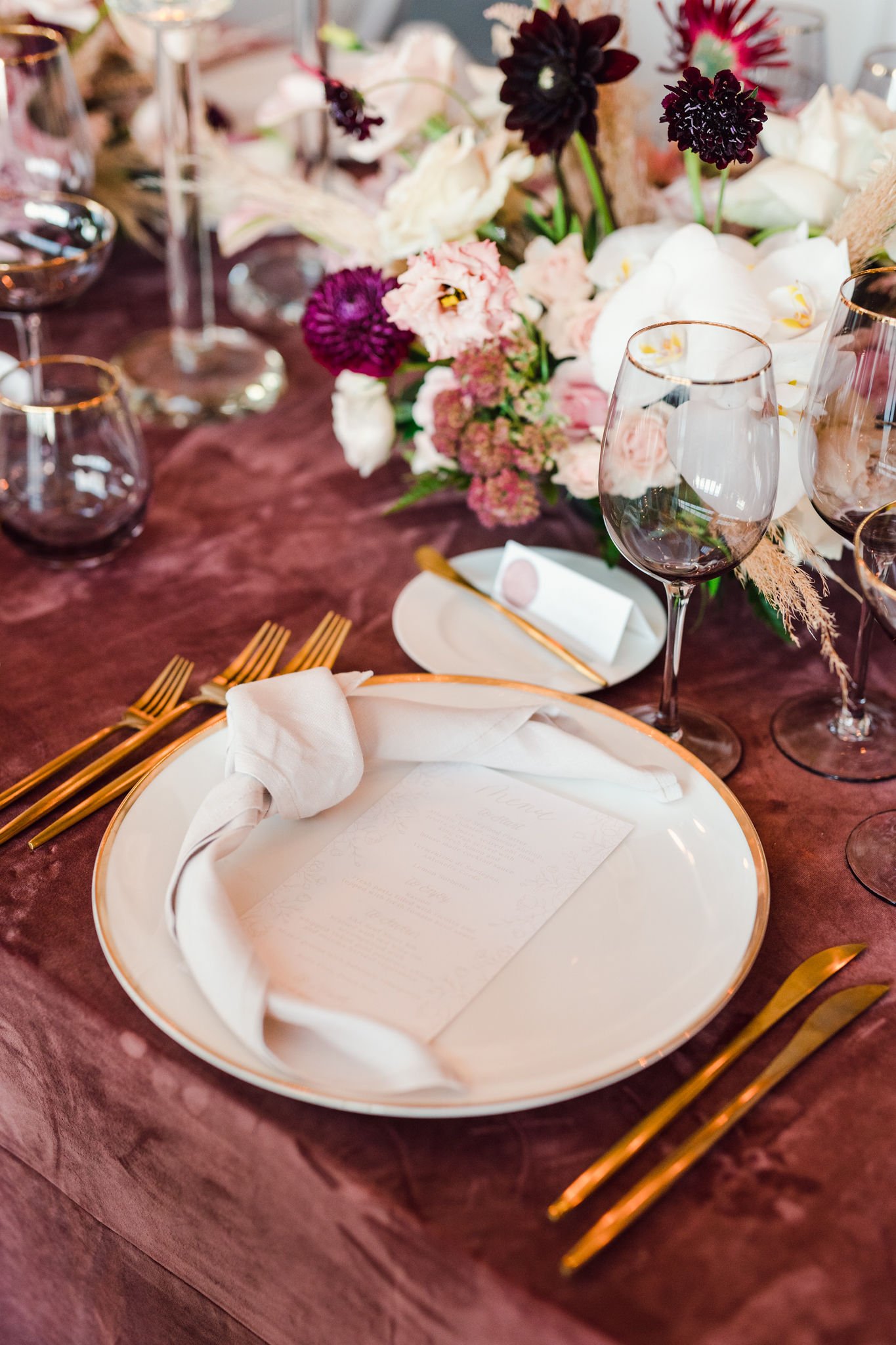
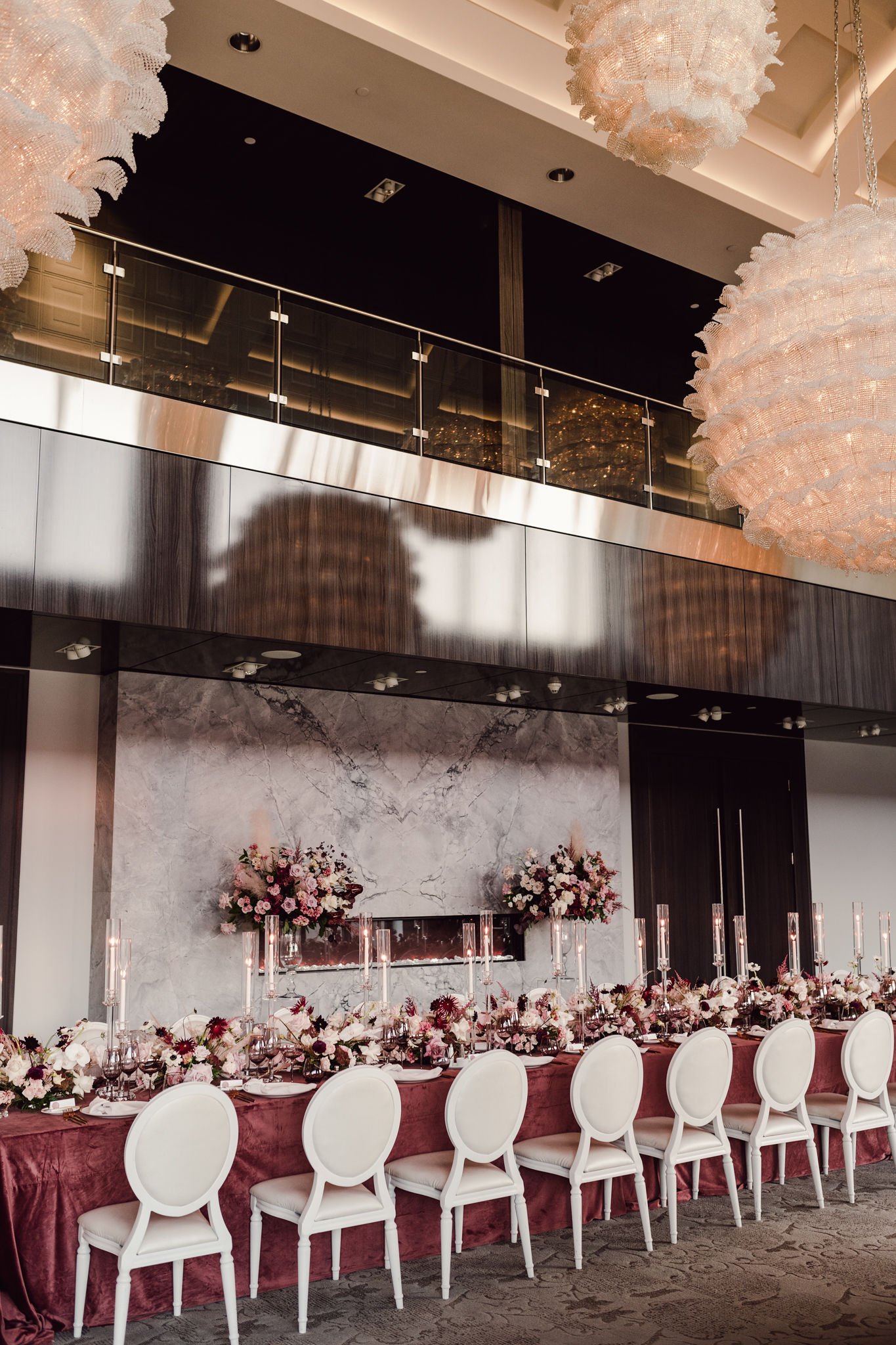
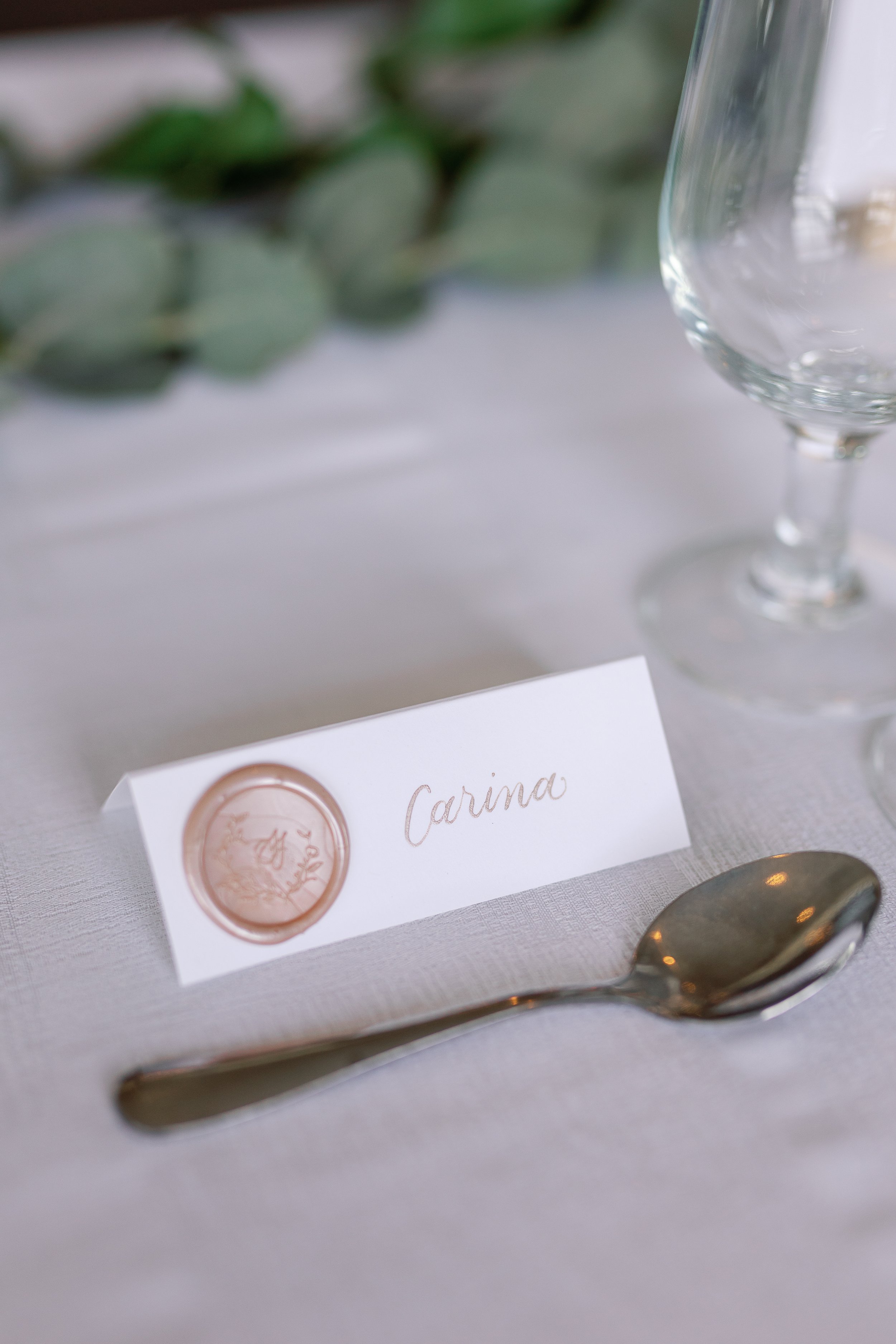
Selina and Frank’s wedding was a pink-lover’s dream. Their invitations were letter-pressed in a nude tone and featured a custom monogram, a hand-drawn map and soft pink details. Their day of stationery included wax seal place cards and nude-printed menus. Their table scape was defined by a duty rose velvet table cloth, glod dinnerware, florals in varying shades of pink and red, and tall tape candles throughout.
jax + alex
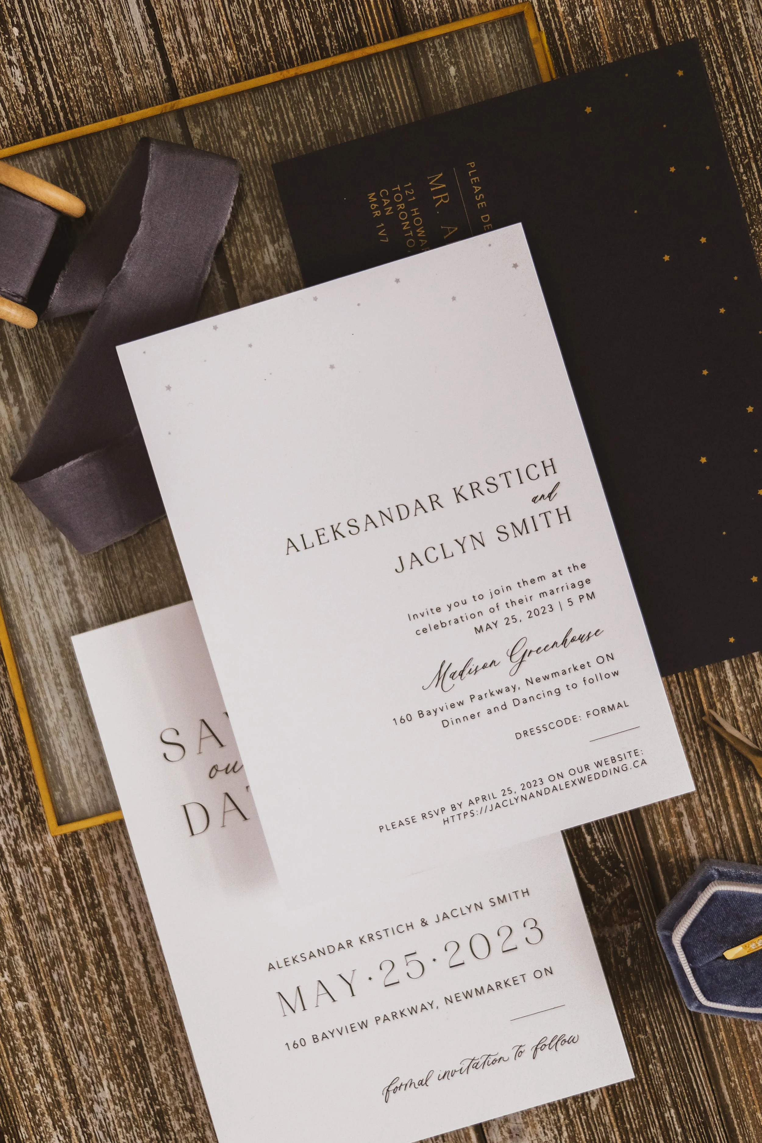
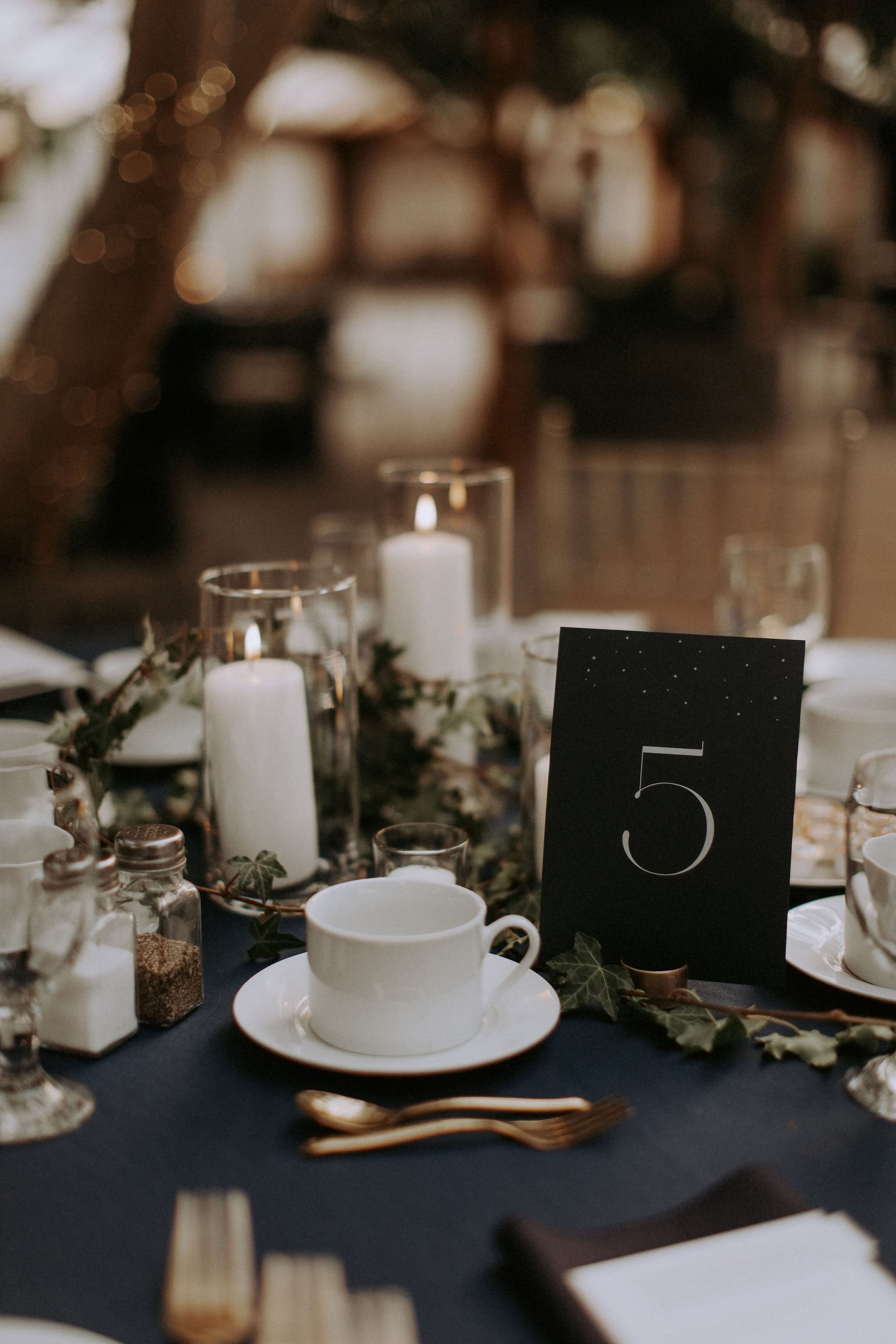
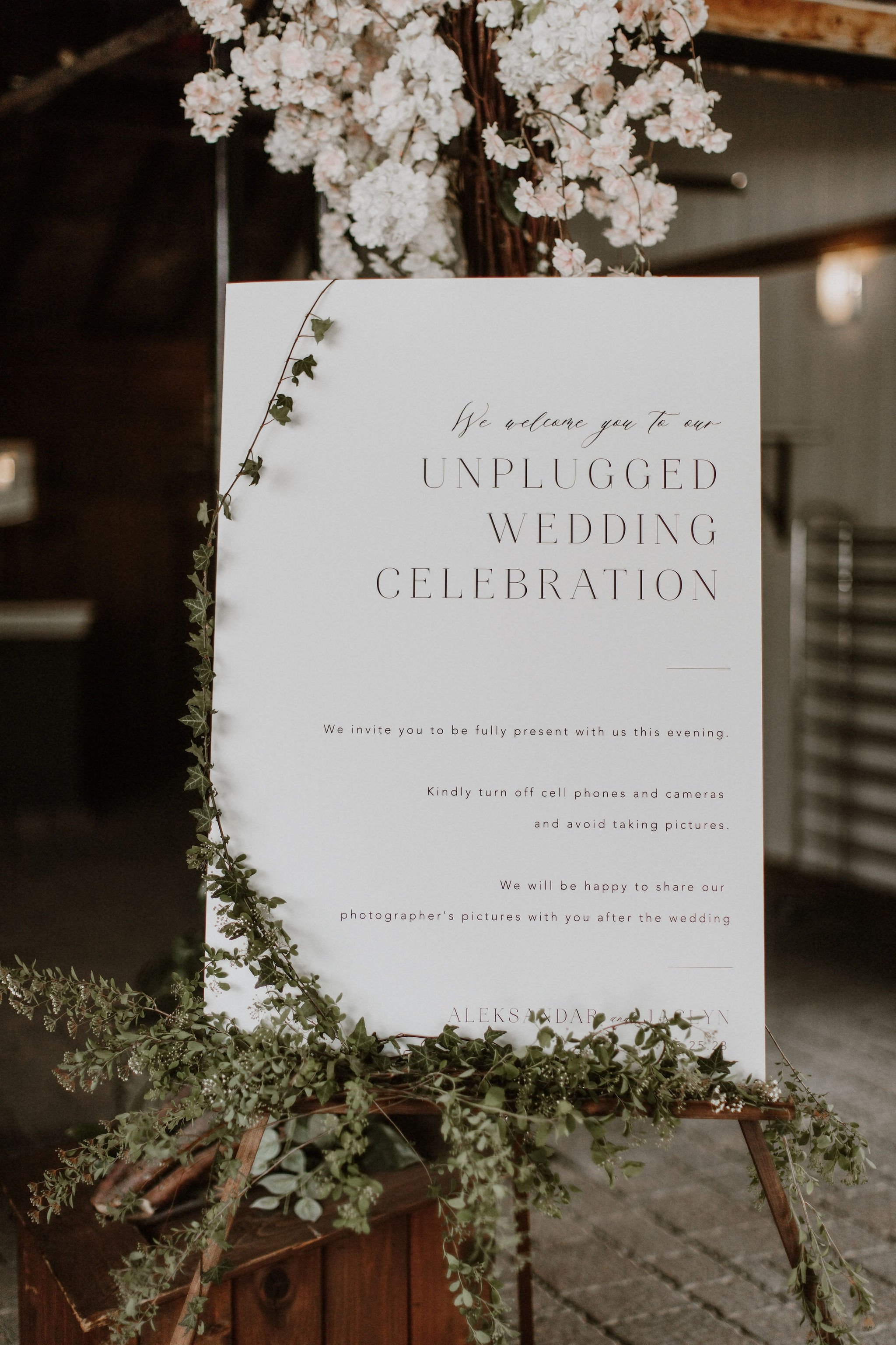
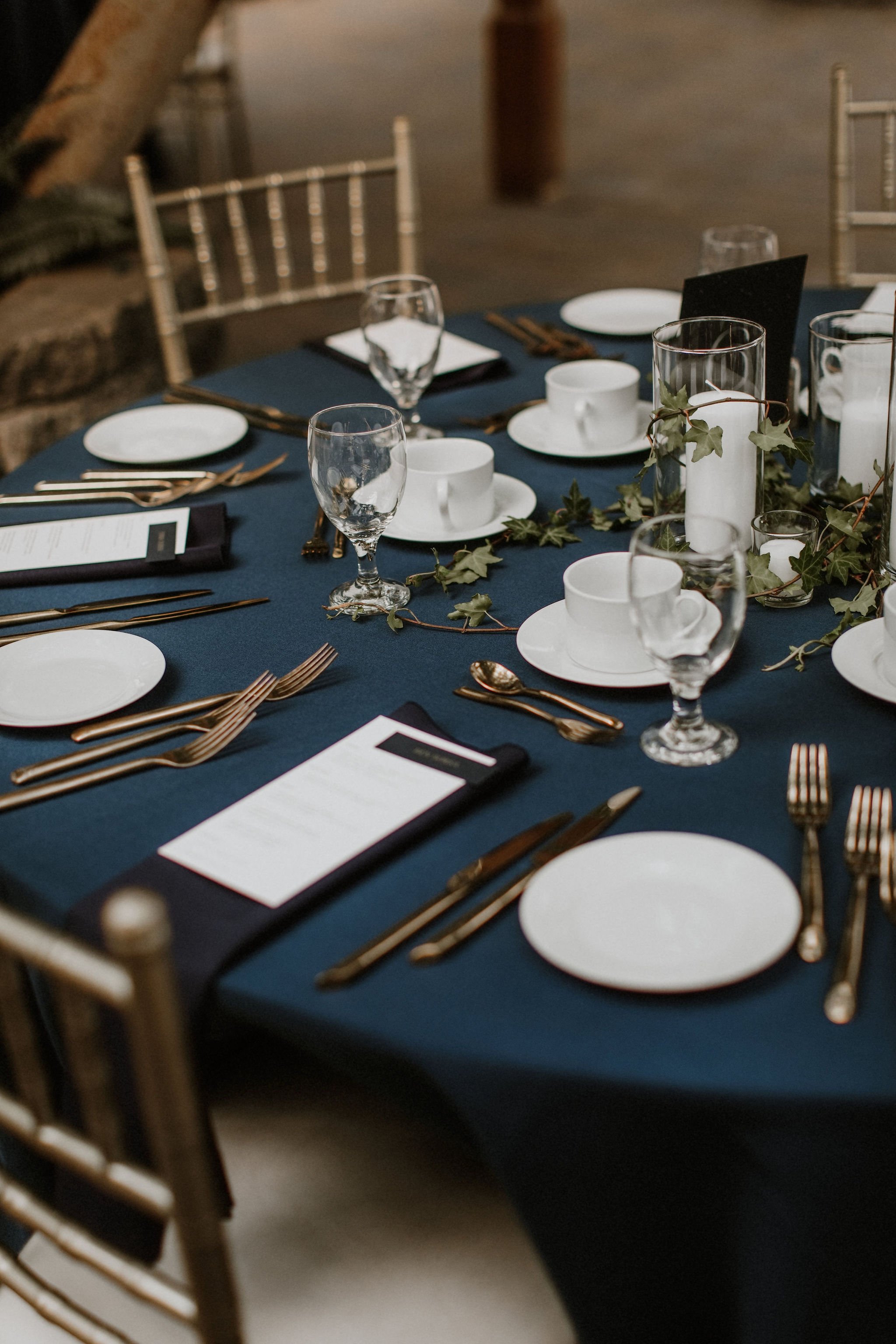
Jax and Alex’s Madison Greenhouse wedding stationery was inspired by the stars in the sky on a clear night. Their stationery was simple, with calligraphy accents, a navy envelope and gold-printed stars. The theme of their custom wedding invitations extended through to their day-of stationery with a large seating chart and menus which also features small star details.
lauren + peter
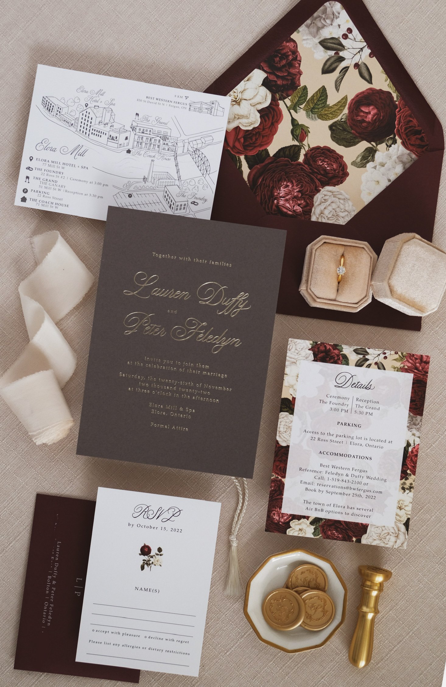
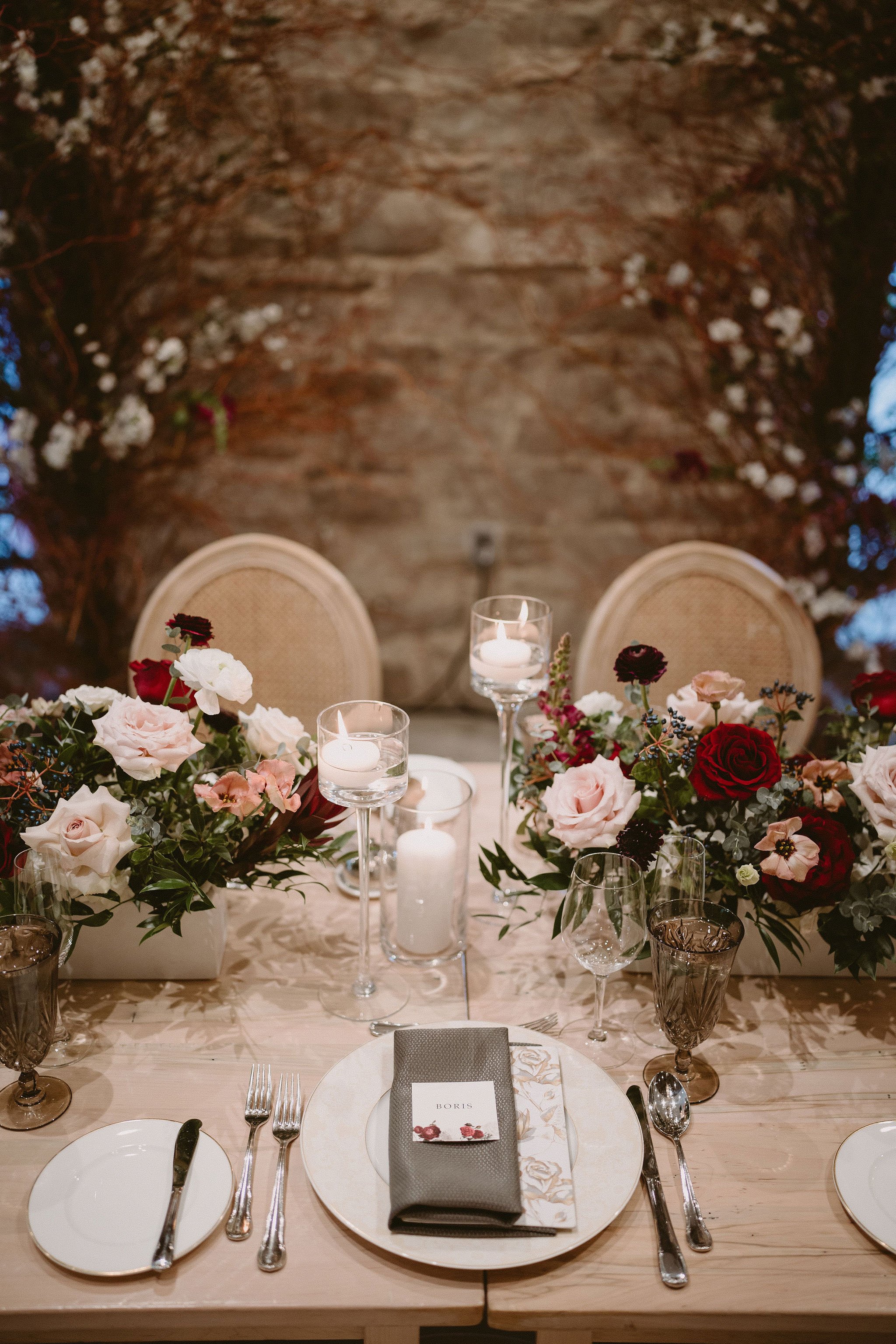
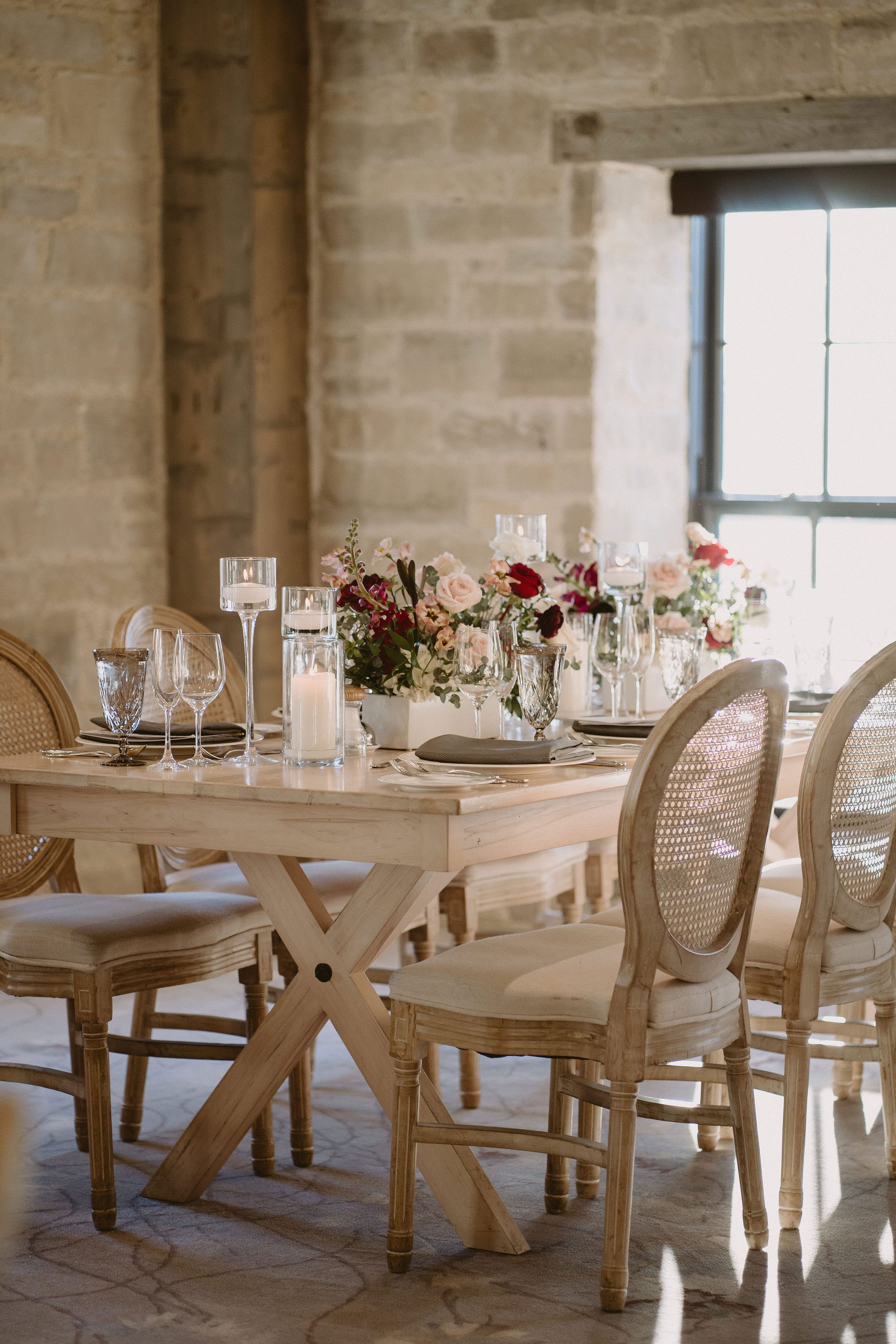
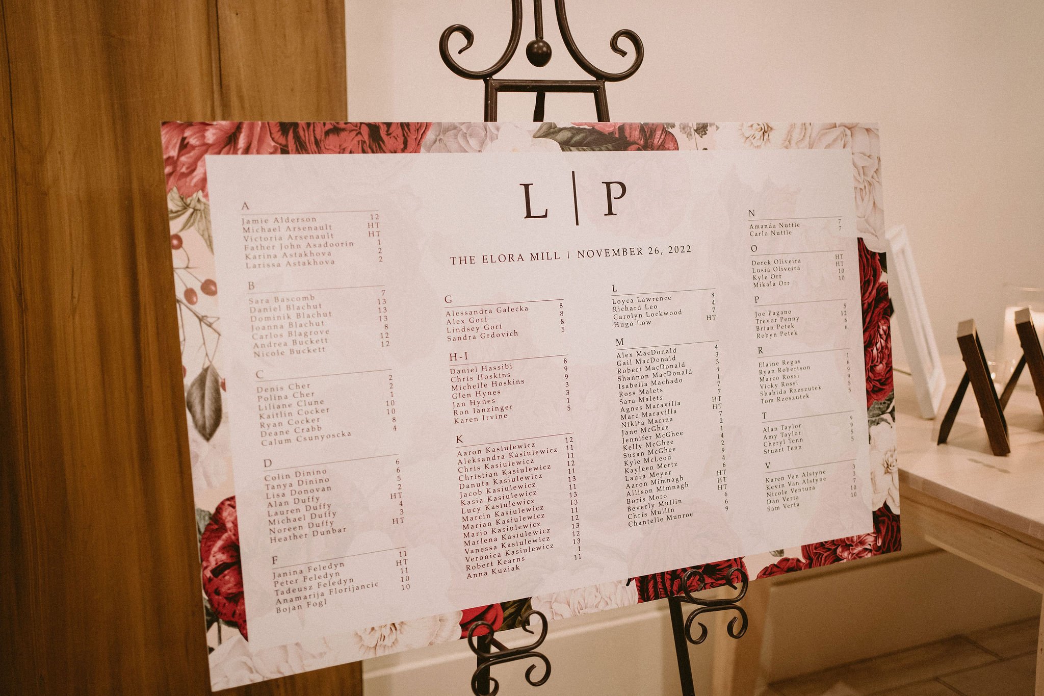
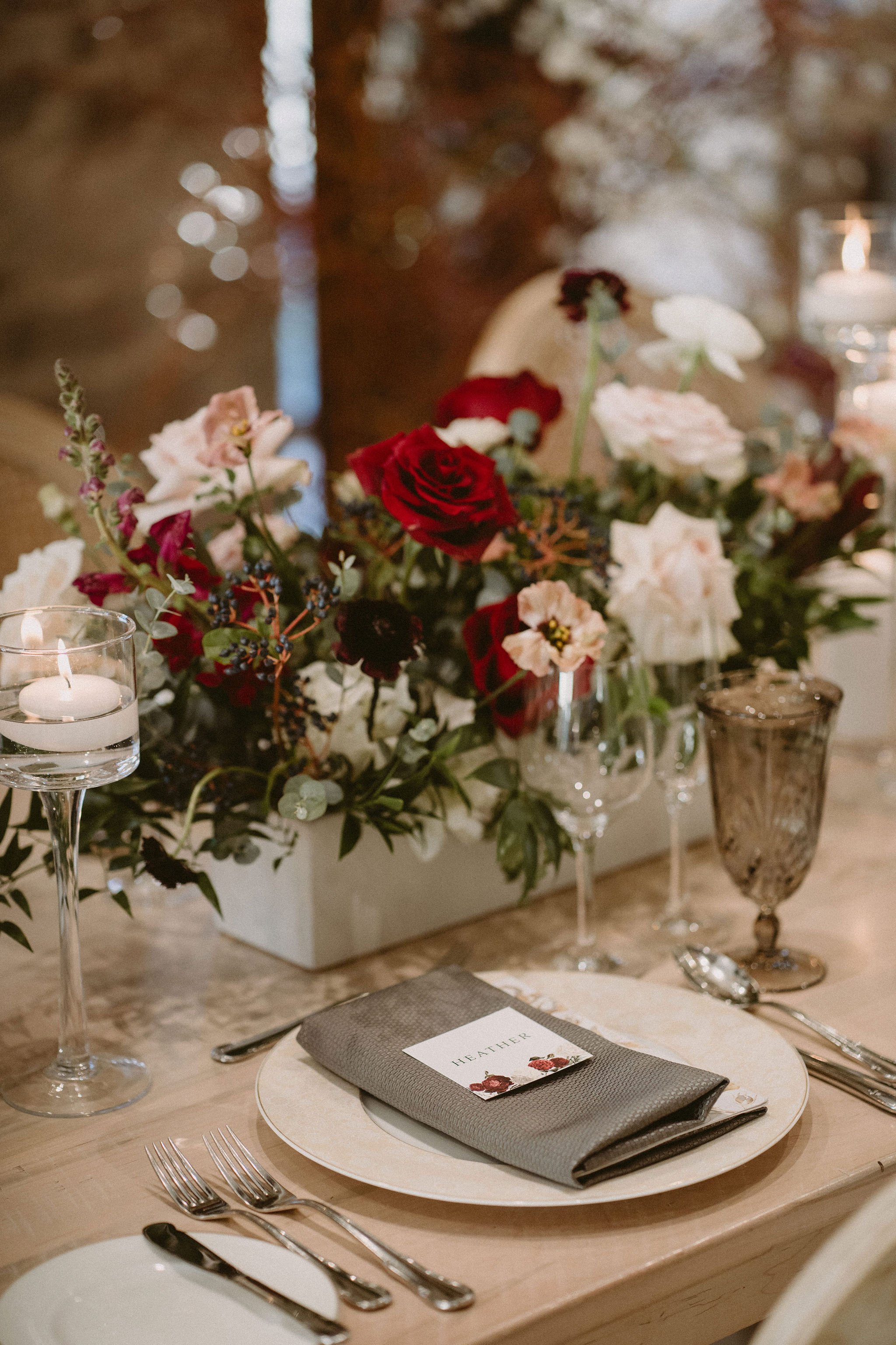
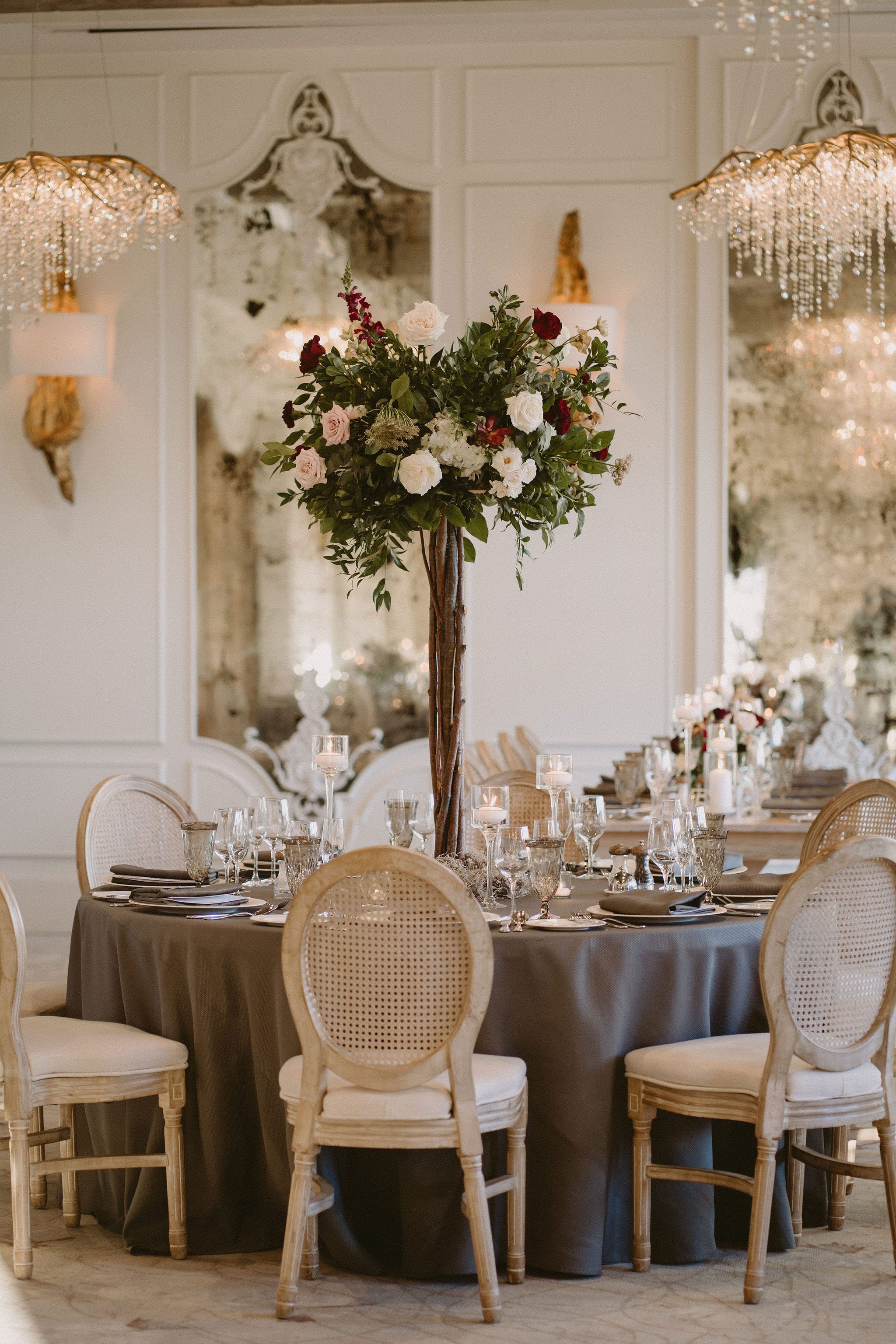
Lauren and Peter’s wedding invitations featured grey main card with gold foil press, a hand-drawn map of their venue at Elora Mill, and deep red tones through their envelopes and floral-print design. Their wedding was cozy and romantic, with low florals and taper candles, wicker chairs and grey napkins.
haleigh + tom
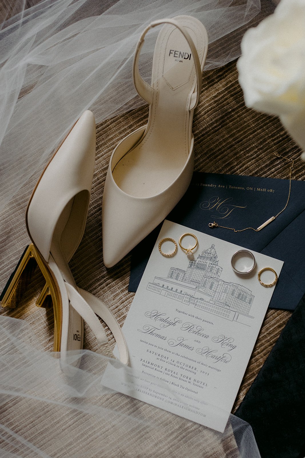
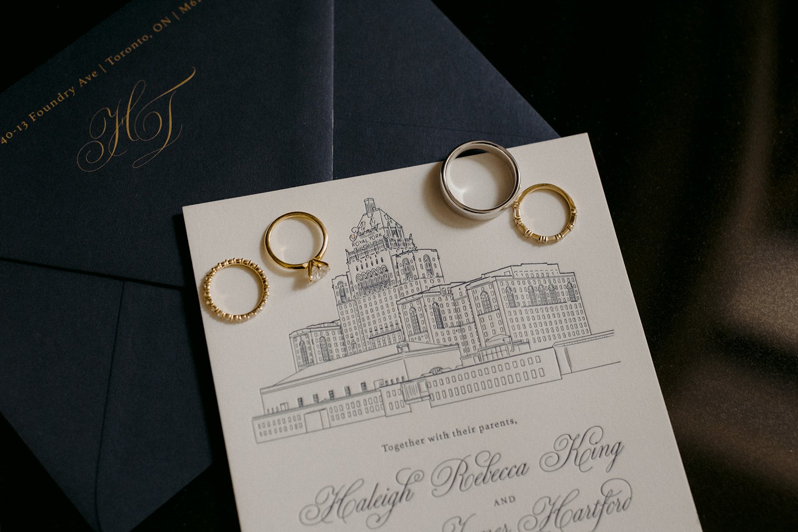
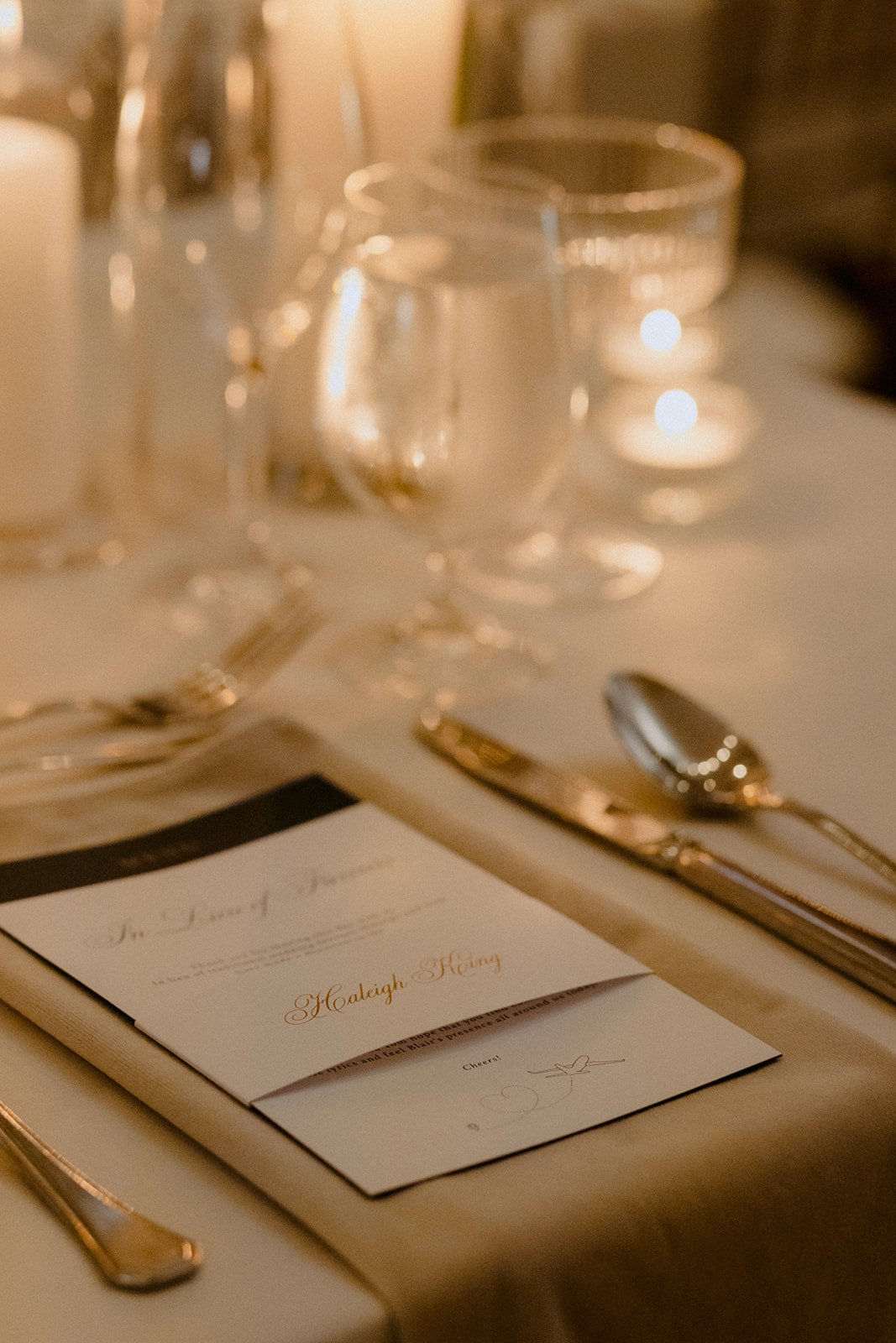
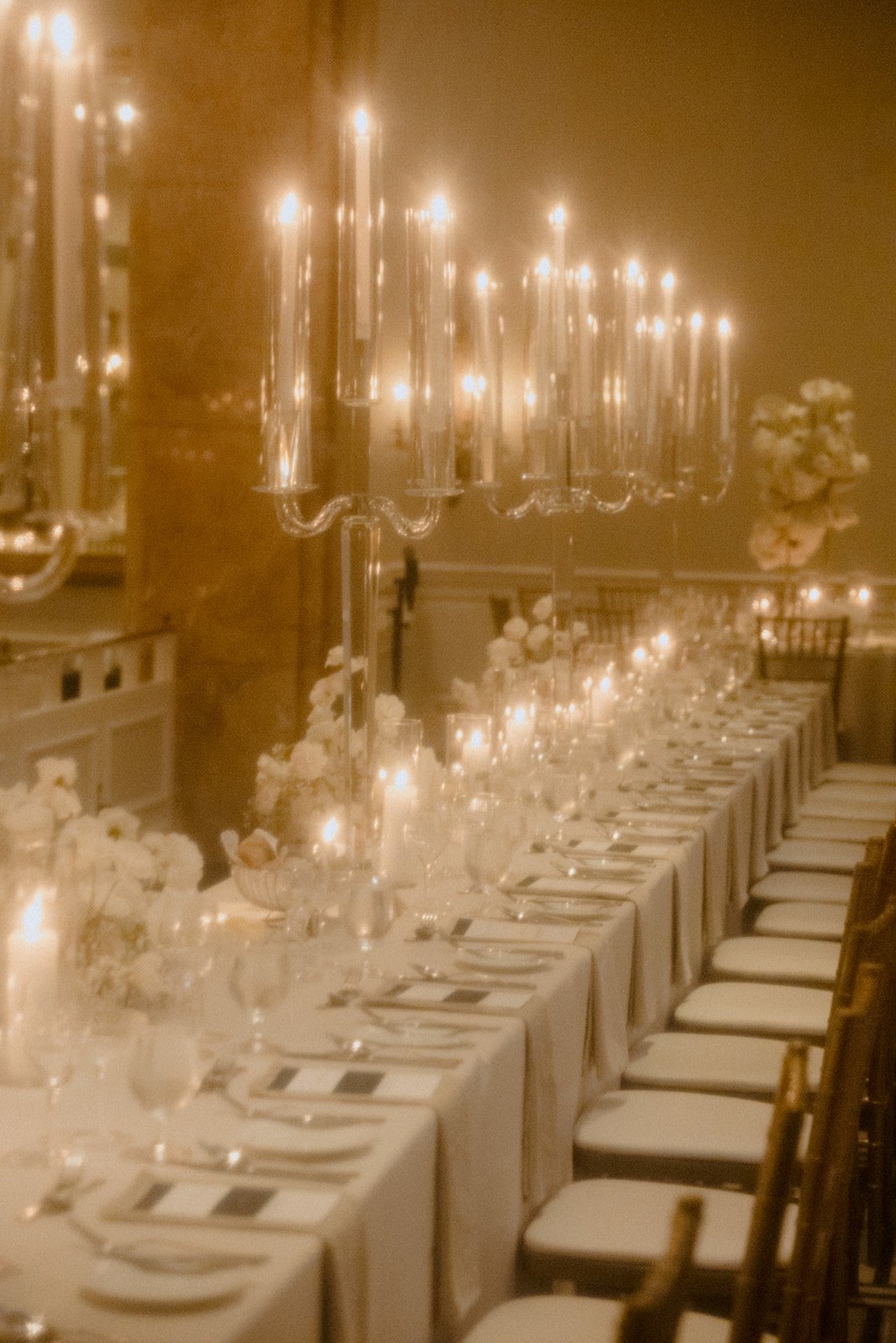
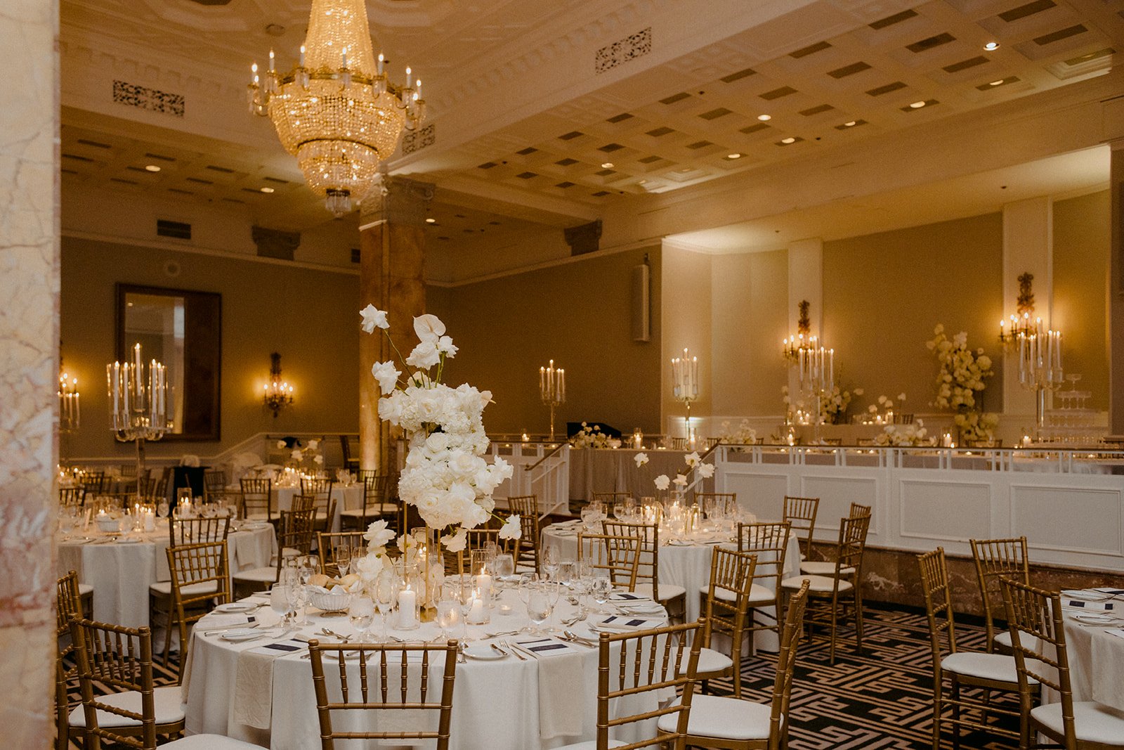
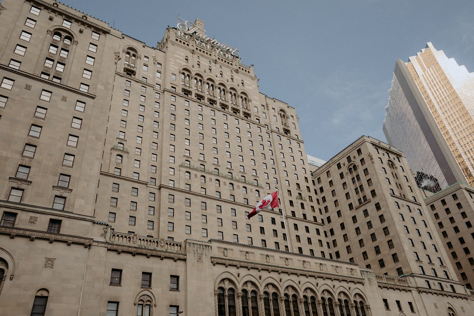
Haleigh and Tom’s custom wedding invitations featured an elegant and traditional script and a hand-drawn illustration of the Fairmont Royal York. Gold printing was introduced to add an extra level of luxe to their stationery. Their day-of details included tall tapper candles, white florals and a menu and personalized note at each seat.
courtney + zachary
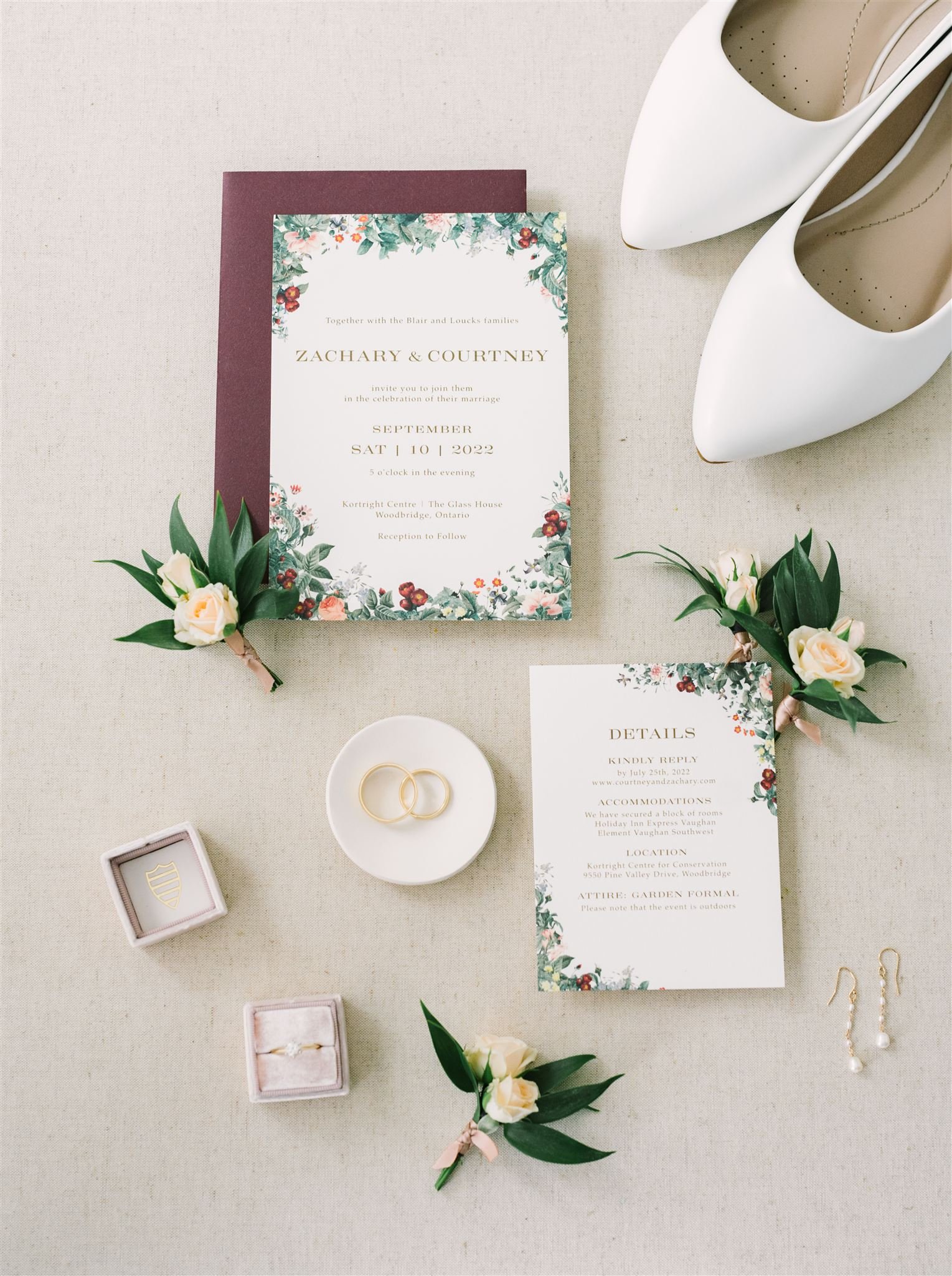
A beautiful blend of classy and greenhouse, Courtney and Zachary were married
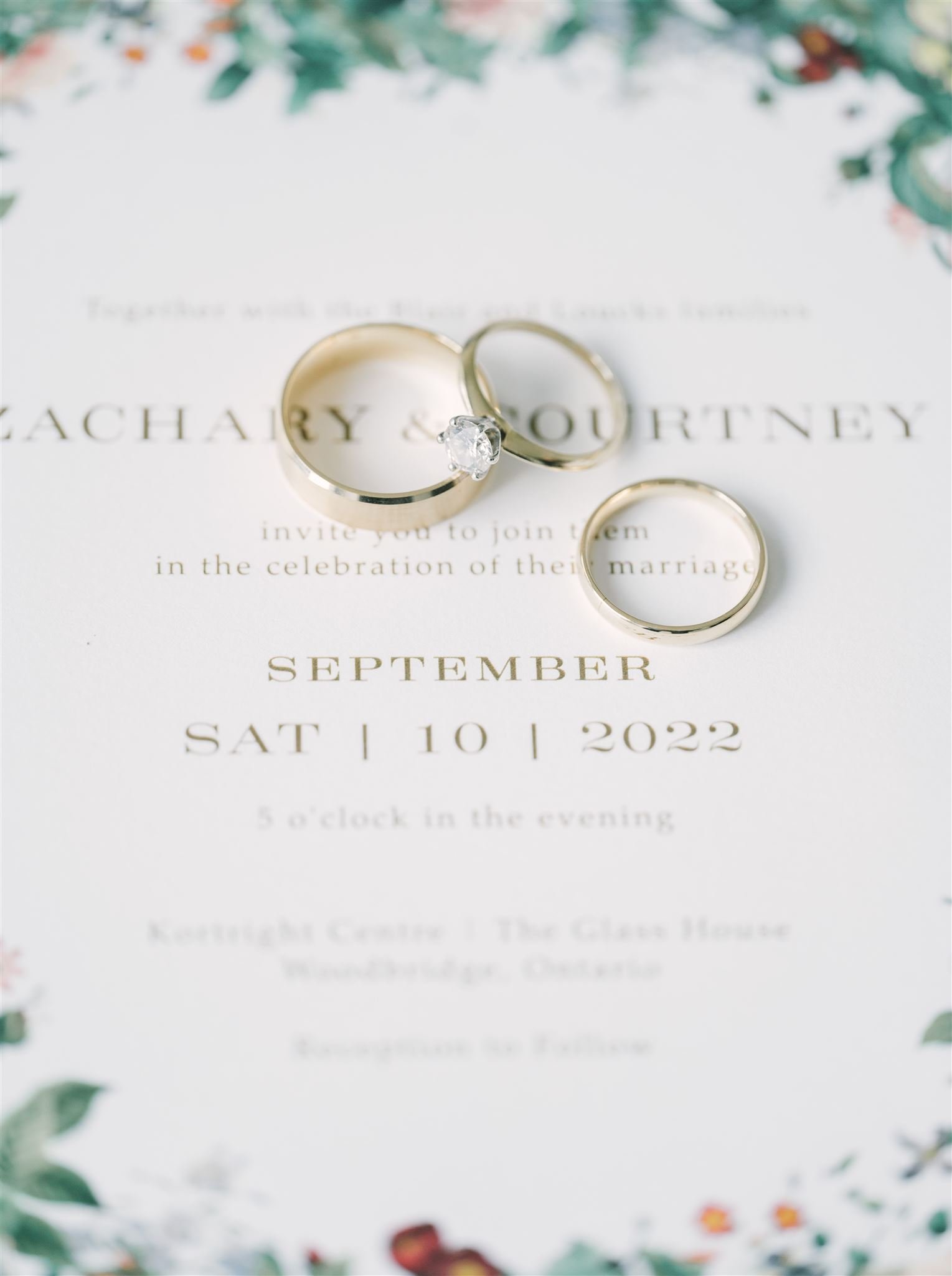
Their invitations were printed on off-white paper and featured baroque florals, giving them a very traditional feeling and aesthetic.
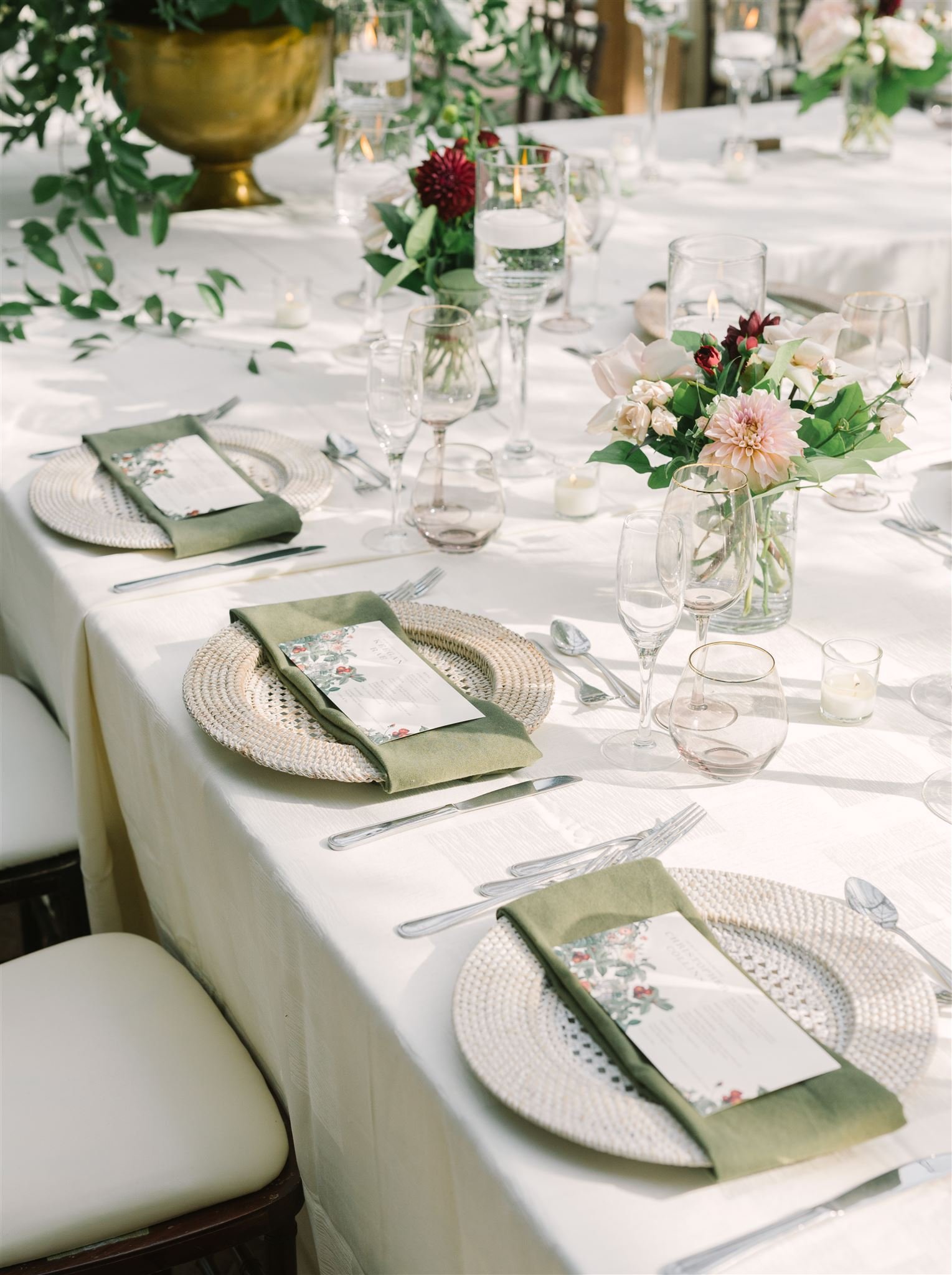
Their day-of stationery included the same baroque florals on personalized landscape menus.
silvia + michael
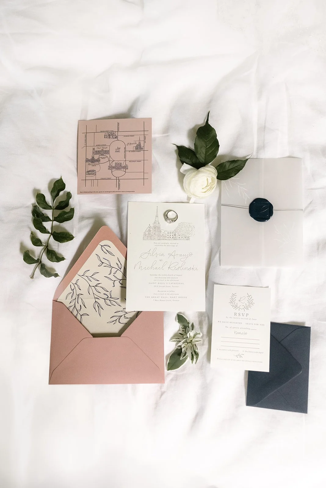
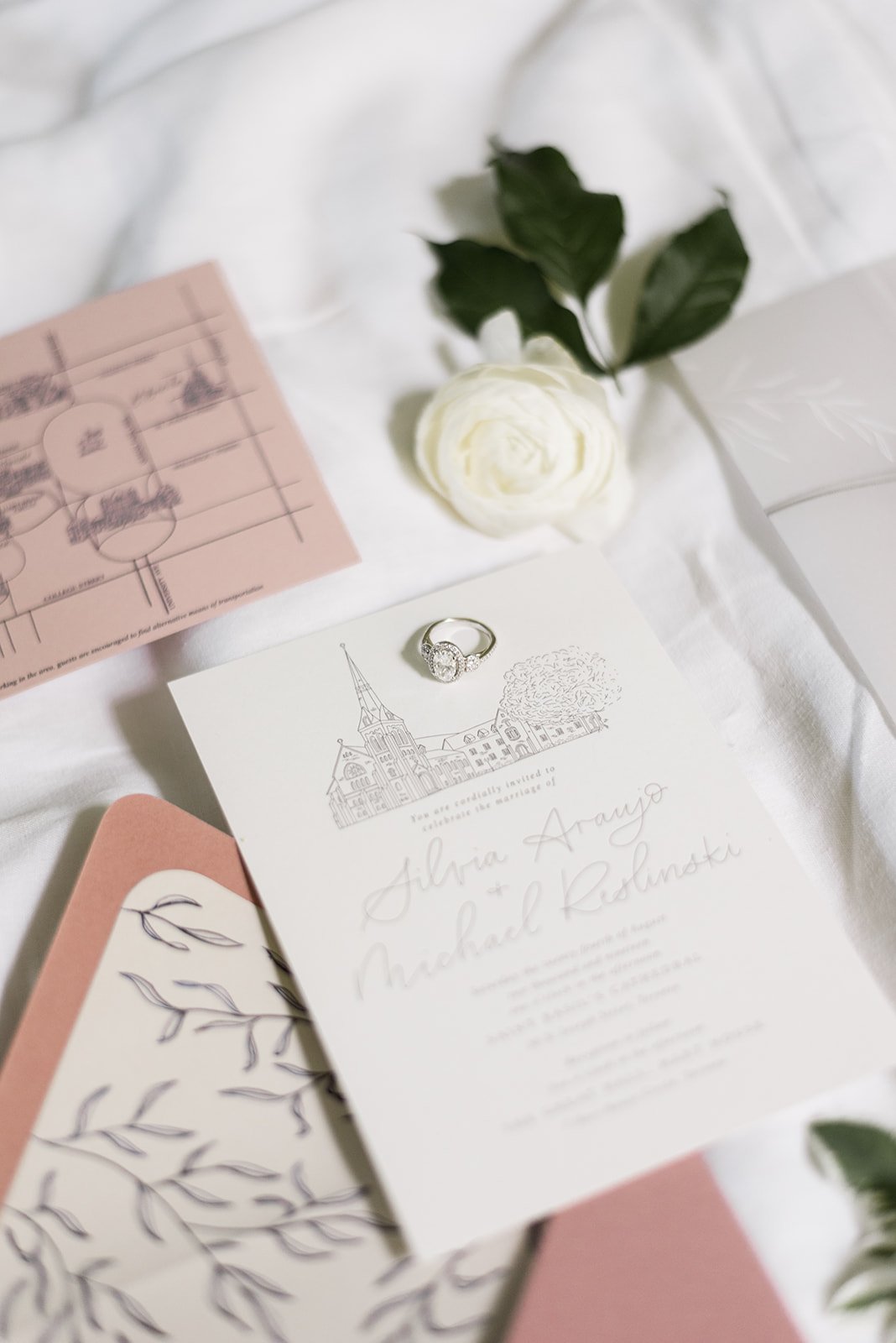
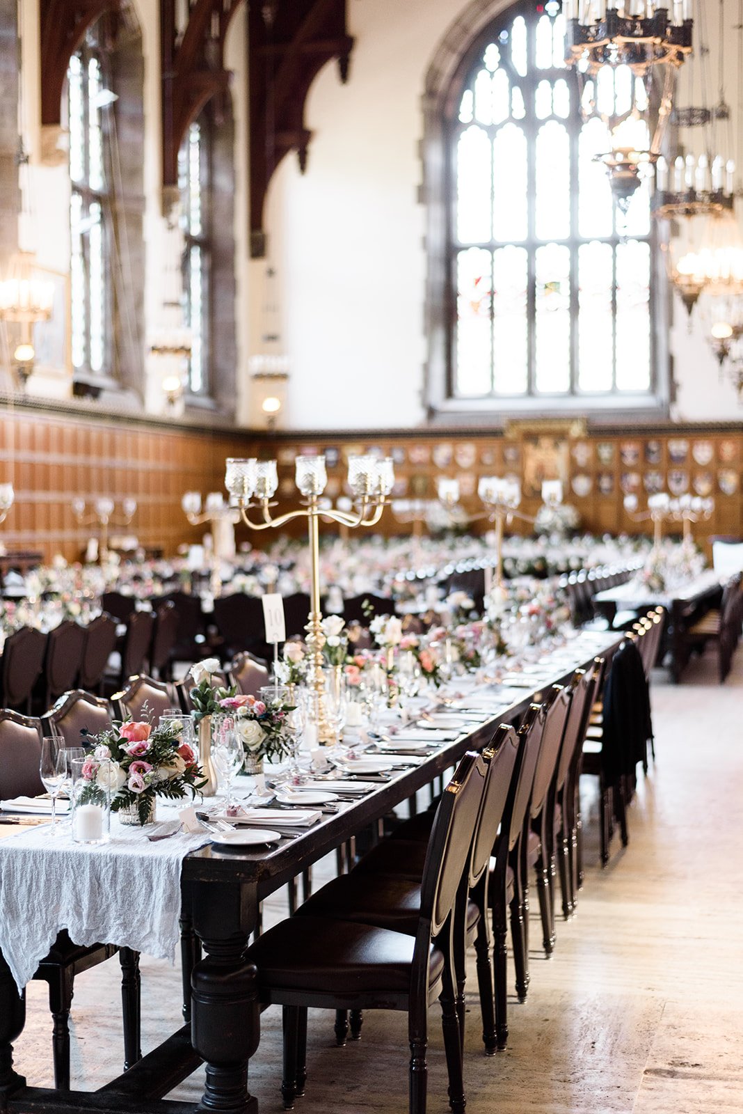
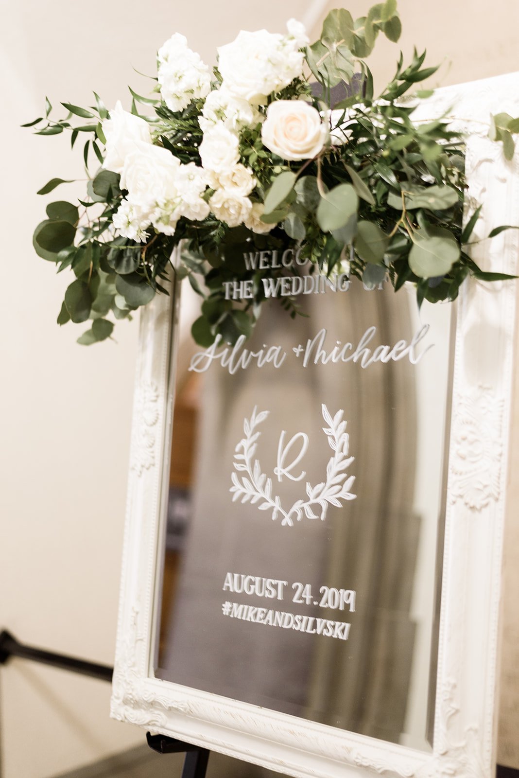
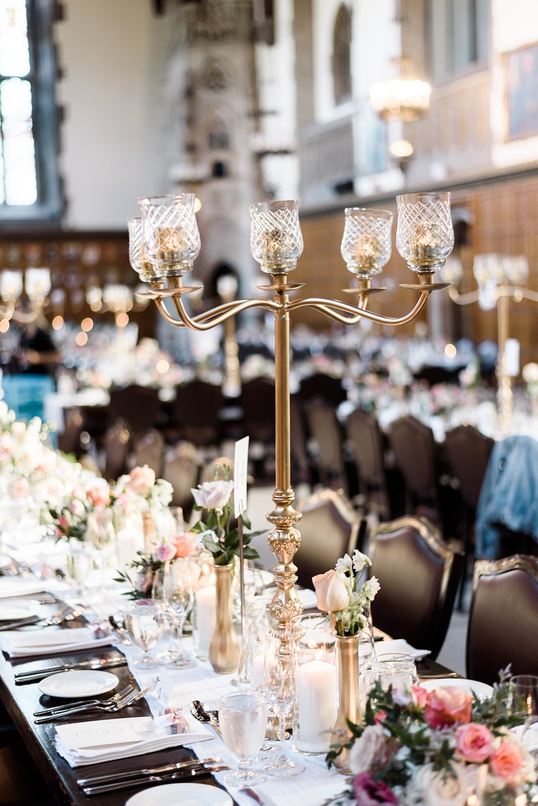
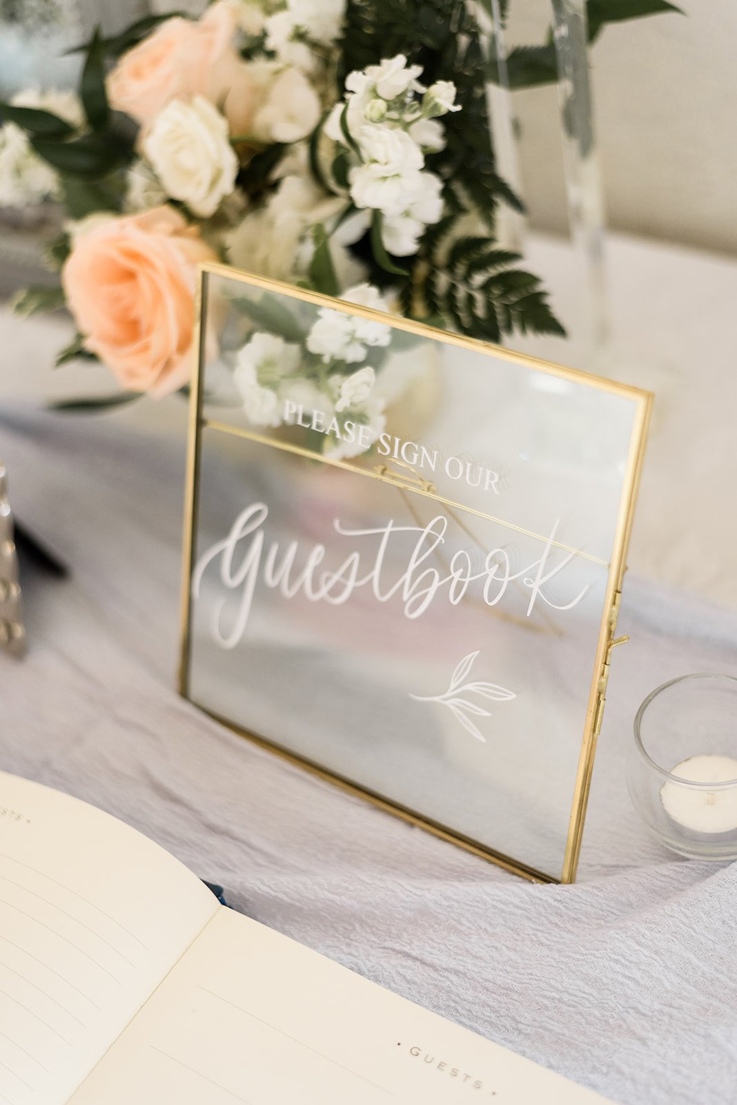
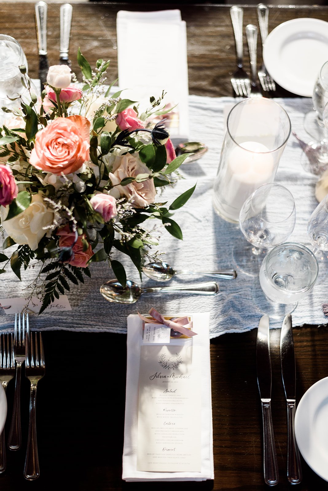
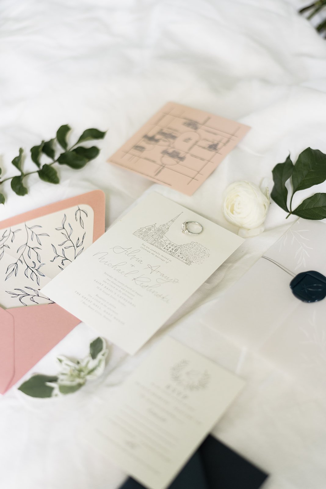
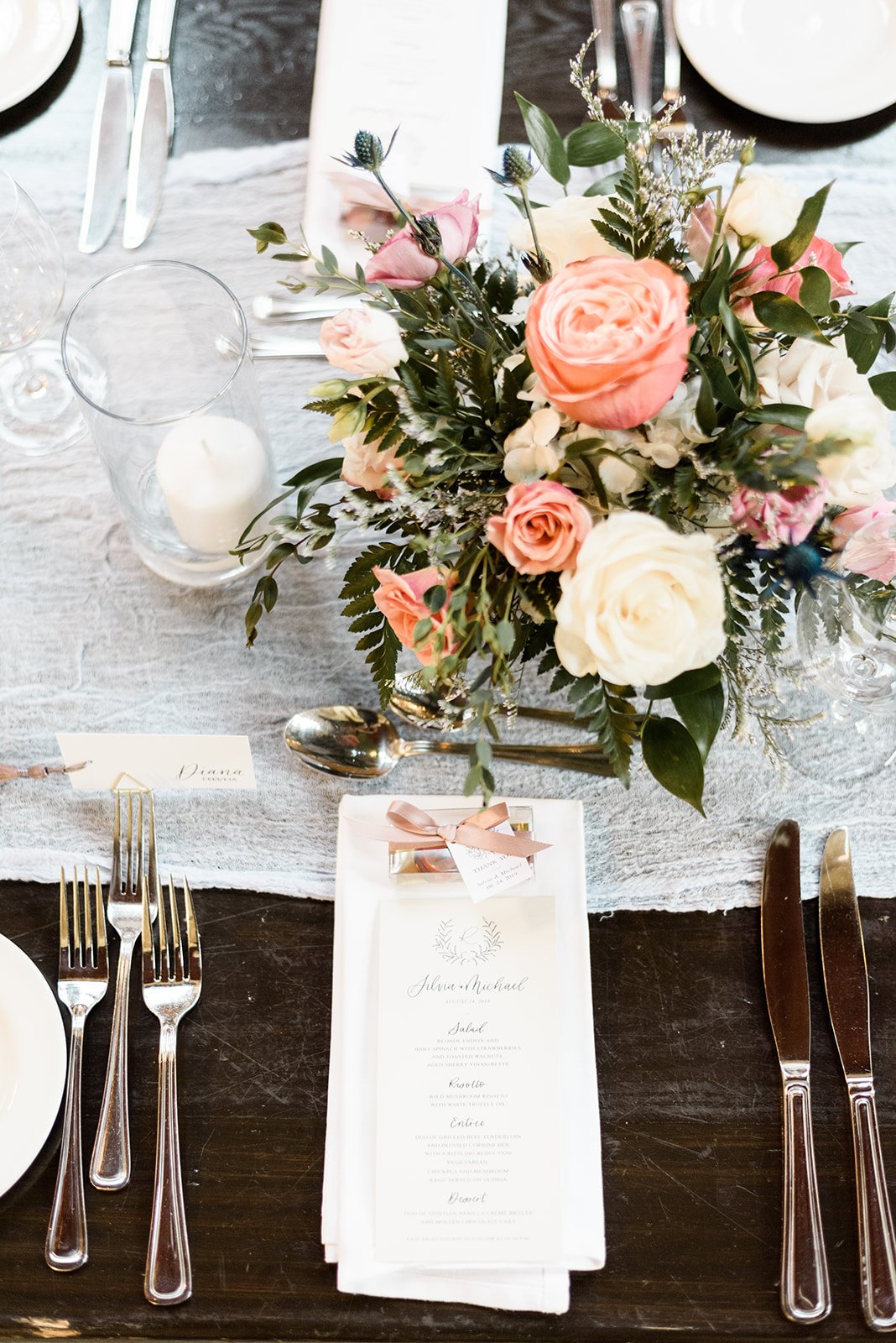
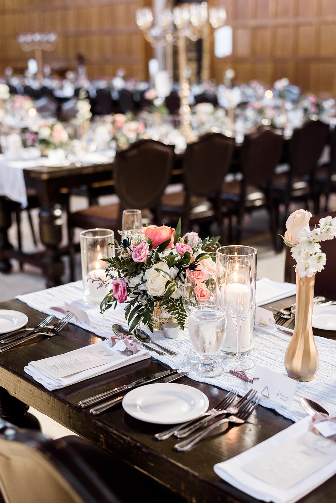
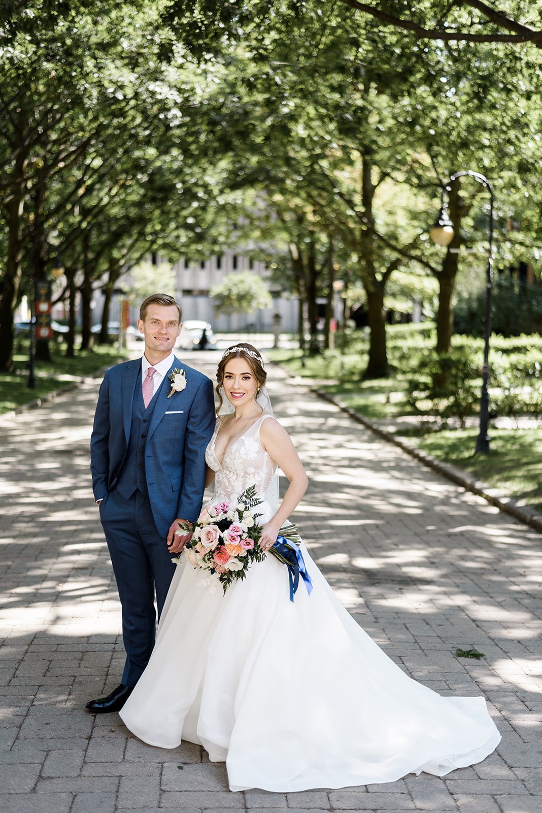
Silvia and Michael’s bespoke wedding invitations included a venue illustration of St. Basil’s Parish and a foliage monogram and envelope liner. A map with hand-drawn illustrations around the University of Toronto campus, guided guests from the ceremony to the reception and other landmarks in the area. Their day-of stationery included linen paper menus, glass and mirrored signage and place cards with deep taupe tassels.
sonia + joseph
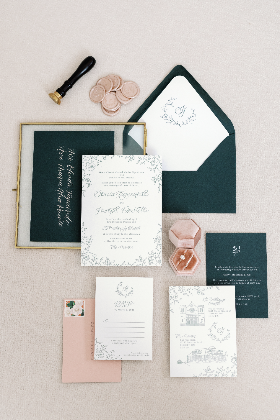
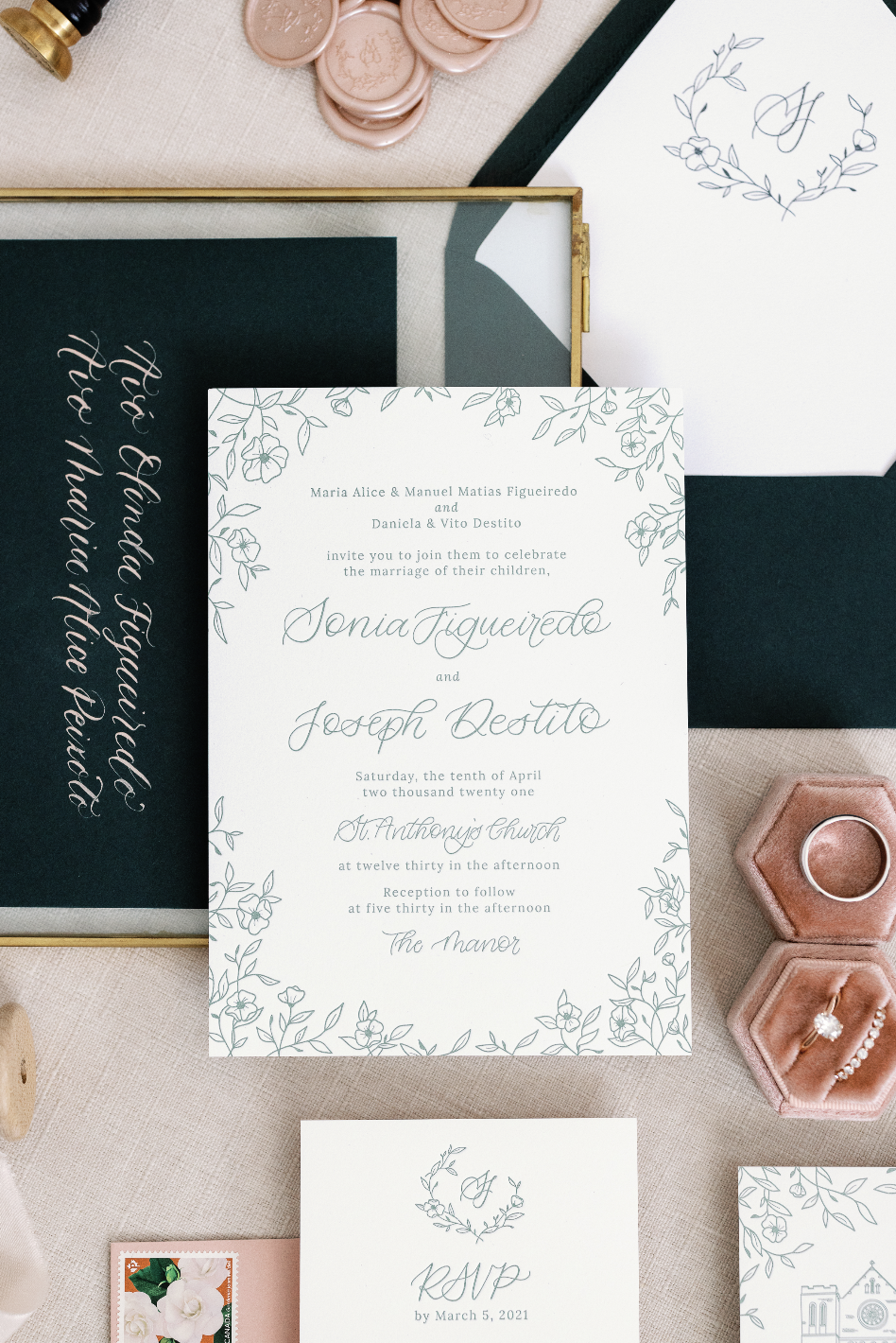
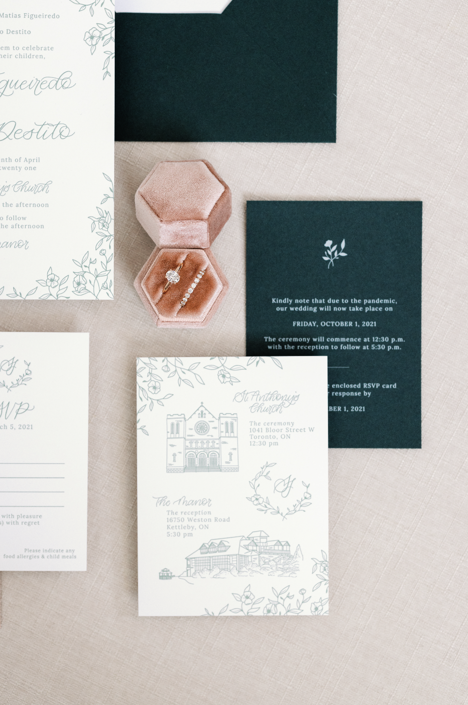
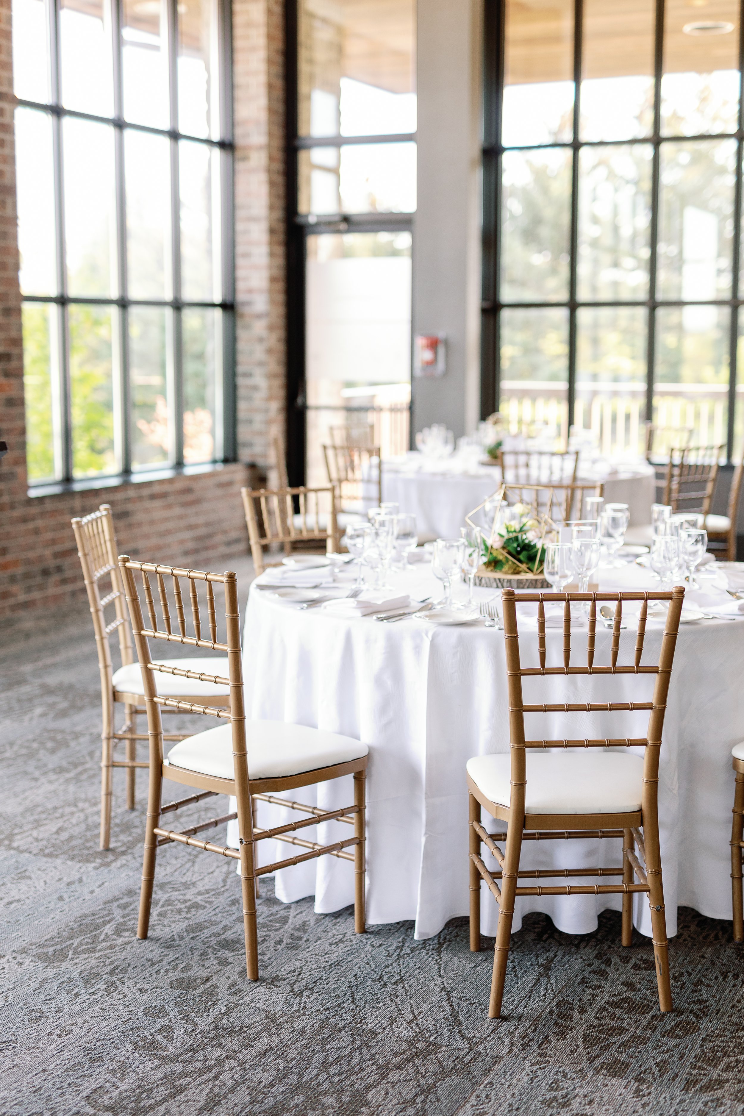
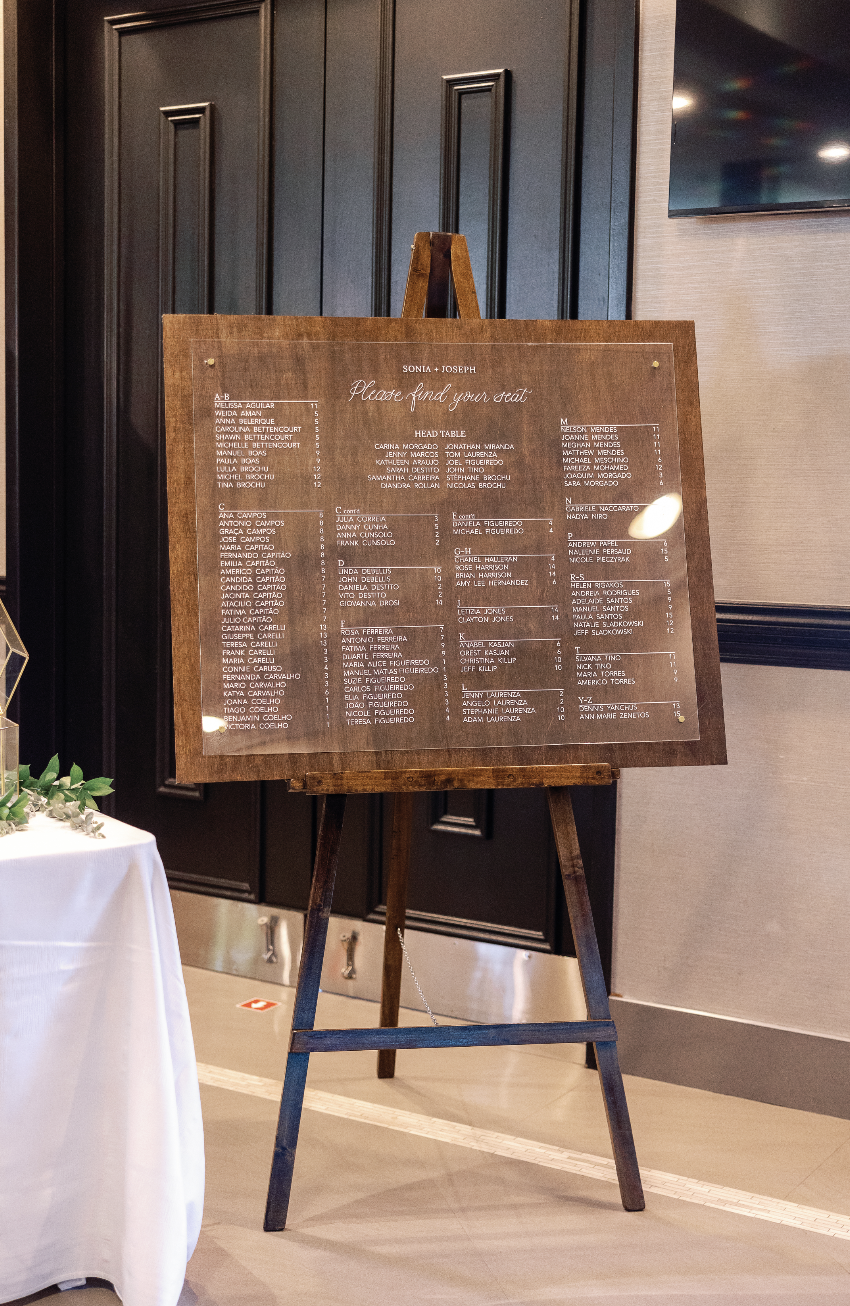
Sonia and Joseph’s wedding bespoke invitations included a beautifully letter pressed delicate floral border, venue illustrations and a floral wreath. Natural tones of green were complimented by soft pink tones, which translated seamlessly to their day-of stationery.
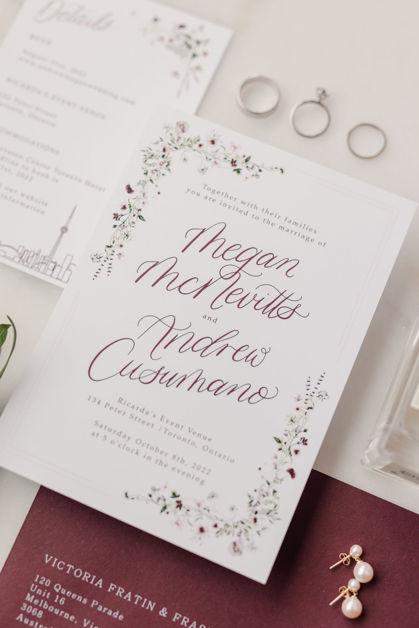
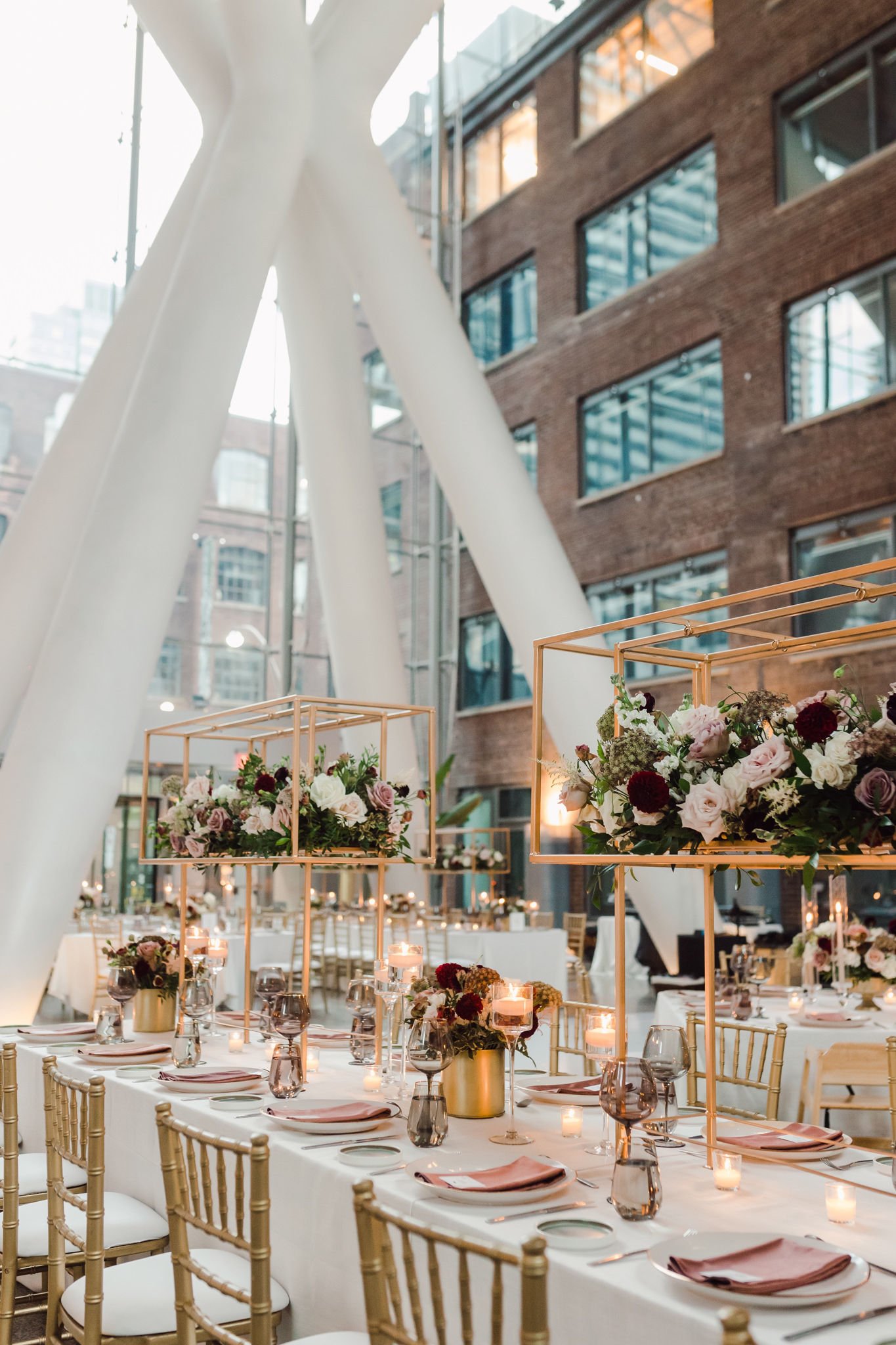
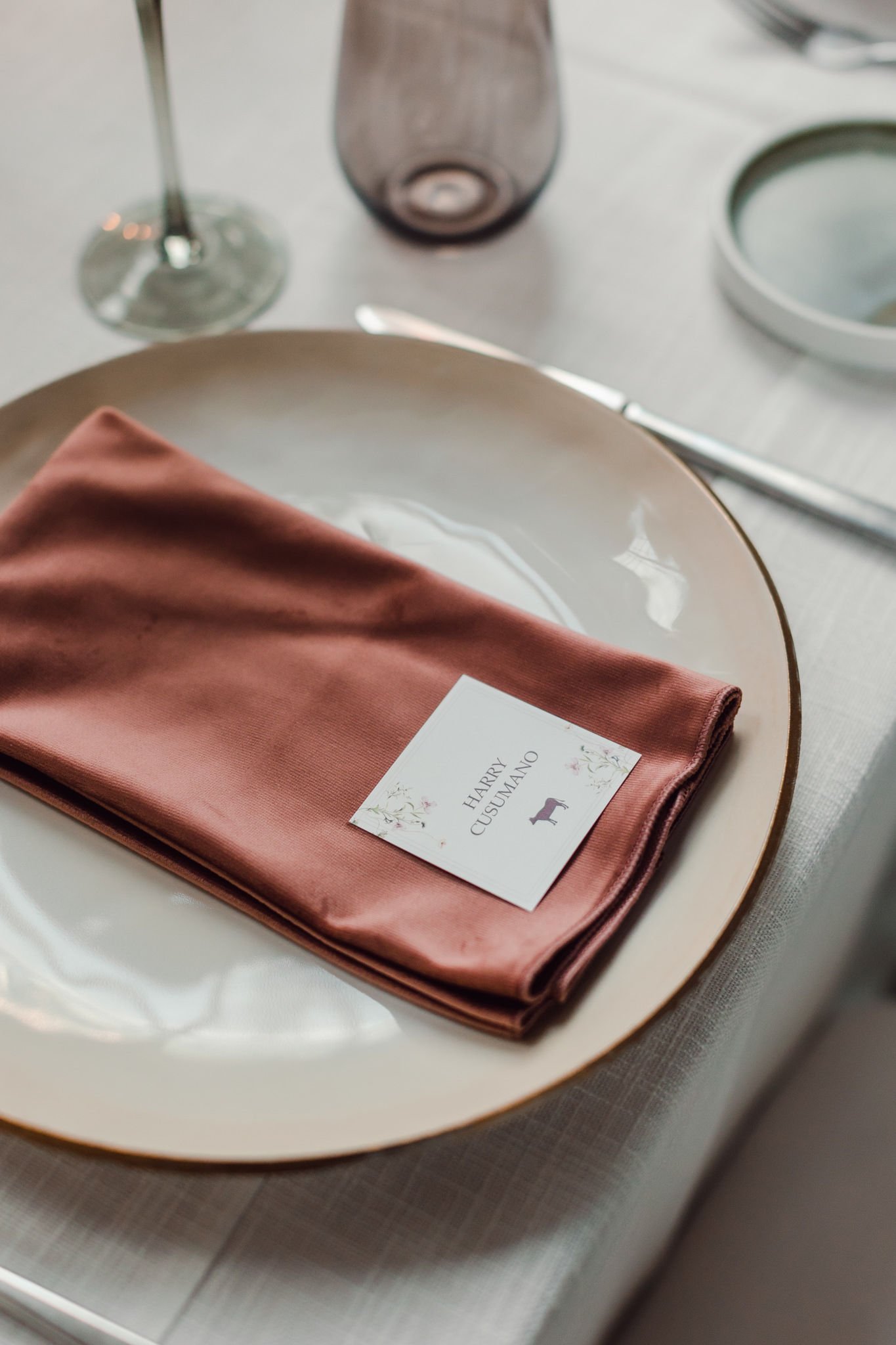
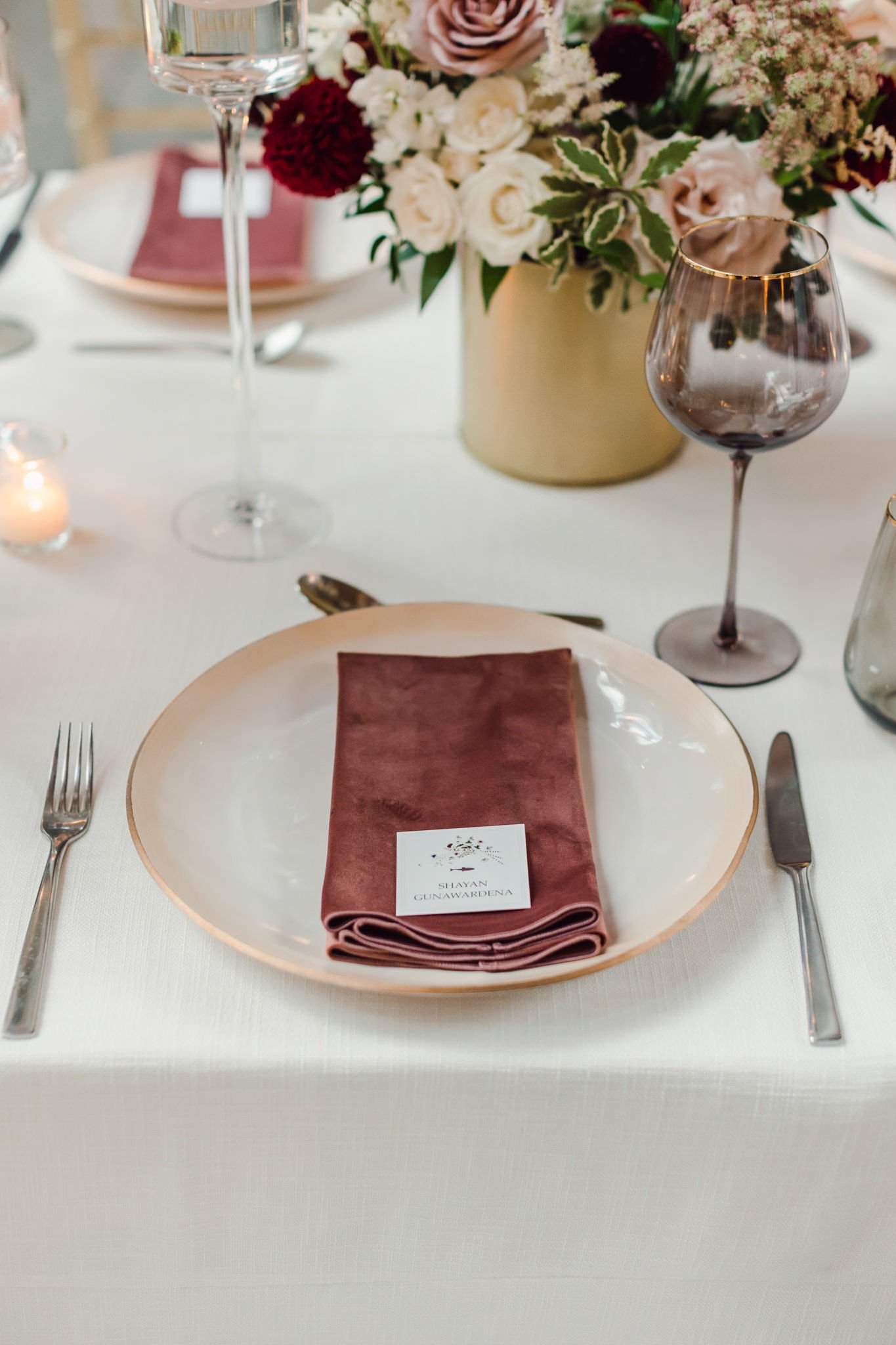
megan + andrew
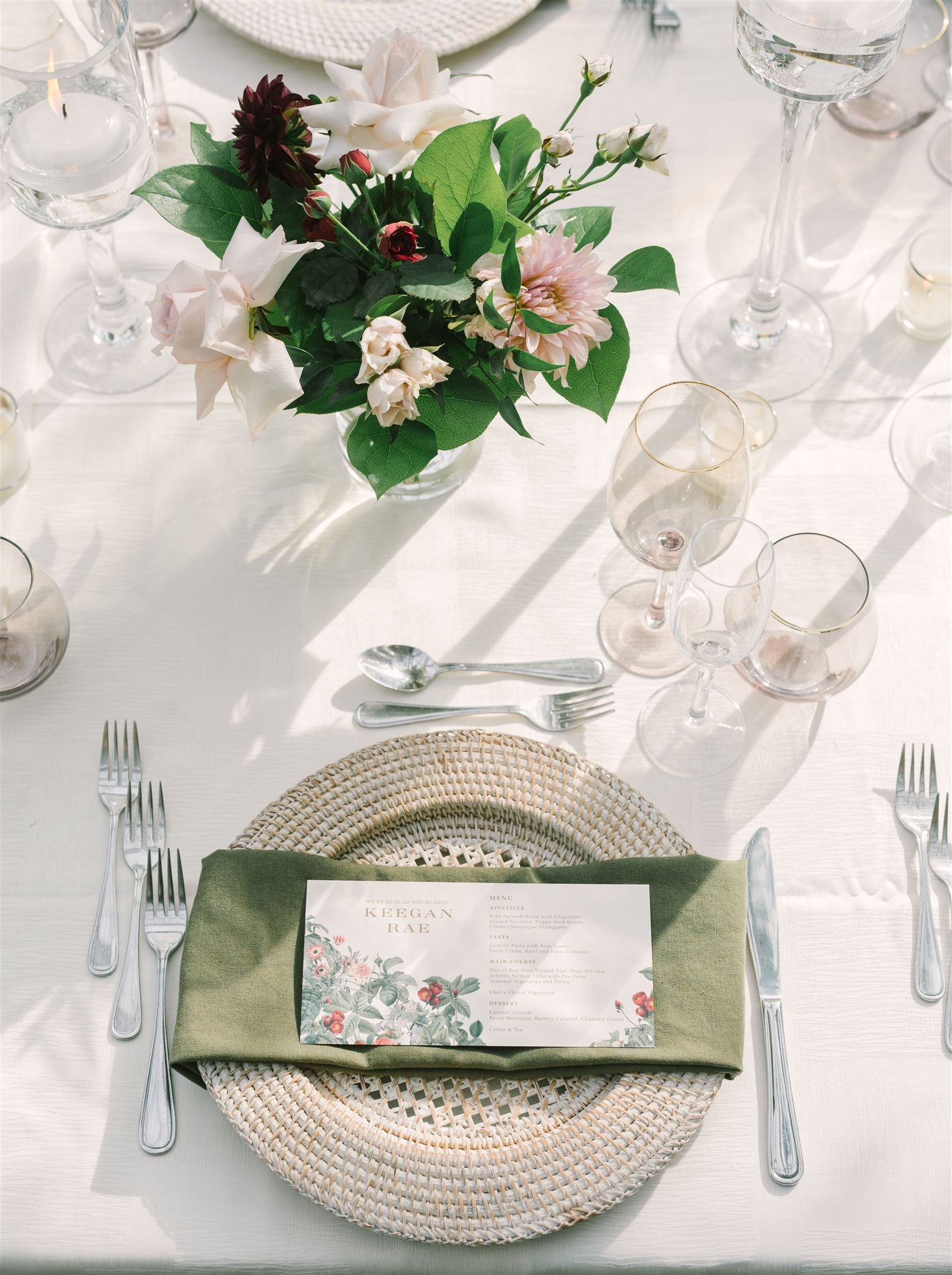
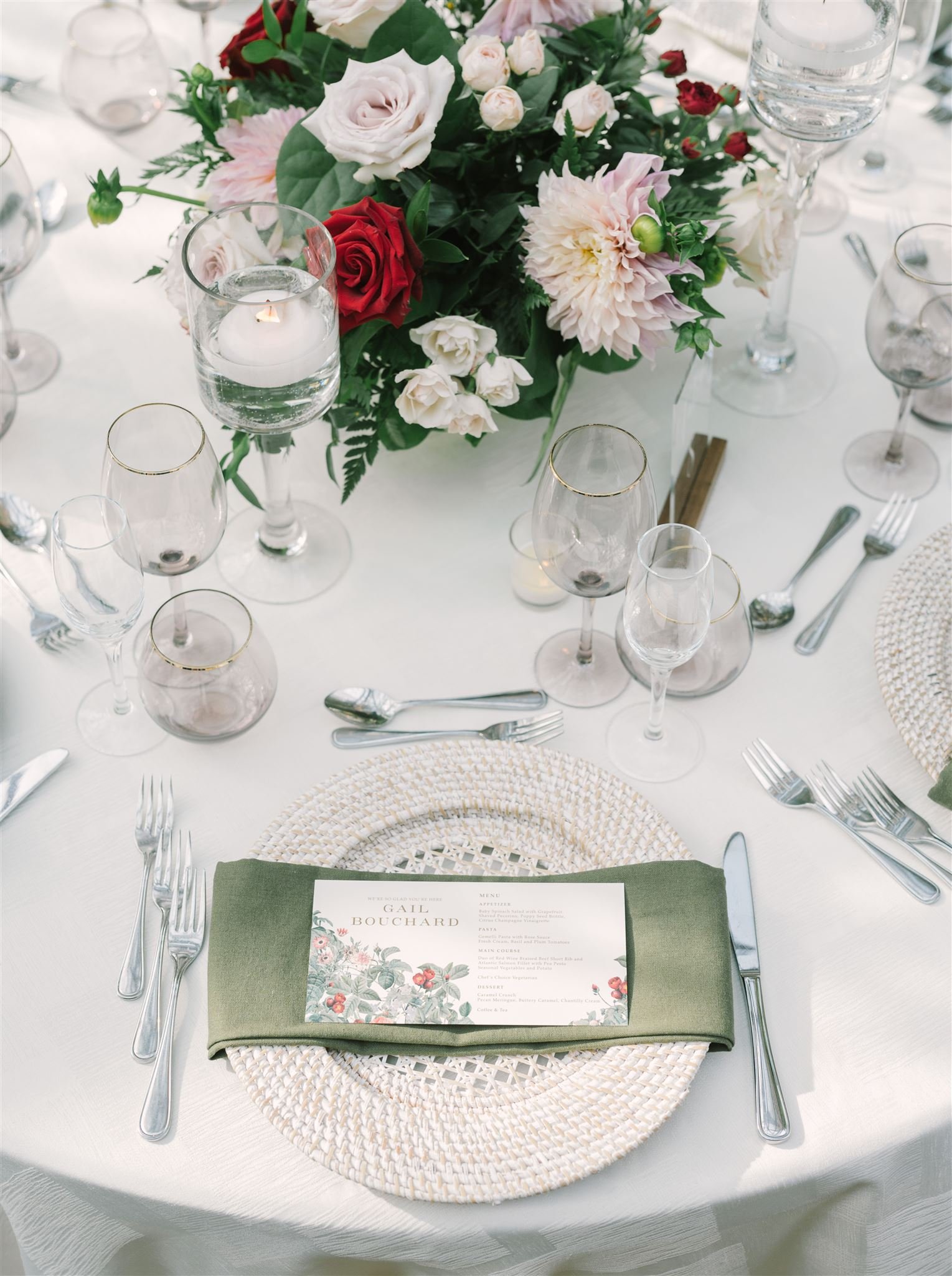
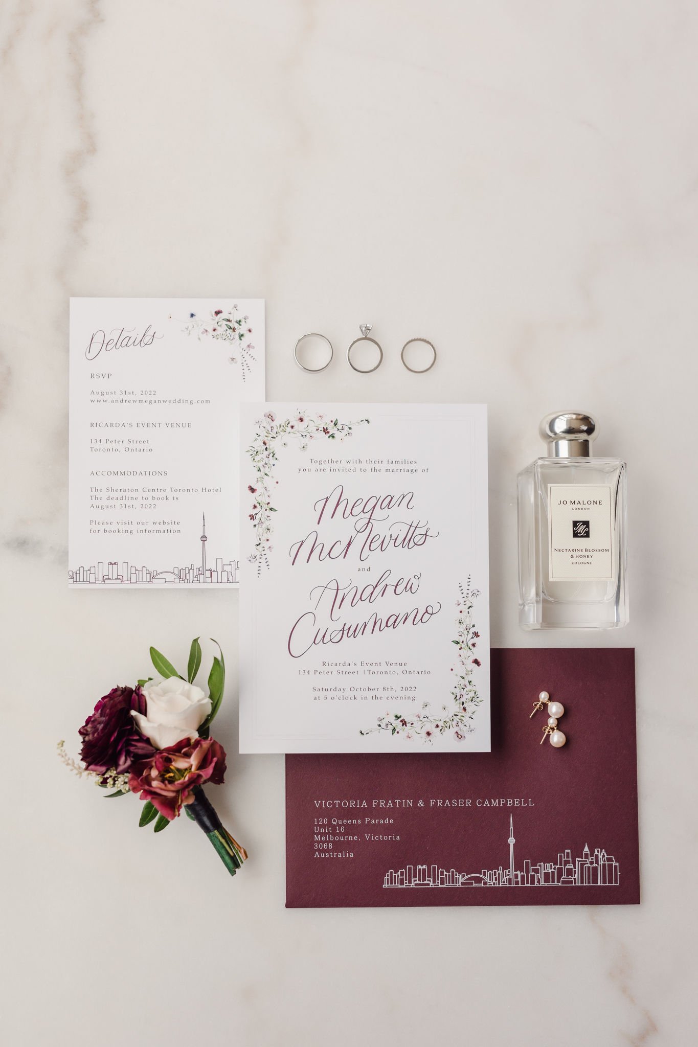
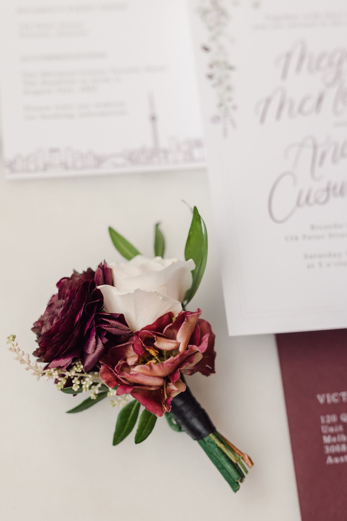
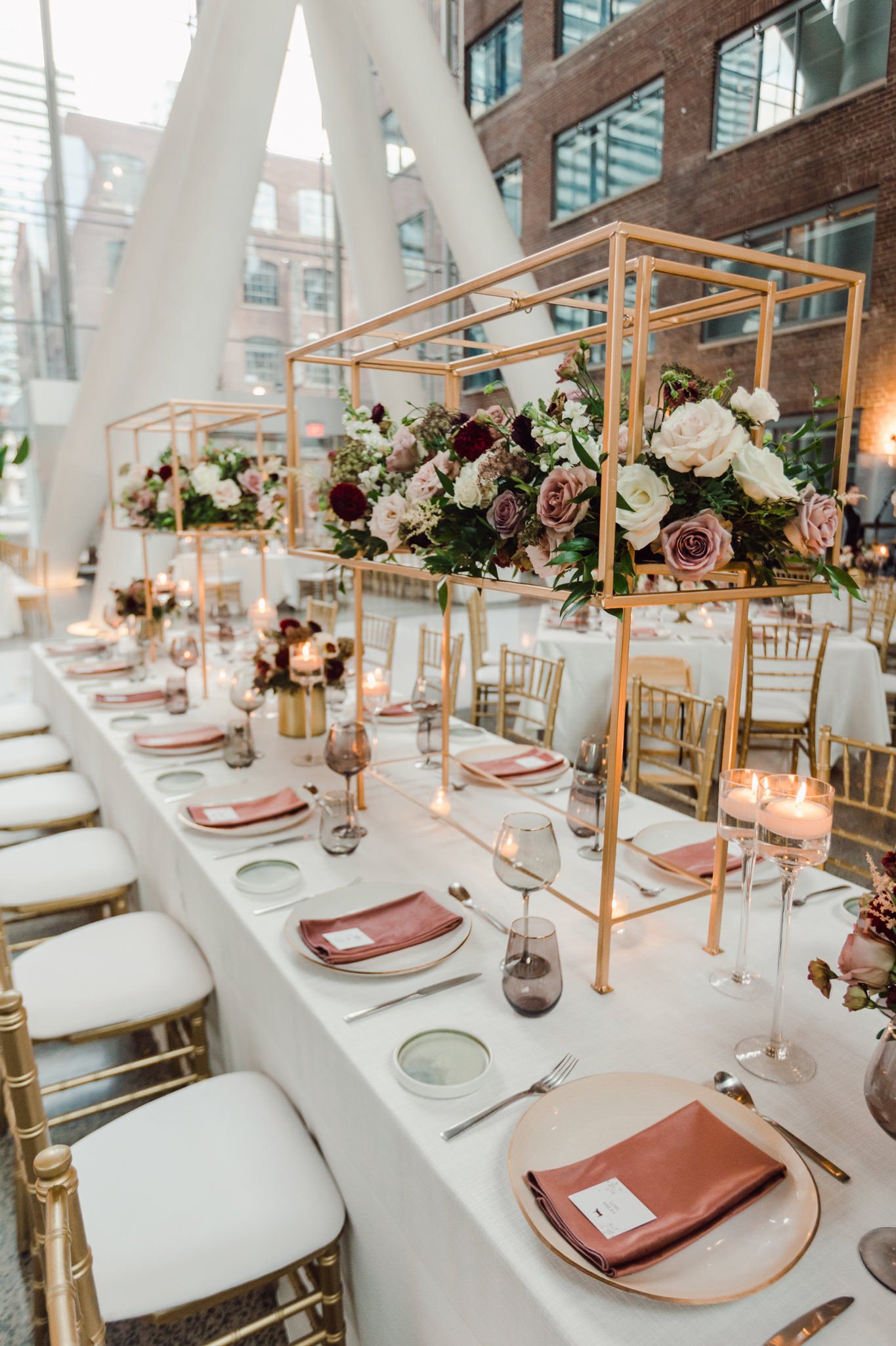
Megan and Andrew’s invitations perfectly set the tone for their wedding, with floral details, handwritten script and burgundy envelope. Their wedding tablescape included a combination of deep and soft coloured florals and gold accents.
samantha + collin
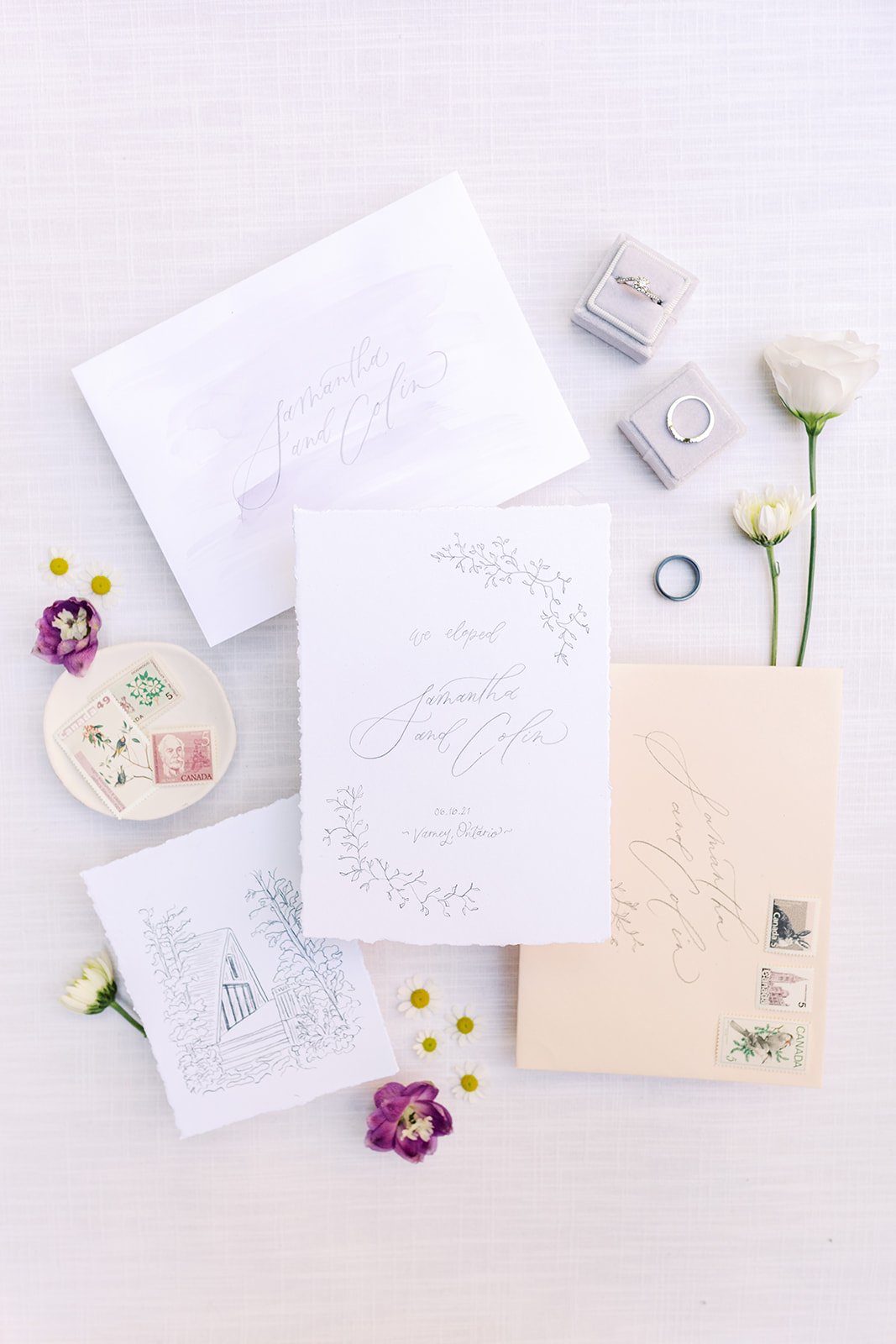
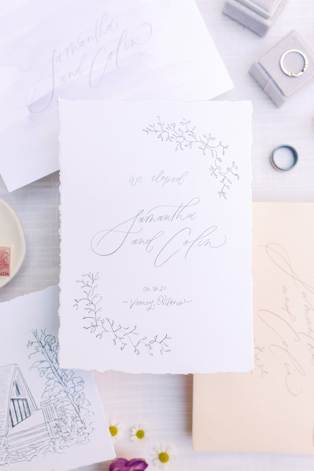
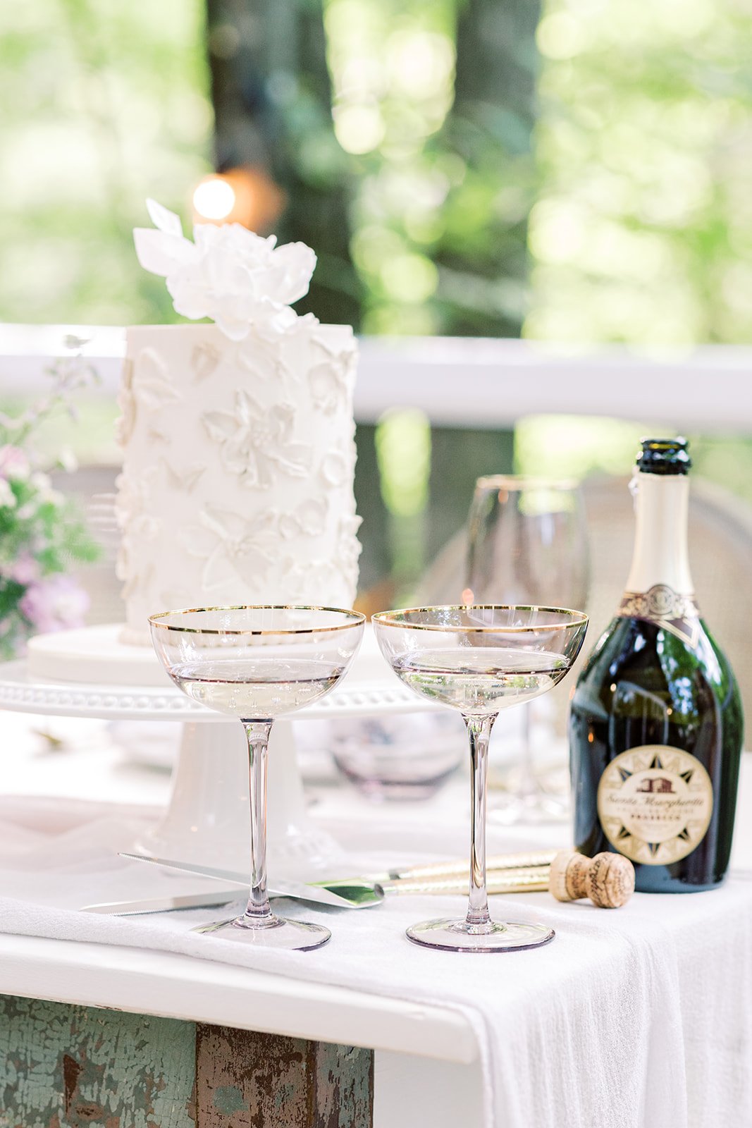
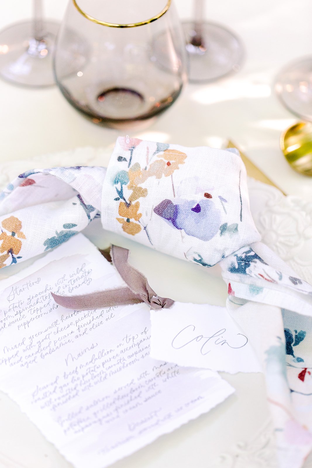
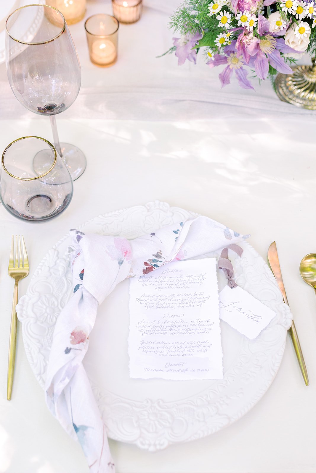
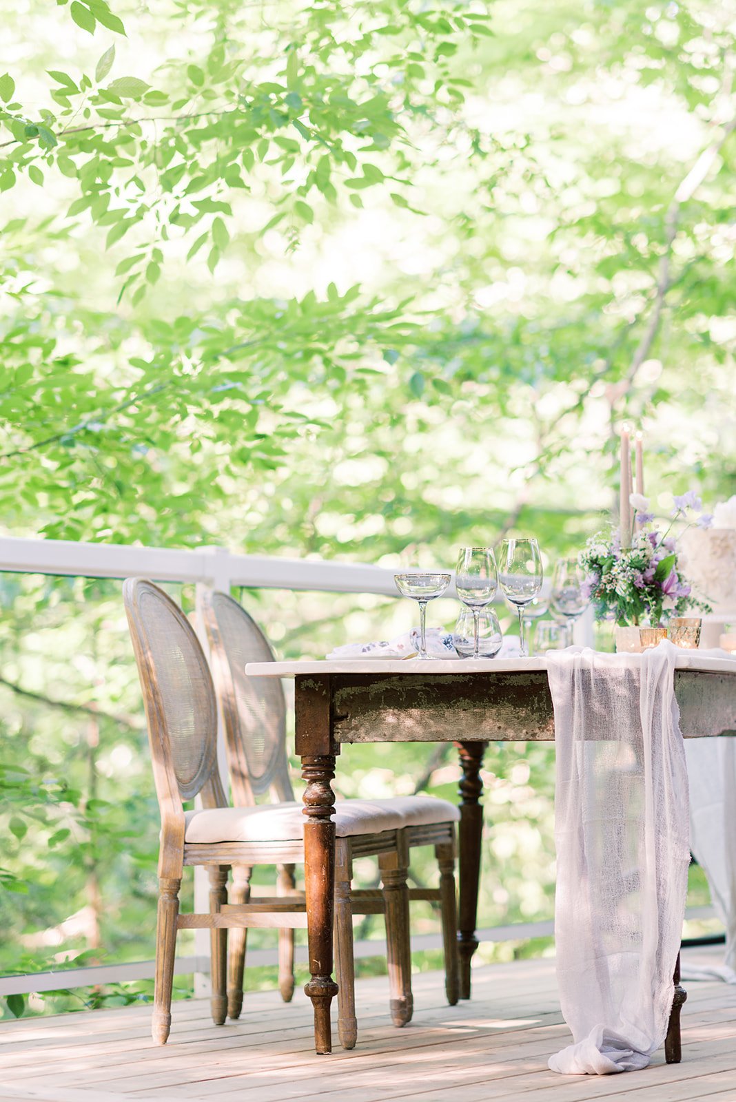
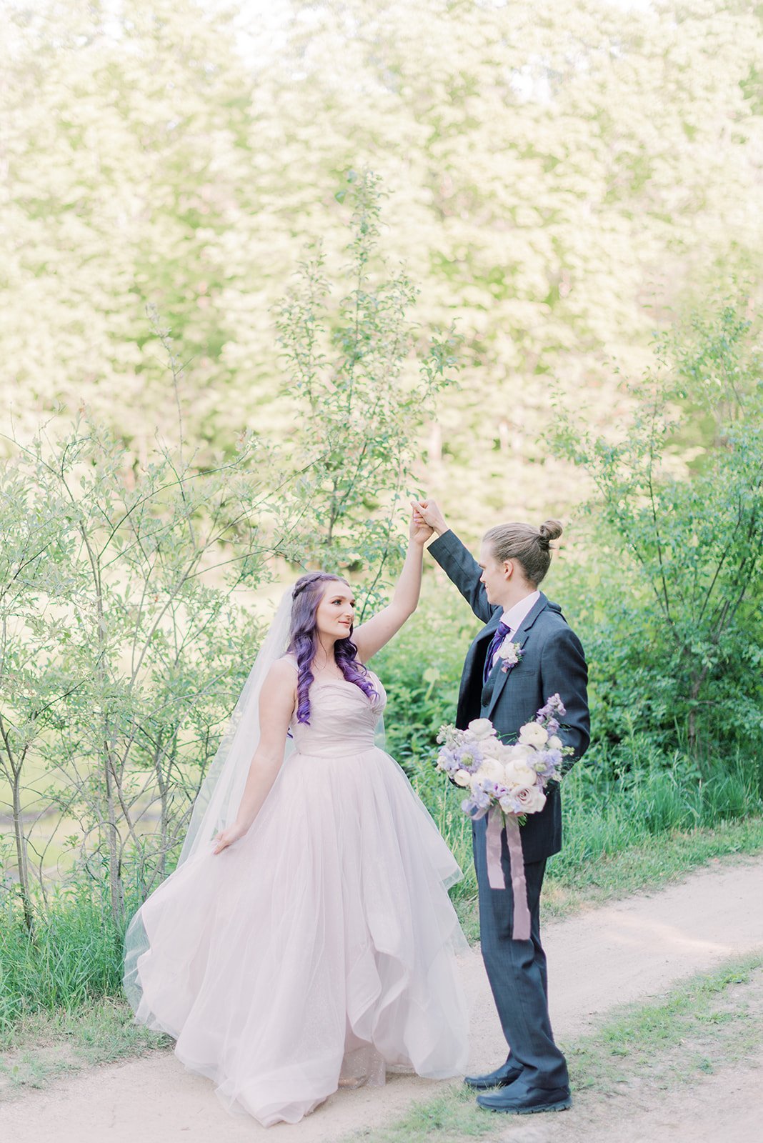
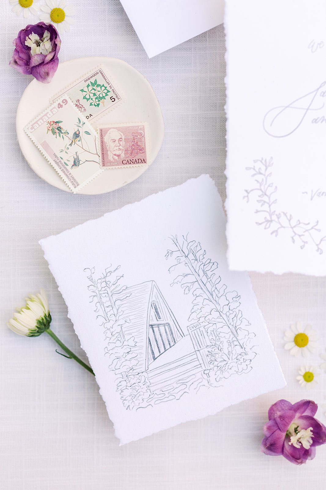
Samantha and Collin’s lavender elopement is what dreams are made of. A hand-illustrated elopement announcement was sketched with pencil and illustrated their cottage venue. Purple and lavender details were displayed throughout their stationery, with hand-written menus and ribbon-tied place cards.
nancy + alessandro
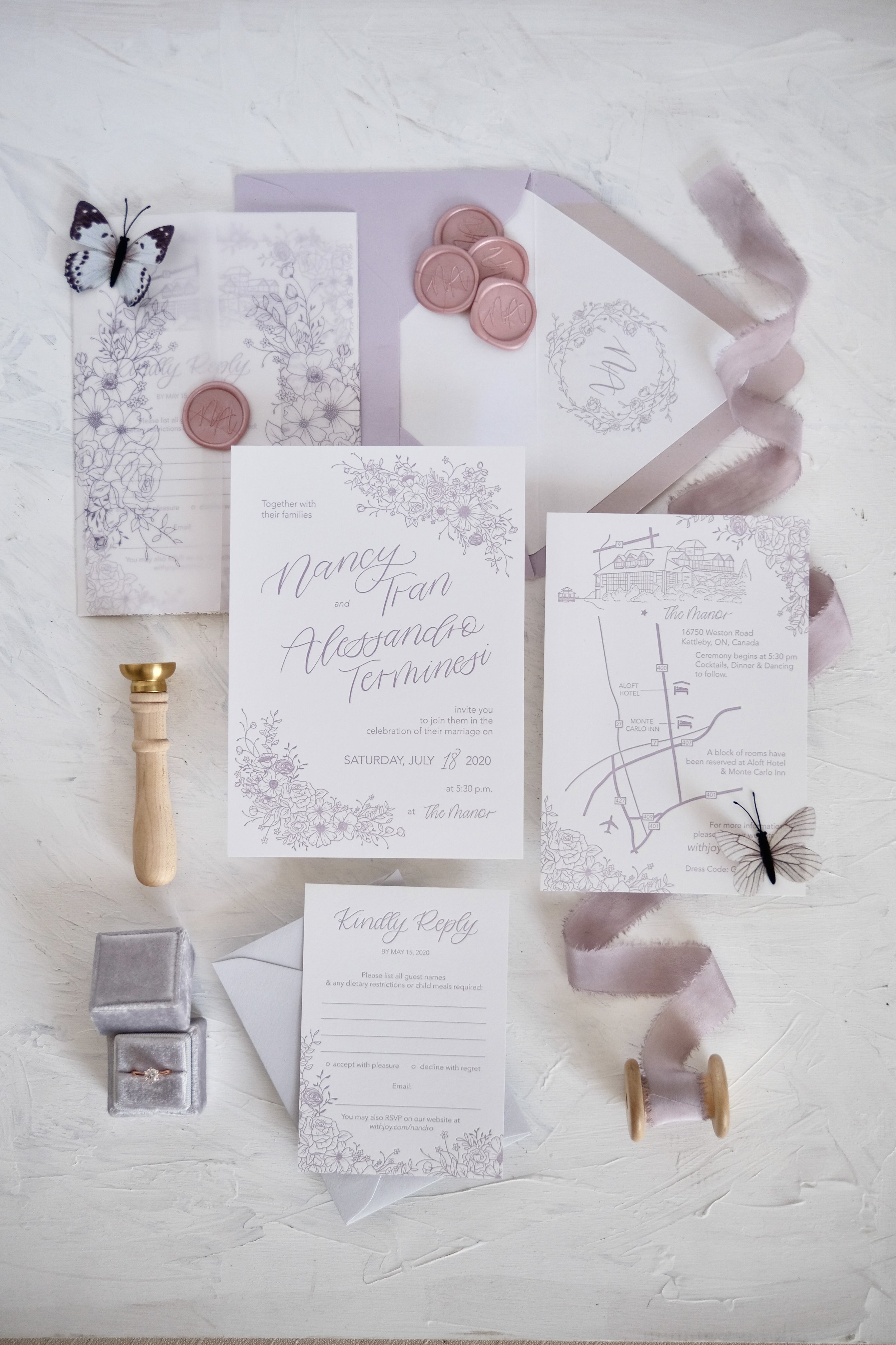
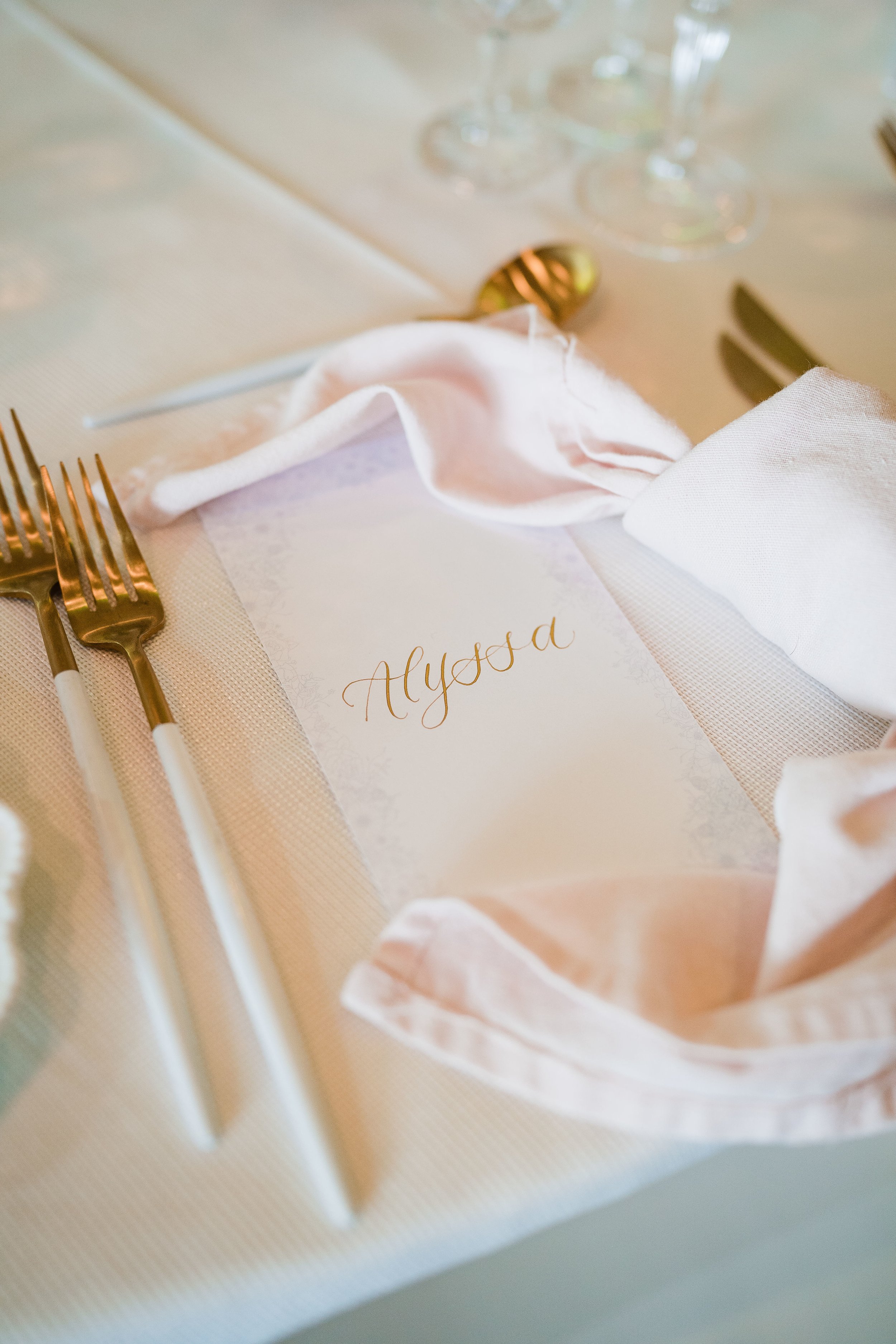
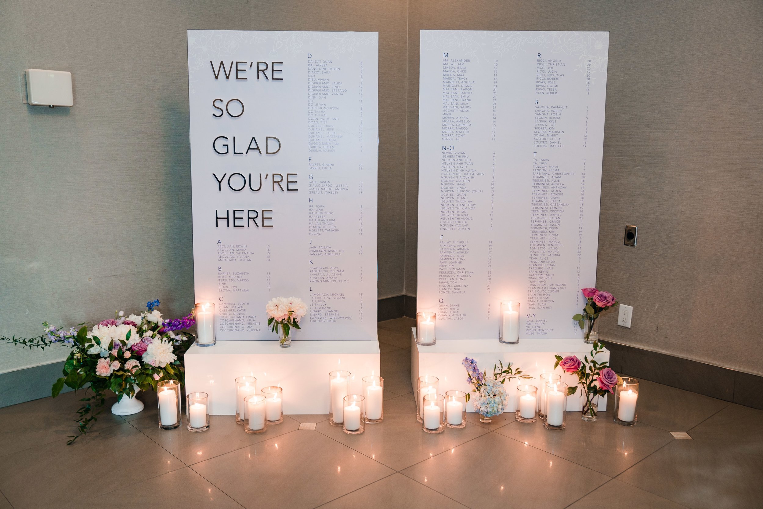
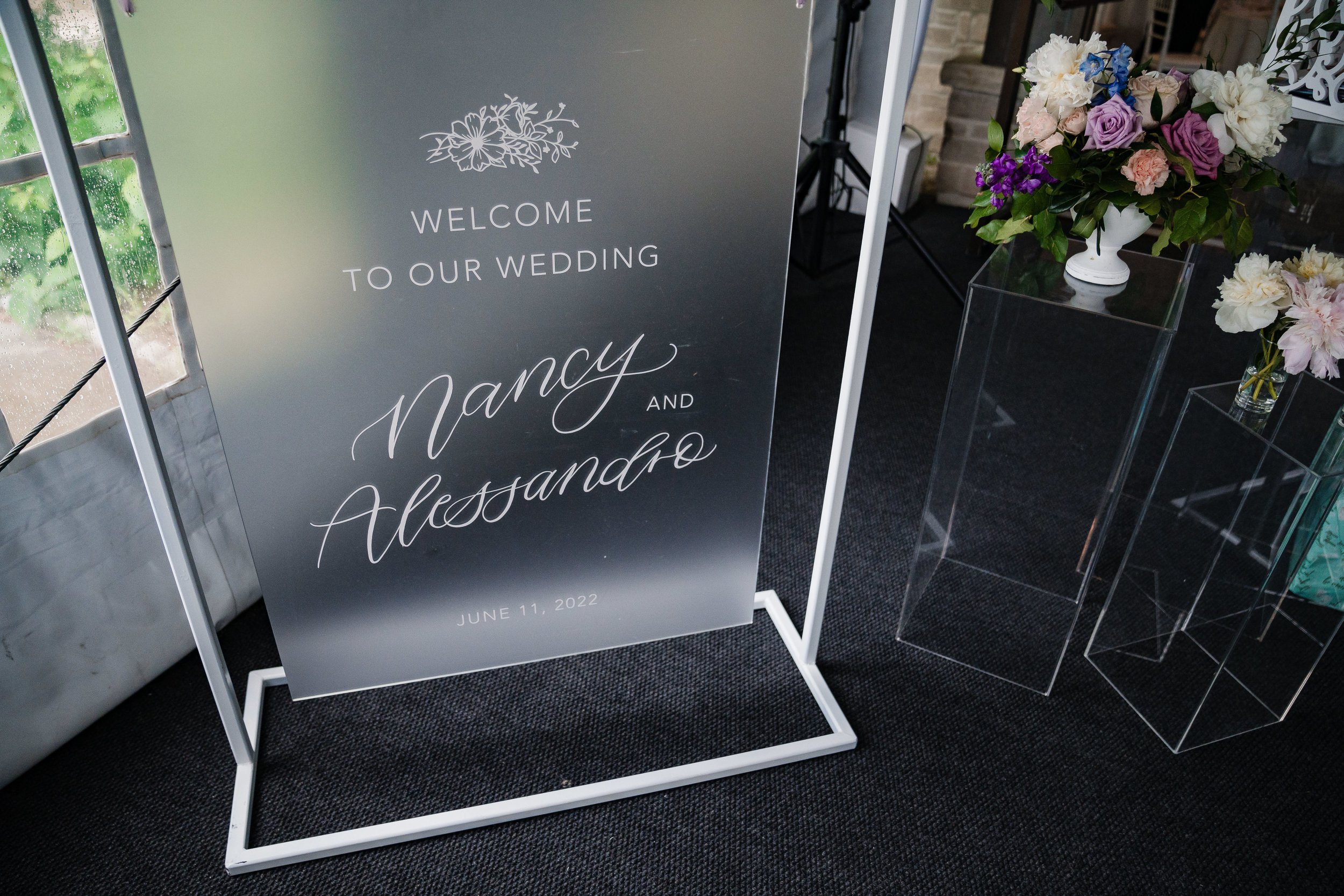
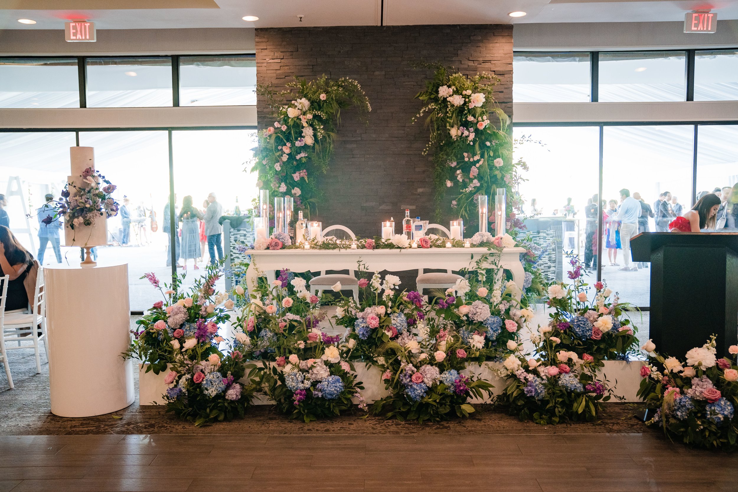
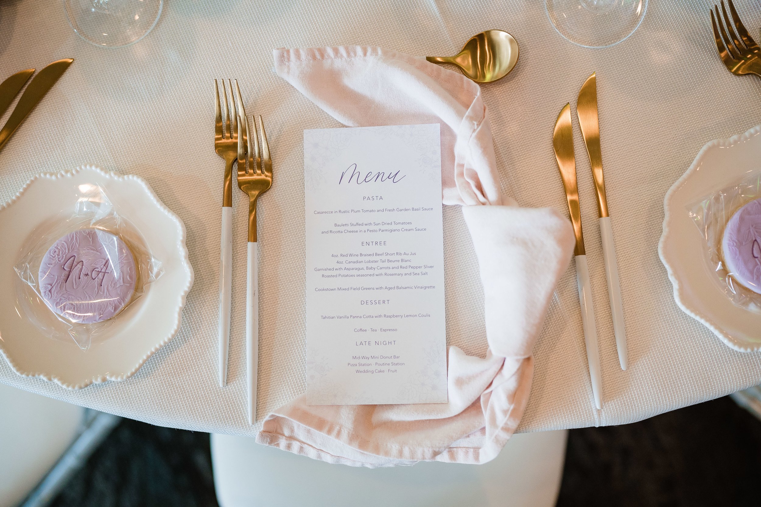
Nancy and Alessandro’s invitations were inspired by shades of purple and garden florals. Their invitations presented custom handwritten script, floral details and a hand-drawn map. Their day-of stationery included double-sided calligraphy menus which also served as calligraphy place cards and a large double-wall display seating chart.
shrouk + hesham
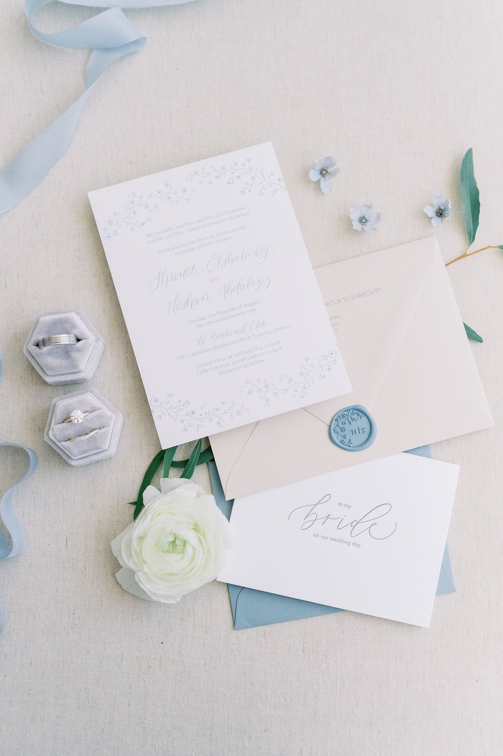
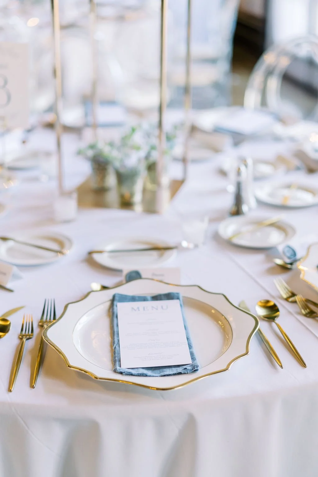
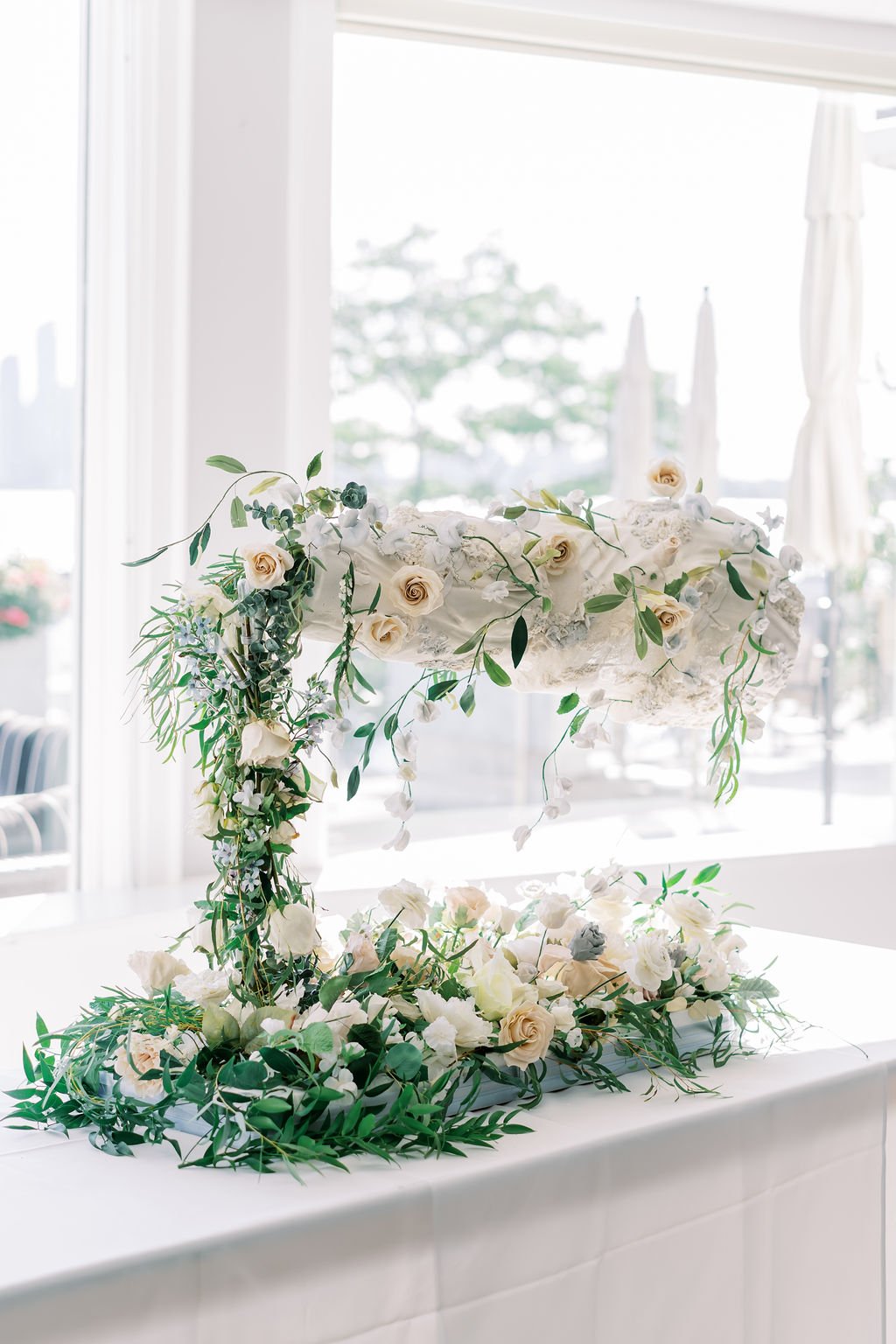
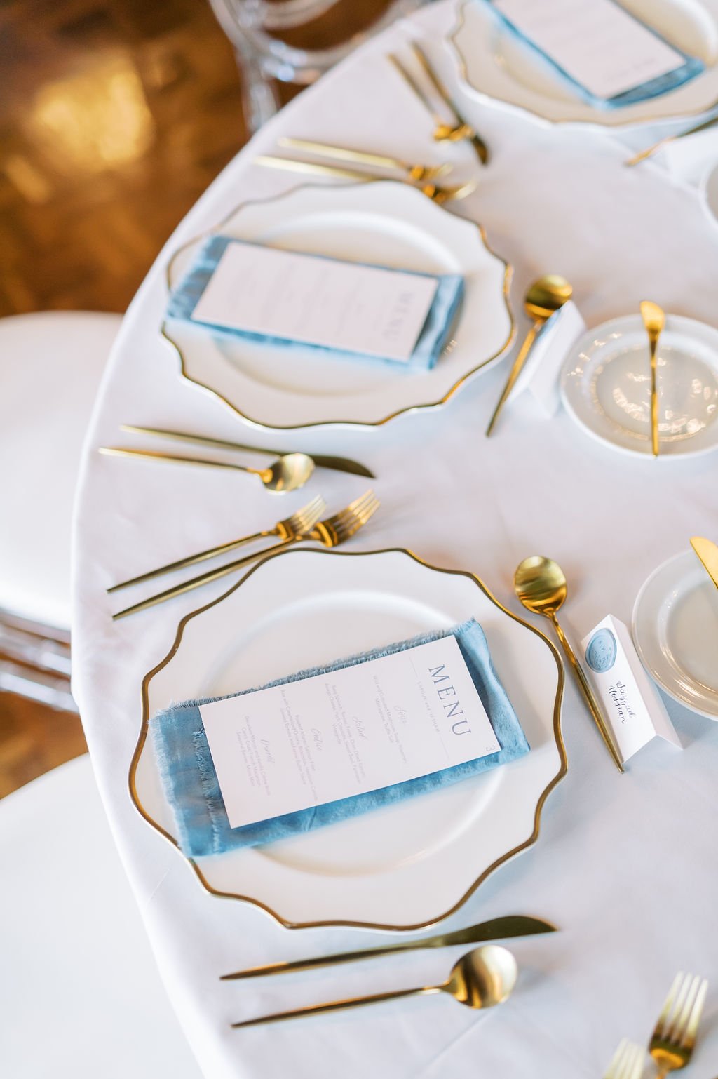
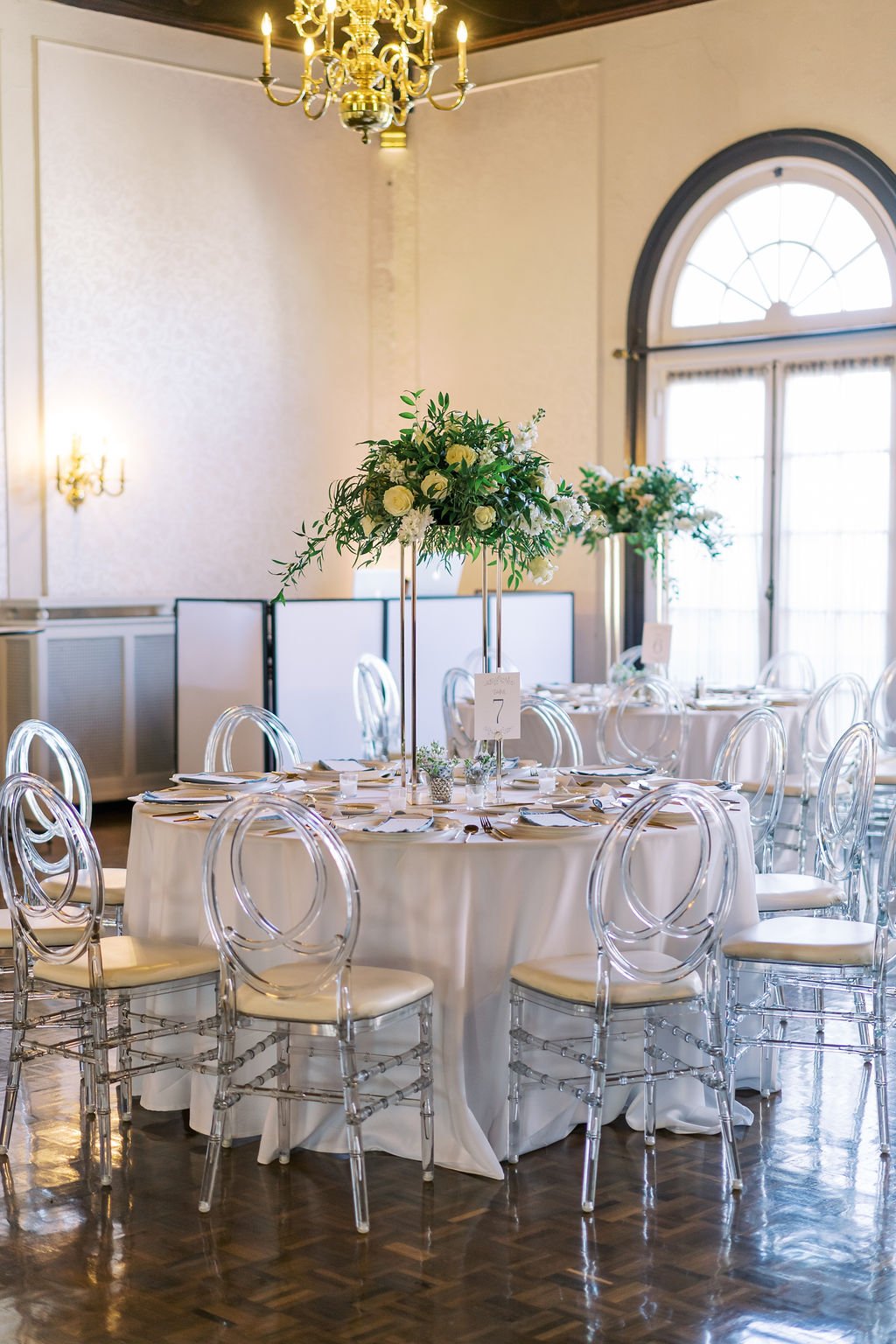
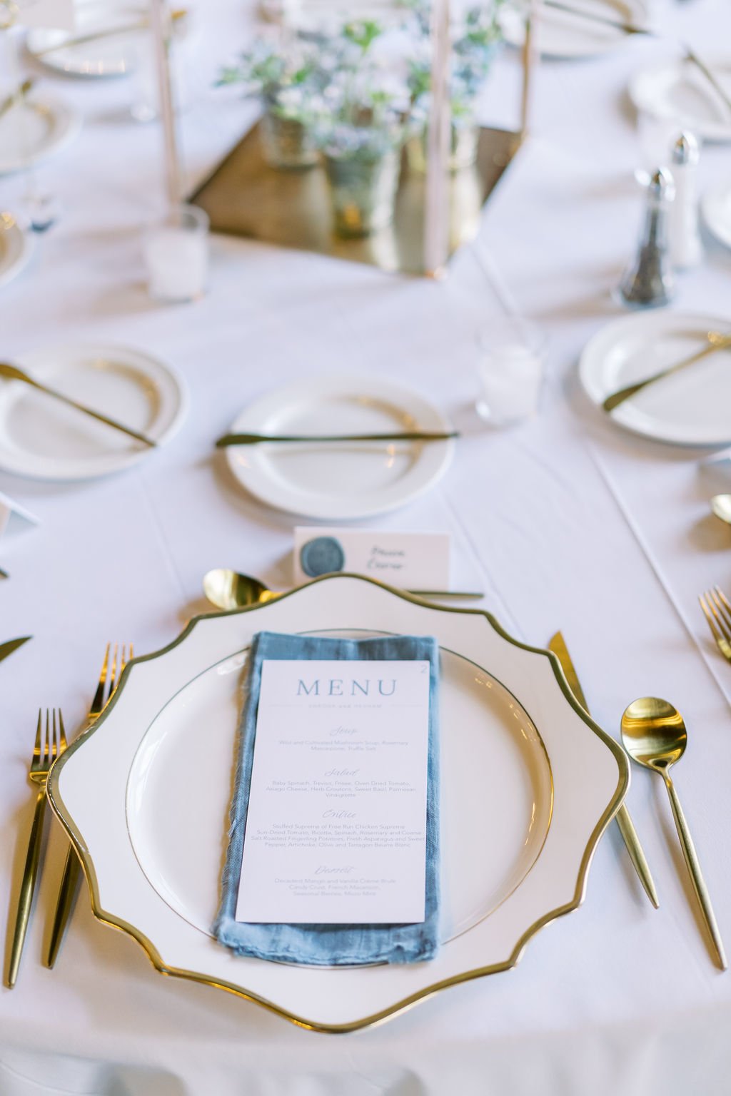
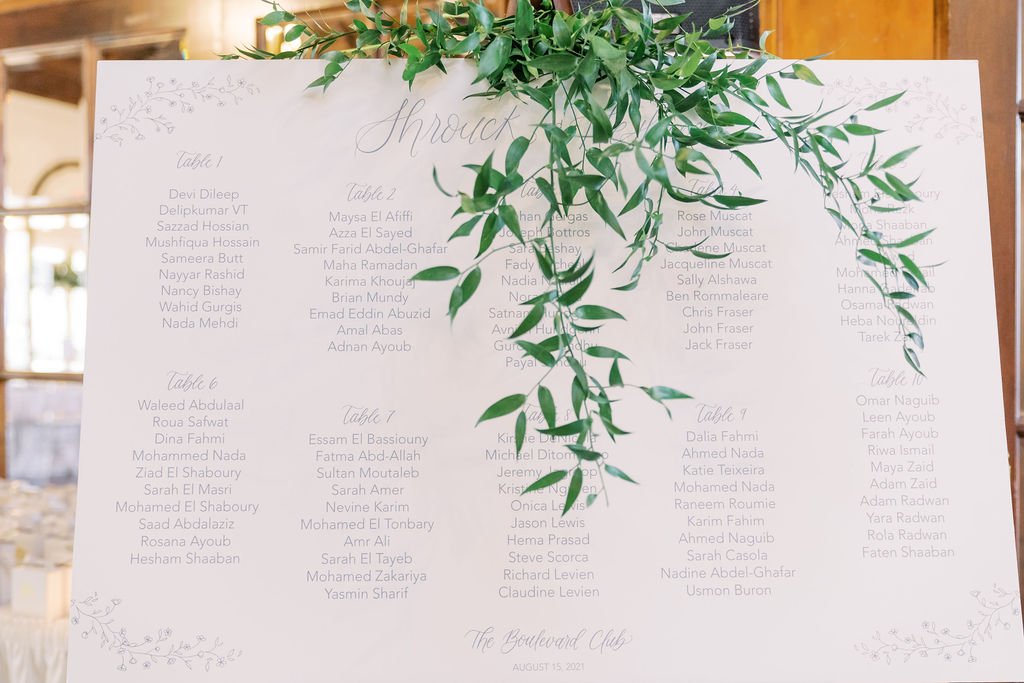
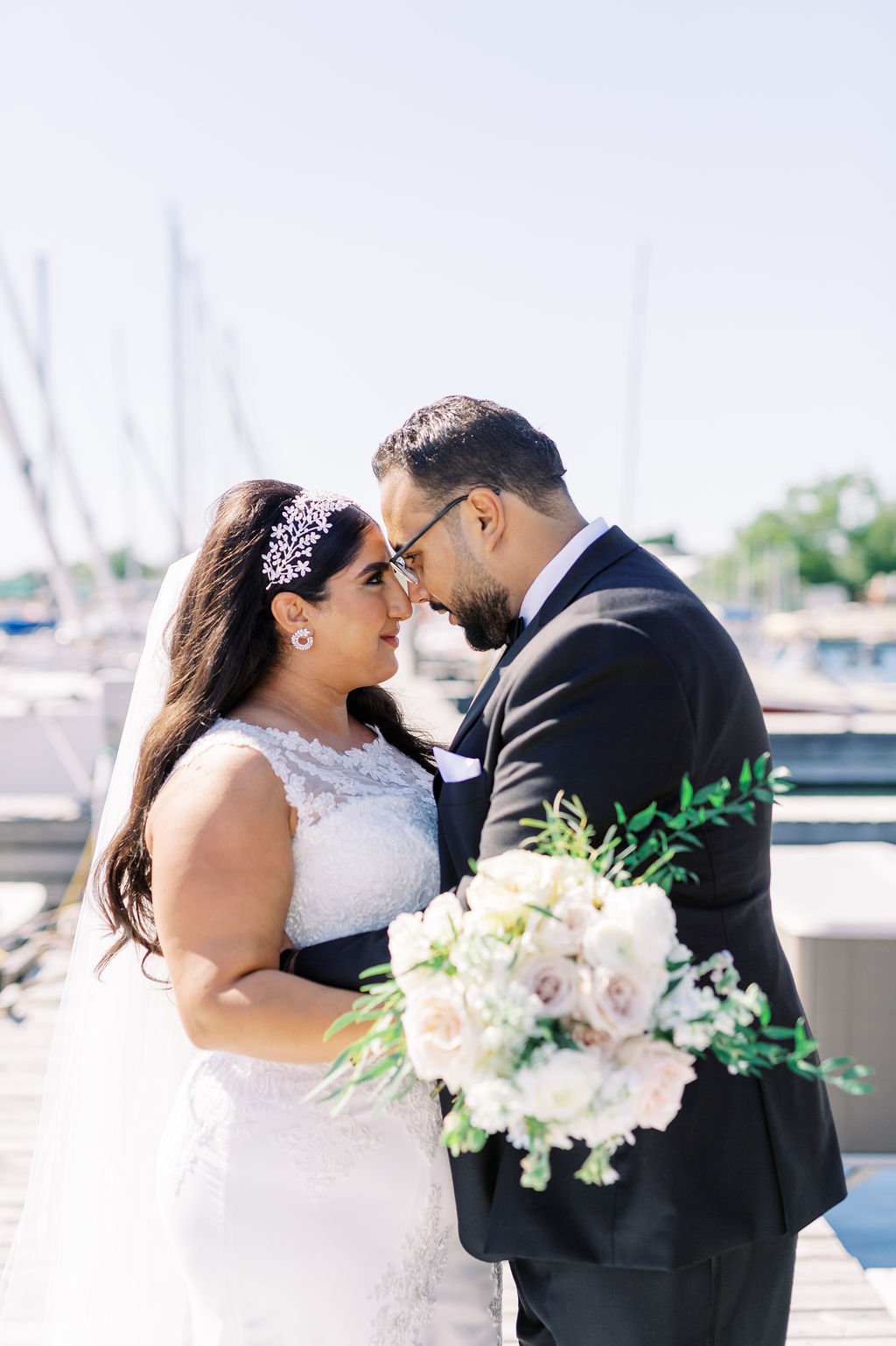
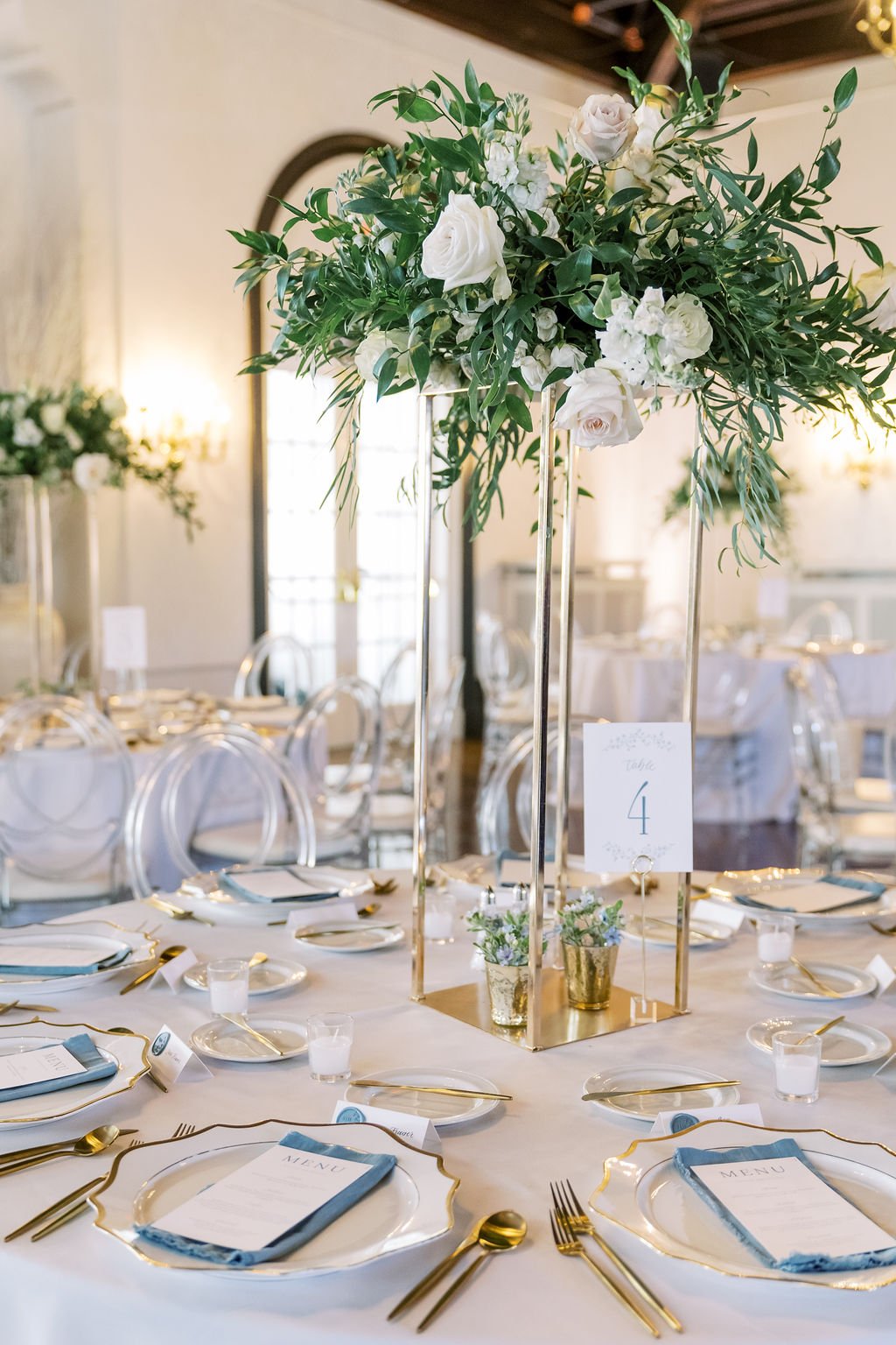
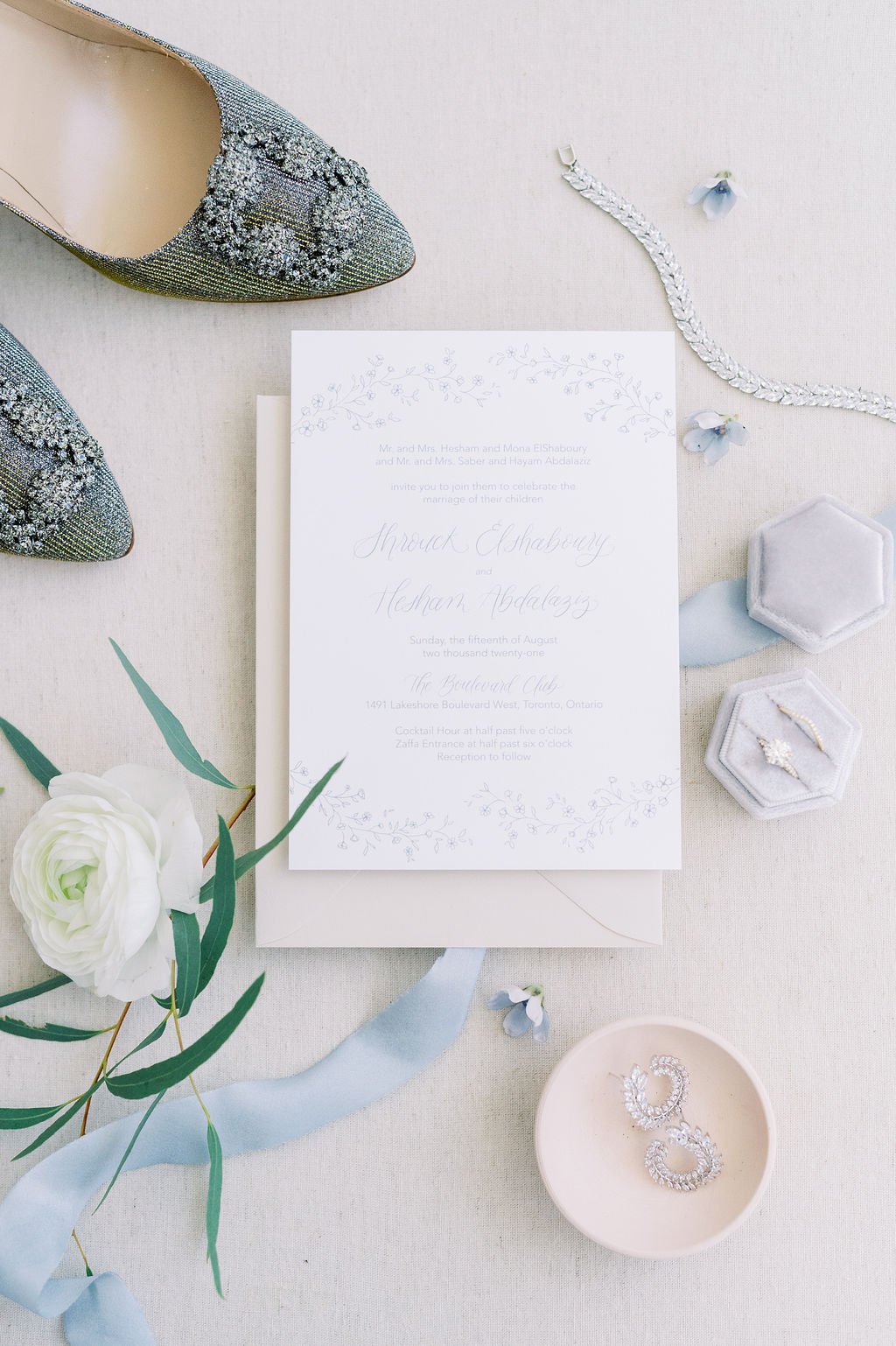
Shrouk and Hesham’s dusty blue wedding was beautifully bright and airy with tones inspired by the Lake. Small delivate florals and suty blue printing were found throughout their wedding day. The jaw-dropping feature was their cake, which was designed to literally defy gravity.
ilana + reuben
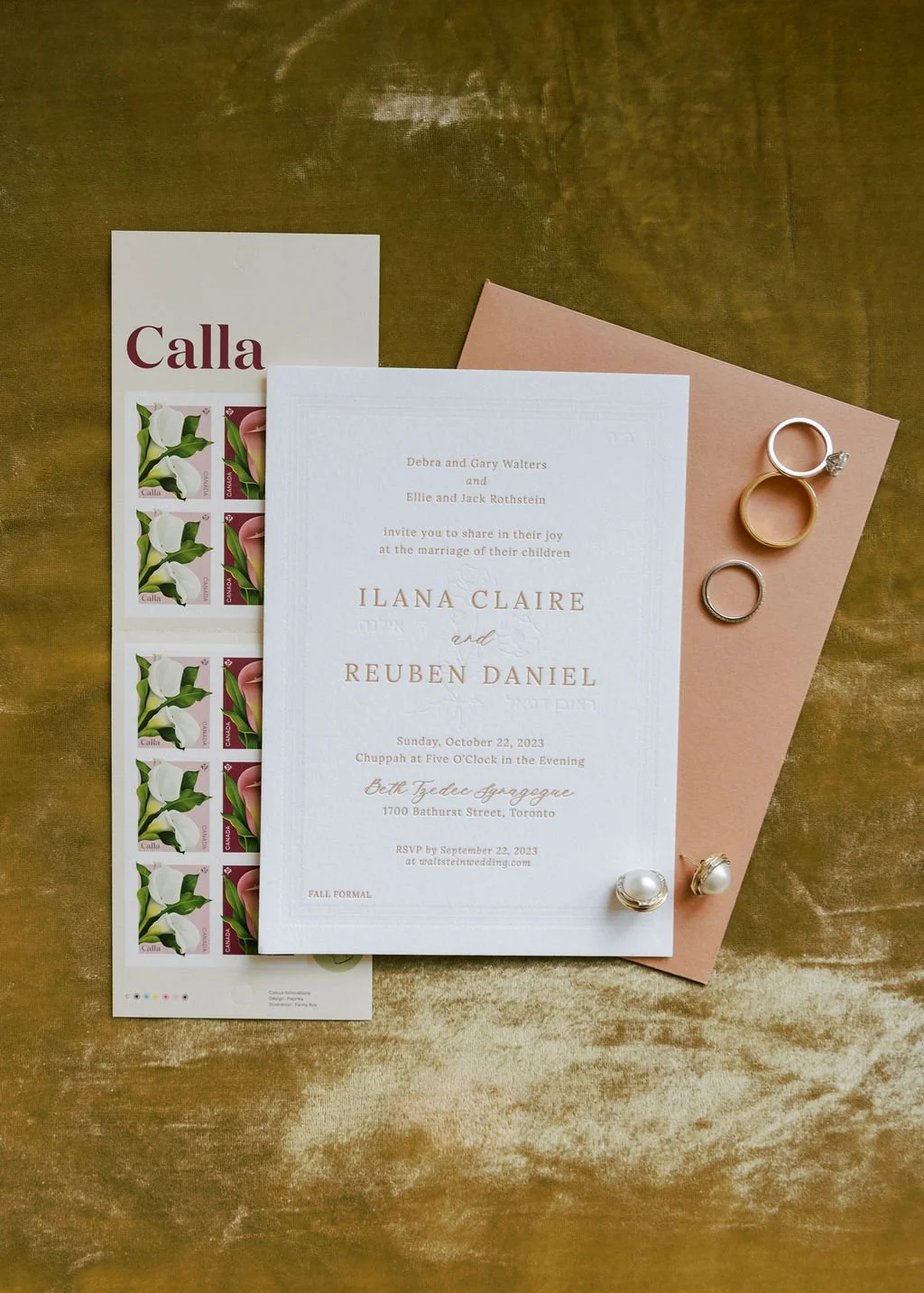
Ilana and Reuben’s autumnal wedding balanced the warm and cozy tones of autumn, with brightness. Their wedding invitation included a blind embossed border and floral, with the copy letter pressed in a rusty brown colour to compliment their terracotta coloured envelope. Their coloured and personalized menus added extra warmth to the autumnal floral and candle tablescape.
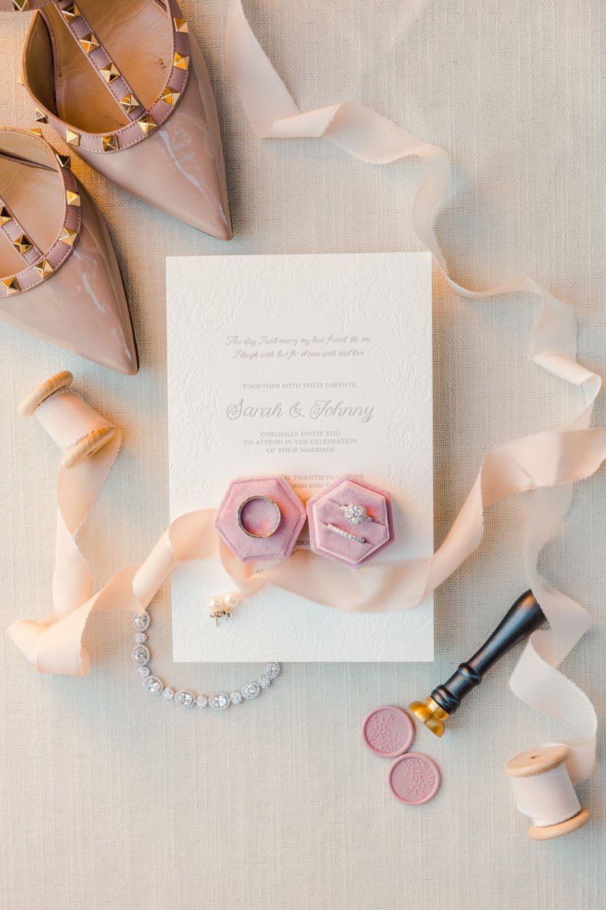
sarah + johnny
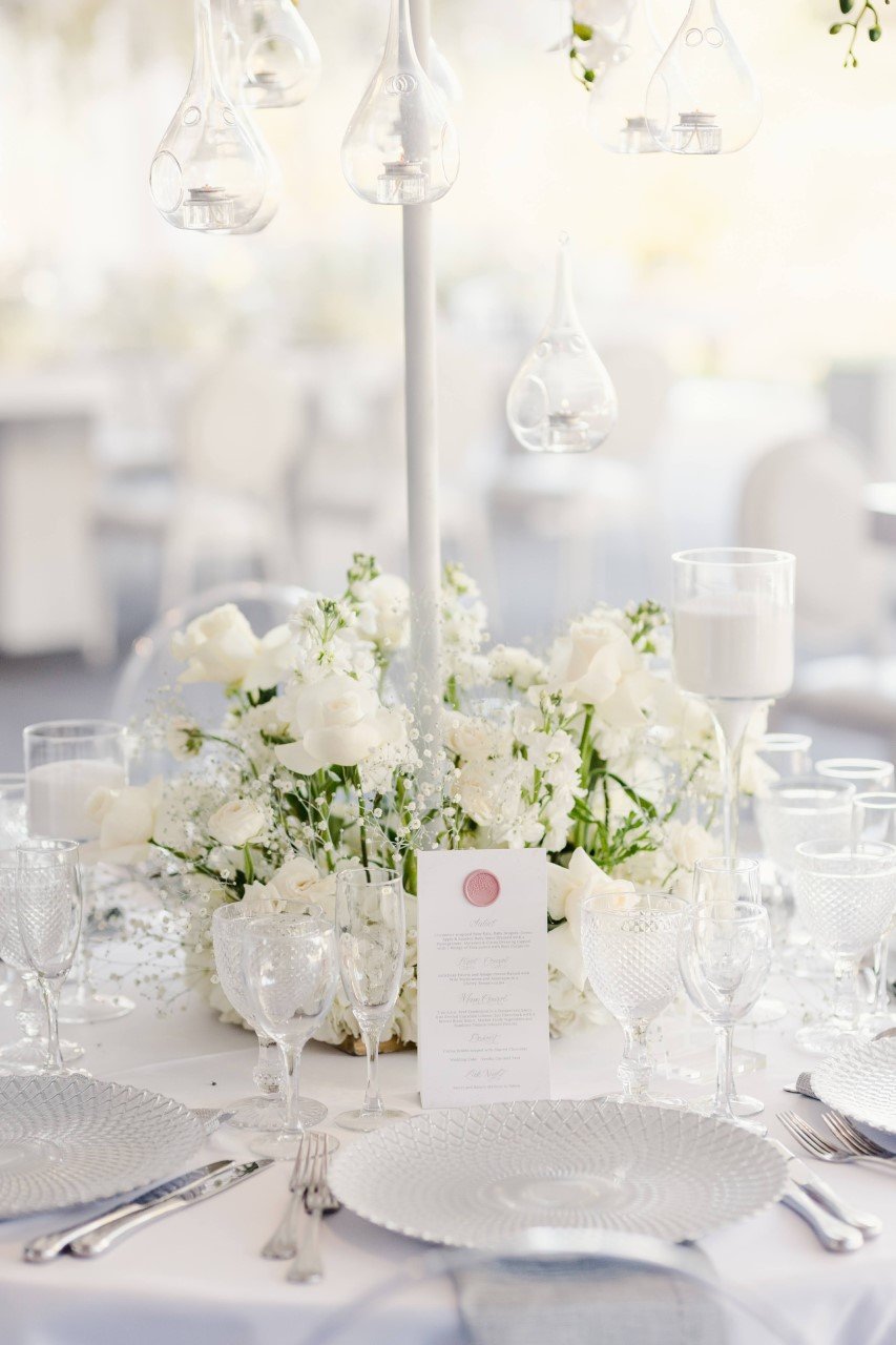
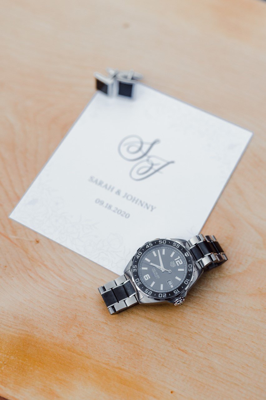
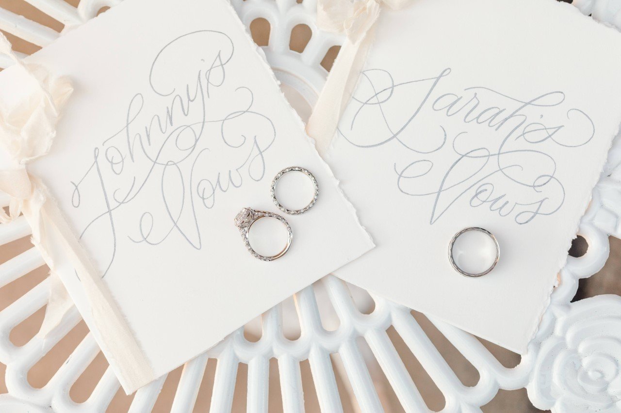
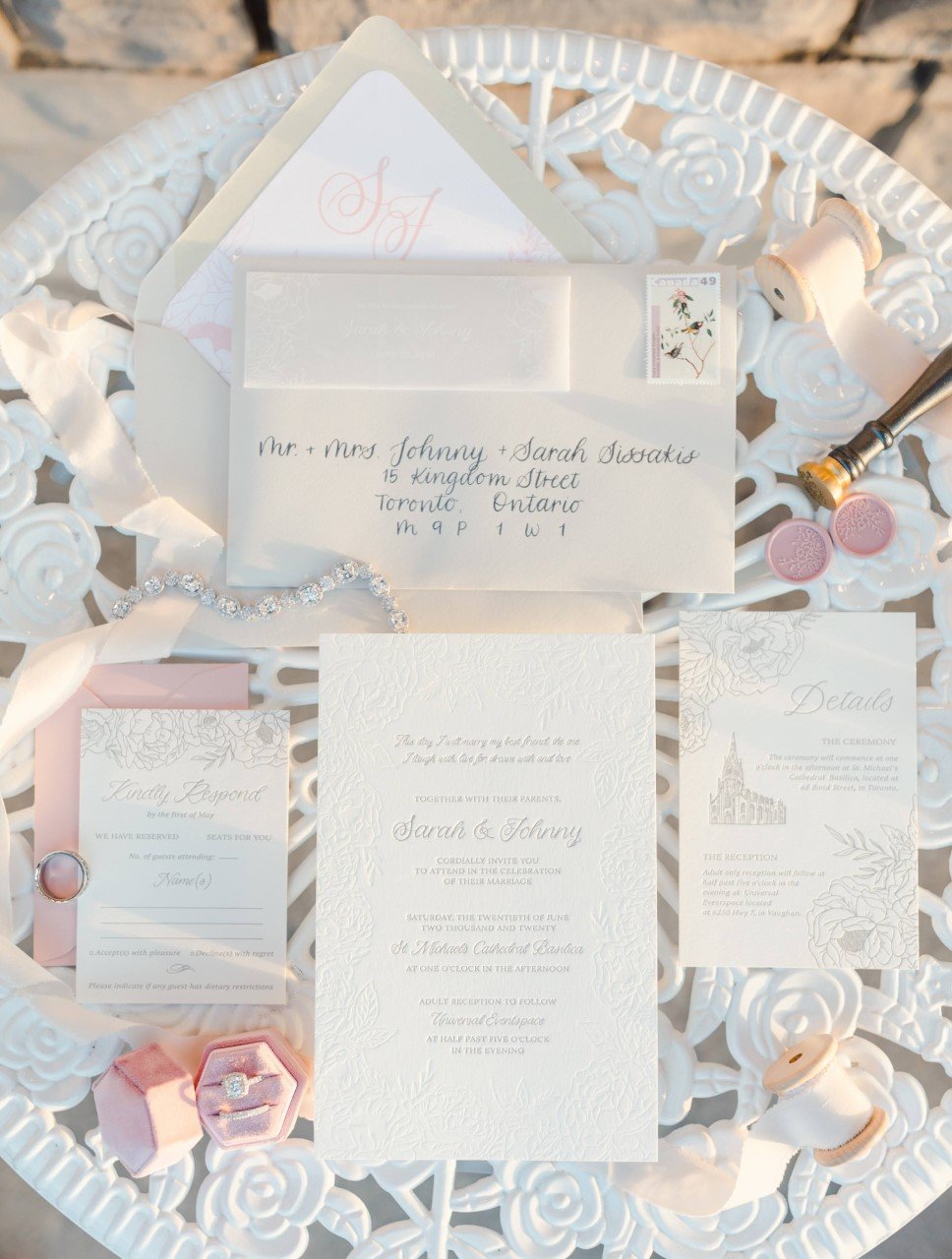
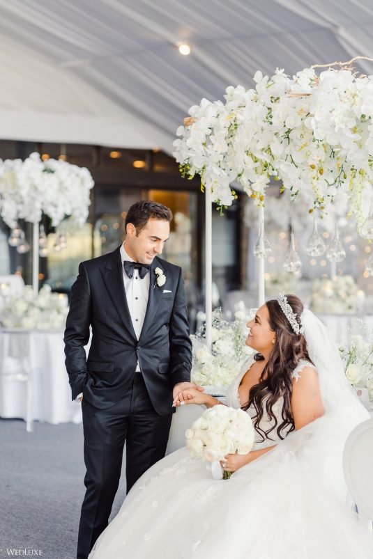
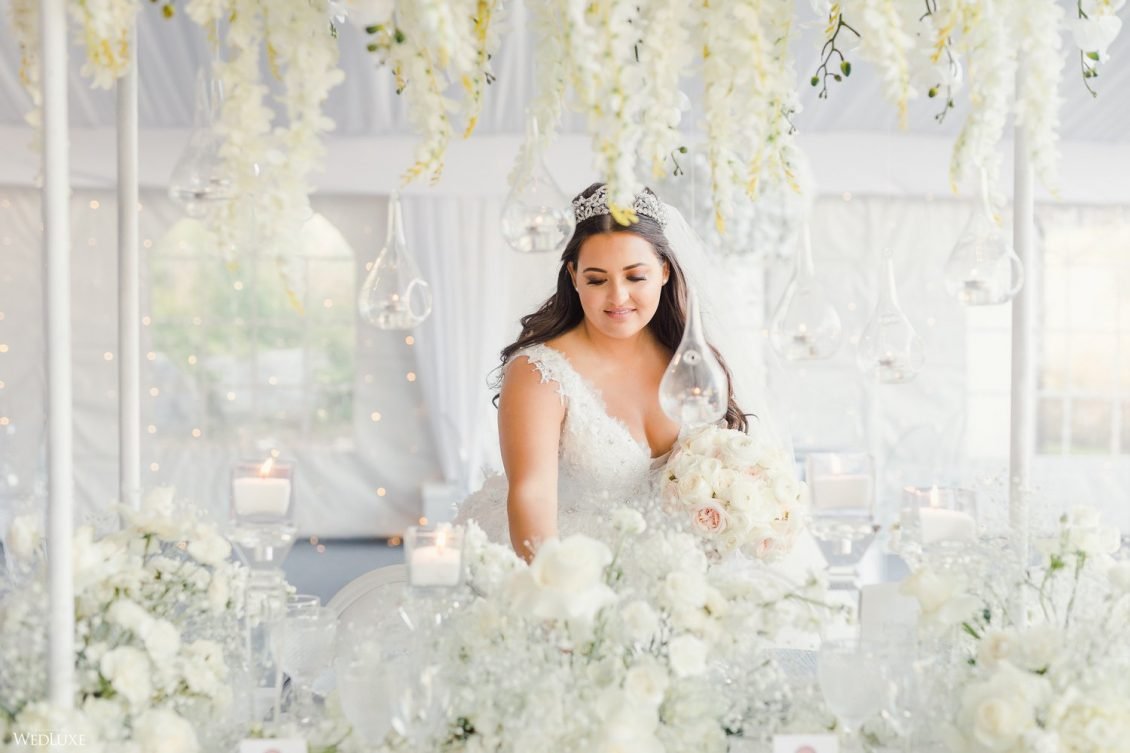
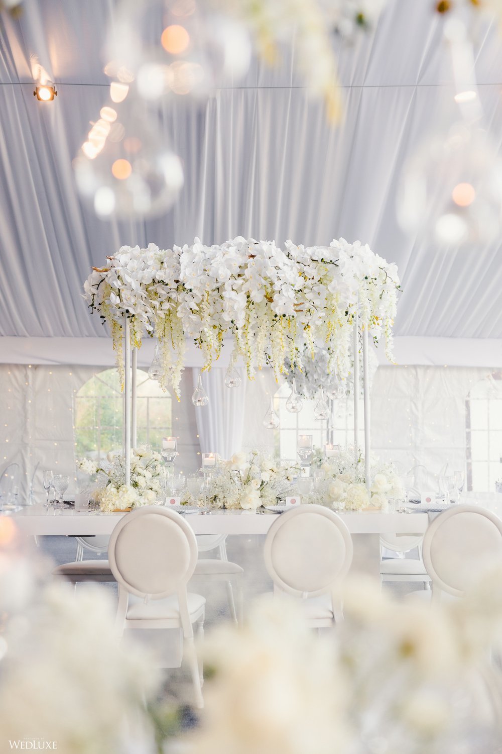
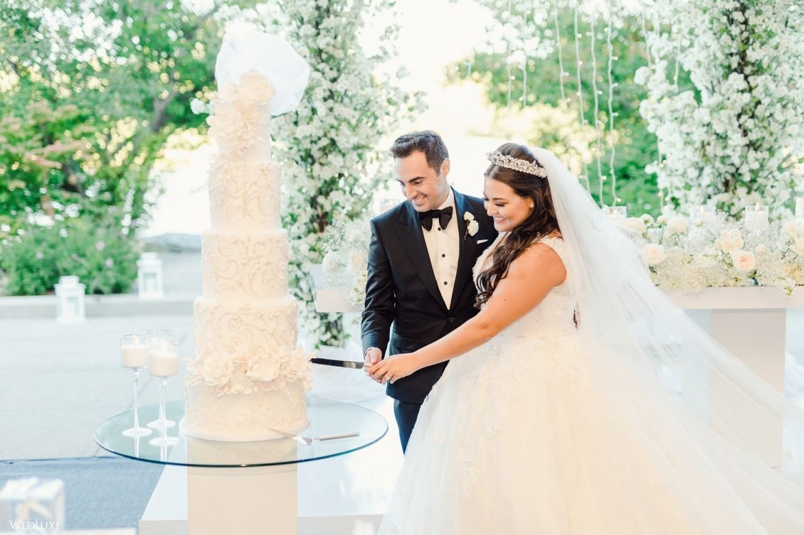
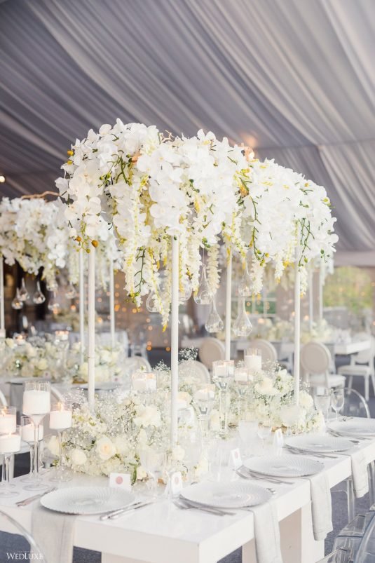
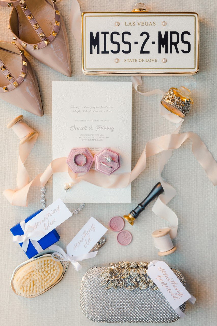
Sarah and Johnny’s tented wedding at the manor was only half as glamorous as the bride. Planning the wedding herself, she left no detail untouched. Wedluxe perfectly described it as an “Ivory Oasis”.
Their wedding invitations were beautifully letterpressed on thick cotton-blend paper, featuring a blind impression peony border, a details card with an illustration of their ceremony location and a pink peony envelope liner.
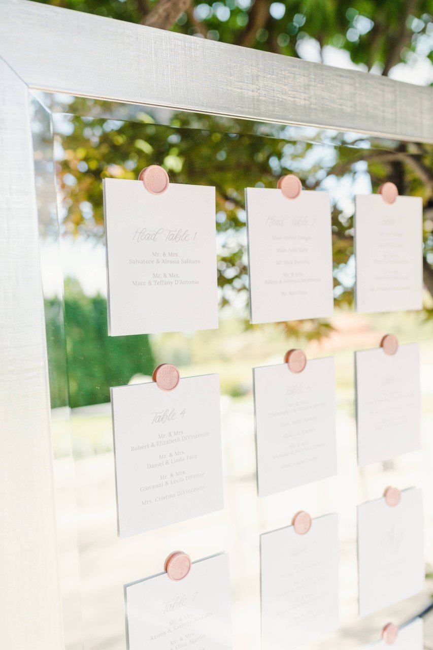
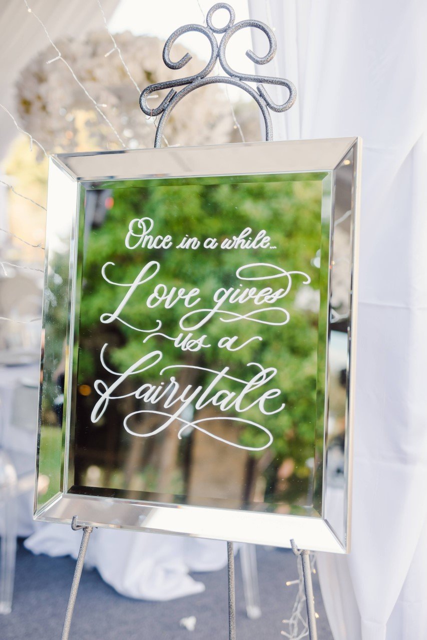
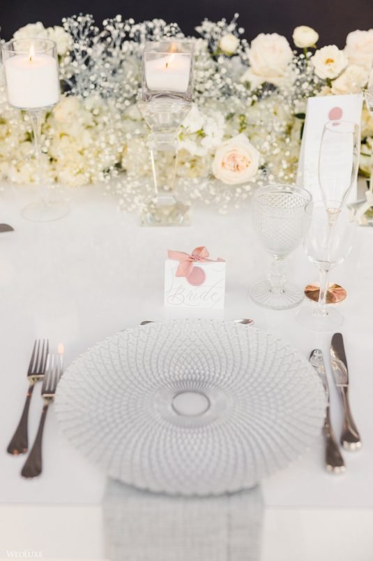
Her day of stationery included pink and rose-god touches that brought a soft pop of colour to her all-white wedding. A mirror seating chart included wax seals, which were also featured on their place cards and tented menus.
leigh + kevin
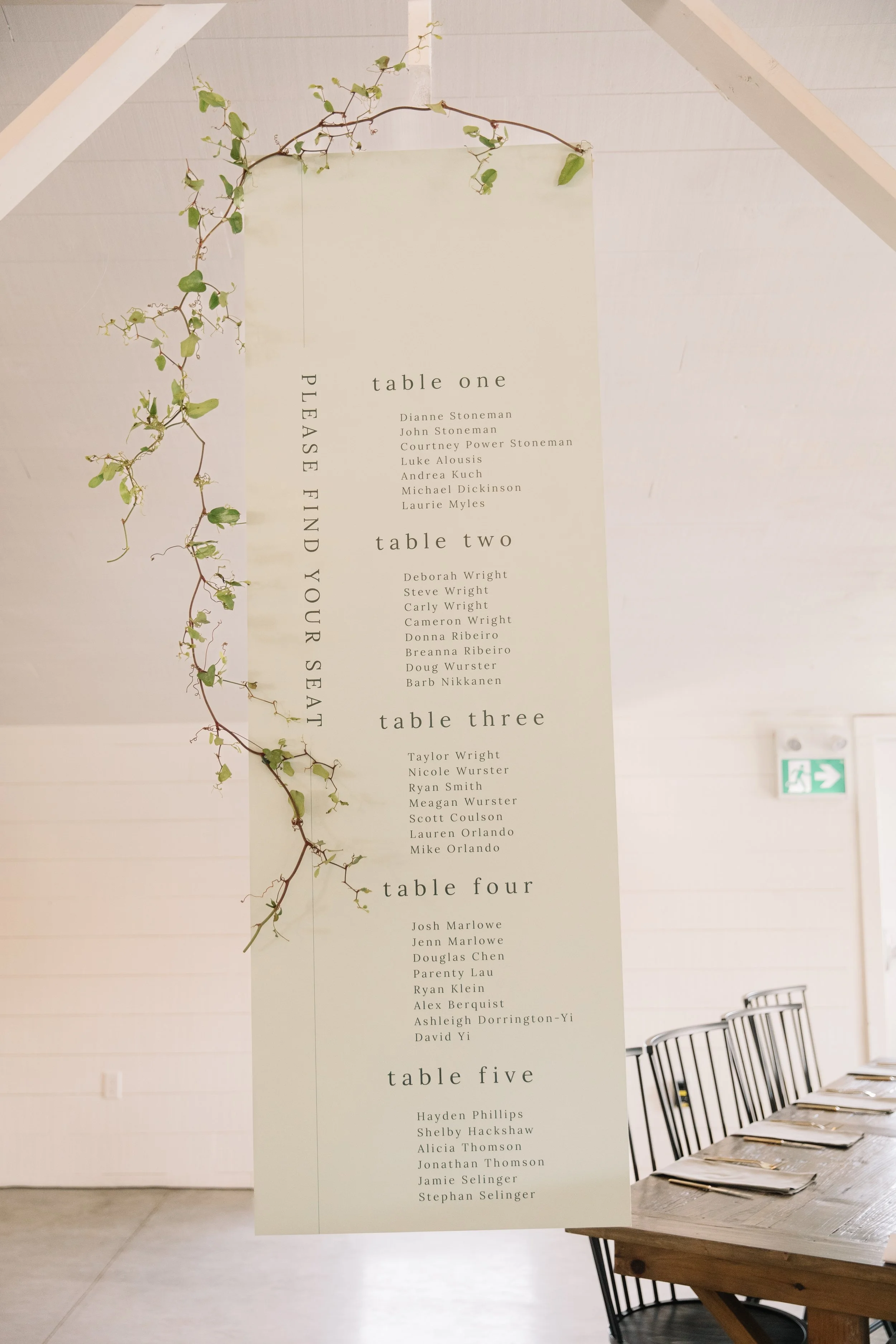
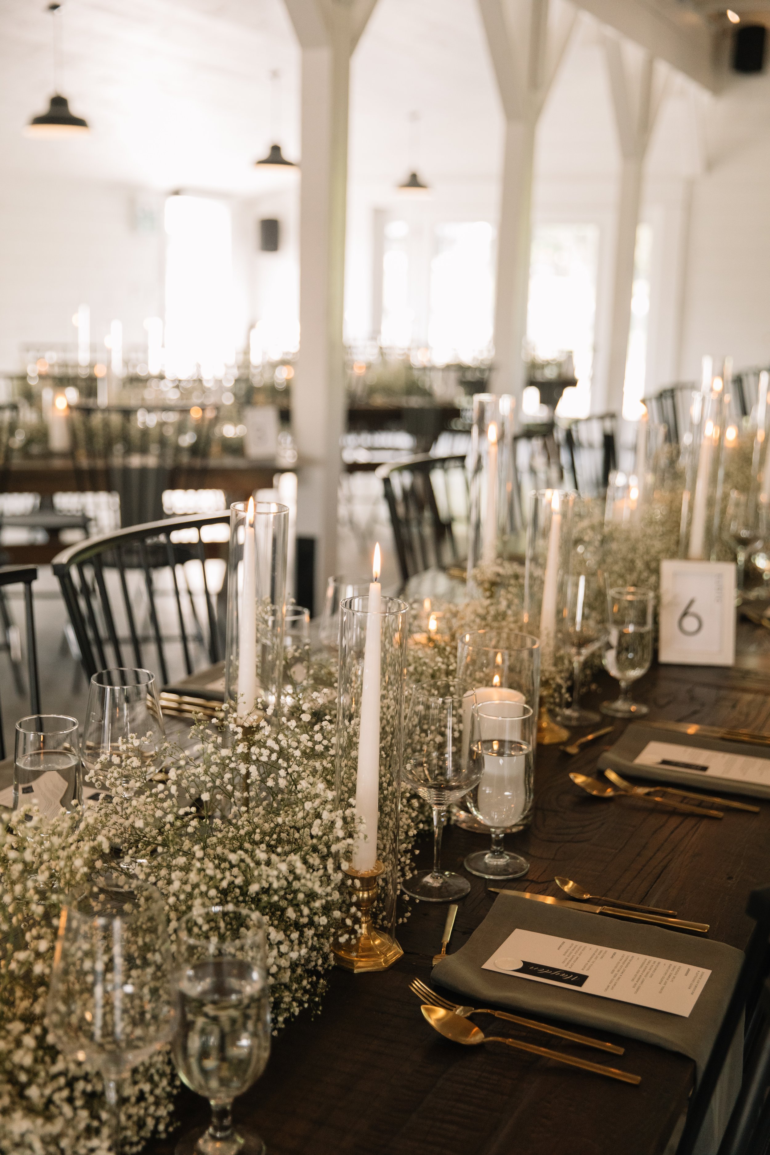
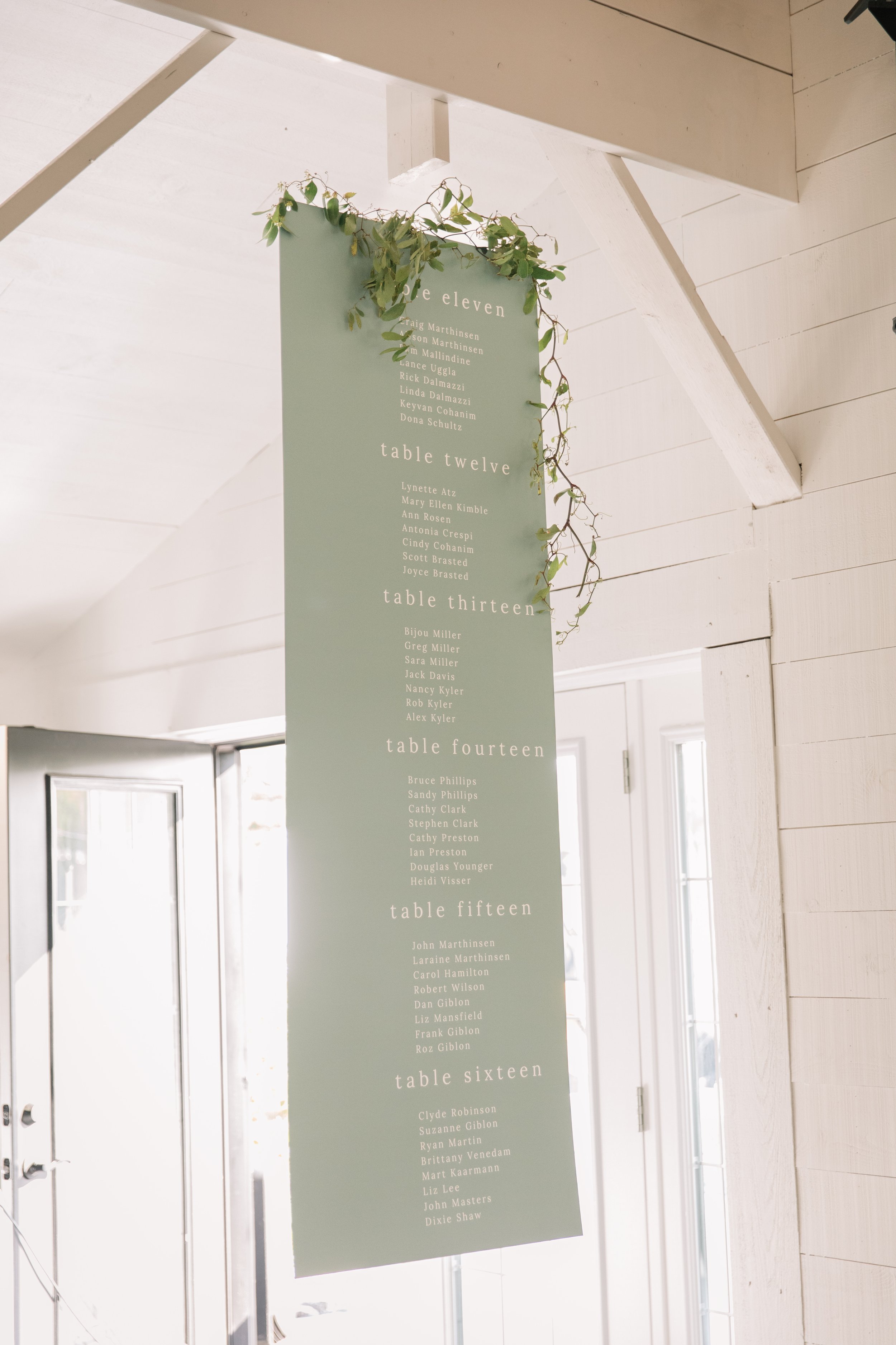
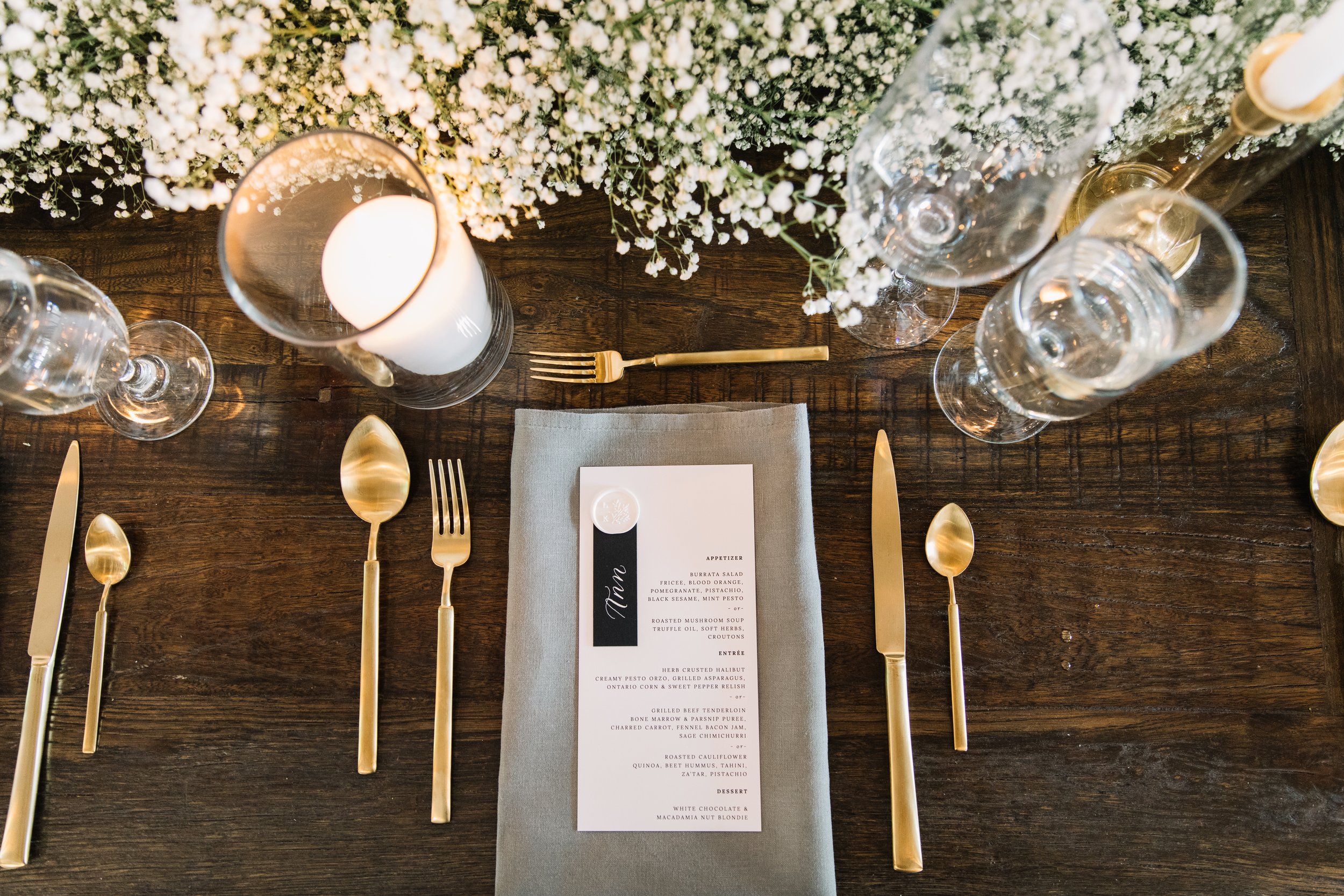
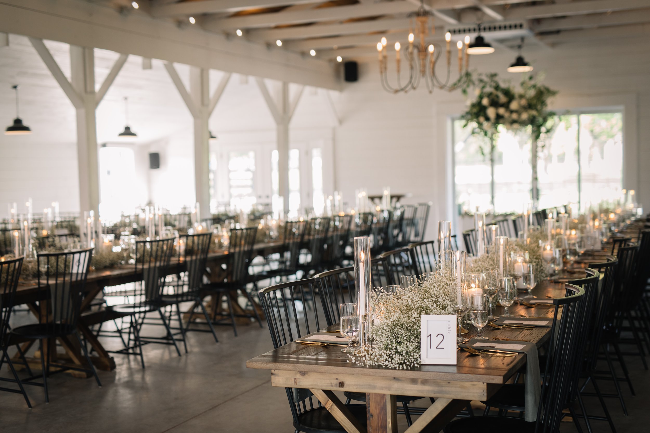
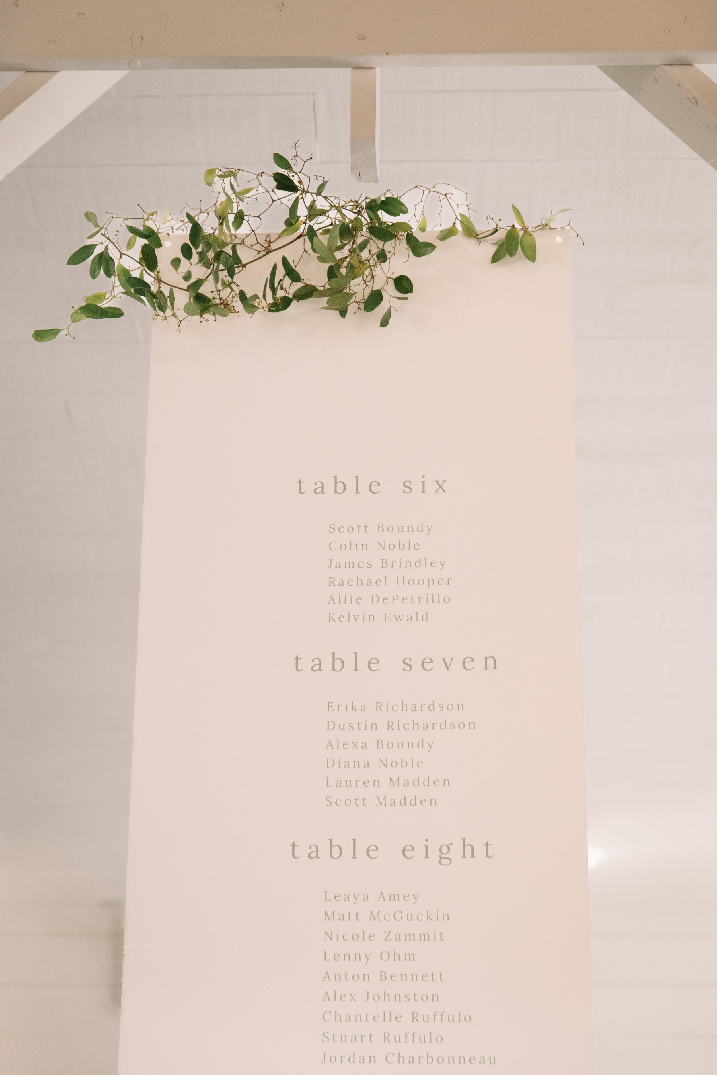
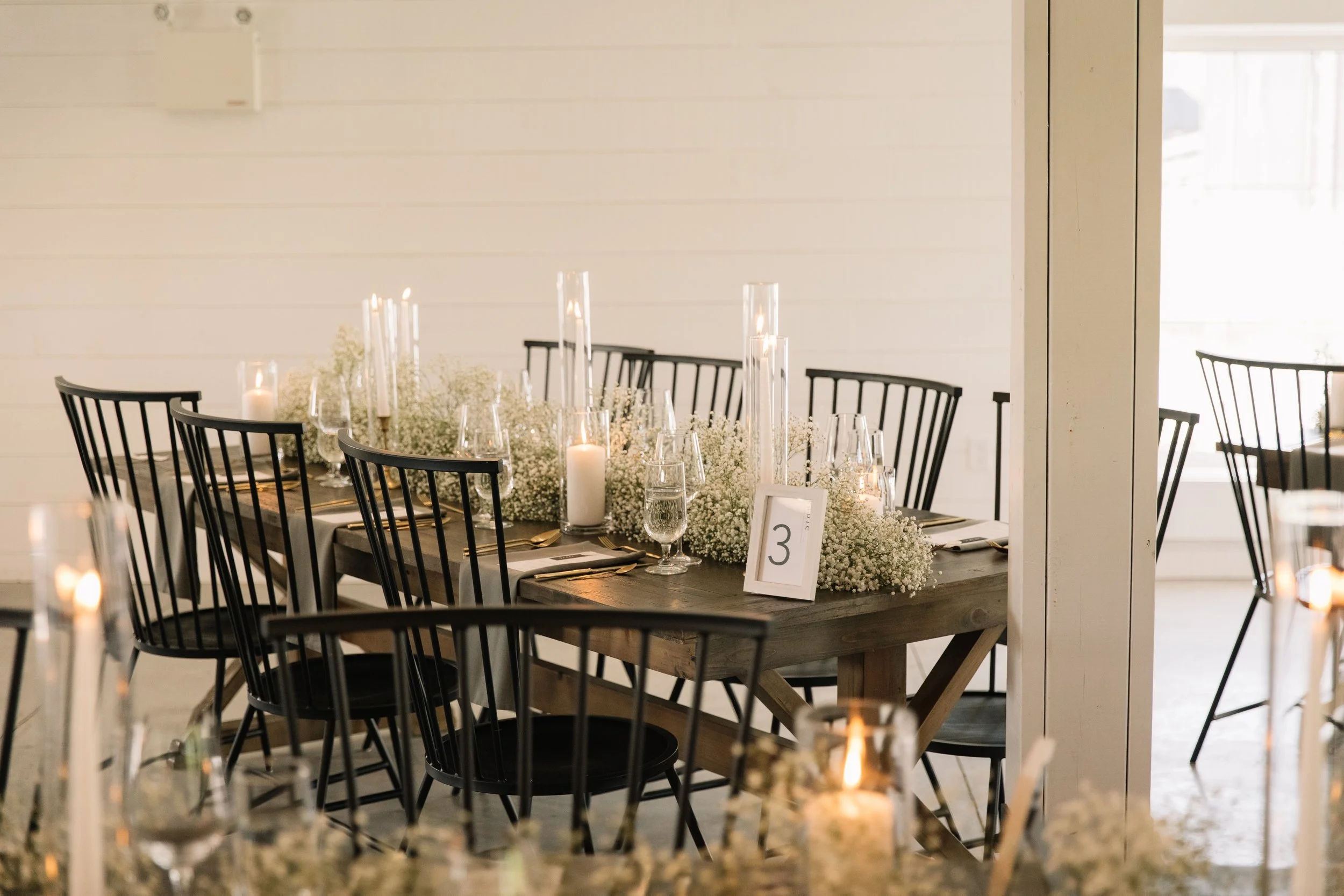
Leigh and Kevin’s wedding was simplicity at its finest. Their seating charts were hung from the ceiling and draped in greenery and their table scapes were adorned with candles and baby’s breath. Their stationery design was kept minimal but unique. Calligraphy place cards were fastened to each menu with a personalized wax seal.
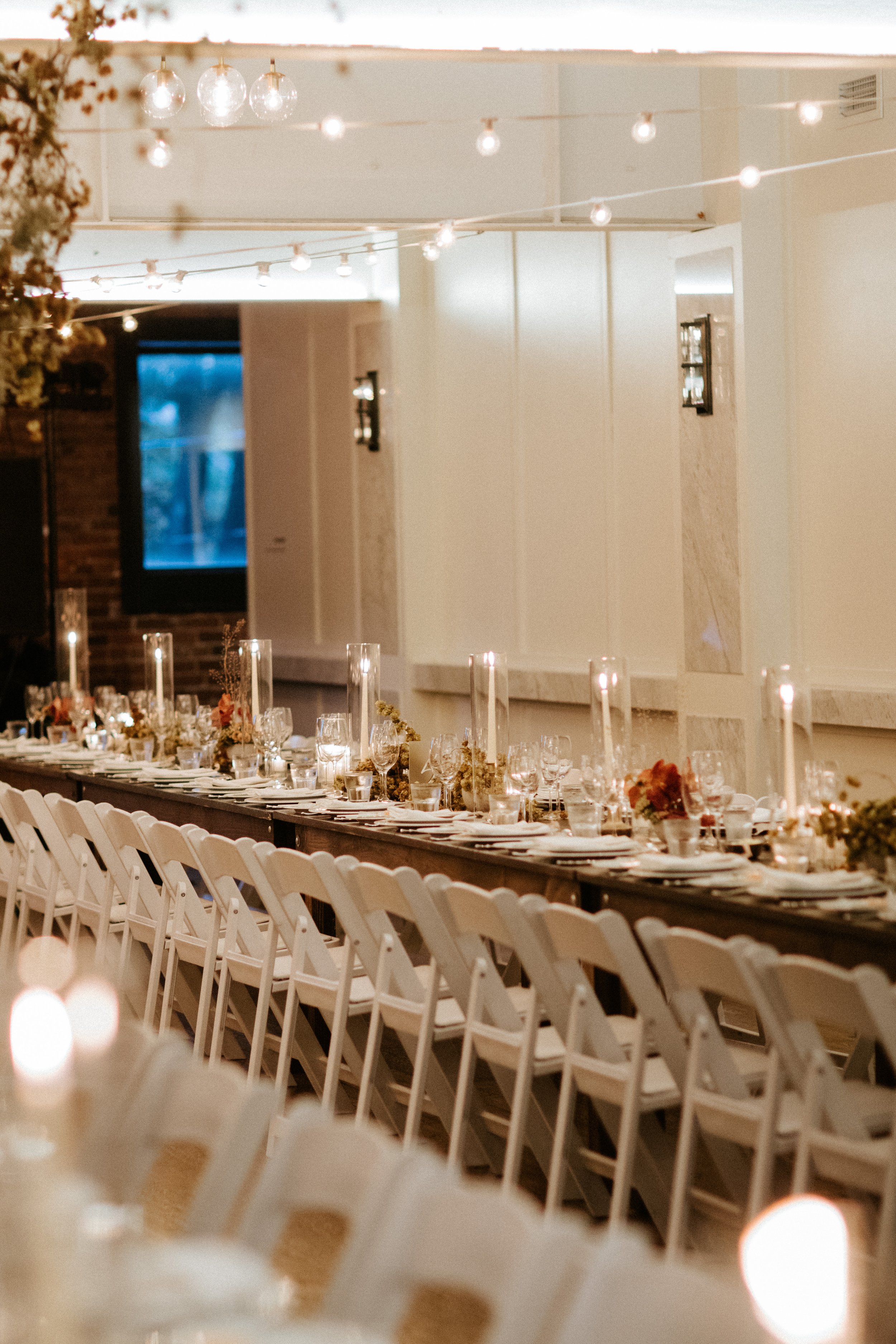
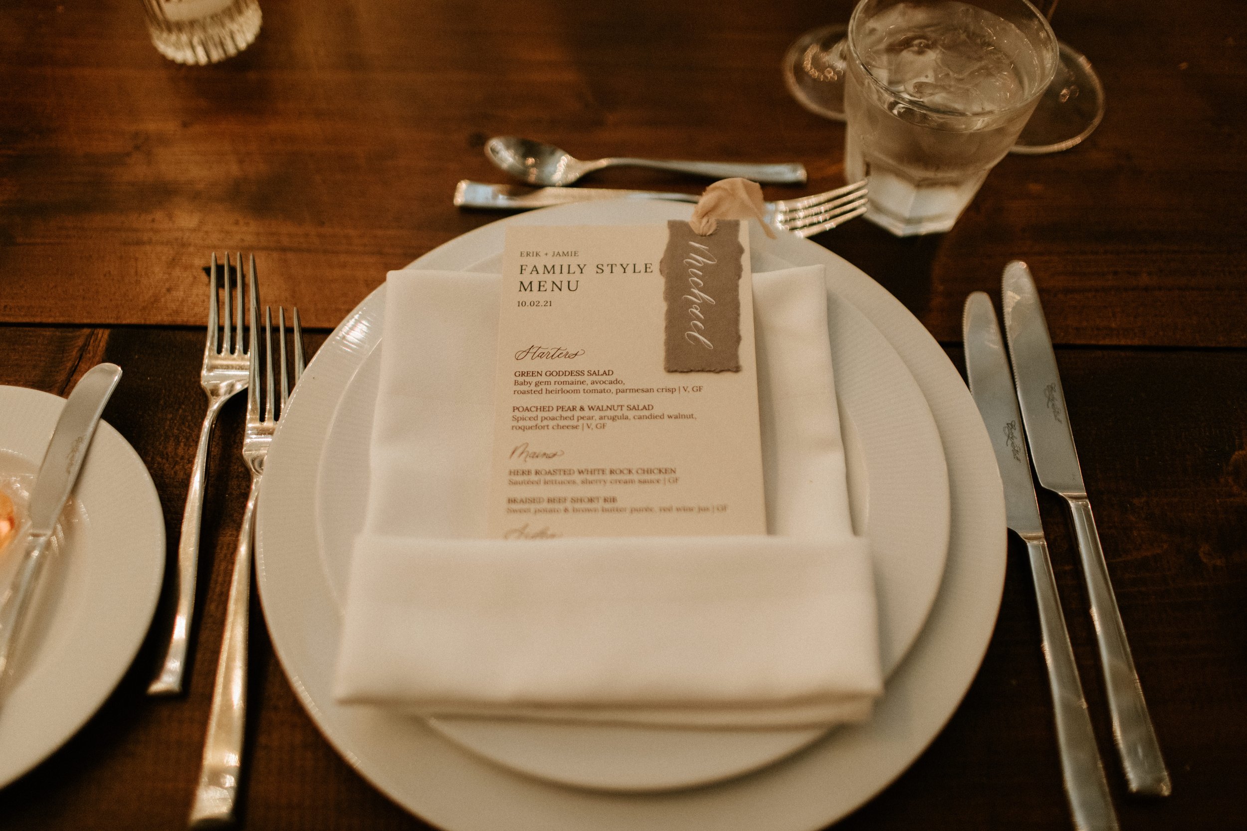
jamie + erik
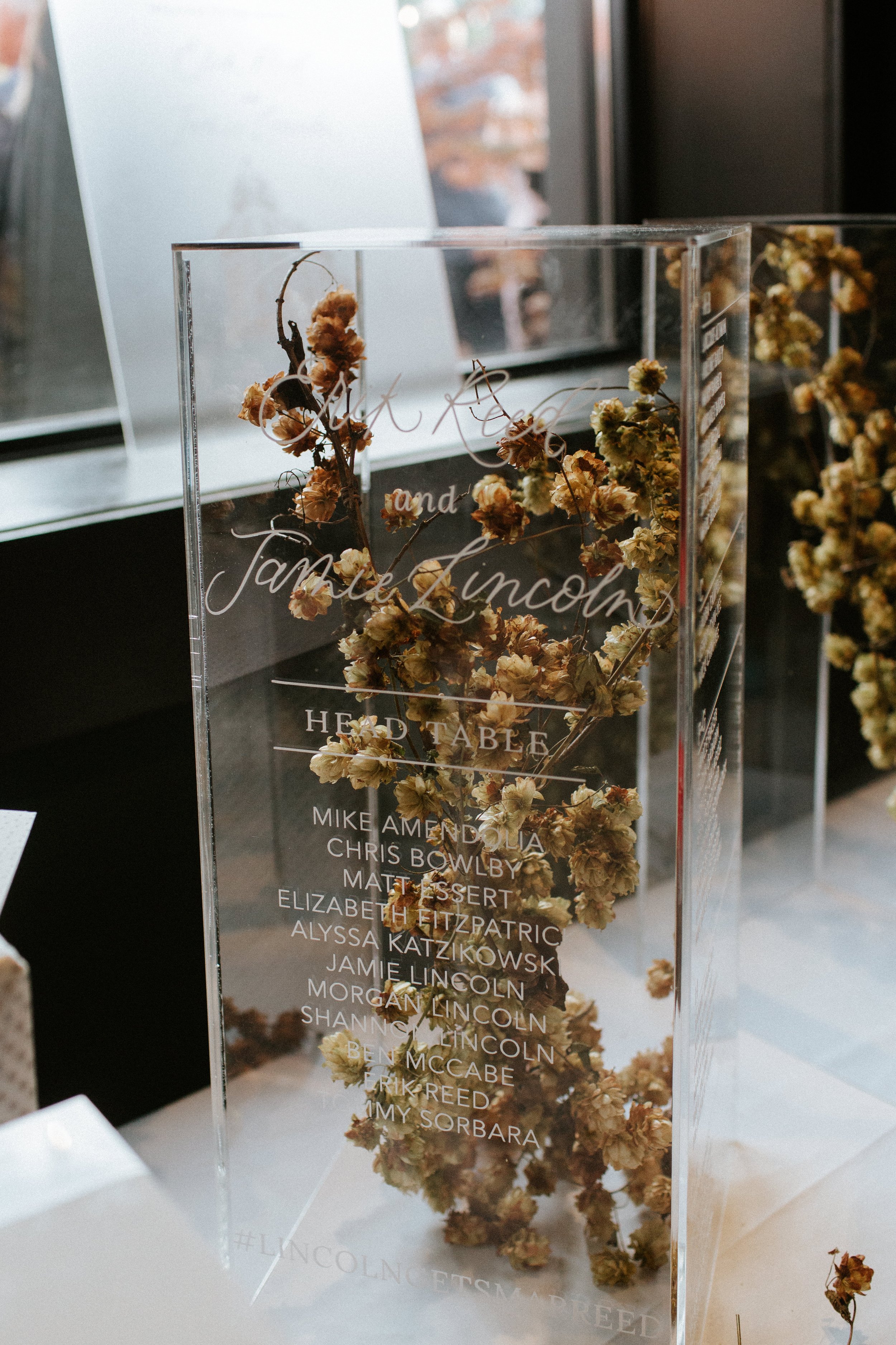
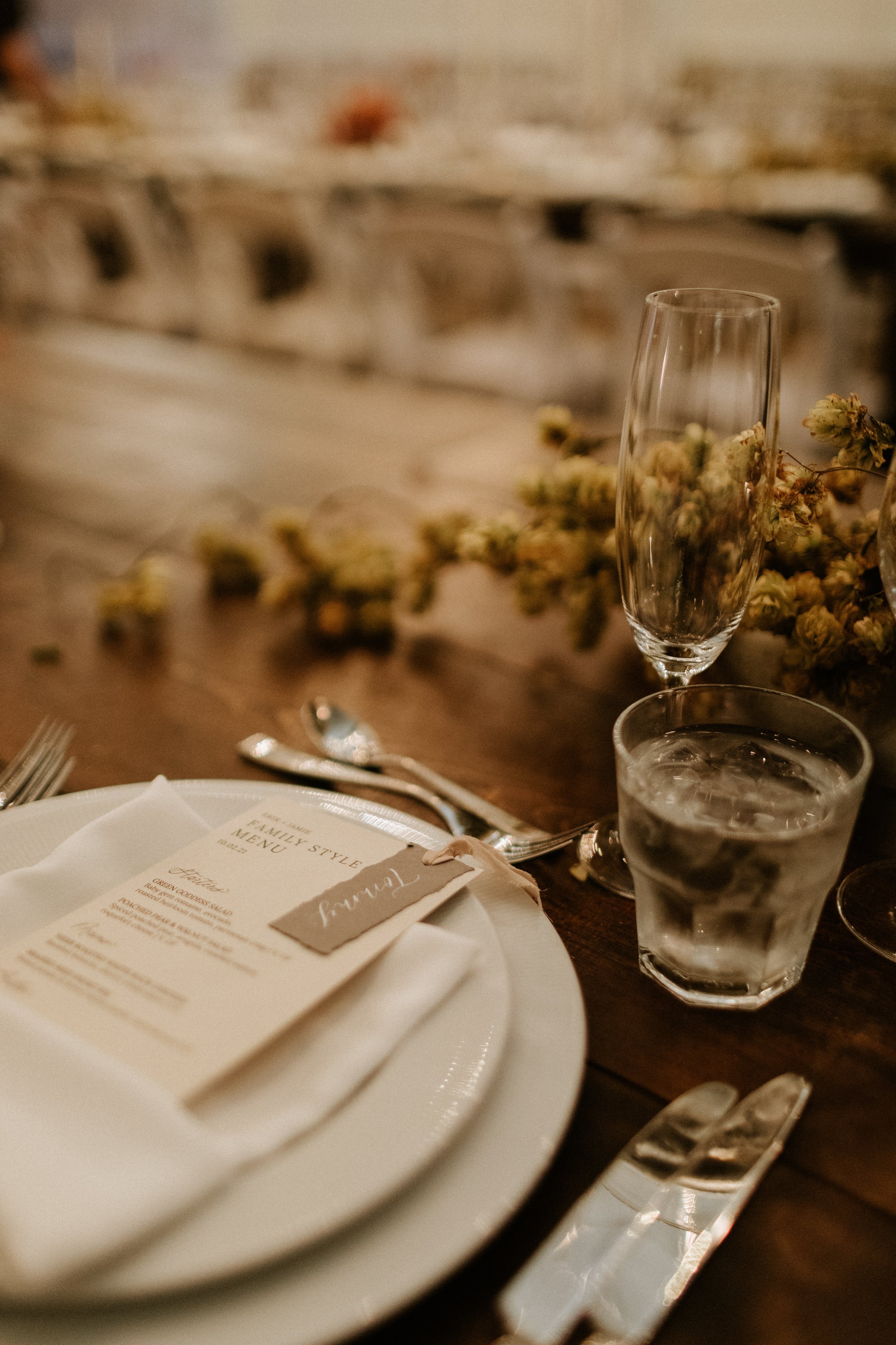
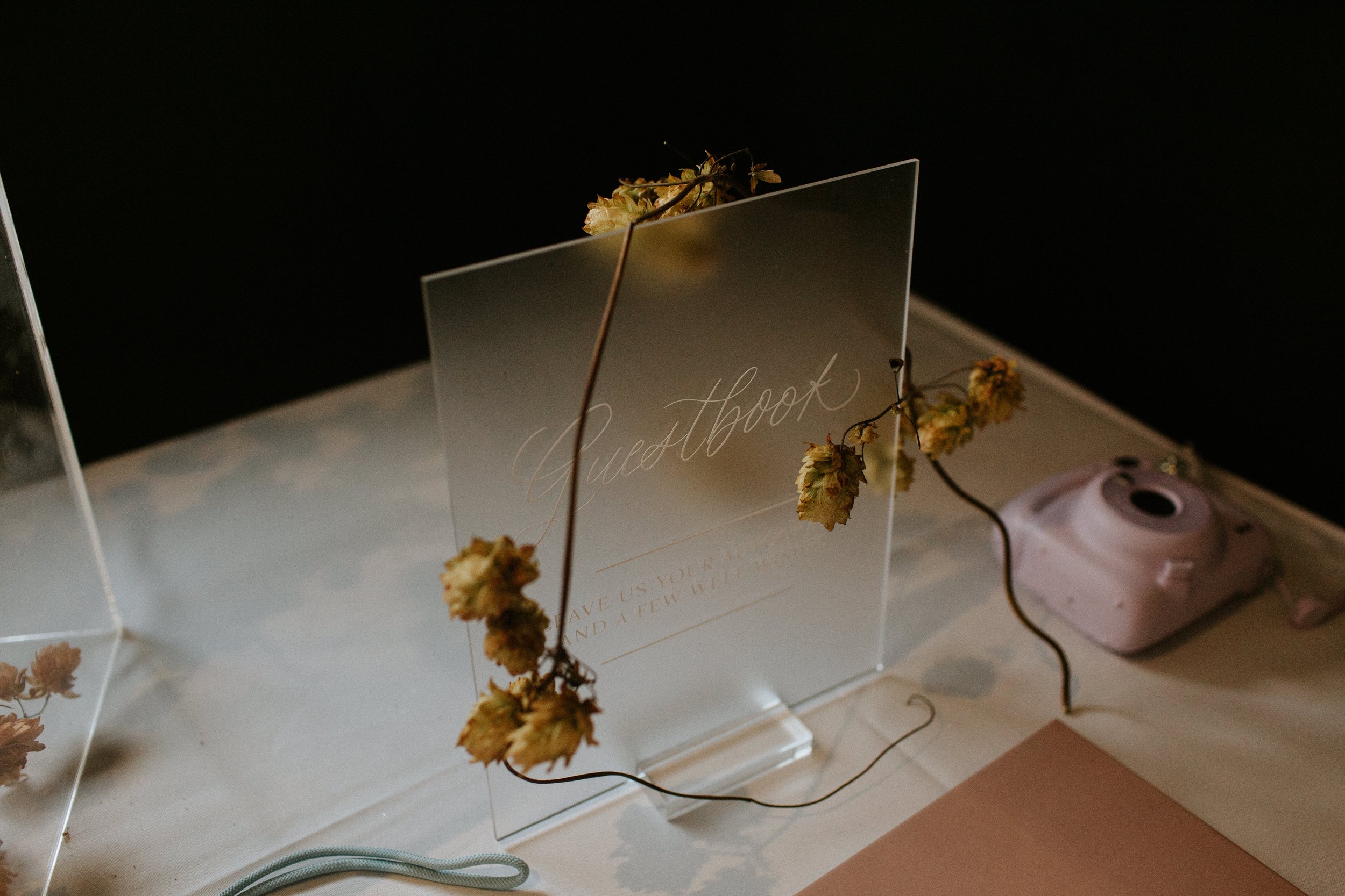
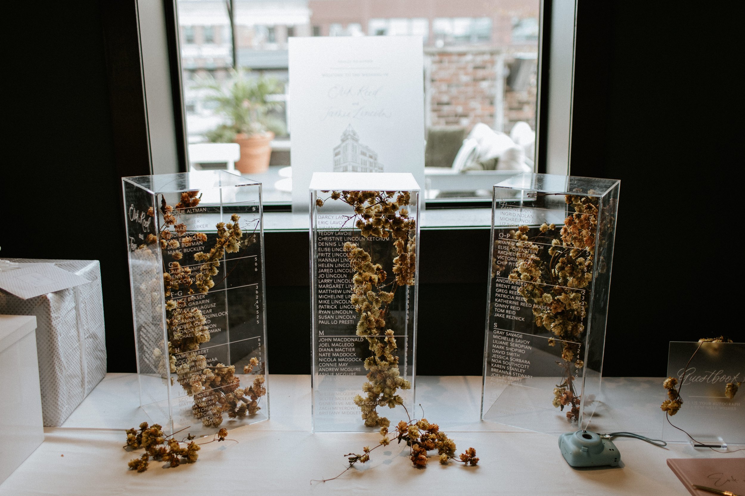
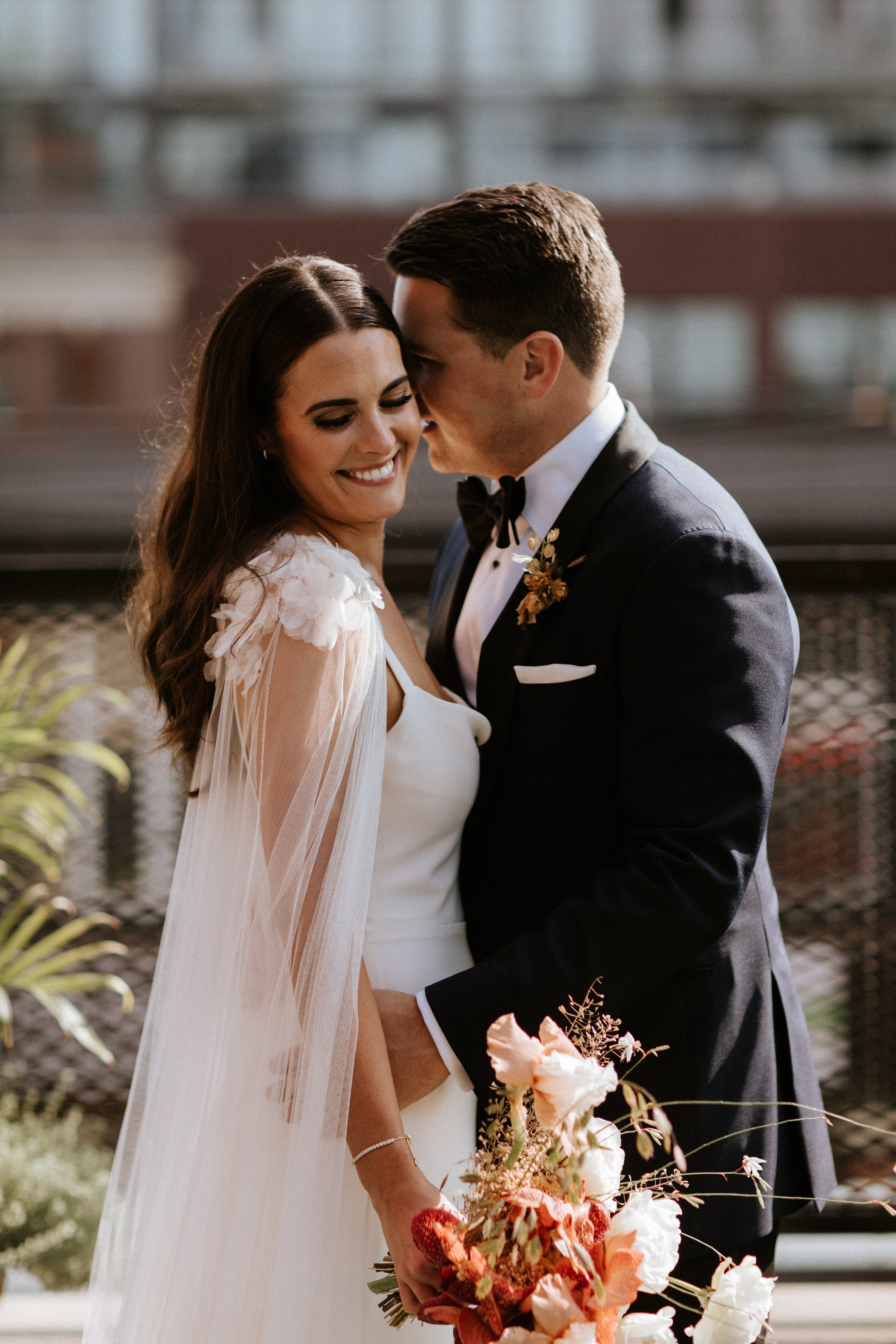
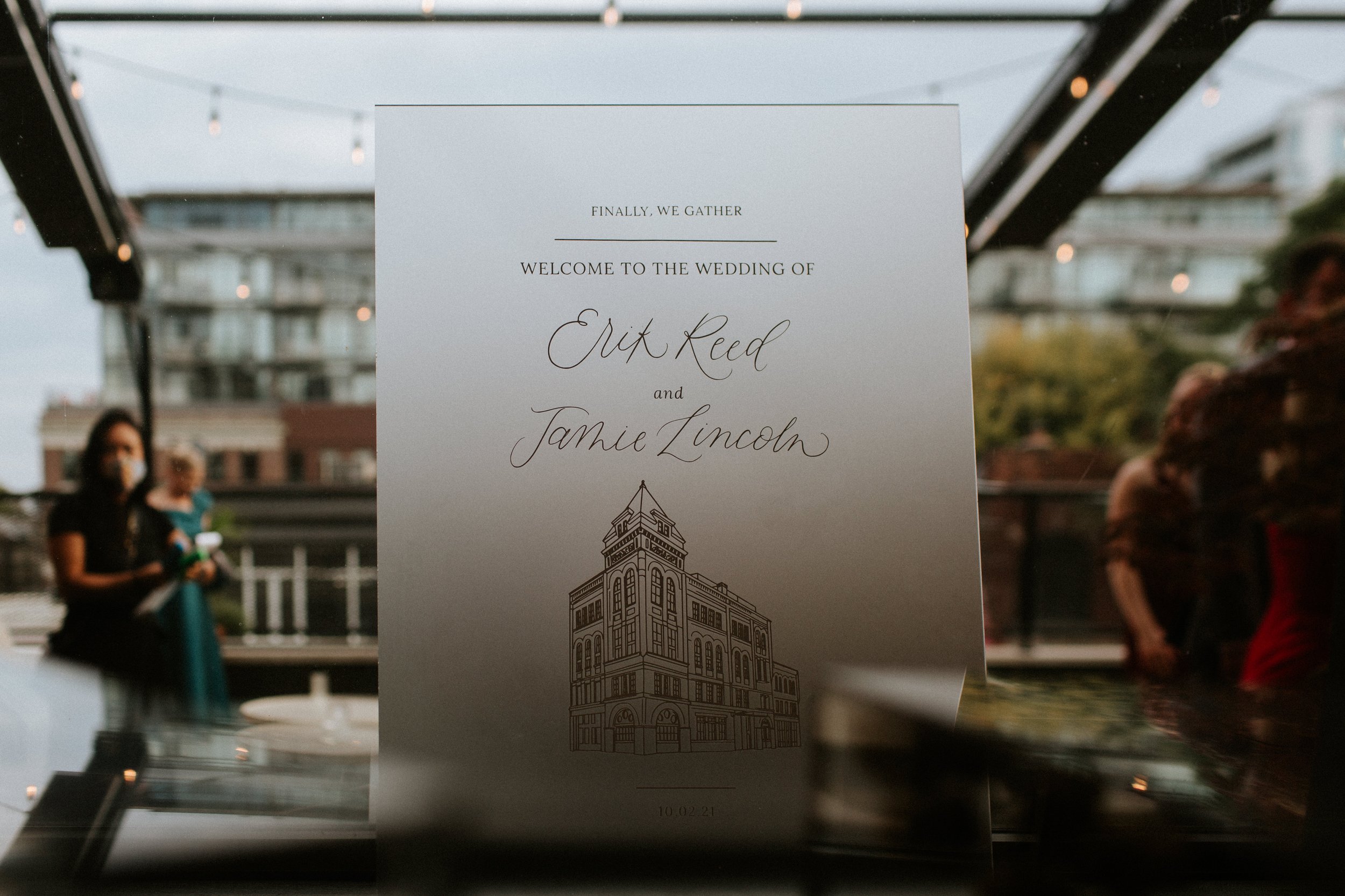
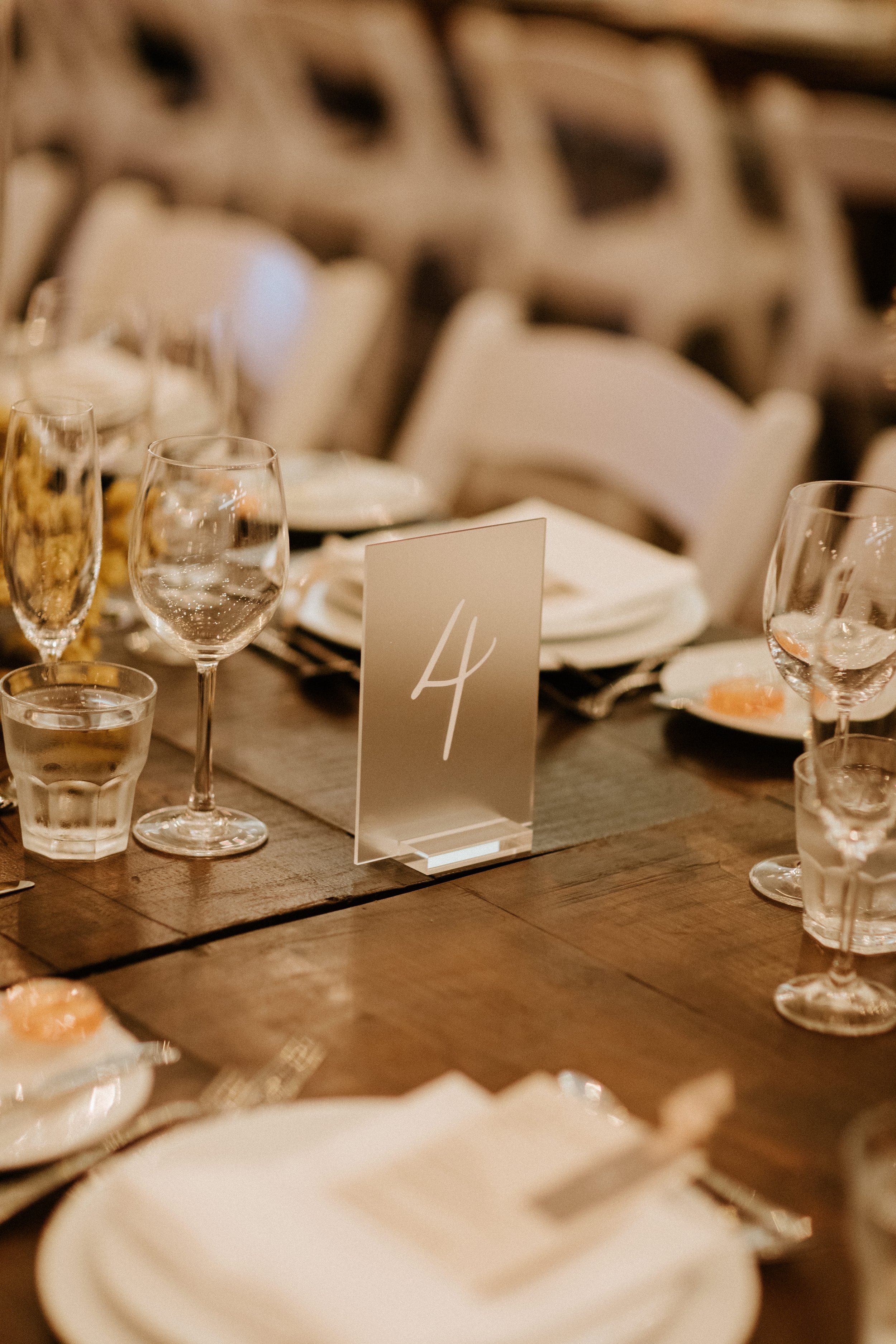
Jamie and Erik’s seating chart was a unique display. The seating chart was applied to acrylic plinths, which were then displayed with dried florals within. The remainder of their signage was designed on frosted acrylic. Their calligrpahy and hand-torn place cards were fastened to their off-white menus with silk ribbon.
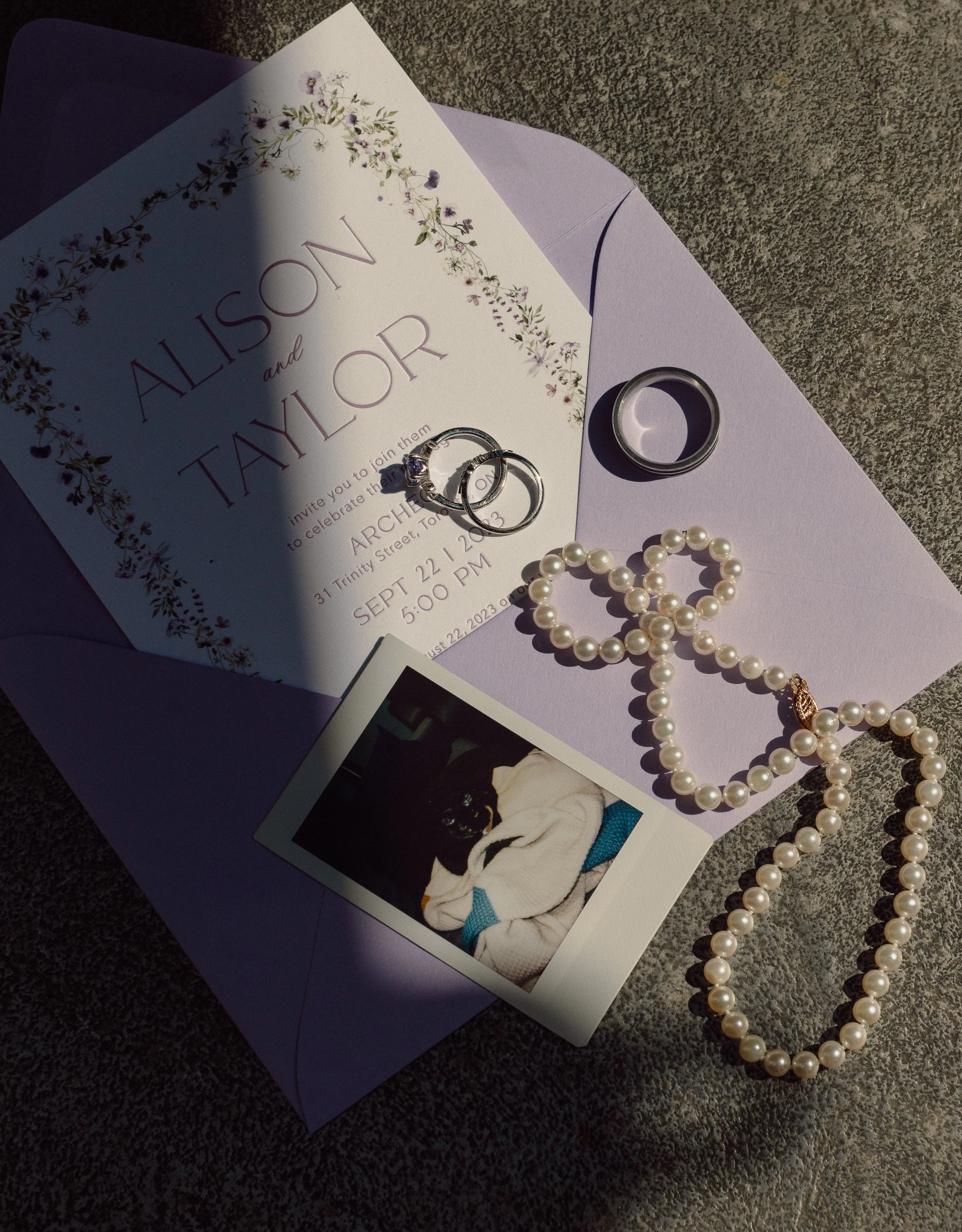
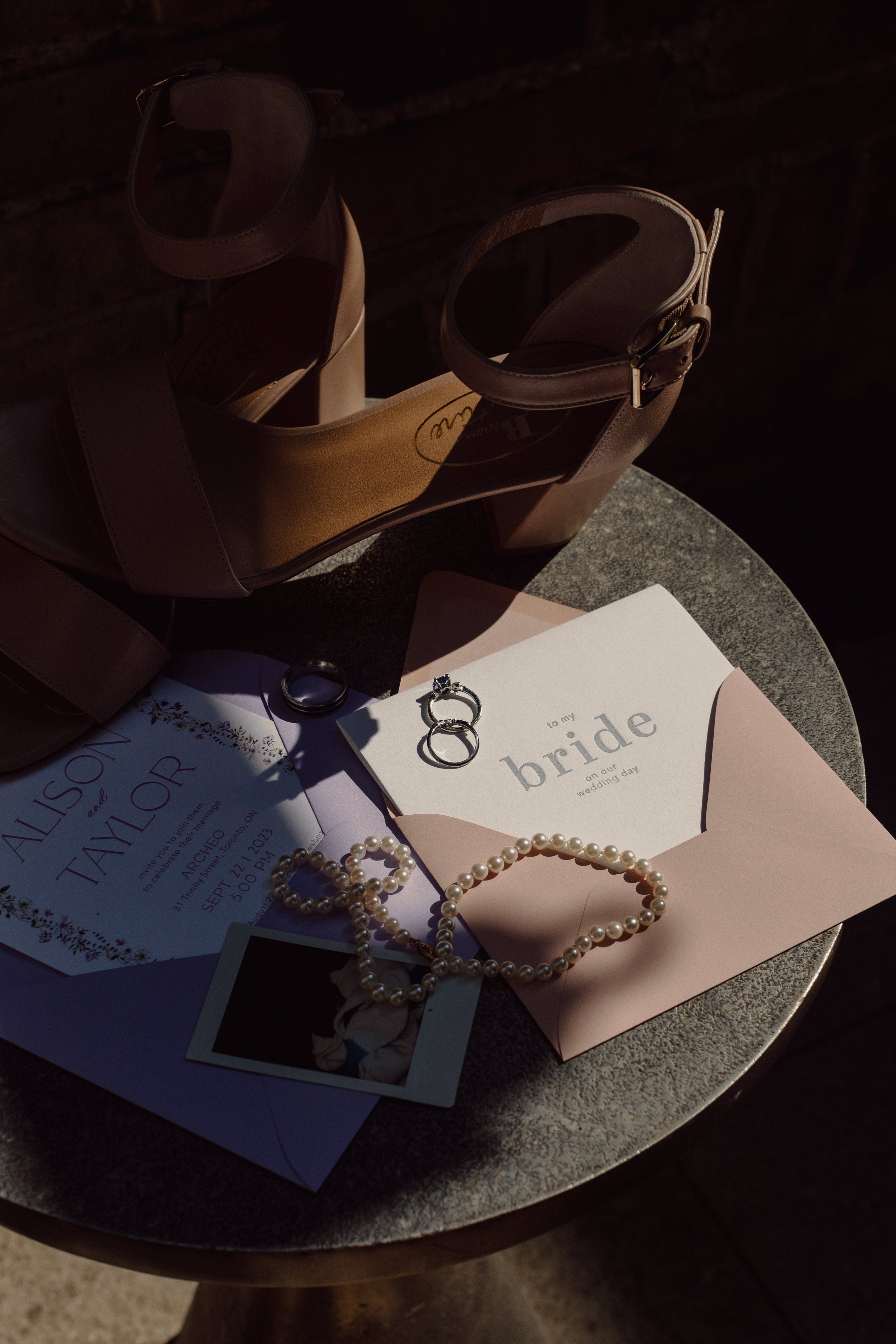
alison + taylor
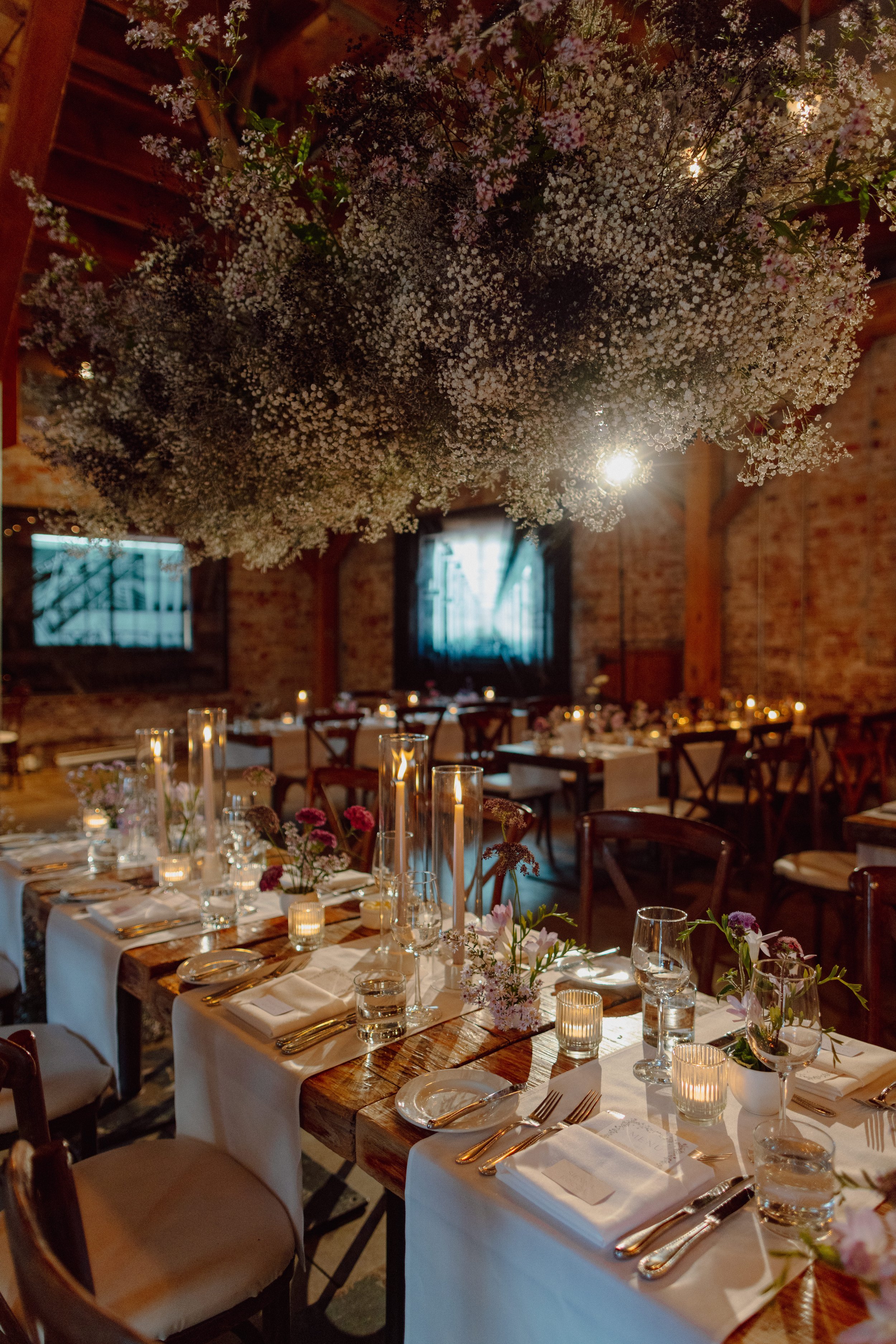
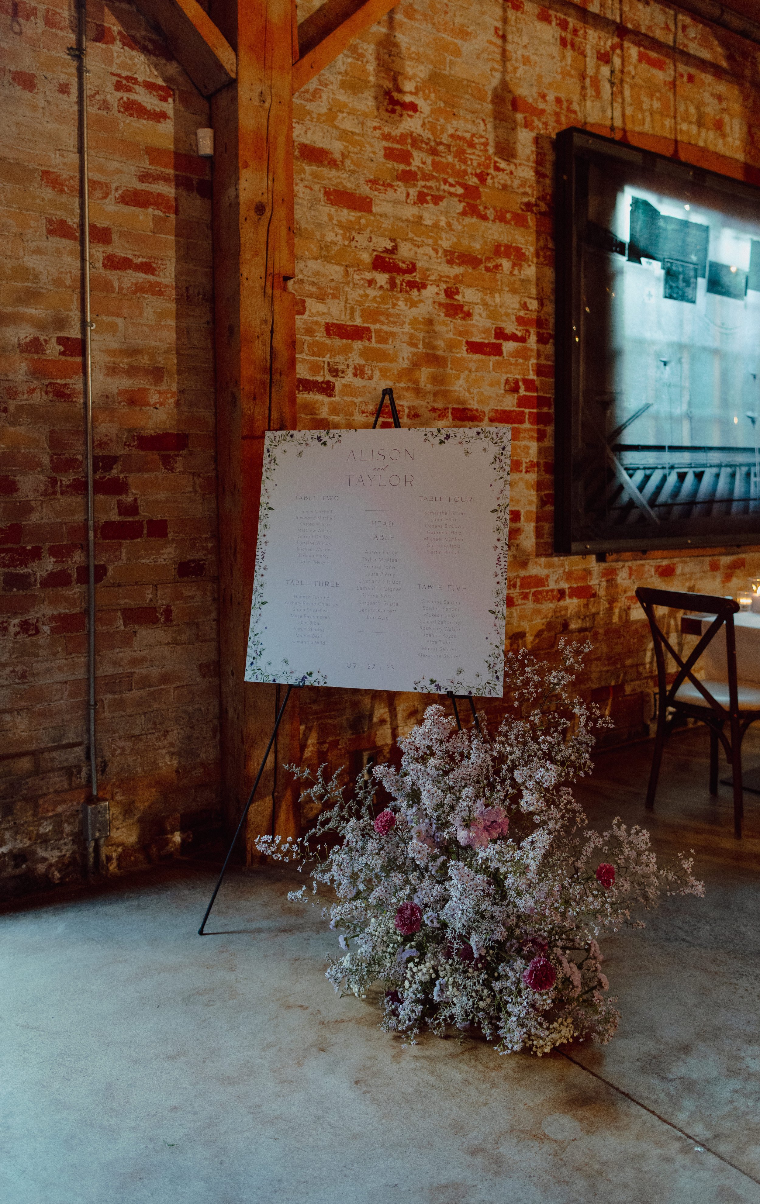
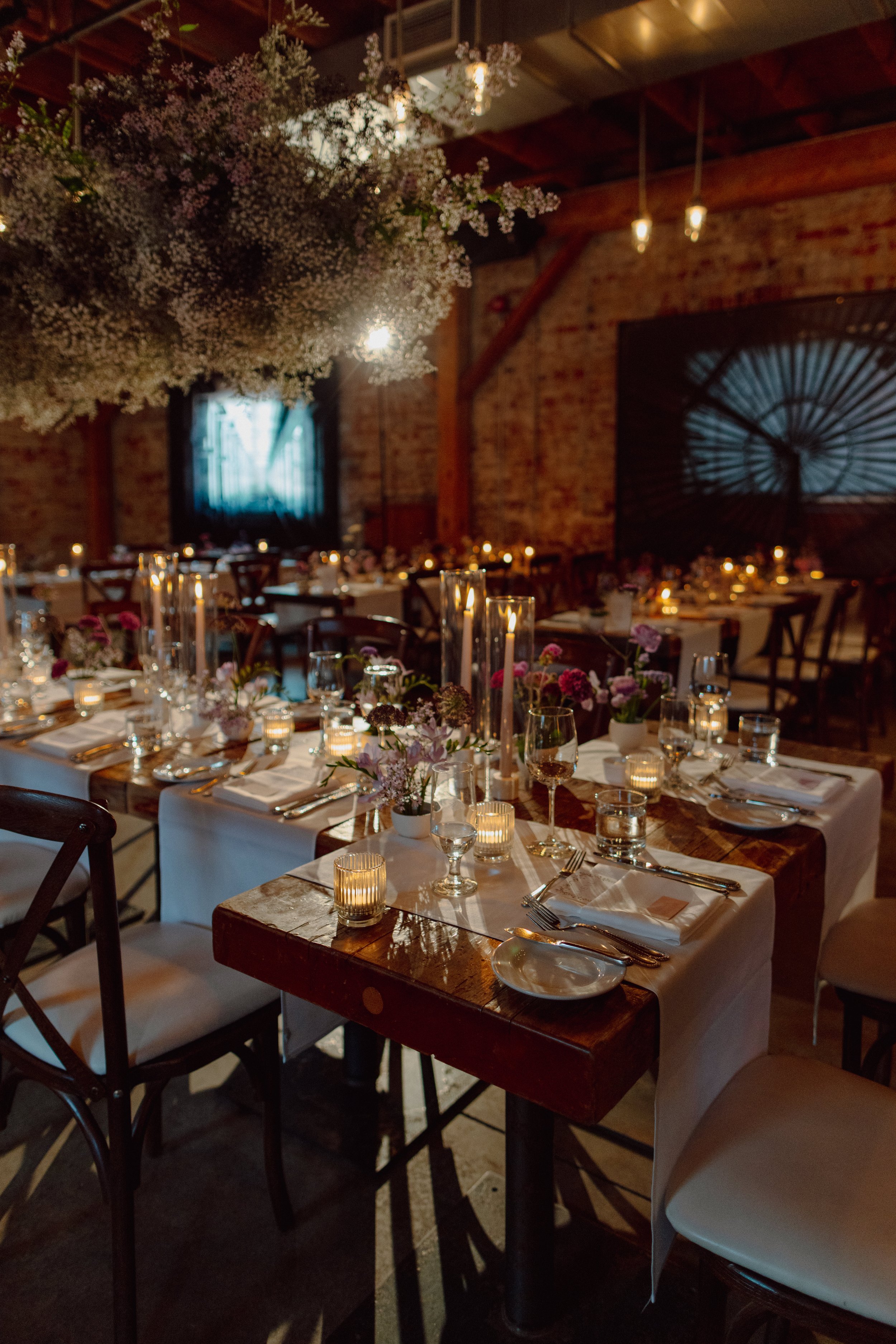
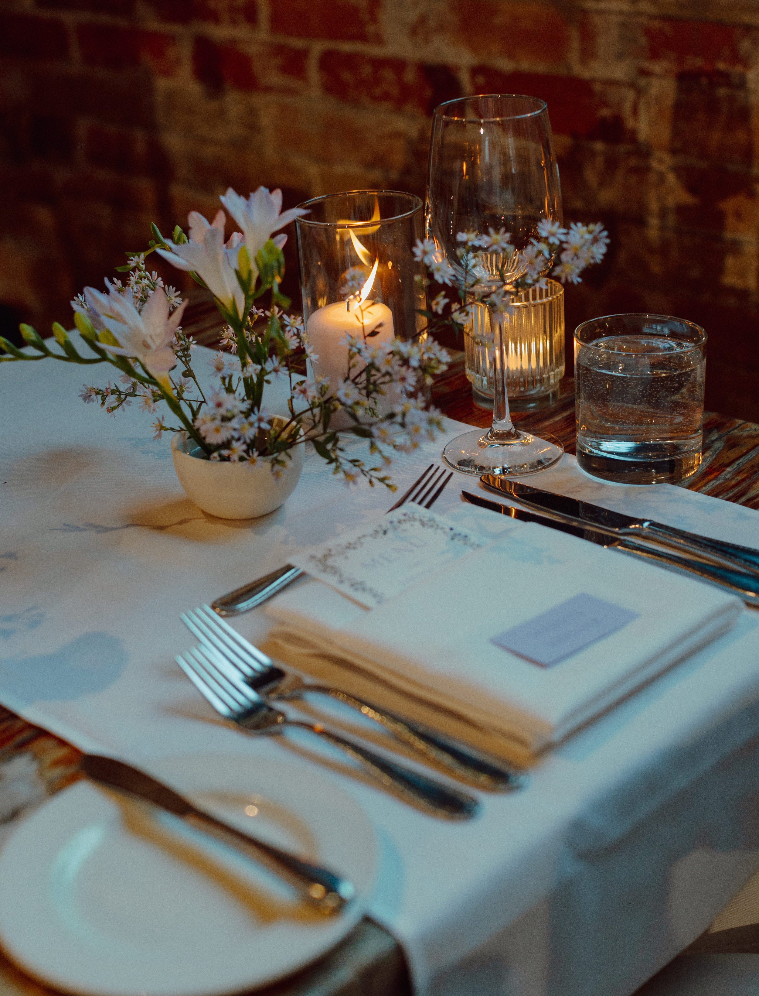
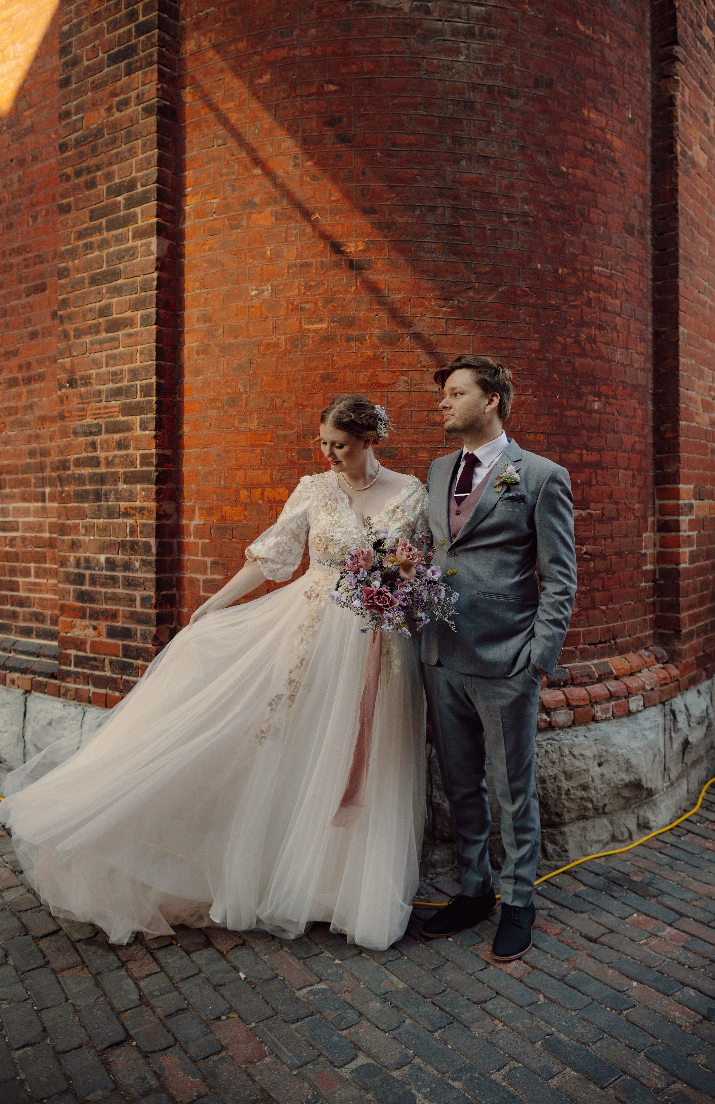
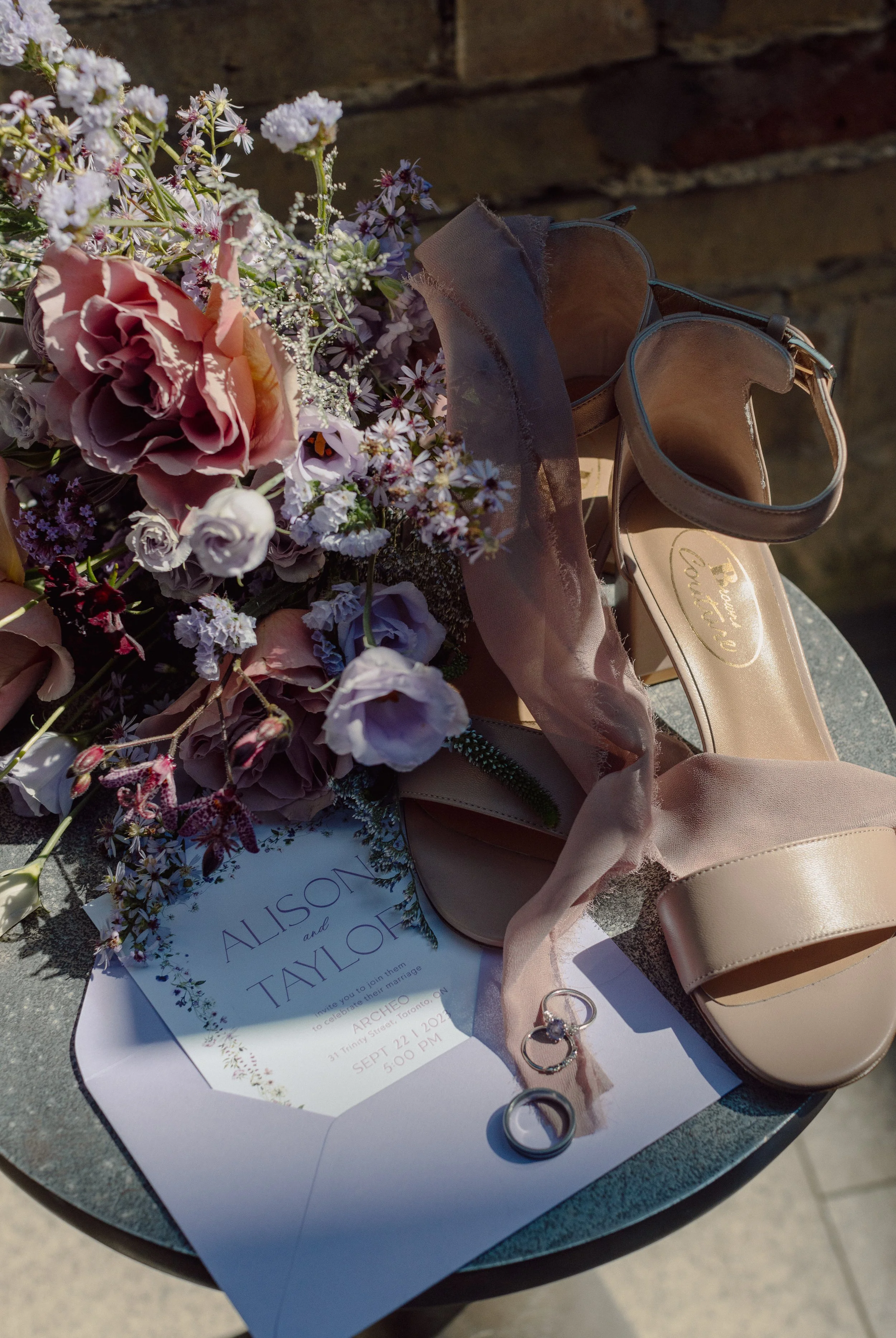
Alison and Taylor’s wedding photos evoke the feeling of renaissance art. Their wedding invitations featured a lavender envelope, a floral watercolour boarder and letterpressed copy. Their day of stationery included menus with floral borders and a large seating chart display.
madeline + ryan
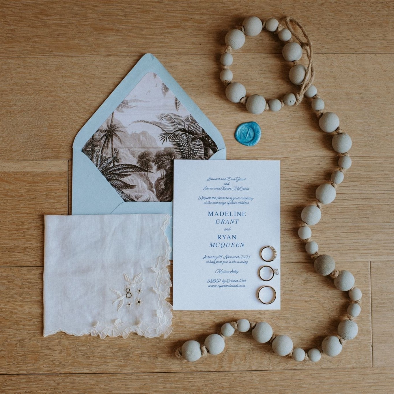
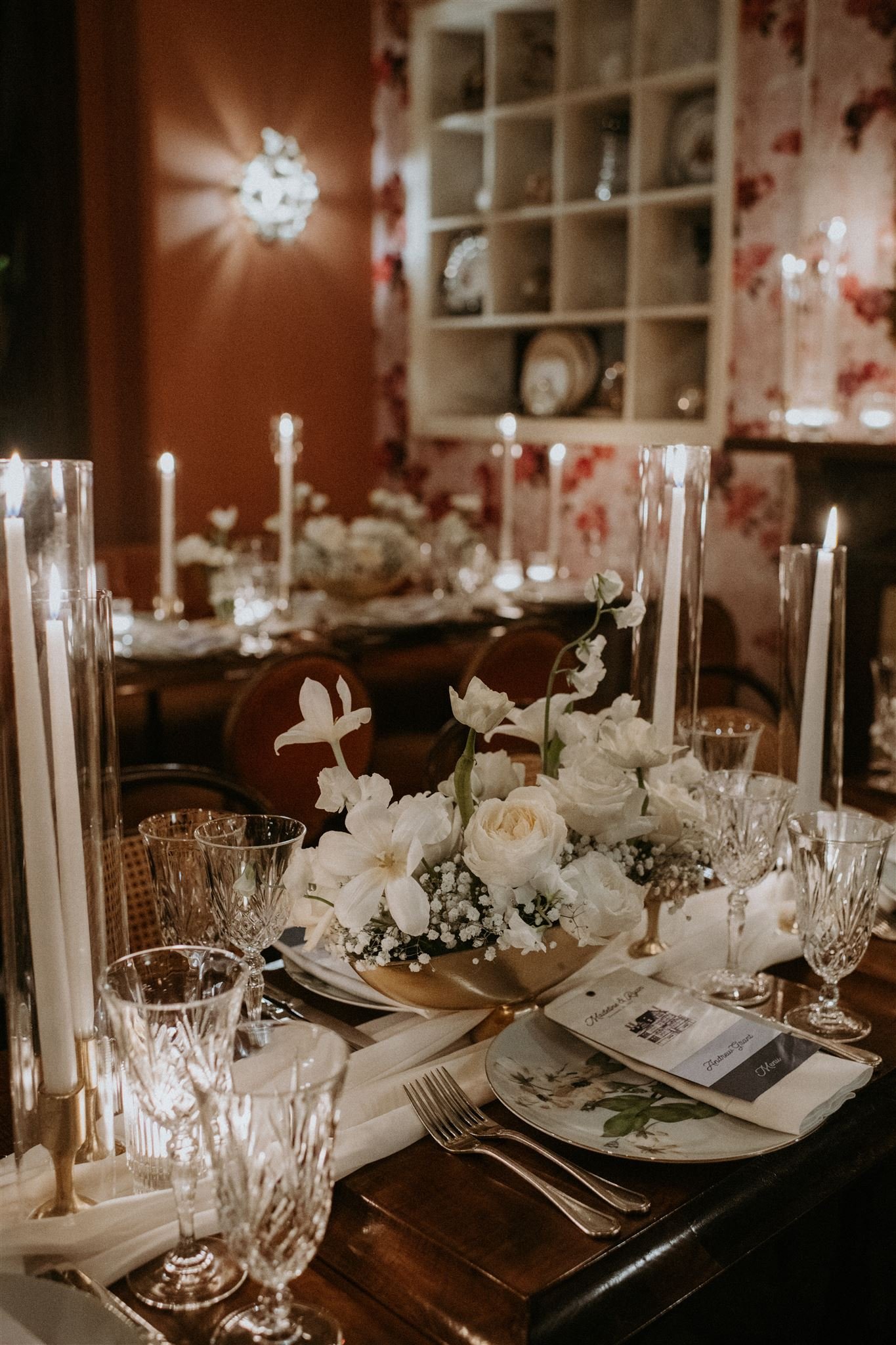
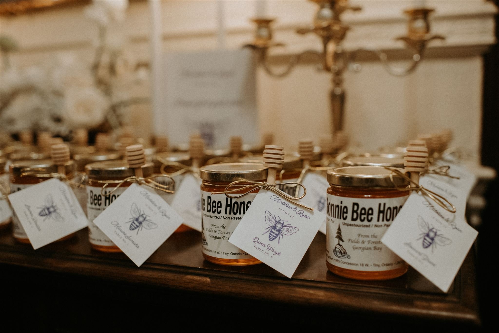
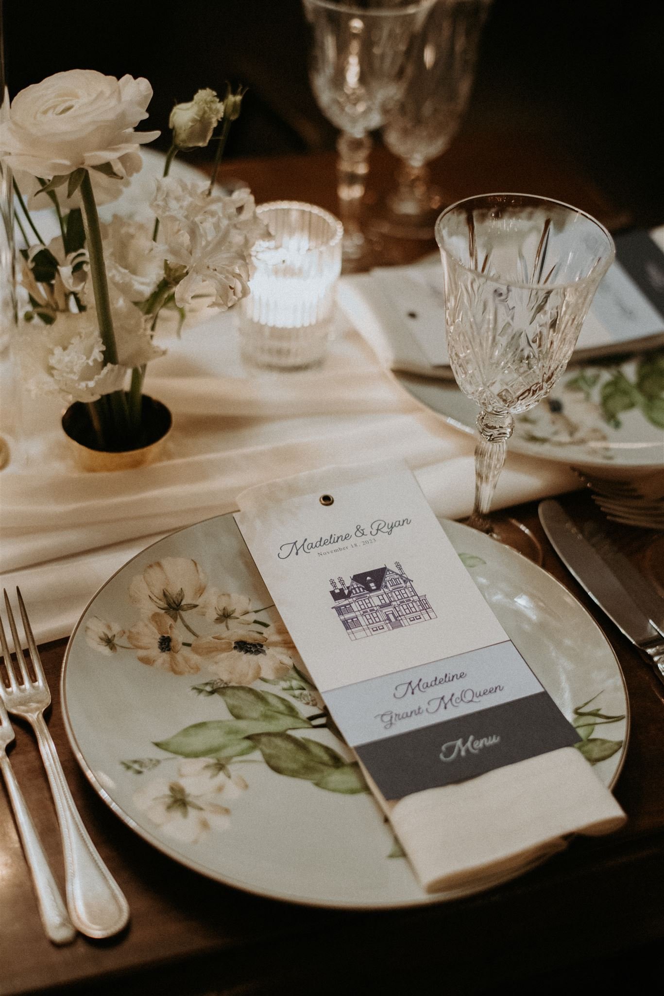
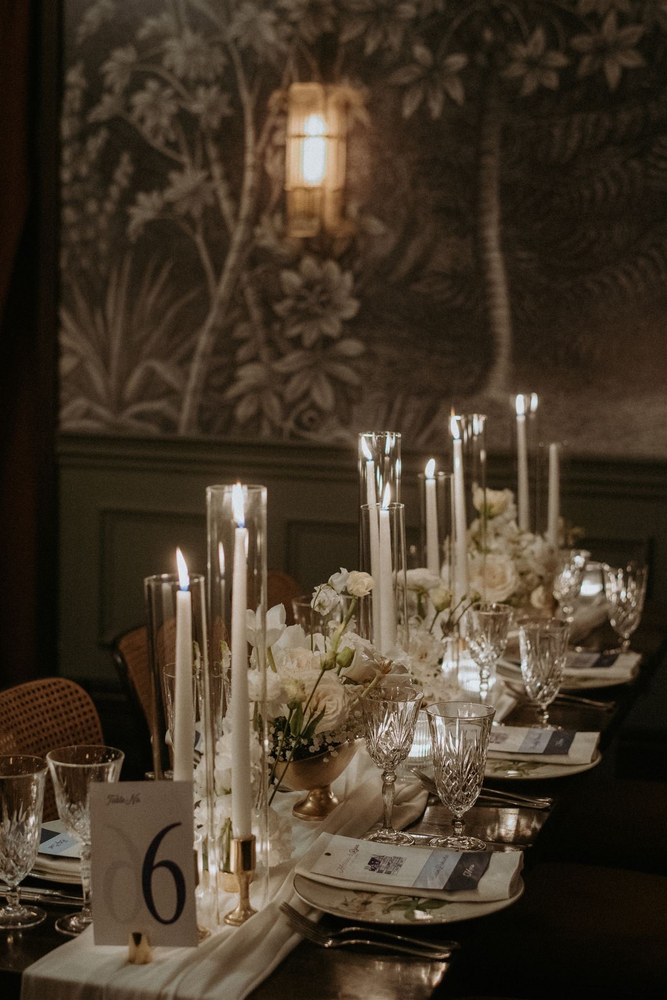
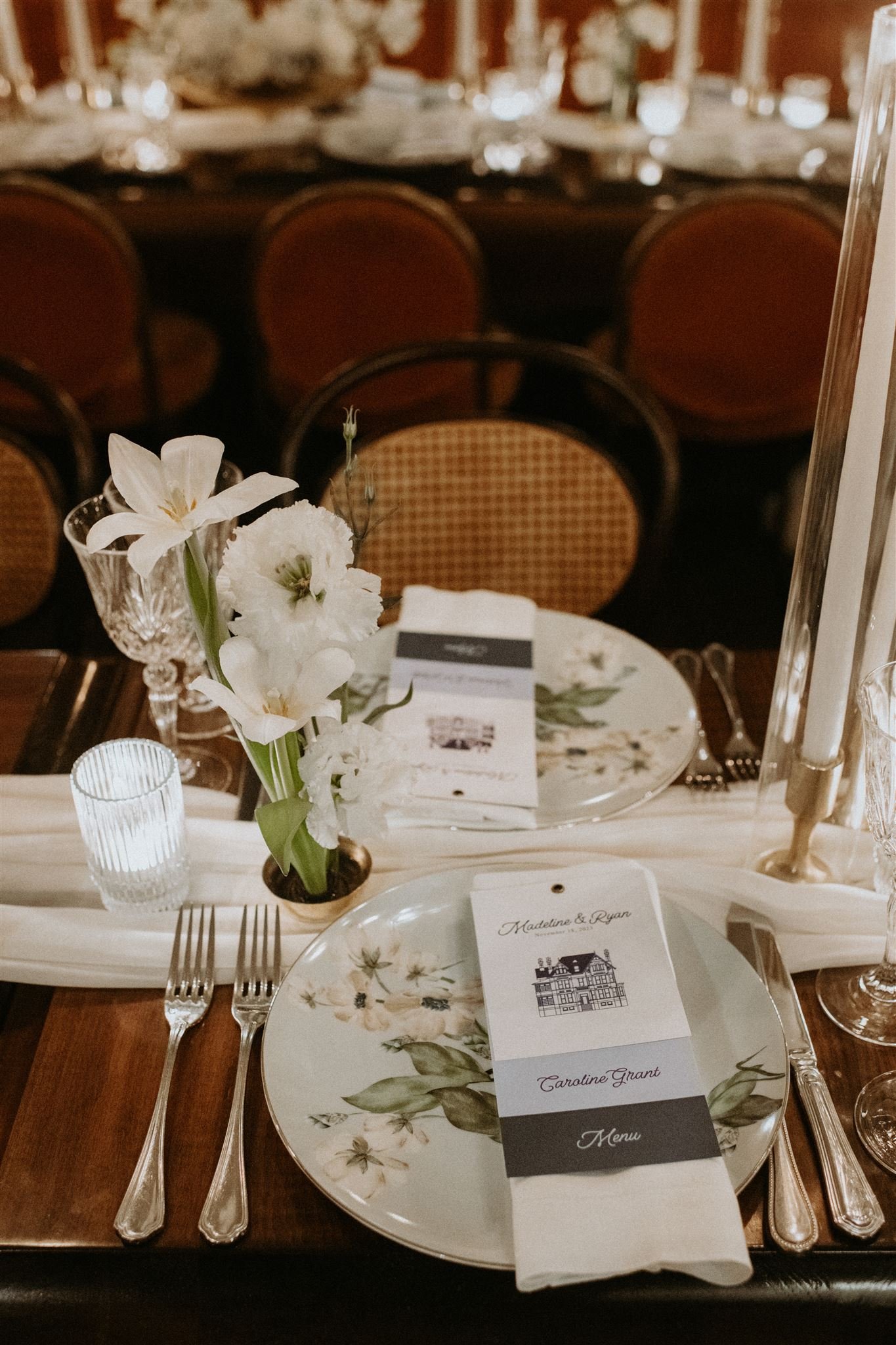
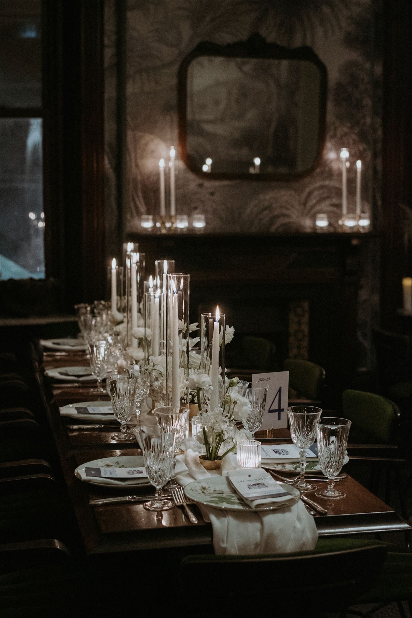
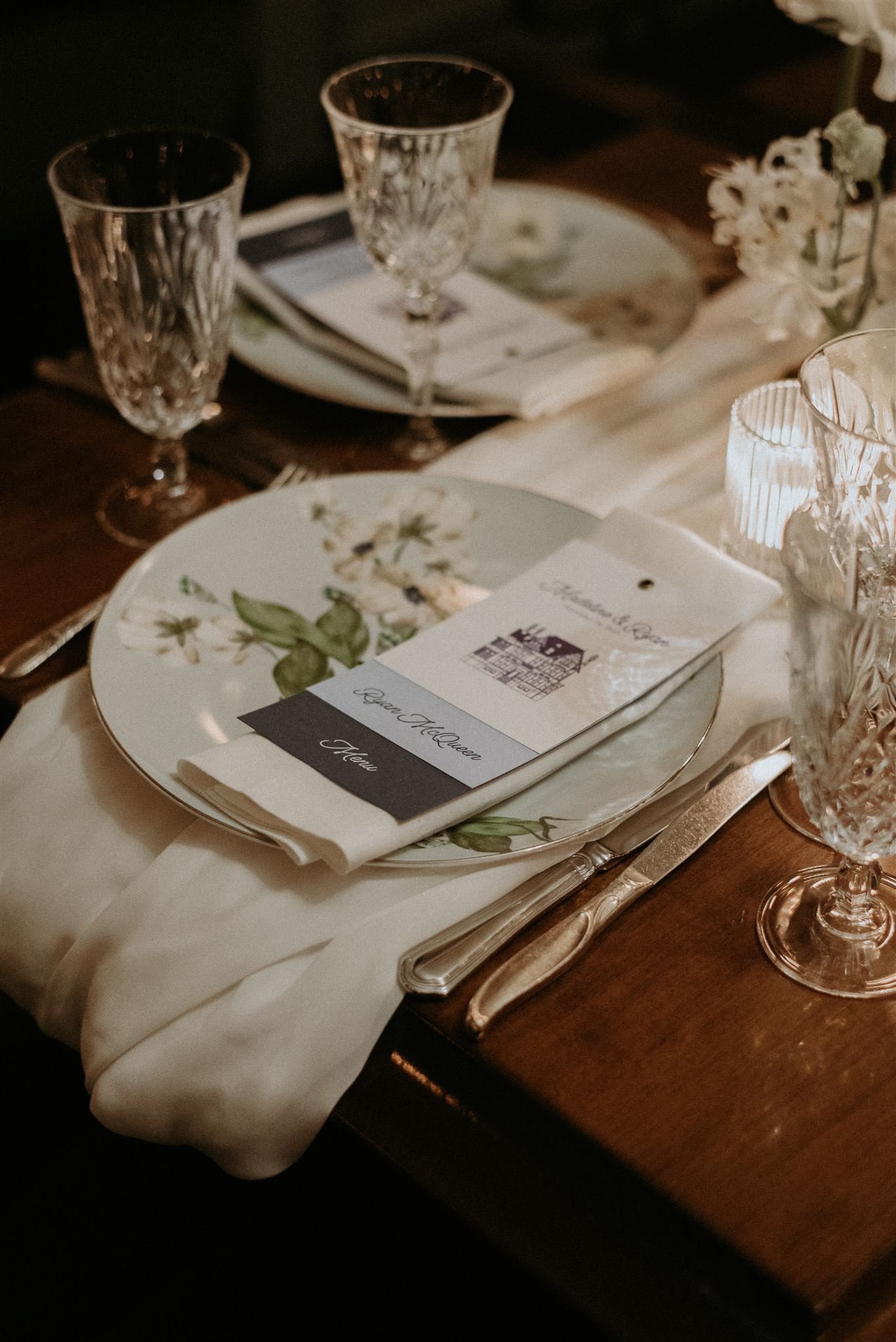
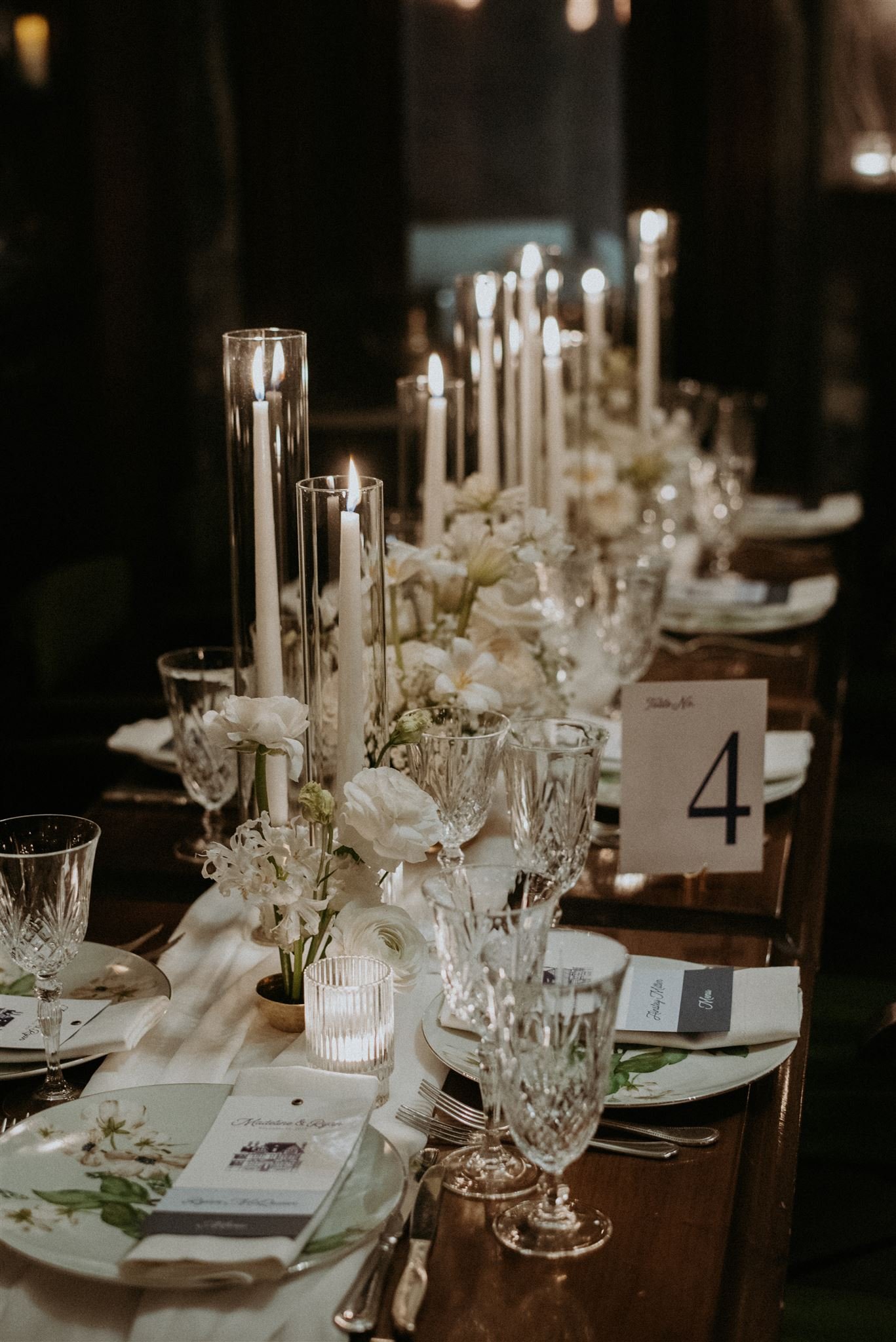
Madeline and Ryan’s Maison Selby wedding was a gorgeous display of modern with a vintage touch. Their invitation included an envelope liner inspired by the wallpaper at their venue and a script with a vintage vibe. Their day-of stationery included tags for honey favours, and a layered menu, place card and note at east seat.

