A Nordic-Inspired Wedding
I consider myself a fairly minimalist person who is obsessed with details and this photoshoot was exactly that; simple with every detail carefully curated to make something neutral and simple, yet bold and beautiful. Paula Scarangella of Flycatcher Weddings & Events perfectly tied together all details of this editorial.
The photoshoot was featured on Dear Bride, where Paula was quoted saying:
This Nordic Nuptials shoot was birthed and inspired by my personal connection with nature, love of Scandinavian culture, and fascination with the poppy flower. My hope was to create a vision that embodied aspects of nature that lay within Scandinavian roots such as the use of very neutral tones, pops of citrus colour, and wood textures in both furniture and venue.
Engagement Ring: Daniel Jewellers
Cake: Truffle Cake & Pastry
Makeup: Victoria Brocca, Velve Beauty // Hair: Marina Lima, Velve Beauty
Wedding Gown & Accessories: Sash & Bustle
The photoshoot took place at a private estate in Ontario, with high ceilings and massive windows that provided the perfect lighting for Samantha Joy to work her magic with her camera.
The invitation design was inspired by a minimalist nordic style, while maintaining a natural feel. We kept the design itself very simple, using refined typography and a simple monogram. This clean and refined look was balanced by the natural edges of handmade paper and a dusty blue envelope that reminded me of the colour of the sky over water on a stormy evening. The suite was tied together with some very simple calligraphy details that complimented the invitation without taking the focus away from the simplicity of it.
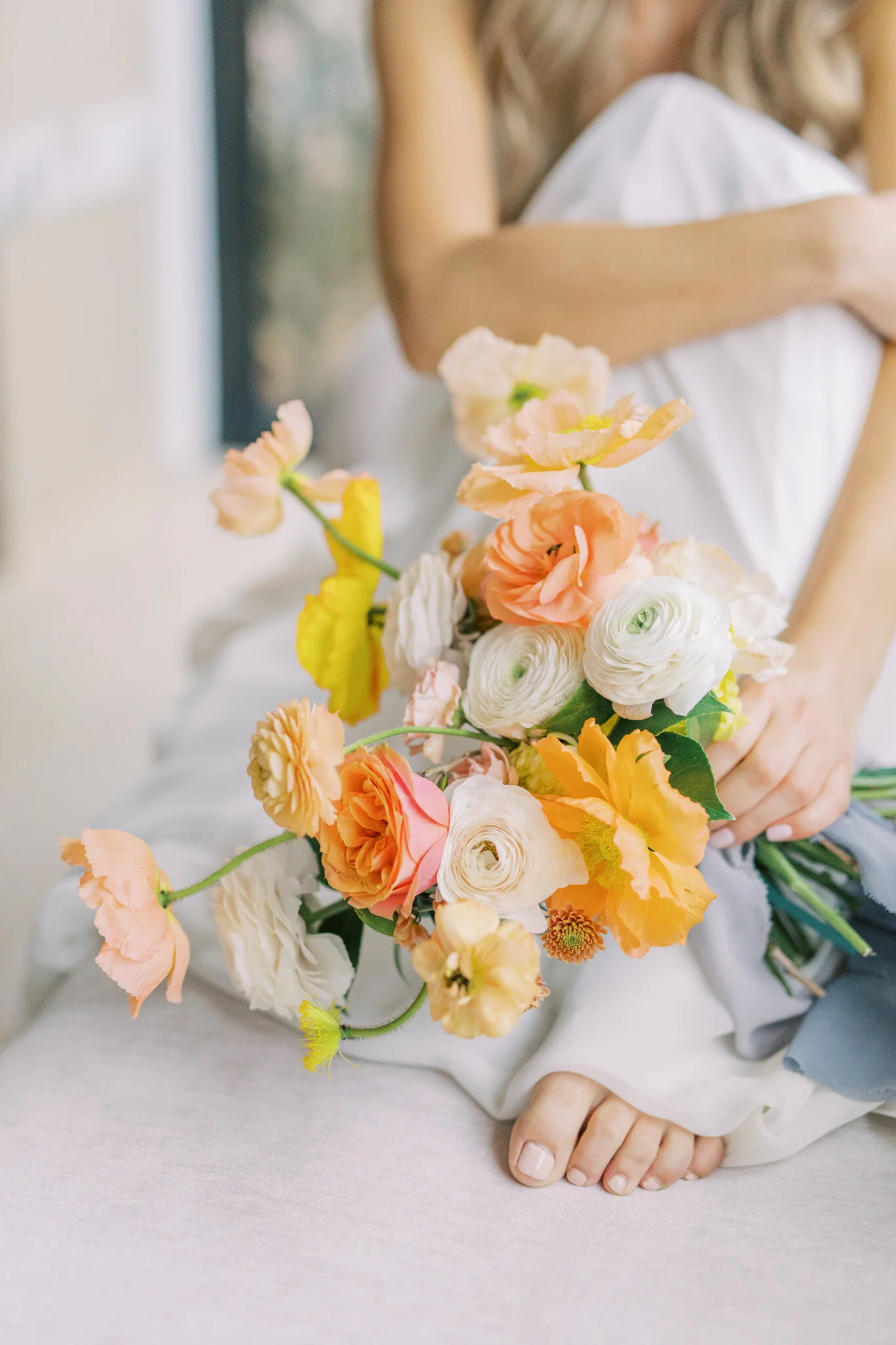
Of course, florals by Rikki Marcone made this editorial a show-stopper, with bright pops of colour and her organic bouquet arrangement.
The bride wore a loose and flowy dress that helped keep the mood of this editorial soft and light.
The tablescape followed the nature-inspired theme with the same pops of colour and ongoing use of texture. Dried floral arrangements helped bring together the bright yellow and orange flowers and candles with the neutral tones of the room and linens.
Table Rentals: Plate Occasions
Linens: Chair Decor Linens & More
Our table stationery stayed true to the invitations with the same handmade paper, clean typography style, simple calligraphy detailing, and dusty blue paper for our place cards. The texture of the handmade paper menus was complimented by the various linens and the ornate plates that adorned each place setting, while the blue place cards helped compliment the yellow, orange and pink pops of colour in the florals and candles.
This editorial was a beautiful balance of clean lines and modern pieces, with an organic flow and texture. The florals were absolutely essential in tying together and balancing the refined elements of this photoshoot with the softer and organic details that stayed true to the Scandinavian style Paula was dreaming of when she put together this editorial.


